We are back today sharing part II of our Baltimore Row House project! The feedback you all have given us on Part I was so incredible! This house truly is a reflection of our amazing clients and the full life they live. In today’s reveal we are sharing a few of the more intimate spaces. Bedrooms, bathrooms, and their coach house behind the main house.
The Master Suite
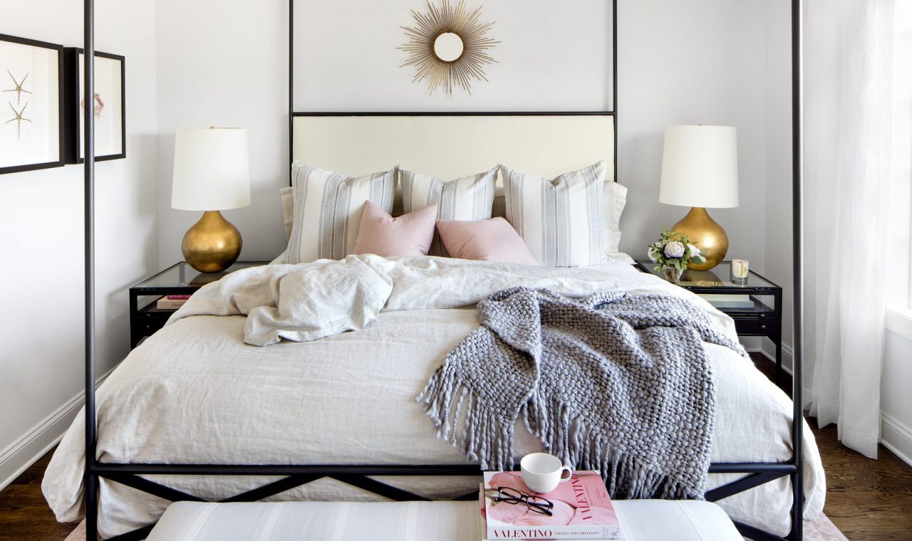
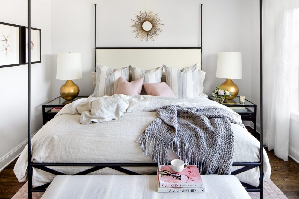
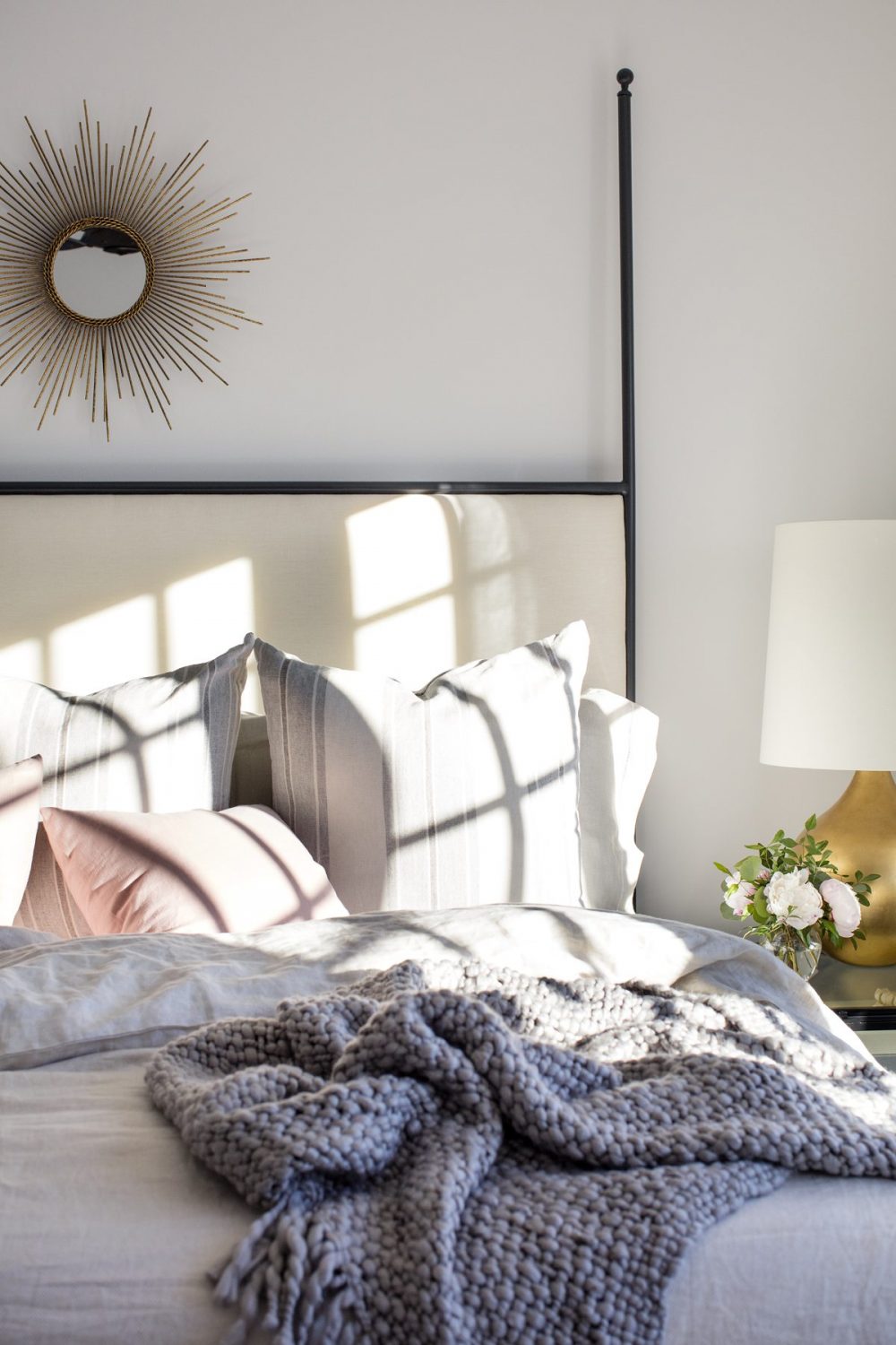
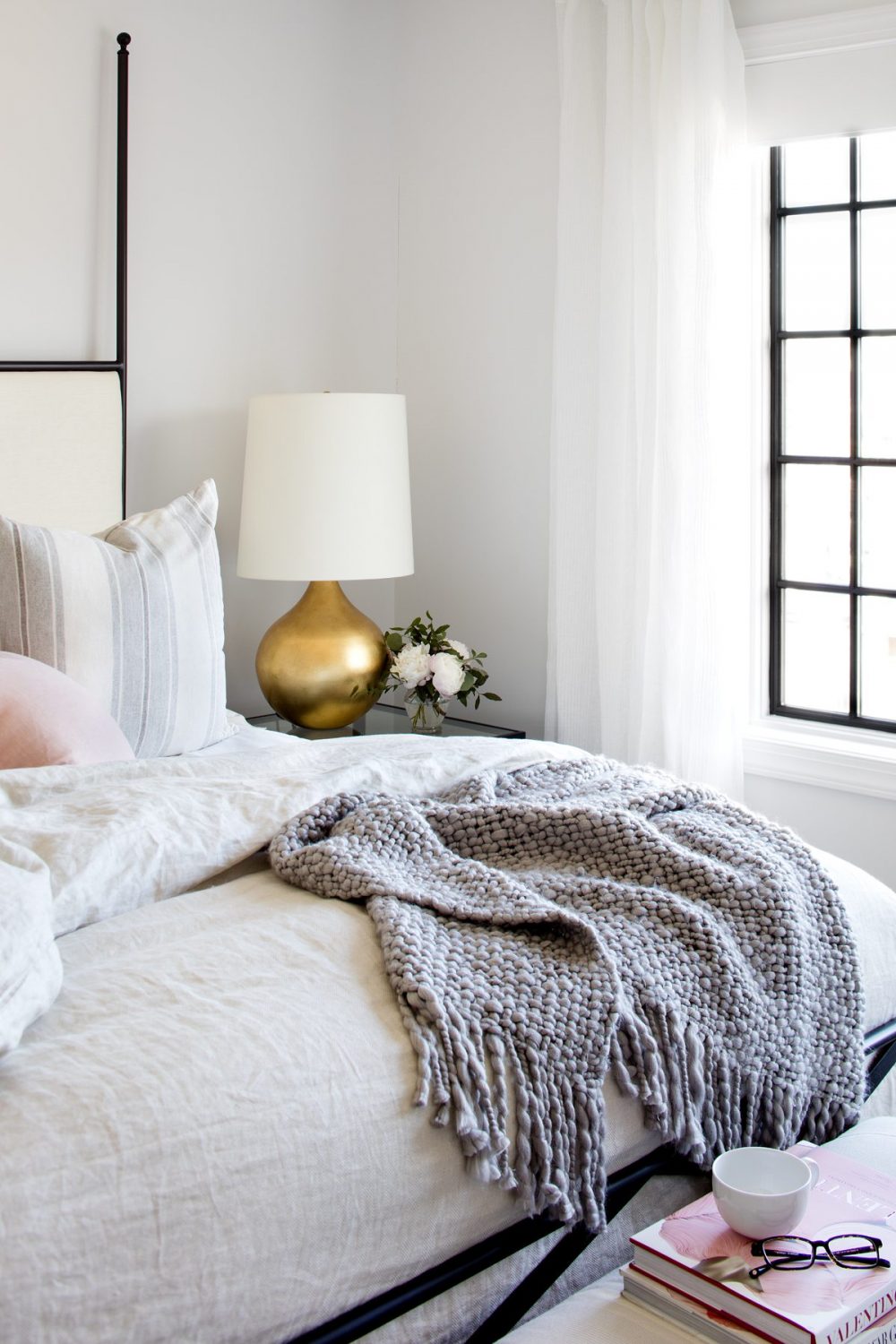
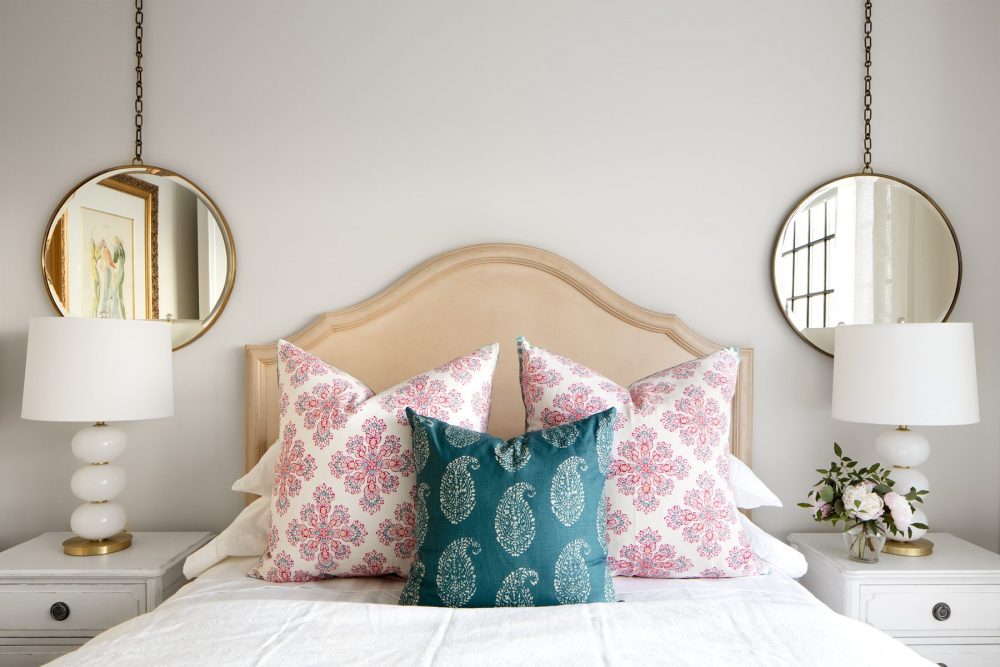
When creating the design scheme for the master bedroom and bath, our clients wanted a warm, light feeling space. They wanted the room to be romantic, but not fussy. We started with the poster bed to set the tone for this space. One of the beautiful details of this bed is the juxtaposition of soft and hard lines. The iron posts with the upholstered headboard was the perfect marriage of these two elements.
This room was the perfect place to add a touch of pink, and we have been dying to use this beautiful rug in a project for a while now! Pairing this feminine rug with the modern lines on the lamps, nightstands and bed kept the room from getting too feminine.
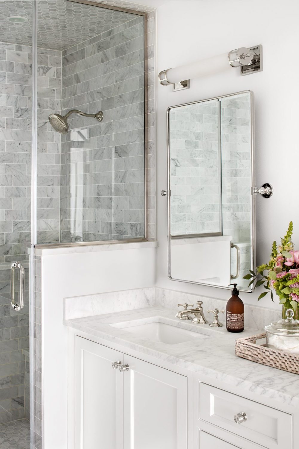
For the master bathroom, our clients had always dreamed of a marble bathroom. With no natural light in the space, it was important to keep the room light and airy. The oversized shower in the back of the room almost made the bathroom feel larger. We used a ghost chair for the makeup vanity chair in order to avoid creating a visual block in the room, and kept the space feeling symmetrical by installing matching articulating mirrors on each side.
Guest Bedrooms
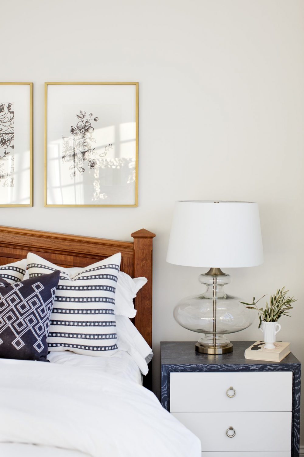
This bed was a family heirloom, a solid wood bed from Vermont that came from our client’s childhood. We complimented the bed with simple casual bedding and a fun two toned nightstand with glass lamps.
On the 4th floor we made this room a little more playful. We had fun playing with color creating a fresh yet vintage palette.
One of the details I love in this home are the x inset transoms we designed and installed on each level. Since there are only windows on the front and back of this home, it was so important to let as much light as possible pour into these spaces. Adding the X detail made these transoms feel like an architectural element that was intended from the beginning.
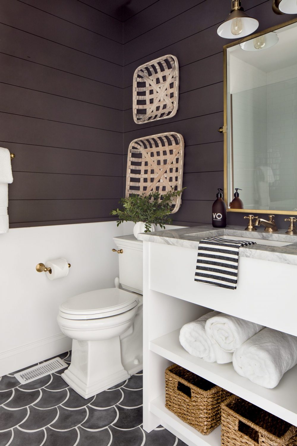
The guest bathroom on the 4th floor has one of our favorite tiles of all time. This perfectly imperfect concrete scallop tile adds character to a new construction home. Adding these “meant to not be perfect” details creates this lived in been here forever feel that we just love to create in our projects.
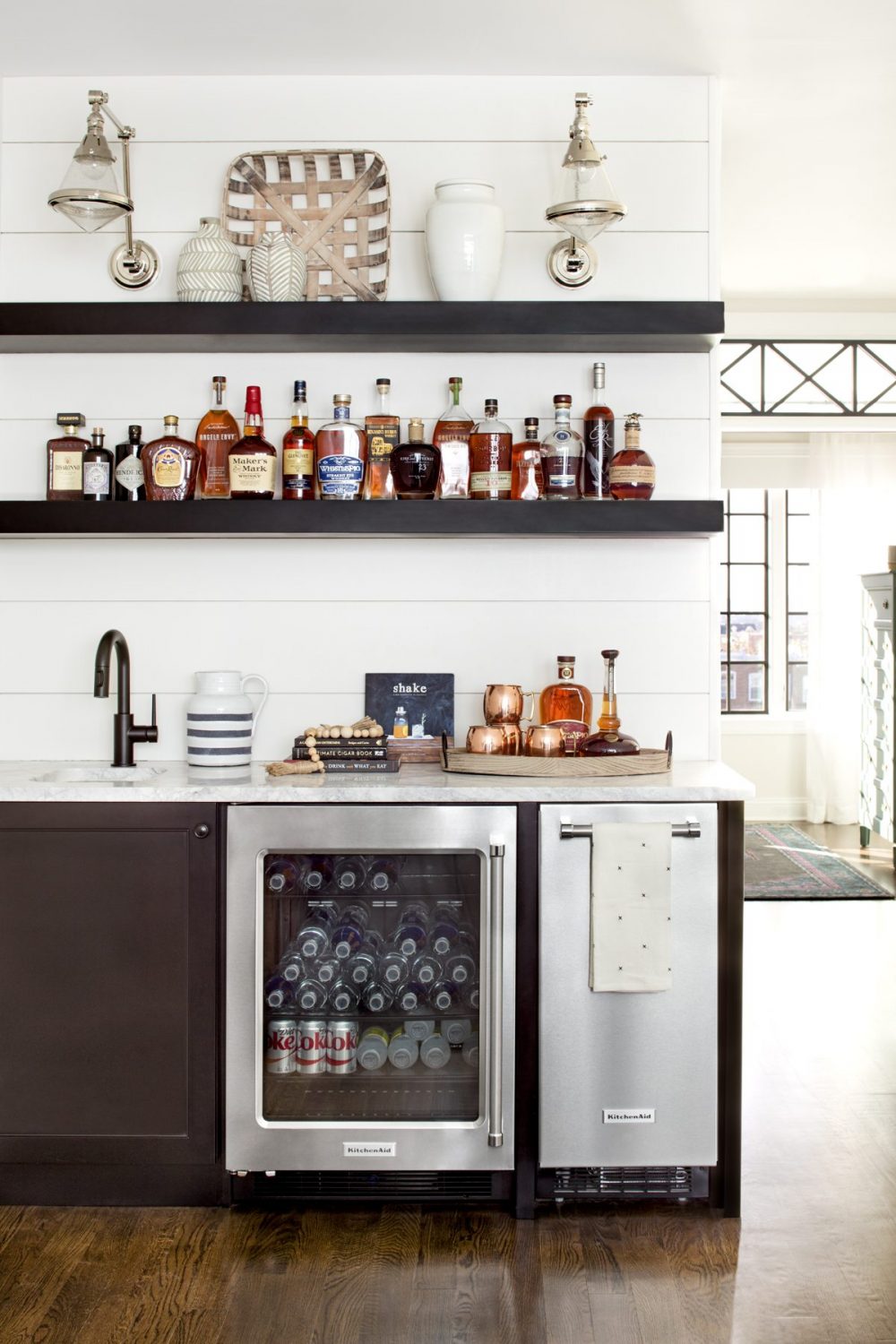
Right outside the 4th floor bed and bath area is this little sitting area and bar, that leads out to a roof top patio. We wanted to keep this area simple but create a display for the collection of liquor our clients have. Adding the ice maker and wine refrigeration allows them to host a get together on this floor without having to go down to the 2nd floor living area.
The Coach House
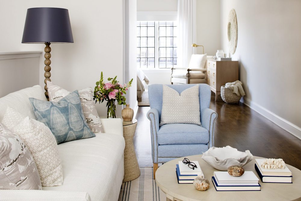
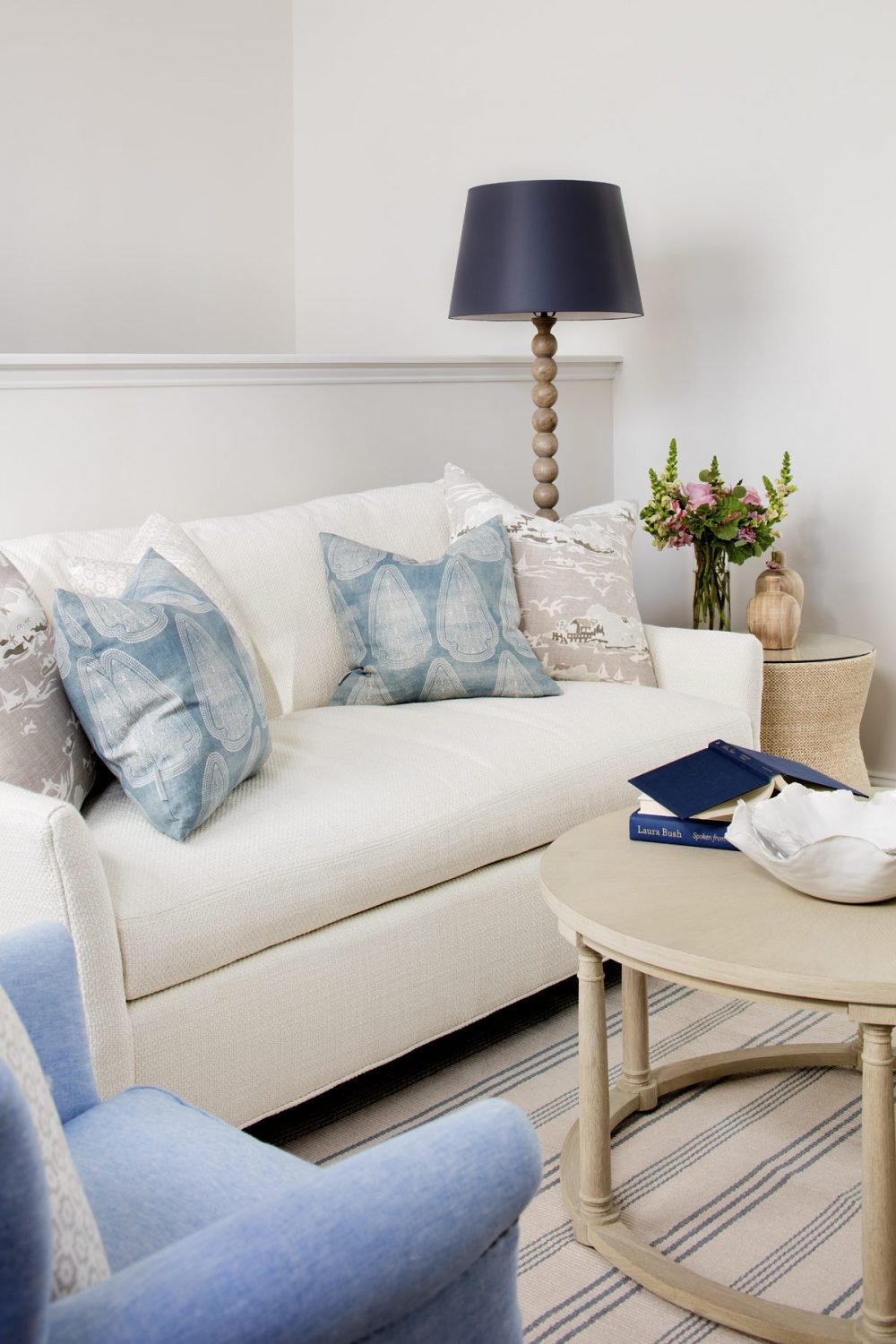
Outside of the main house, and above the garage is what we call the coach house. It’s a separate living quarters that could be used for a mother in law suite, or just a more private guest area for visitors. We wanted to keep this space light and airy, and give a little more of a coastal vibe to the space. Scale of furniture was important in here, as the layout doesn’t allow for oversized furniture. We wanted to create a comfortable sitting area so focused on small scale but high comfort furnishings.
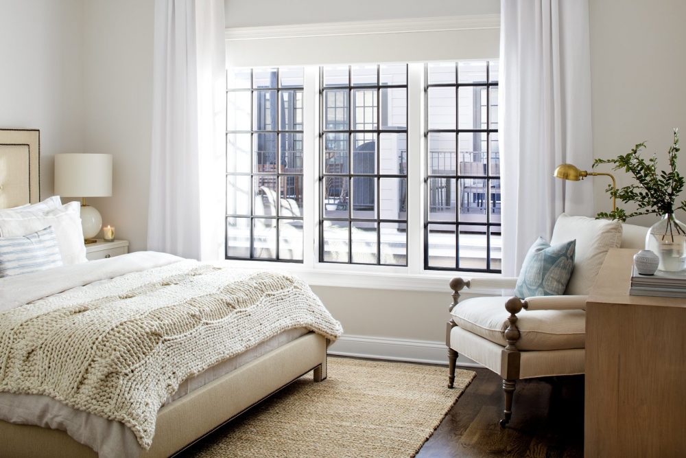
The bed we used in this space was from our clients previous home, and we knew we could use it in this room. It is simple, classic, and set the tone for the soft color palette in the coach house. By adding layers of texture we could maintain this light palette while not feeling washed out and boring. The textured sisal rug, the chunky knit blanket, and the airy linen panels all created this layered look.
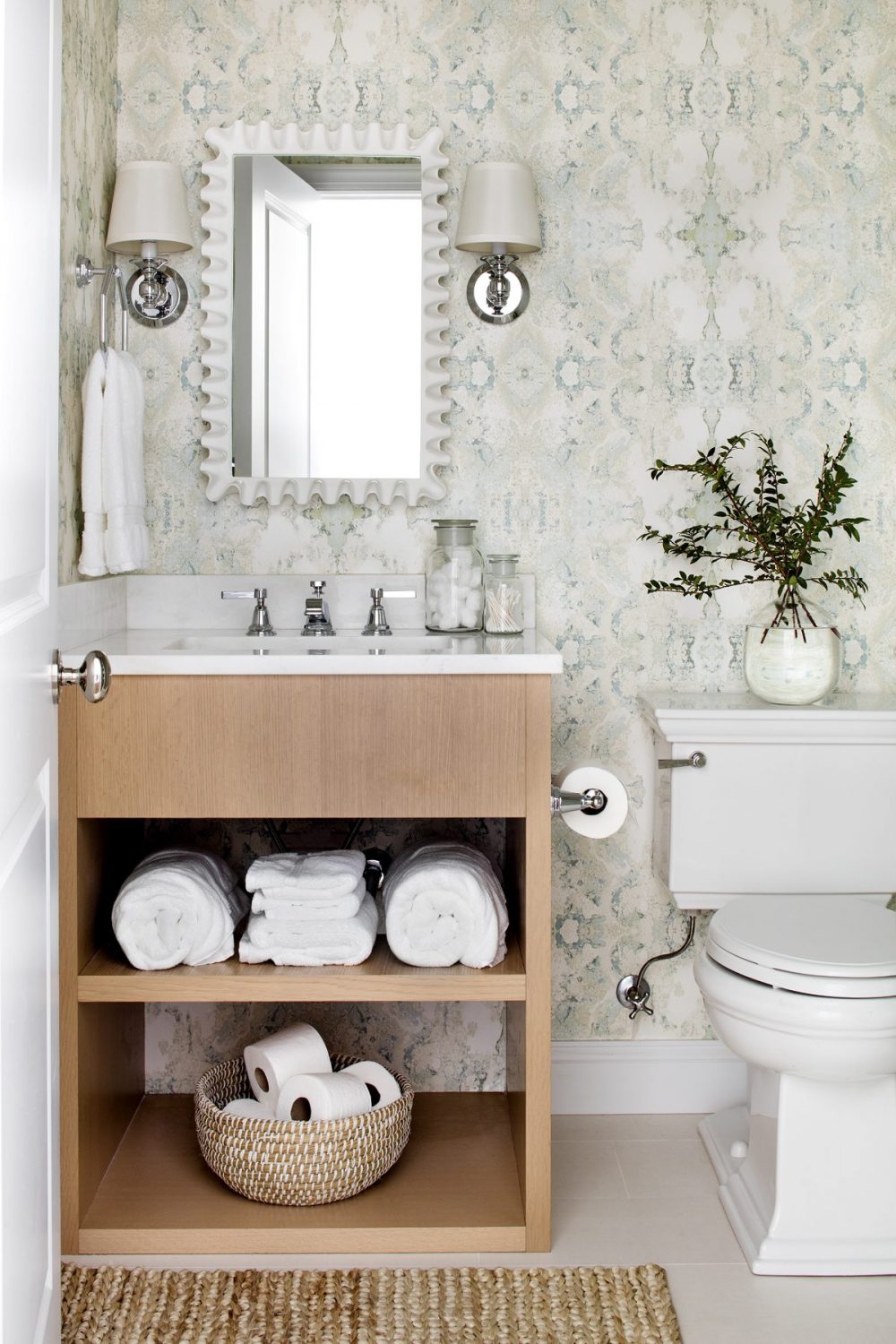
The bathroom in the coach house was one of the last rooms we designed in this project. We knew we wanted to have fun with the space but yet wanted it to compliment the rest of the area.
We found this beautiful abstract watercolor wallpaper and fell in love. The wallpaper was the perfect backdrop to this white oak bath vanity we had built. It’s amazing how wallpaper can transform a space!
It is always so bitter sweet writing these posts, as it means we are wrapping up the project. These client’s of ours will forever be friends. Our business is an intimate one, and we are so lucky to share our passion with such beautiful wonderful people!





Comments
Hey was wonderful the names of your favorite whites used in the rooms above and a white with a hint of gray???
Hi Jan! We used Benjamin Moore Classic Gray thoughout a lot of the rooms in this home. It's a favorite of ours! Bria
Can you tell me where you got the abstract wallpaper from? It is stunning!
Thanks Chelsea! You can find it linked here.