We are so excited to share with you today a project we have been working on over the past 2 years! We learned quickly 2 years ago how charming of a city Baltimore, and have so many wonderful memories from our travels there. Wonderful clients, amazing food, and so much history.
Our clients in Baltimore are a young professional couple who love their city and weren’t ready to move away from city life. A lot of people as they get married and grow older move out to the County, but our clients wanted to stay in the hustle and bustle of this fun city- while building a home of their dreams.
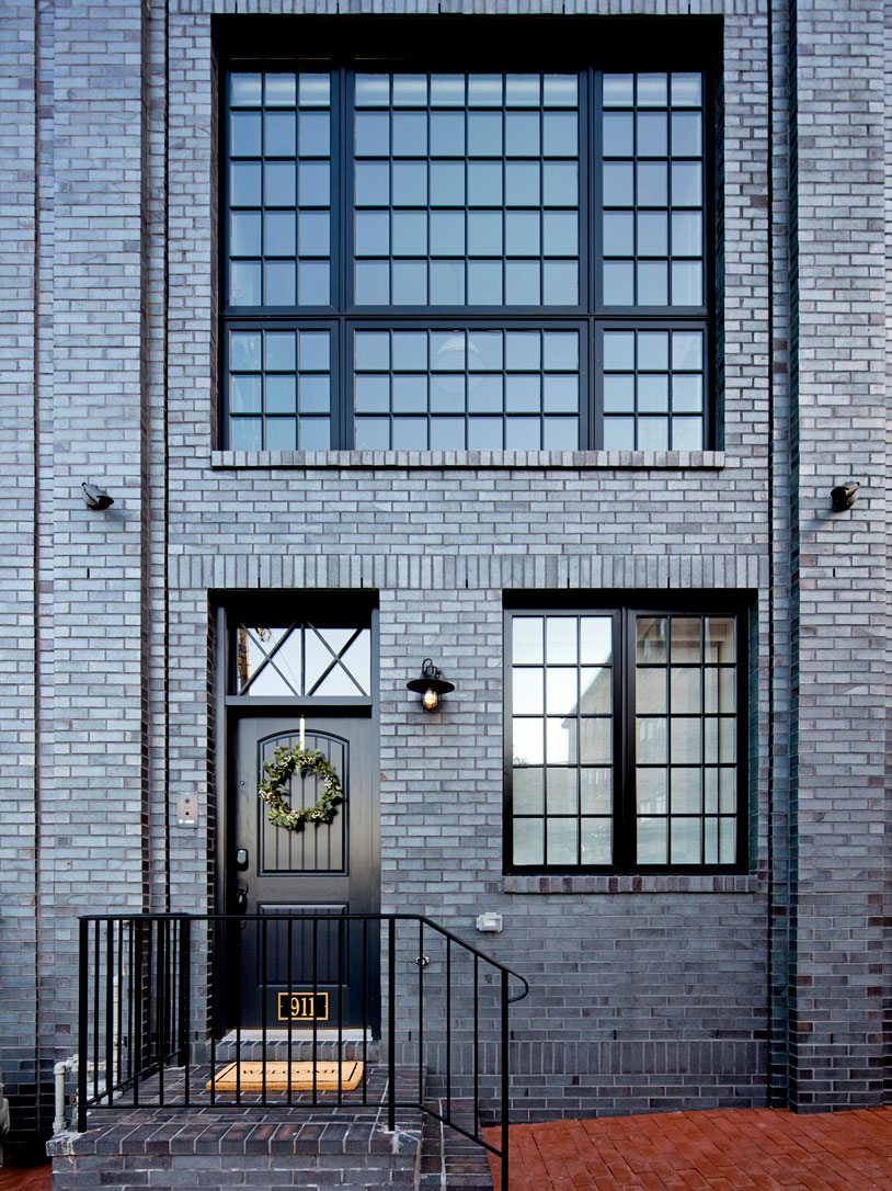
A row house was a new style of house for us to work on. Basically it is an individual home connected to other individual homes. This house has 4 stories, with a carriage house behind it and lower level garage. The floorplan is long and narrow, so we had to be creative with space planning from the beginning. We worked closely with the architect and builder to make each floor as functional as possible, to make this home not only beautiful but very livable.
The First Floor
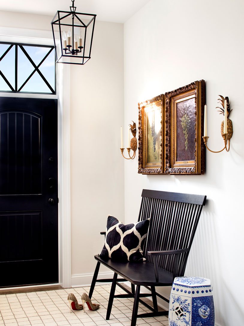
When you walk in the front you are greeted with a small but beautiful entry way. It’s always important to us to give a glimpse of the homes style as you walk in the front door. We mixed a simply styled bench with the client’s antique artwork. The pineapple sconces were a traditional nod towards the symbolism of warmth, welcome, friendship and hospitality.
The home is in more of an industrial neighborhood, so it was important to not lose touch with that surrounding style. We were inspired to bring a new level of sophistication to this home. We wanted to highlight our client’s love for travel, and also create a backdrop for some of their antique family heirlooms. I don’t know that we have ever been able to work with such beautiful antiques before!
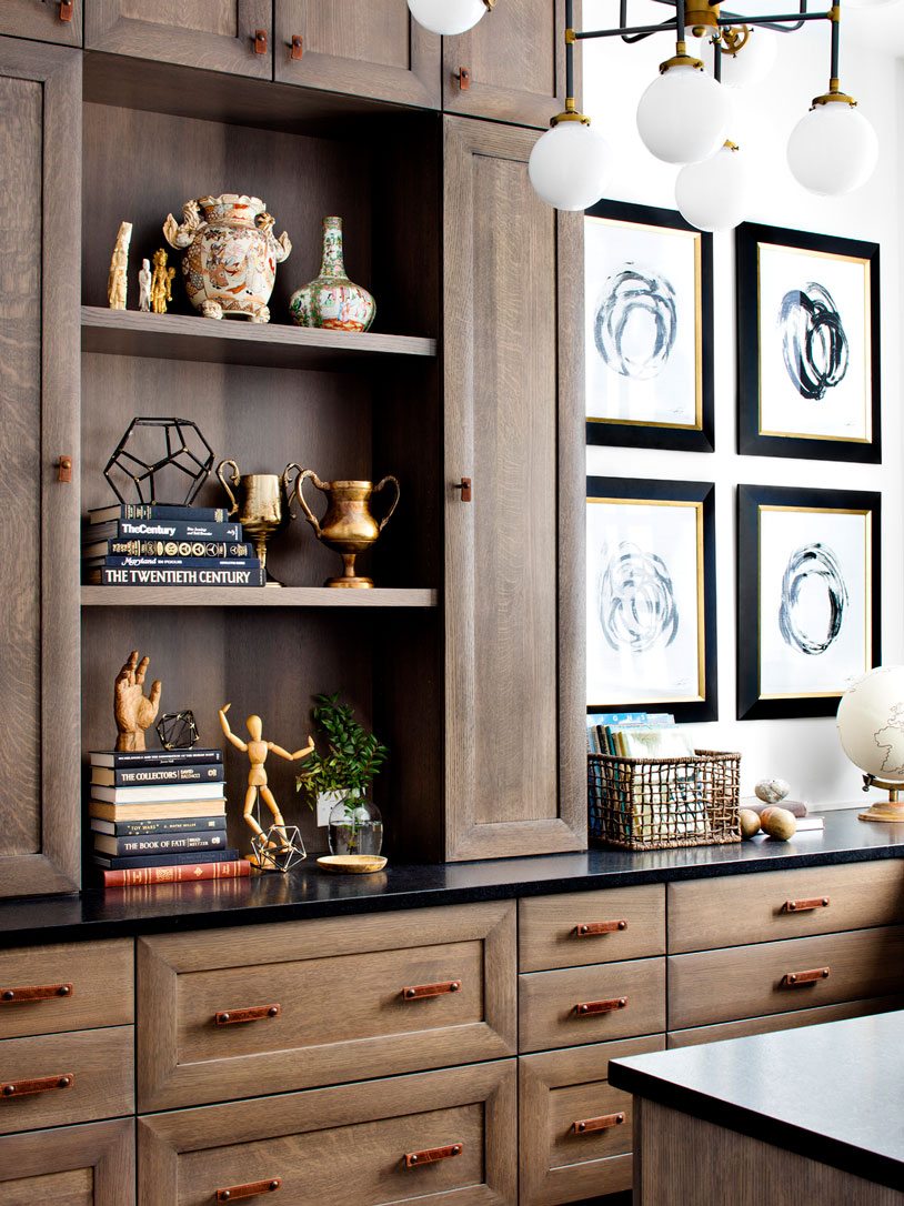
The office is directly off of the foyer in the home. We wanted to keep this space masculine and a touch more modern then other spaces in the home. The cabinetry takes center stage in this room with quartersawn white oak cabinets with a pillowed cabinet profile.
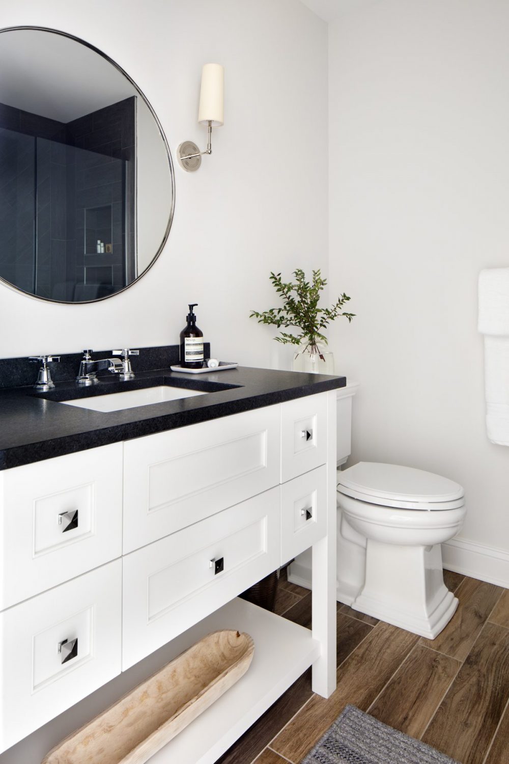
The rest of the first floor consists of a bathroom, laundry room, and sitting room off the backyard. The bathroom we kept simple with a black and white theme. In the mirror you can see a glimpse of the beautiful chevron tile installation in the shower. We love to include these special details in unexpected places.
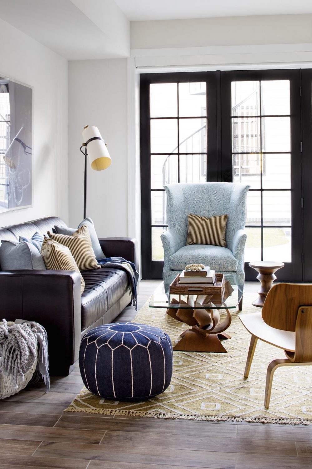
The sitting room on this floor had a nod to mid-century modern. We incorporated some of our clients collected pieces of furniture from their previous home which was much more modern. It was fun to mix the two styles in this space. One of our favorite color combinations, mixing cool and warm, this room is the perfect spot to cool off in the hot summer days.
The Second Floor
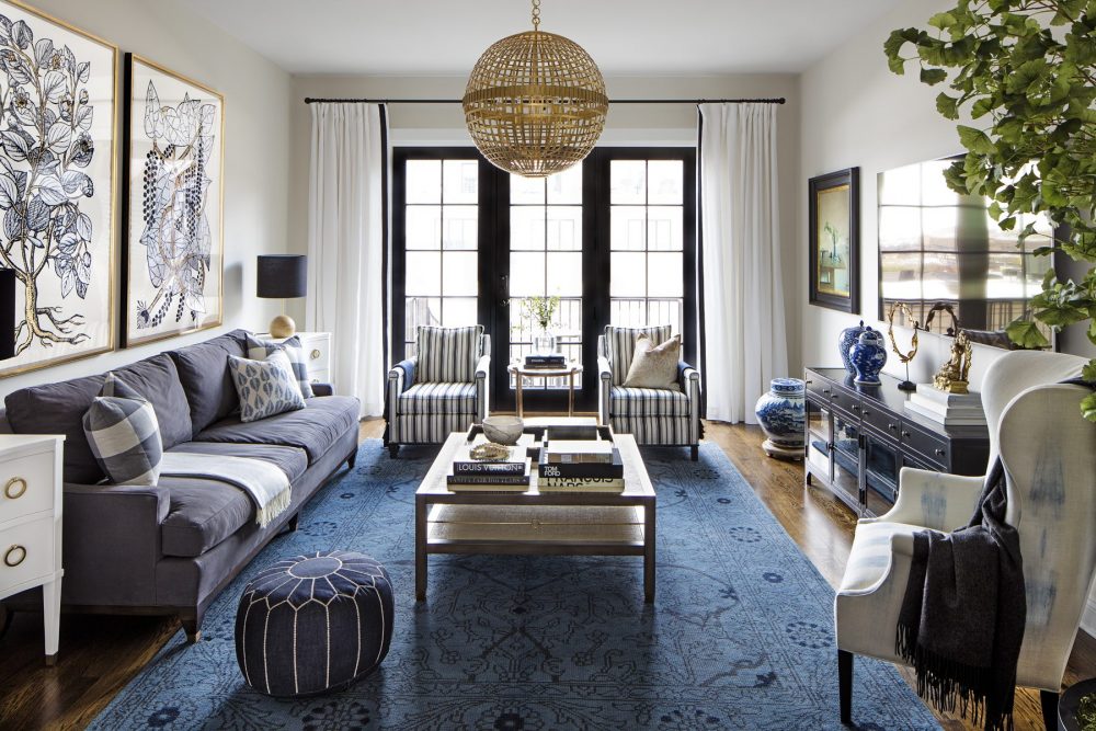
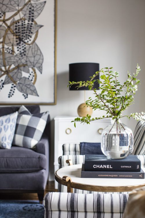
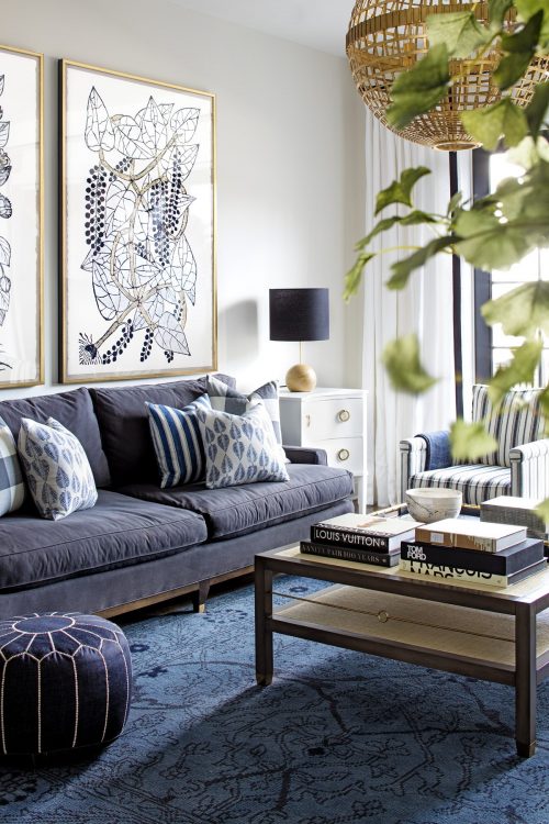
Probably our favorite floor. On the 2nd floor lies the great room, dining room, and kitchen. Our starting off points were the industrial iron staircase and our clients beautiful collection of antiques. We knew we had to create an eclectic mix of new vs. old, modern vs traditional. To begin, we played with the scale of the pieces we selected. We installed an oversized chandelier in the center of the room to accentuate the tall 10′ ceilings and make a big impact when you walk up the stairs. We paired 2 large floral pieces of artwork over the sofa to help balance the light, and then created focal points for the antique artwork and garden stools our clients had in their collection.
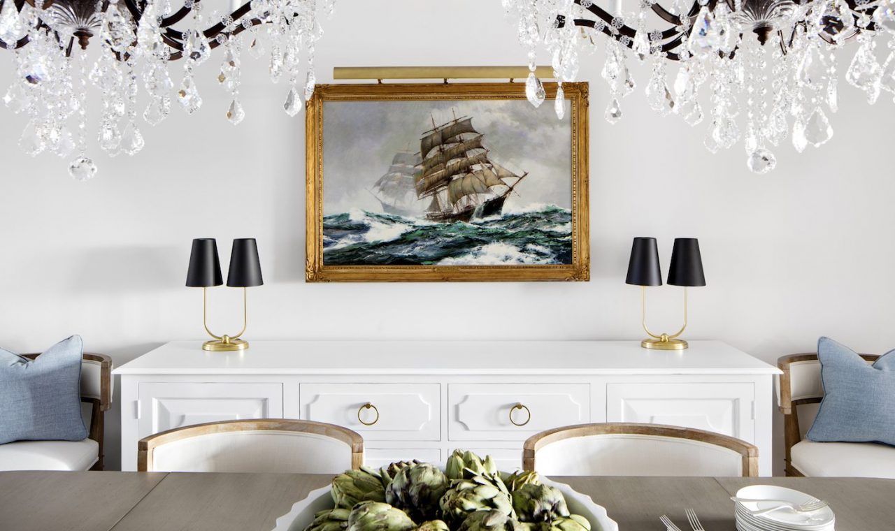
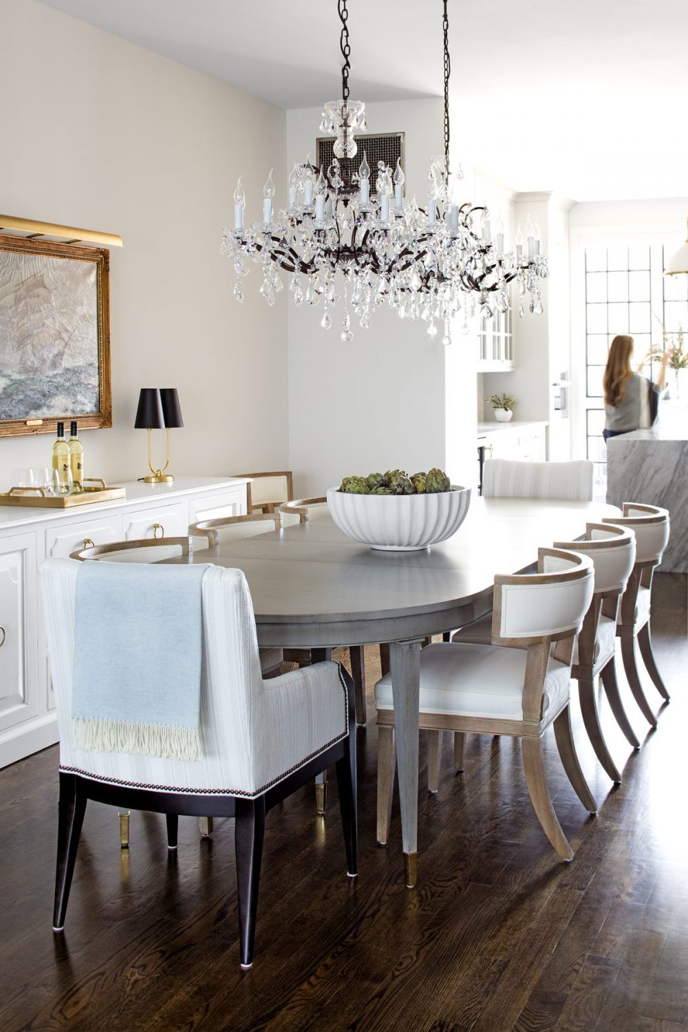
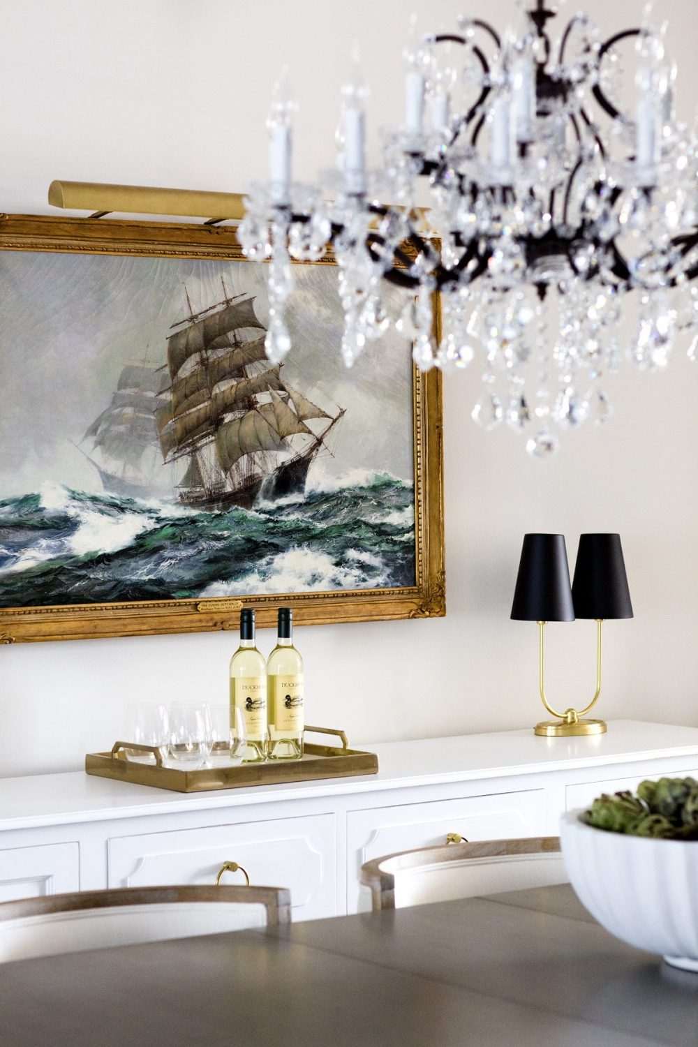
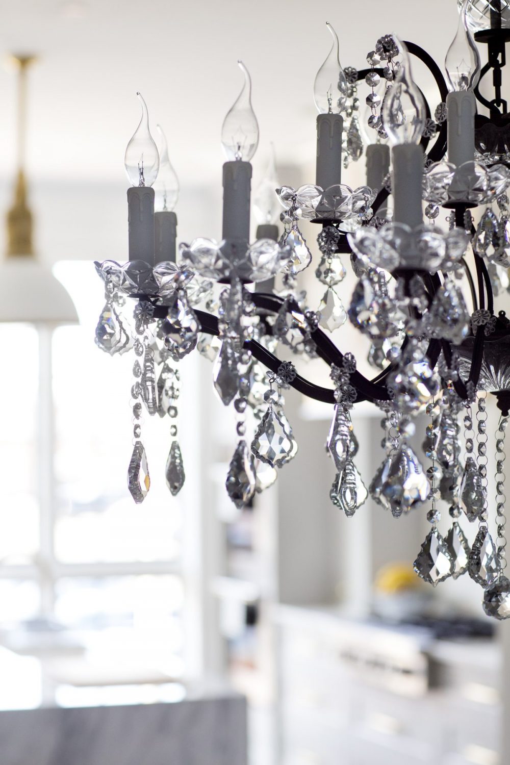
For the dining room we added a touch of glam. We doubled up the chandeliers to accentuate the long lines of the space. The artwork over the buffet needed to take center stage, it’s a family heirloom of the client’s and it is a showstopper in person. We had a custom dining table made to perfectly fit the space. The dining chairs were designed to keep a low profile and not overpower the room.
As much as we want to share the beautiful kitchen with you today, we have to hold off as it’s going to be featured in a really special place in the coming months. We promise we will share it as soon as we are able to! {You won’t want to miss it!}
Stay tuned for Part II of this beautiful home. Let us know what you think so far!






Comments
Would you please share the source of the prints in the 1st floor sitting room? This home is perfection!
Love your designs! We are redoing our wet bar and I love the mini scale mosaic you chose for the row house kitchen. Could you please share where you ordered it?
Hello Bria, I LOVE what you have created in this row house! It's an absolute beauty and I am in awe of your work. Can you share the exact colour of the kitchen cabinets? Thanks so much.
I love the kitchen cabinet color. Can you share the paint and shade?
Fabulous