Last Summer, our Afton project with Divine Custom Homes had the wonderful opportunity to be a part of Midwest Home’s Luxury Home Tour. While in the process of getting ready for the tour, we shared a few sneak peeks of the home on our Instagram stories and received more feedback and love than we could have ever imagined.
Included in the responses was a note from Kelly Keegans, Editor in Chief of Minneapolis-St. Paul Home & Design Magazine. She loved the project and wanted to connect us with the Magnolia Journal for a feature. Our first thought was ‘YOU’RE KIDDING!’ quickly followed by ‘OH MY GOD’, ‘GET OUTTA HERE!’, and ‘DOES THIS MEAN WE’RE BEST FRIENDS WITH CHIP AND JO NOW?’. It’s safe to say we were pretty excited about the opportunity. 😉
Well, almost 6 months later, and we’re finally able to shout it from the rooftops! Our Afton project is featured in the Spring issue of the Magnolia Journal (on stands now) and we couldn’t be more honored, flattered, and ecstatic. Although it was hard to keep this not-so-little secret from you all, we promise it’s worth the wait.
Over the next few weeks we’ll be sharing a tour through this home we’ve come to nickname our Mountain Modern house. This project was a huge accomplishment for our team and one of our most unique and modern houses we’ve ever done. It holds a special place in our heart not only because our clients were a dream to work with, but because it really pushed us creatively. In this process we found that we really can do modern design and do it in our own special, BHI way. As modern as it is, it still has that bright, airy, comfortable, and livable aesthetic that we’re passionate about and known for.
Okay, enough chit chat! Let’s get to the tour. Today, we’re excited to take you through the exterior, office, dining room, kitchen, and bar.
The Exterior
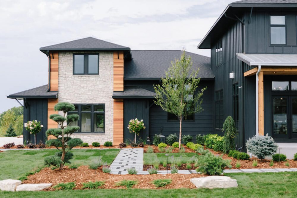
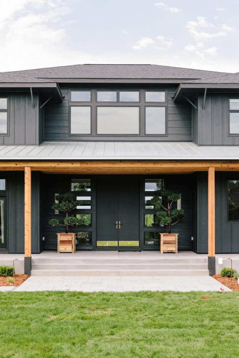
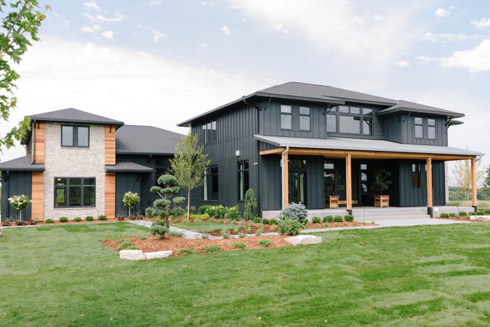
After a few meetings with our clients and getting to know their style and personalities, we knew that we wanted to paint their exterior a dark, charcoal color. Why? Well, two reasons. 1) We knew the sleek and chic dark exterior would perfectly play to their modern vision and compliment the interiors. 2) It takes a pretty brave, cool, and visionary person to let us paint their home black and we couldn’t have picked a better client than them to take this on.
Boy oh boy are we glad they trusted us because it really paid off and turned out oh so stunning. With natural wood accents and beautiful landscaping, this home is a complete show stopper before you even step inside.
The Office
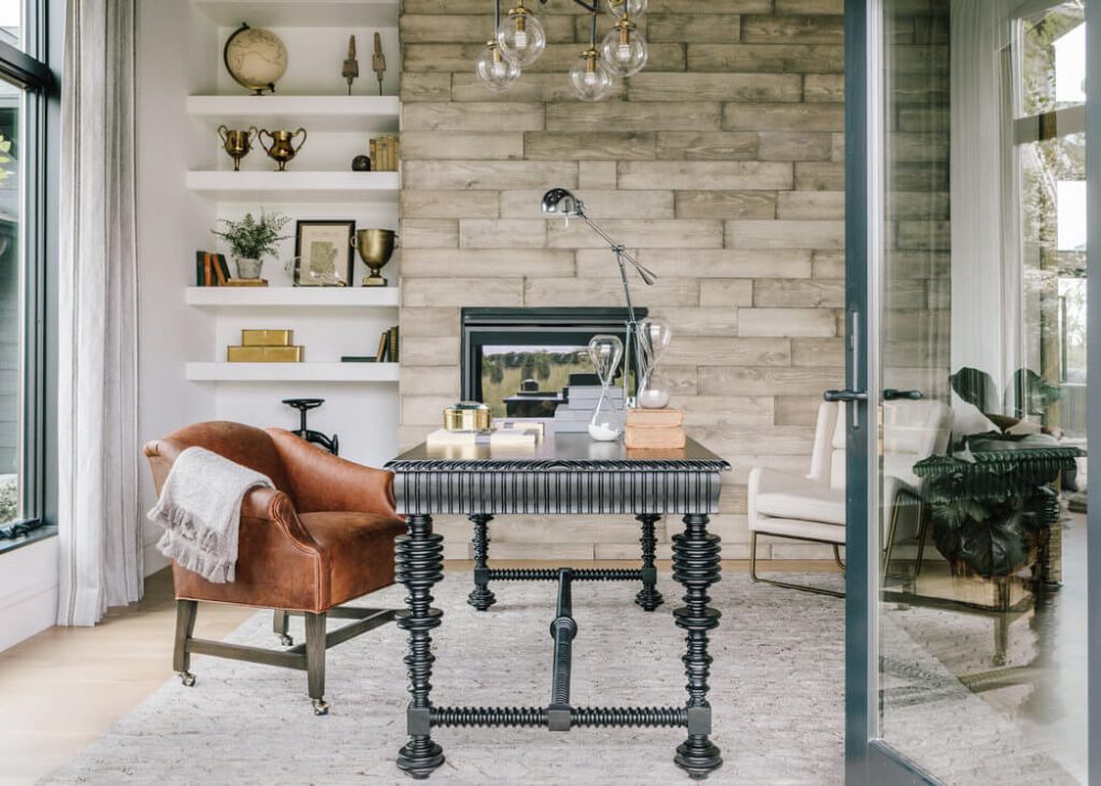
Right off the foyer of the home is the office. This room gets so much natural light which is in part due to the French doors that open up to the front porch. We love that our clients have the opportunity to open them up and let in that fresh air during those sunny, Spring and Summer days. And for when it get’s chilly, we installed a gas fireplace to cozy up the space.
It’s no secret that we adore beautifully styled open shelving and this office has a pretty incredible one. We used one-of-a-kind décor pieces and artwork we found at our local vintage shops to bring the shelves to life and we love it’s masculine, eclectic feel.
Dining Room
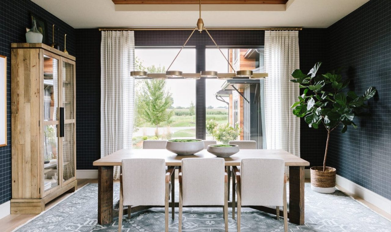
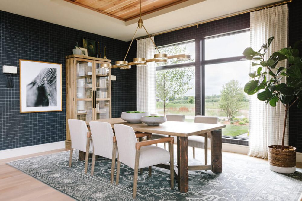
Our clients have two children and love entertaining their friends and family at their home. We knew that we wanted to create a dining space that was large enough for hosting but still comfortable and casual for their lifestyle.
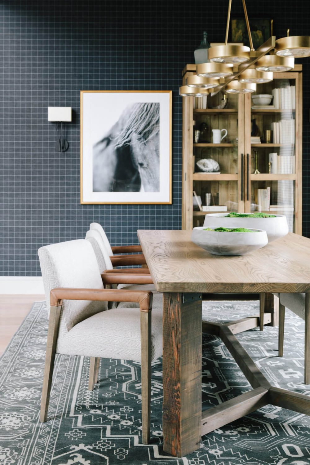
We installed a wool, plaid wallpaper to create a tailored and textured look and paired it with a table made by local craftsman and a rug that we scooped up at a nearby vintage shop.
The Kitchen
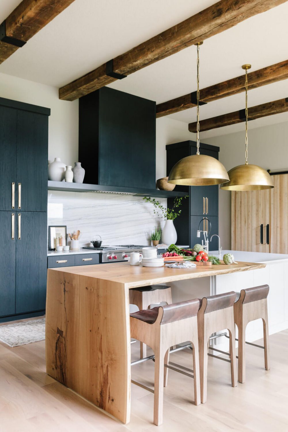
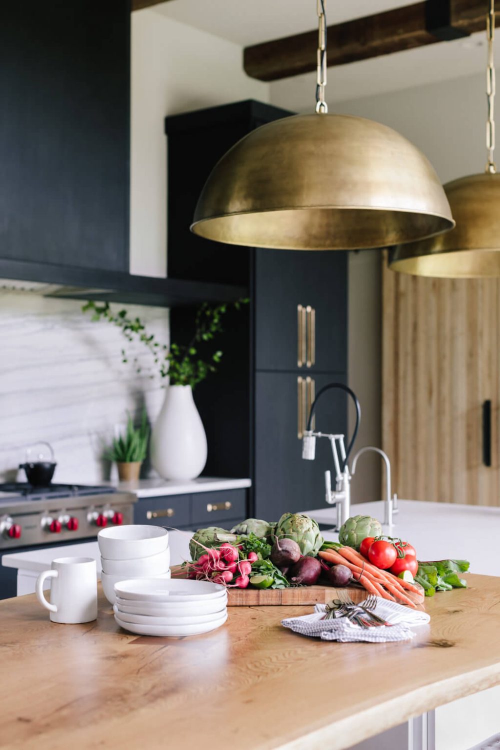
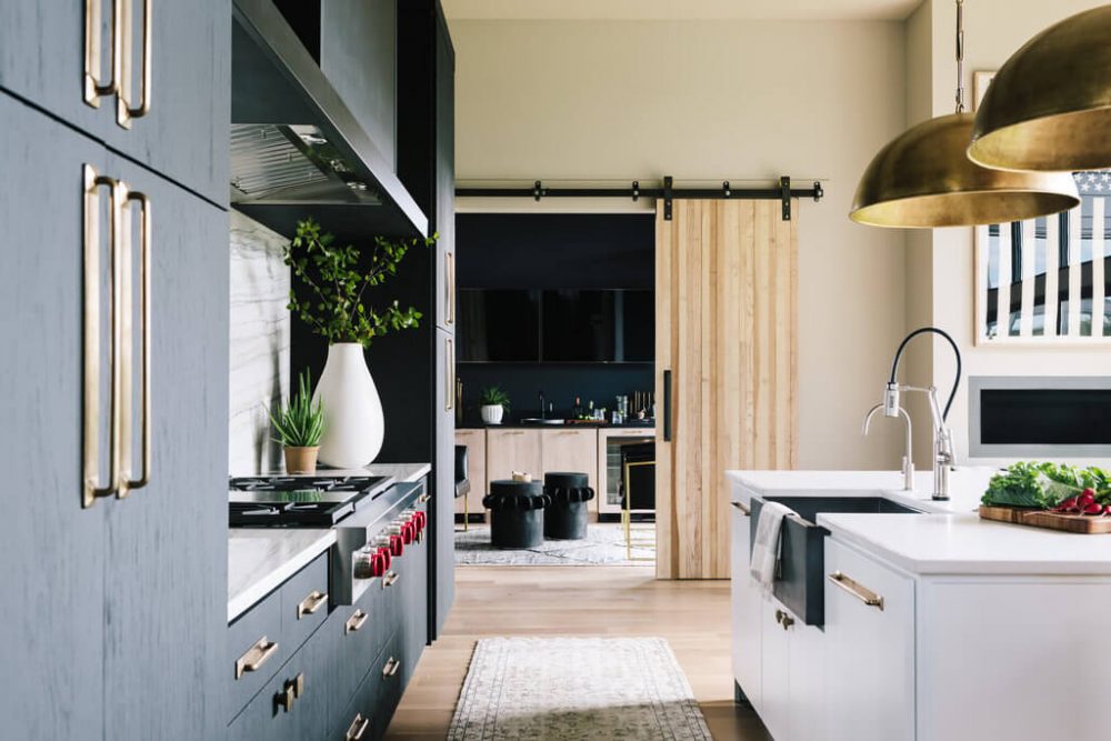
We don’t think we could love this kitchen more if we tried. Modern design sometimes gets a bad rap for being cold or uninviting and it was important to us to not let that happen. Since kitchen’s are already a pretty clean and sterile space in a home we brought in elements like the exposed wood beams, custom elm waterfall table, leather barstools, and brass light fixtures to warm the room up.
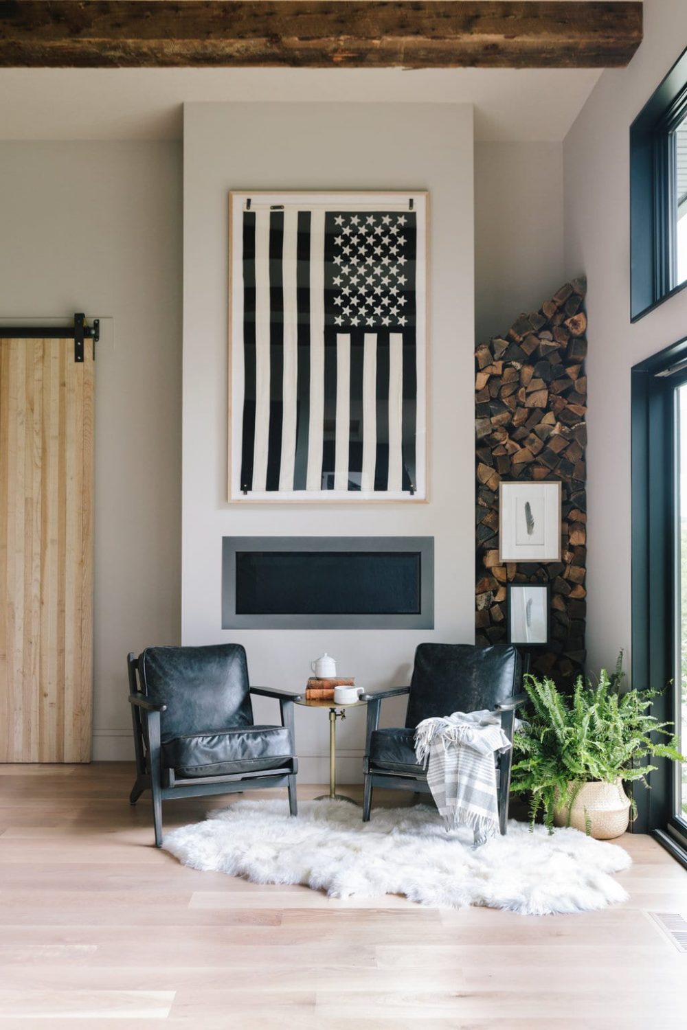
Off of the kitchen is this casual and cool seating area. We love this spot for our client’s kiddos so they can sit, read, or chat while their parents are cooking. Plus, how great is that black and white American flag? One great memory we have from doing the final reveal with the homeowners is when our client plopped down on the comfy leather chair and made a comment about this is the spot he was going to drink a cup of coffee and read the newspaper in the morning. He looked so happy and content, like the spot was made just for him. What more could we ask for?
The Men’s Lounge
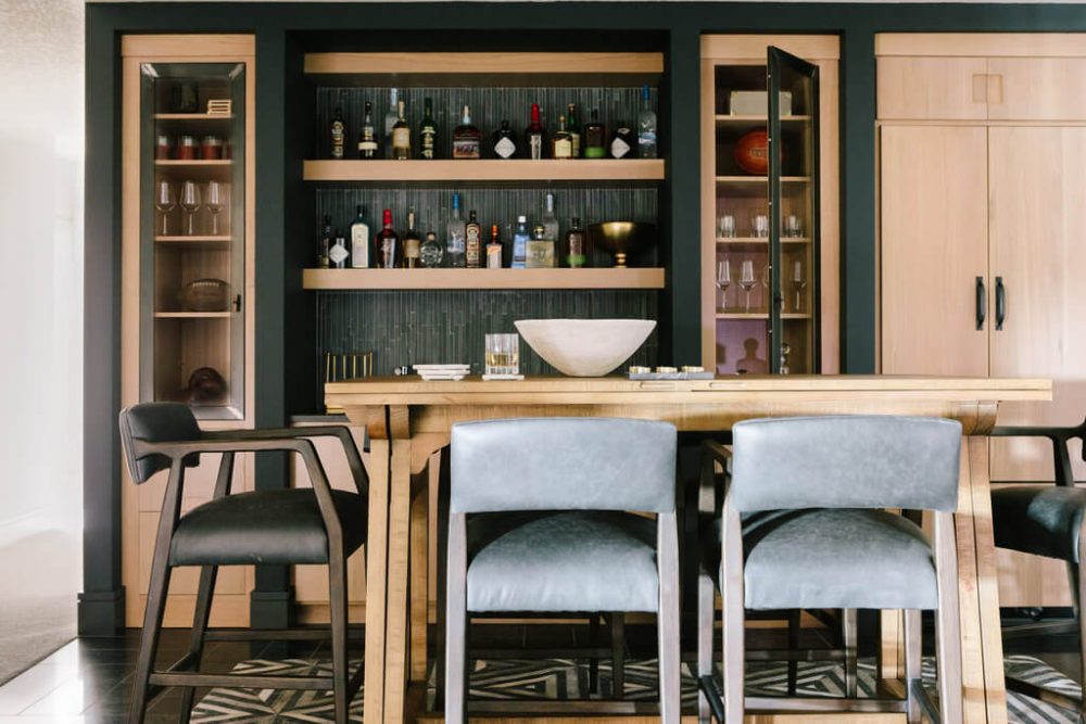
We designed this space with the husband in mind! From the side-by-side televisions for watching sports, a fully stocked bar, a small, cigar room and a patio off of the space, this room is ready for him and his pals. And, if it gets too loud and rowdy, that’s what the sliding, wood doors are for… 😉
That’s Part I of our Afton project! Up next we will continue through the main floor to the living room, master bedroom and bathroom, and head upstairs to the loft and kid’s rooms!
Photography by: Aimee Mazzenga




Comments
Love this whole look so much - you are a talented woman with such a great eye! Can you tell me where the lighting fixture above the dining room table is from? It's so low profile and organic, and I have been searching for something like this!
Hi Elise! It is the Montesquieu Linear Chandelier from Restoration Hardware. Thanks for following along :)
Congrats! Beautiful space... what are the kitchen lanterns - did they provide enough light? Thank you!
Would love to know where I can purchase the American flag from the Men's Lounge?
Hi! Gorgeous kitchen! Where are the kitchen pendants from? I’m redoing my kitchen right now and love the style of those!
Hi Kylie! Thank you! :) They are the Grand Brass Dome Pendant from Restoration Hardware.