Last week we revealed the mudroom of our Marianna Cottage project and the incredible makeover it went through. We mentioned in this post that this house was one of our biggest (and best!) renovations we’ve ever done and, honestly, the mudroom was just a small glimpse into that. Today we’re so excited to continue the tour of the rest of the home and we think you’ll be pretty blown away by the transformation.
Our clients came to us looking to freshen up the home they built over 20 years ago. After recently settling into retirement, they wanted to use this renovation as a way to celebrate this fun, new chapter in their lives. The homeowners love to host their family and friends and with the birth of their first grandchild, we wanted to make sure that this home was livable and ready for entertaining just in time for summer. The home already had amazing bones and, because of that, we didn’t have to make any changes to the floorplan or even cabinetry/trim to restore the spaces. By simply updating the paint, countertops, lighting, flooring, and furnishings this house was brought back to life with a traditional, cottage style feel.
Alright, enough chit-chat… let’s get started with the tour!
Kitchen
Before
AFTER
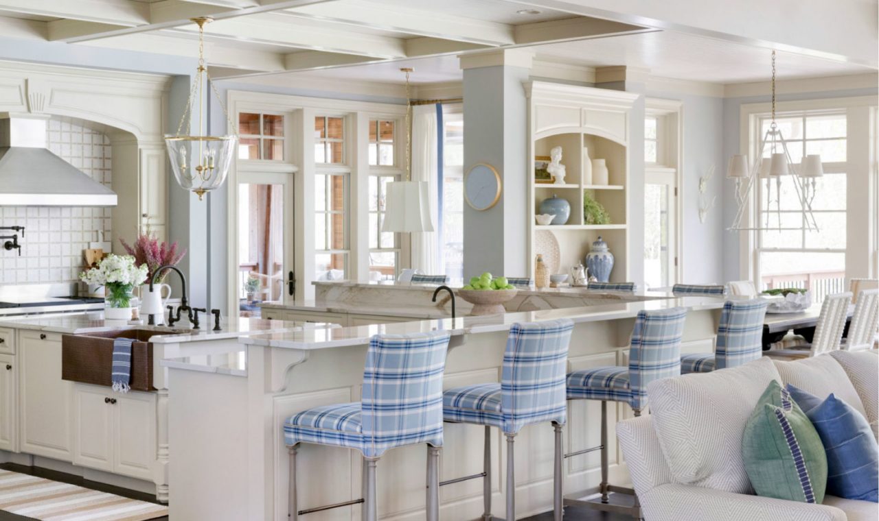
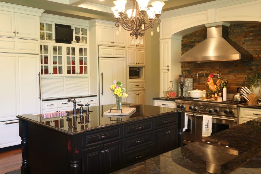
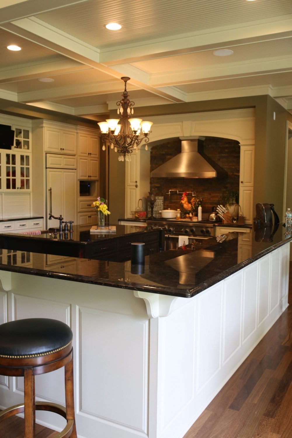
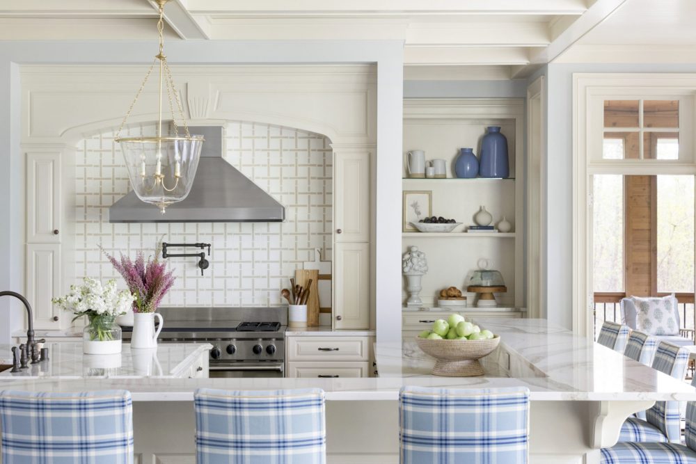
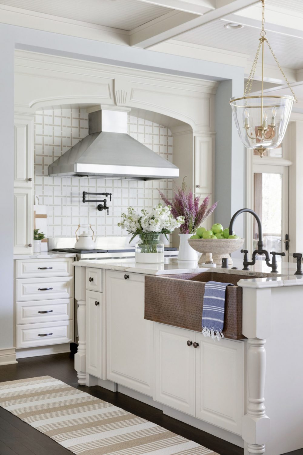
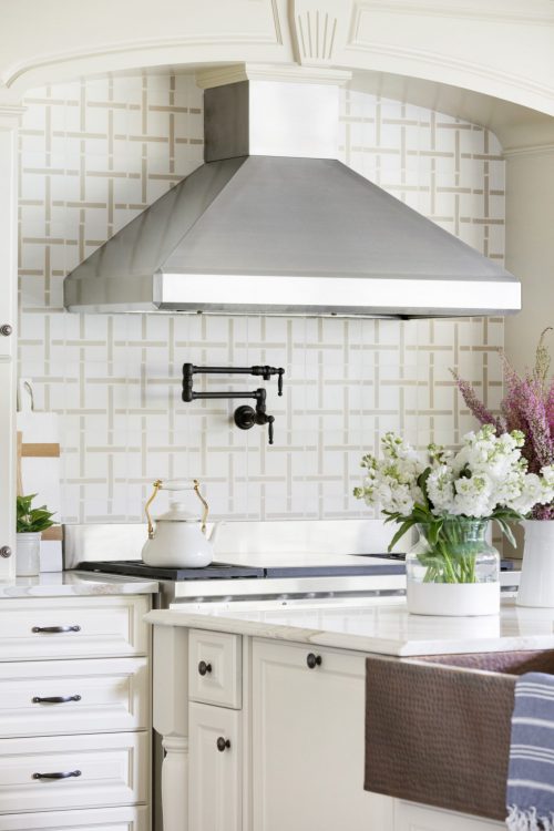
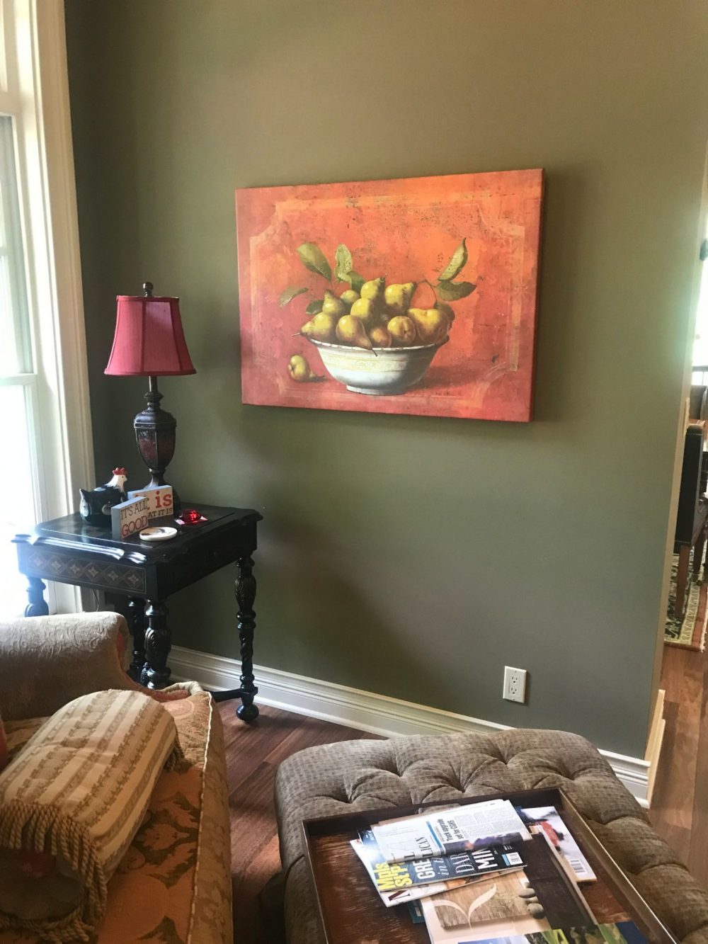
The main theme of this renovation was to brighten up the home. Before, it’s main color scheme was olive green, burgundy, and black and we wanted to do a complete 180° with the new design. To do so in the kitchen we switched out their dark countertops with Cambria’s Britannica Gold quartz and replaced their stone backsplash with a creamy, cement tile.
Along with the original cabinetry, there was another item in the kitchen that we just couldn’t part with and that was their stunning, copper sink. Can we get more copper sinks in 2019 please? We’re pretty obsessed!
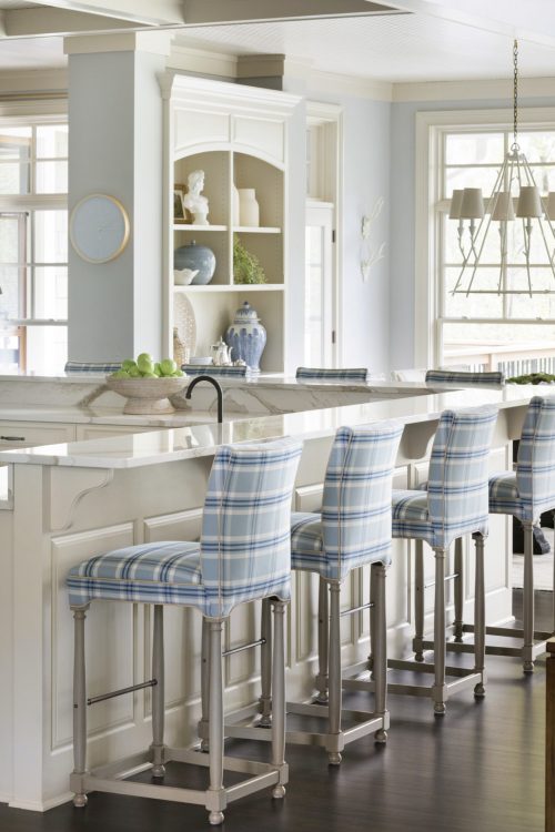
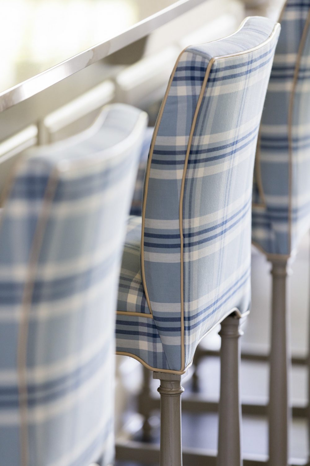
Surrounding the island are eight, custom barstools in a beautiful, blue plaid that became our clients favorite pieces in the entire home. And how could it not be?! They couldn’t be more perfect for hosting and we can already imagine all of their family and friends sitting up at the counter chatting during one of their famous dinner parties.
Living Room
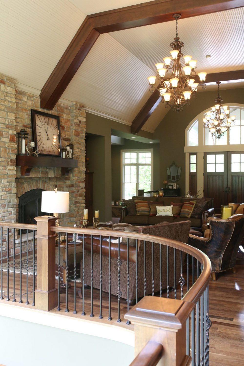
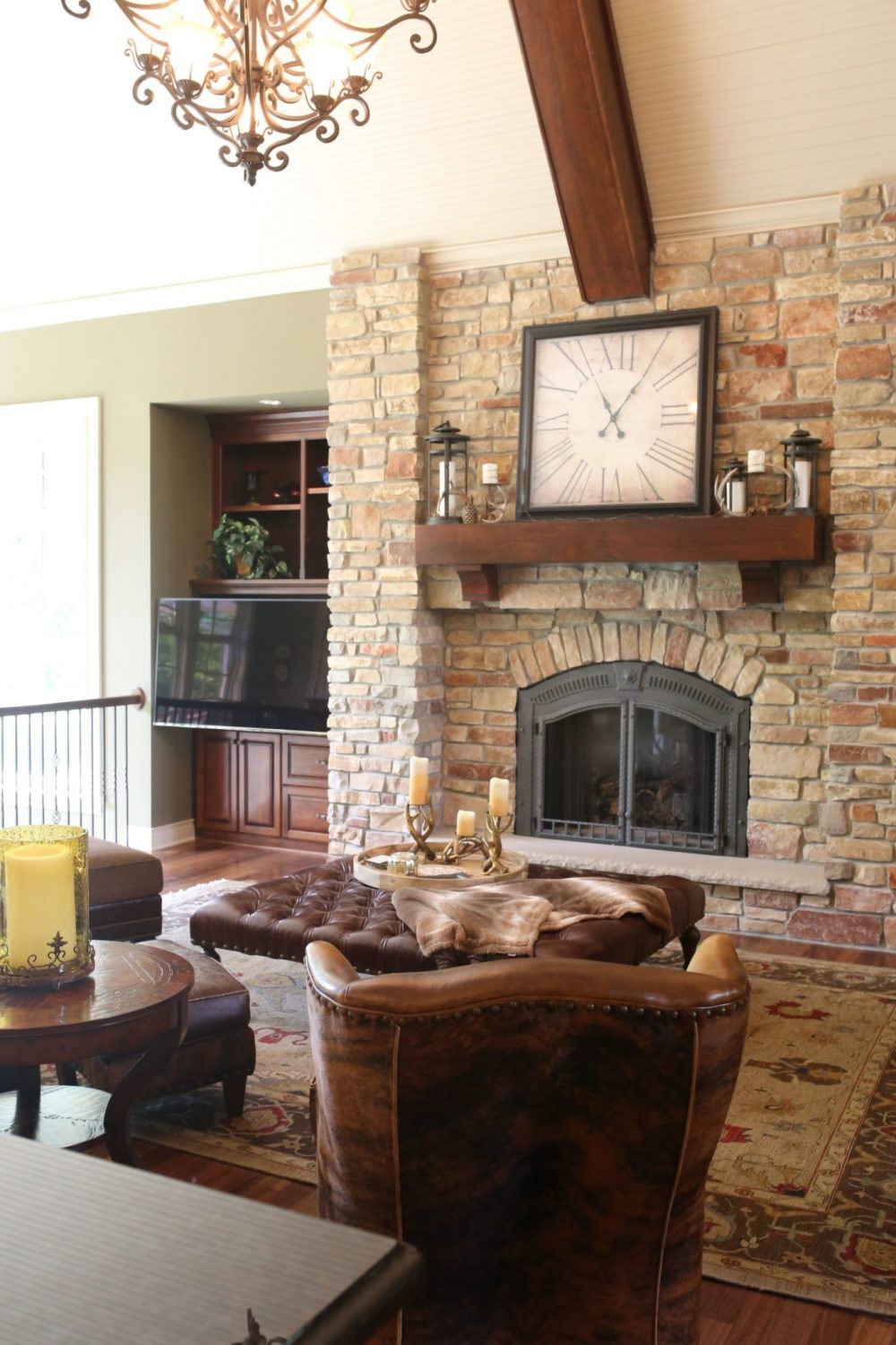
Before
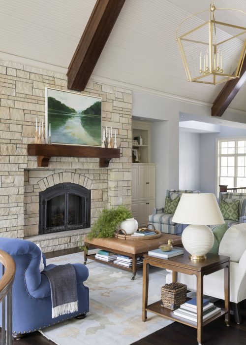
After
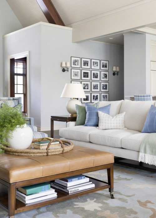
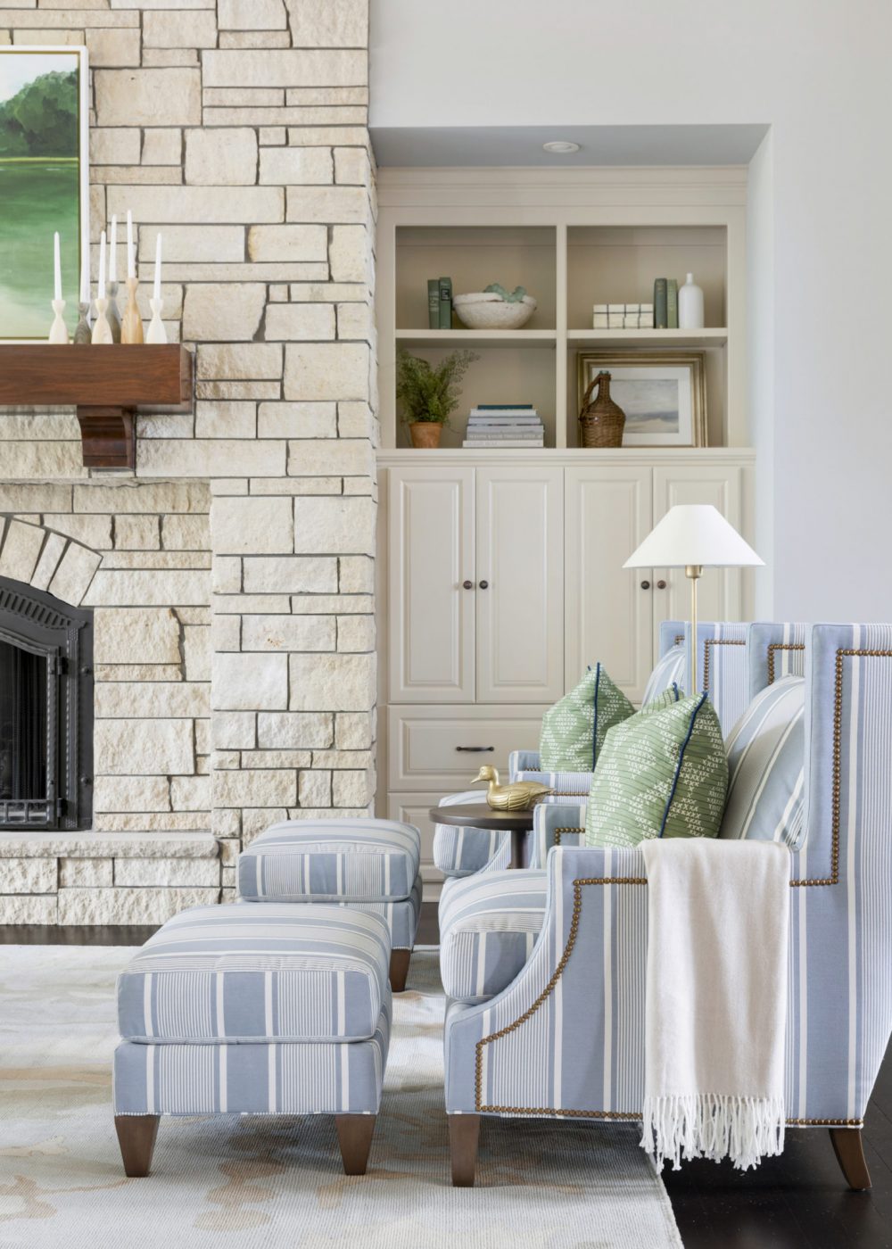
This home is truly open concept and we love that from the kitchen you can see directly into the living room. For the furnishings in this room, we made sure to select pieces that can withstand the test of time and stand up to little grandchildren on the move!
Our clients were not afraid of color so we really played that up in this space. Then, by layering in different patterns and textures this room immediately had that “lived-in” and cozy feel you always want in a main living space.
Dining Room
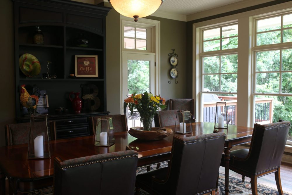
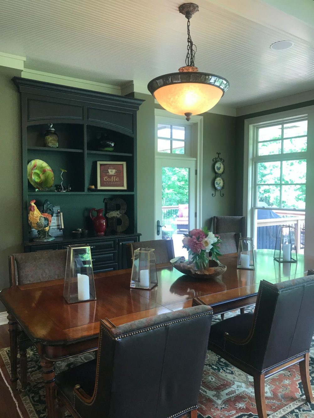
Before
after
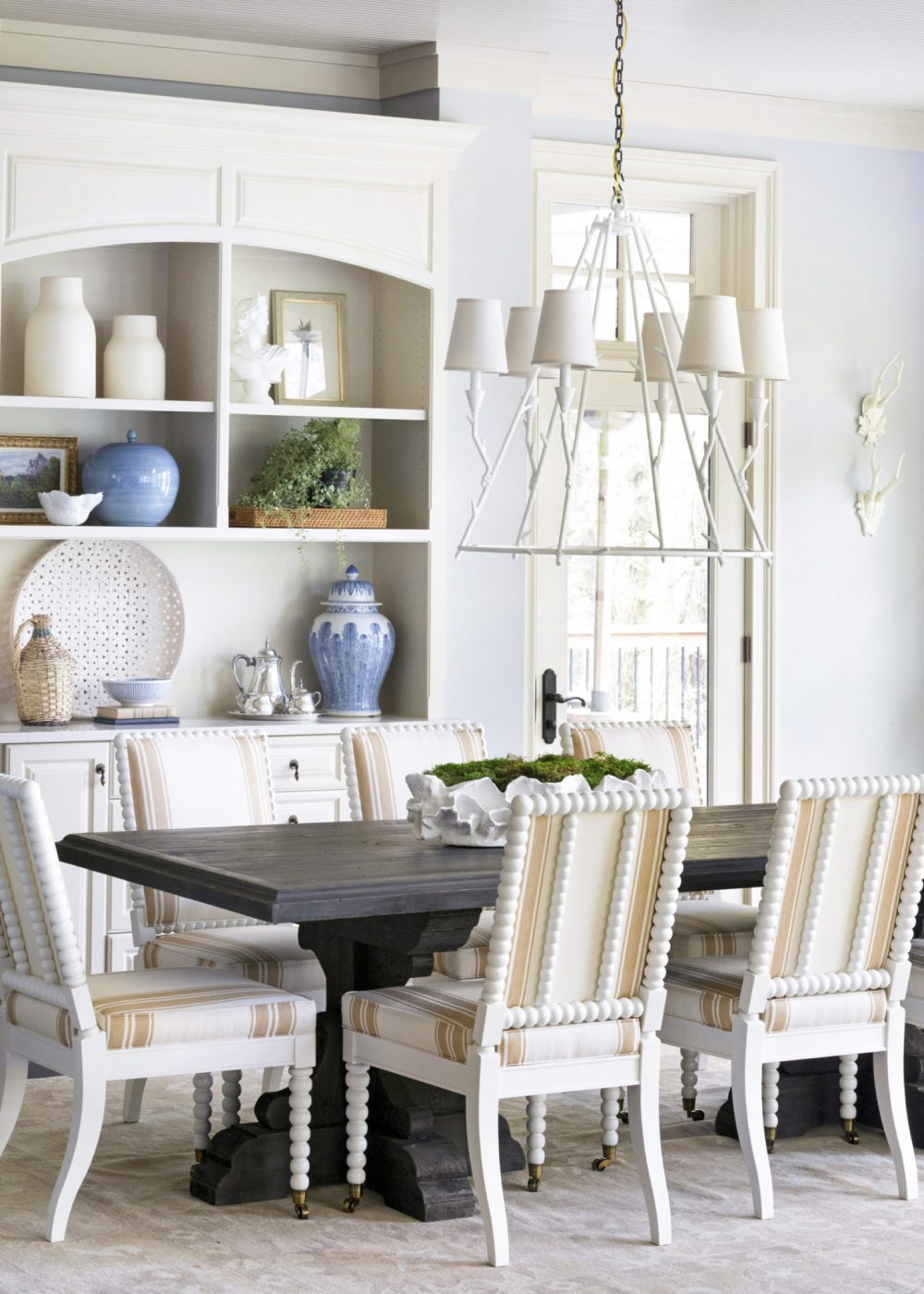
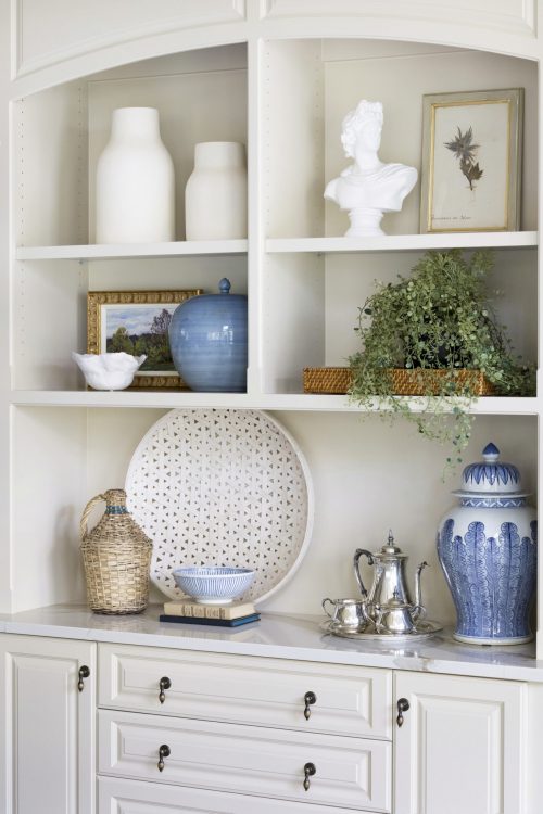
Next to the kitchen and living room sits their dining space that has the best view of their impeccably groomed backyard. We didn’t have to do too much to this area to bring it back to life. By repainting the built-in buffet and installing new lighting and furnishings this room was ready for Sunday brunches.
To contrast the cooler tones we used in the living room, we decided to go with warmer, neutral colors for the dining room to make it as inviting and welcoming as possible. We selected Brooke & Lou’s French Pine Dining Table as the base and custom spool chairs, a white plaster chandelier, and a camel colored rug to complete the look.
Breakfast Nook
Before
After
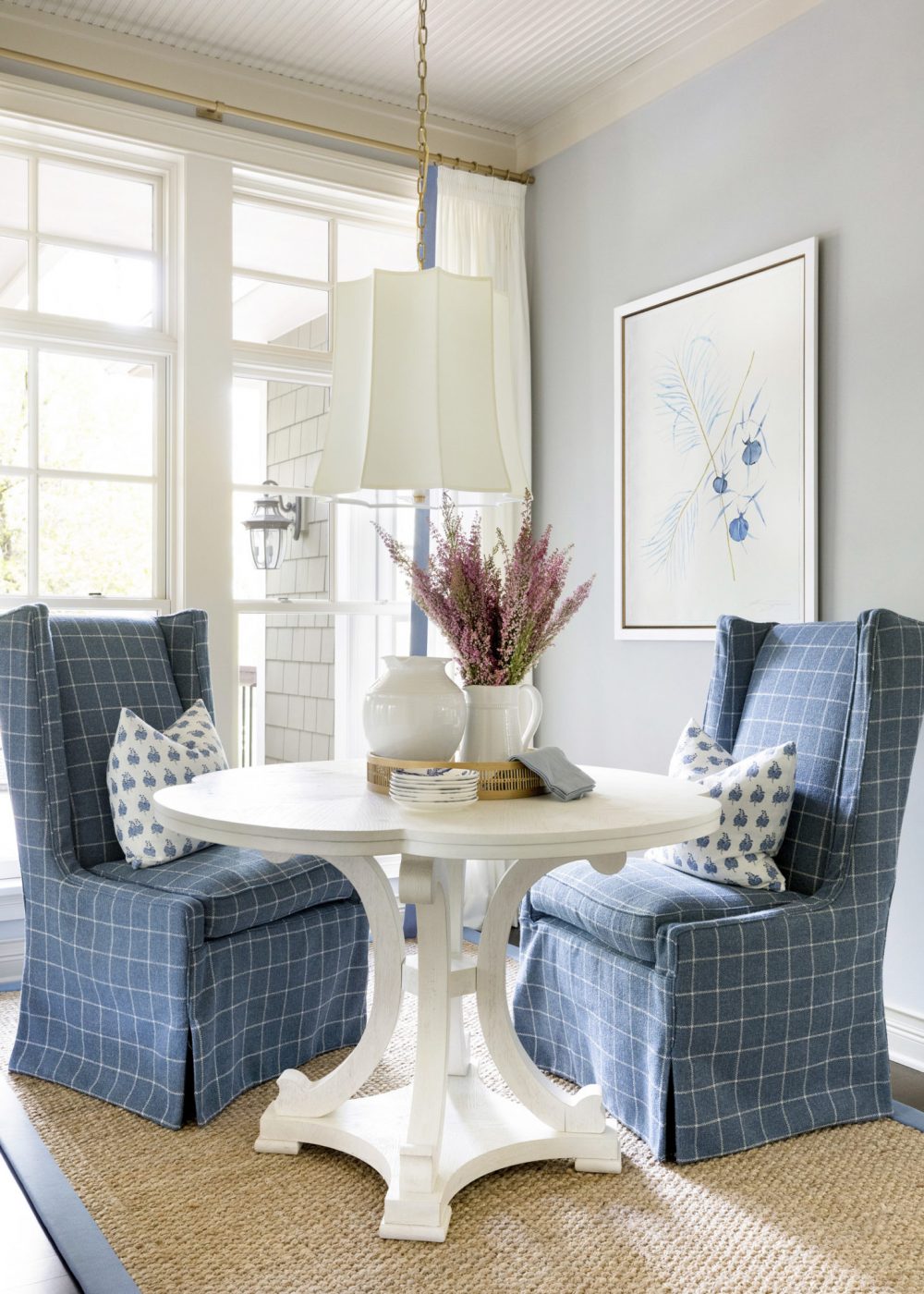
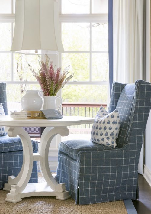
Around the corner from the dining room lives the breakfast nook. This simple and sweet space was made for easy, casual meals and we loved mixing in those cozier fabrics and textures that are perfect for when you want to sit and sip your coffee slowly in the morning.
That’s all for today! We are so excited about this project and hope you loved seeing Part I of the tour as much as we loved sharing it. Stay tuned for Part II next week!
Photography by: Spacecrafting




Comments
Gorgeous!
[…] home makeover project from Bria Hammel Interiors is filled with fabulous before and after […]