Happy Thursday, friends! We are back at it today with part II of our Modern Tudor project reveal. If you missed part I, click here!
Living Room
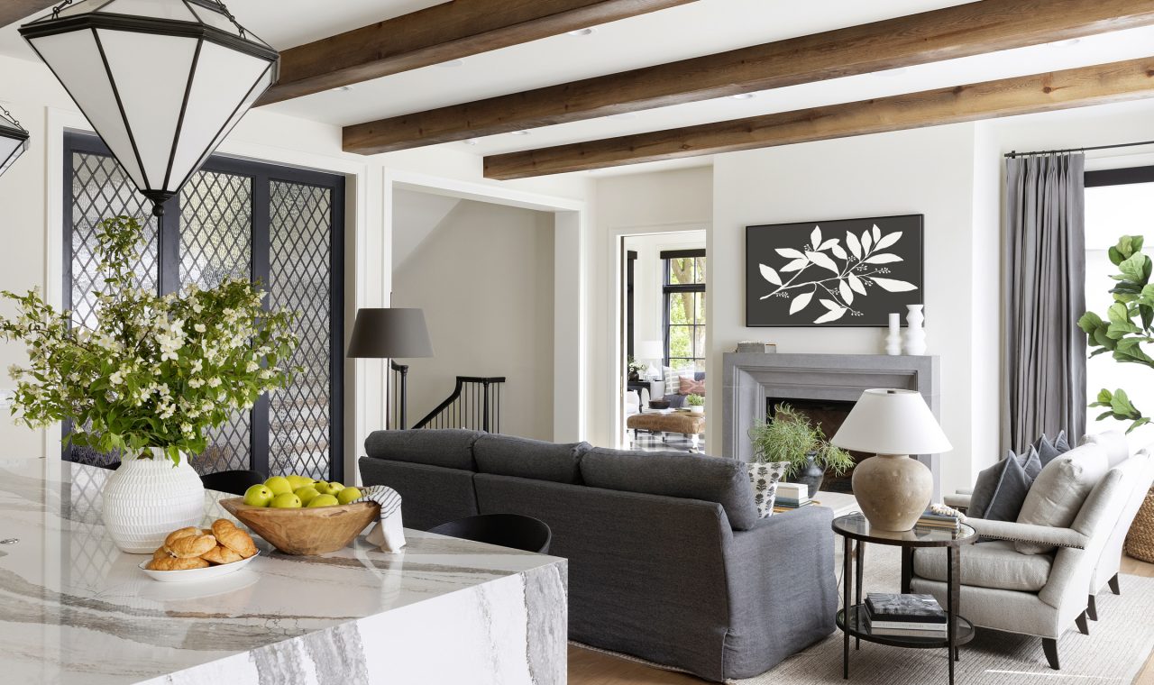
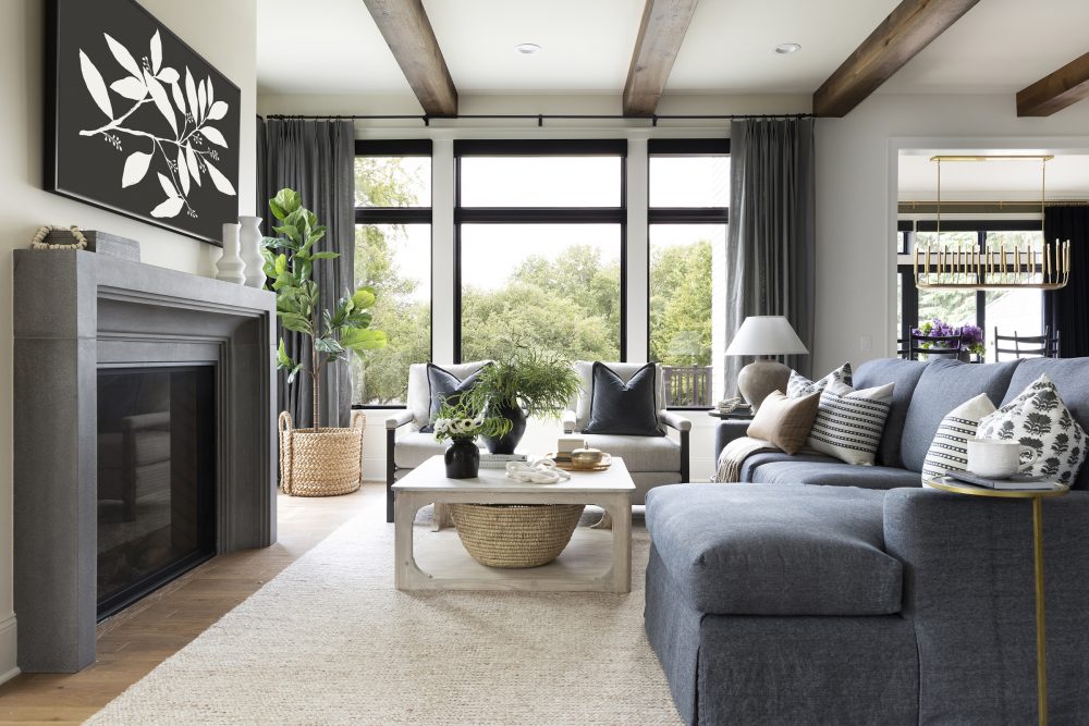
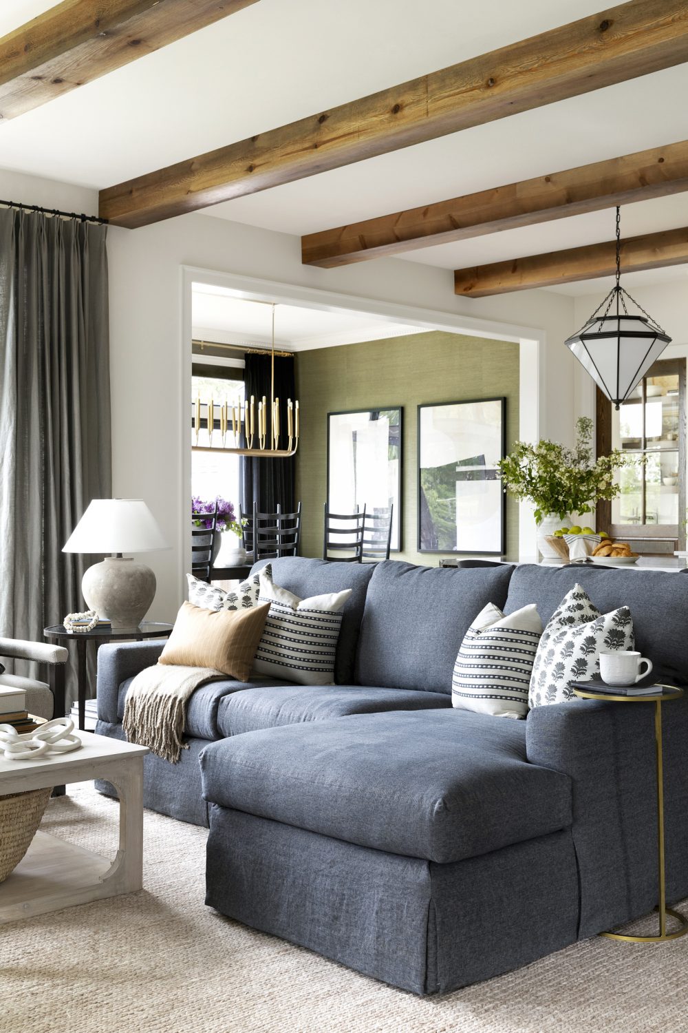
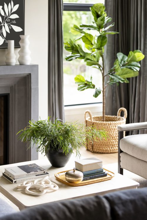
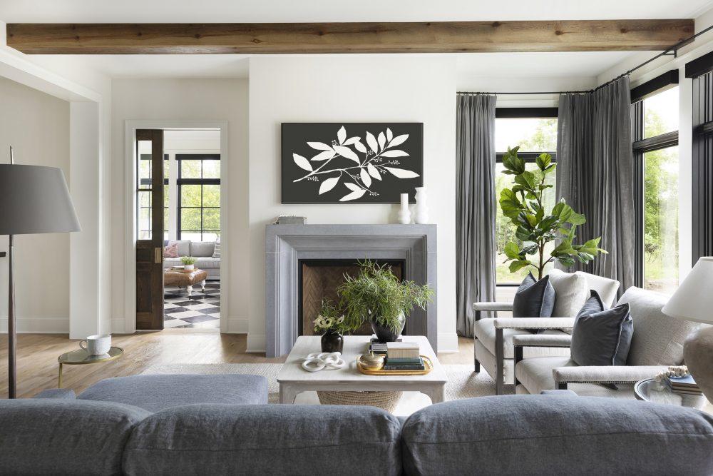
As we mentioned in our previous post, this home was made for a bustling, busy family. So, for their main living space, we wanted to put together something for them that would be practical and functional but also beautiful and luxurious. Over the years, finding that sweet spot of high-end design paired with sensible, livable pieces has pretty much become our bread and butter.
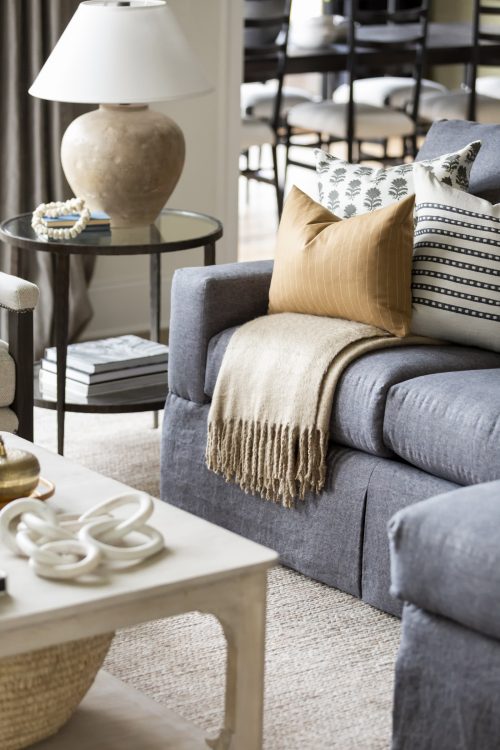
In this space, we opted for a striated fabric on the sofa that hides the inevitable stains that come with two young boys and an aged-wood coffee table already bears a few nicks and dings so that there are no worries when their Lego sets come out to play.
Dining Room
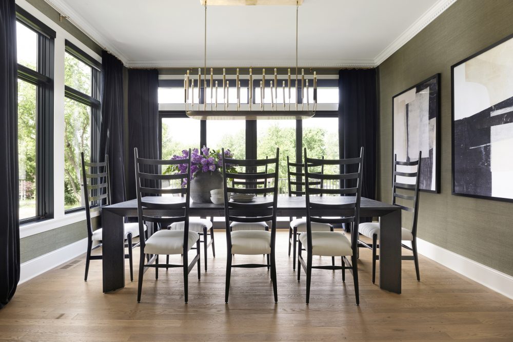
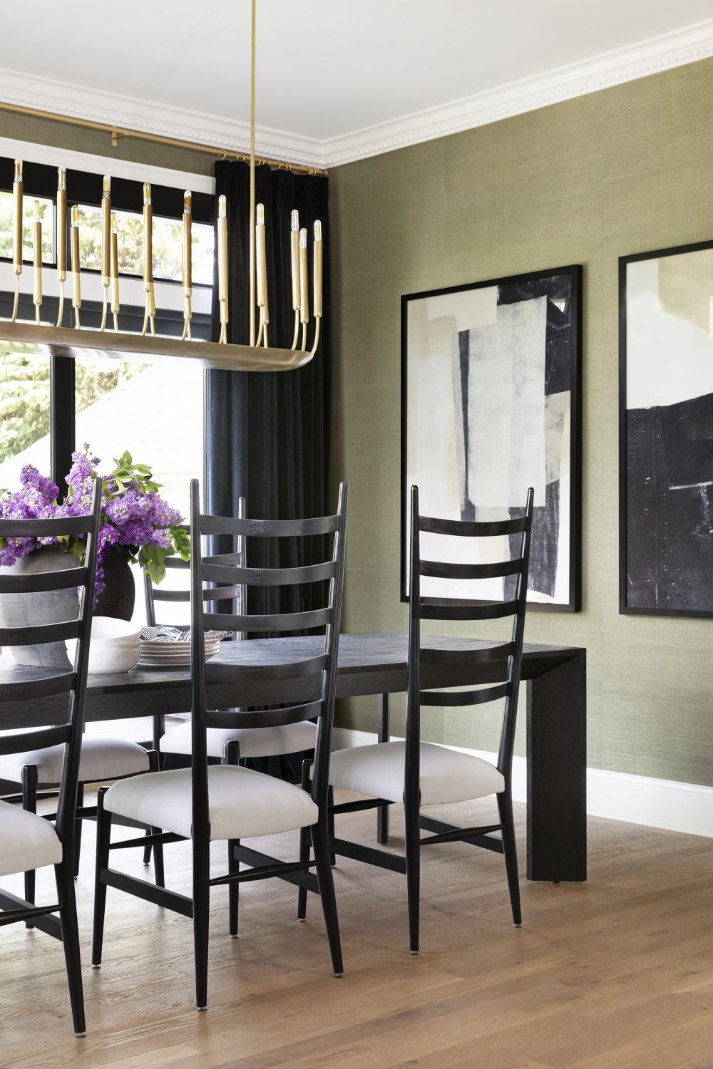
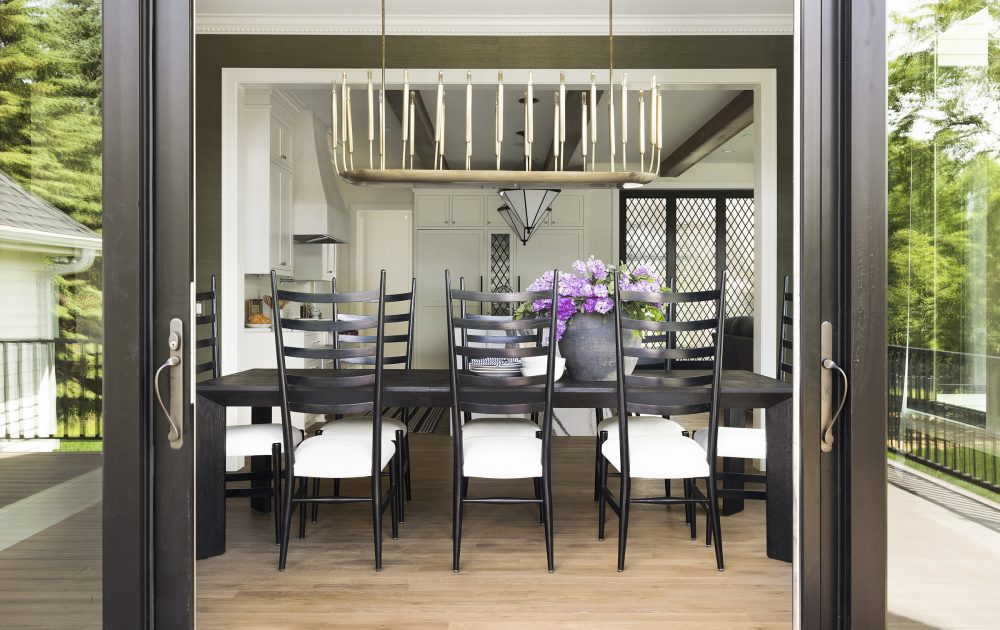
We wanted to play with a bit of drama in the dining room and it became one of the most memorable and unique spaces in the entire home. For a pop of color in a sophisticated, soft way, we covered the walls with a gorgeous, olive green grass cloth. Black velvet window treatments, dentil molding, and a brass chandelier gave the room a bit of glamour in a warm and approachable way.
Laundry Room
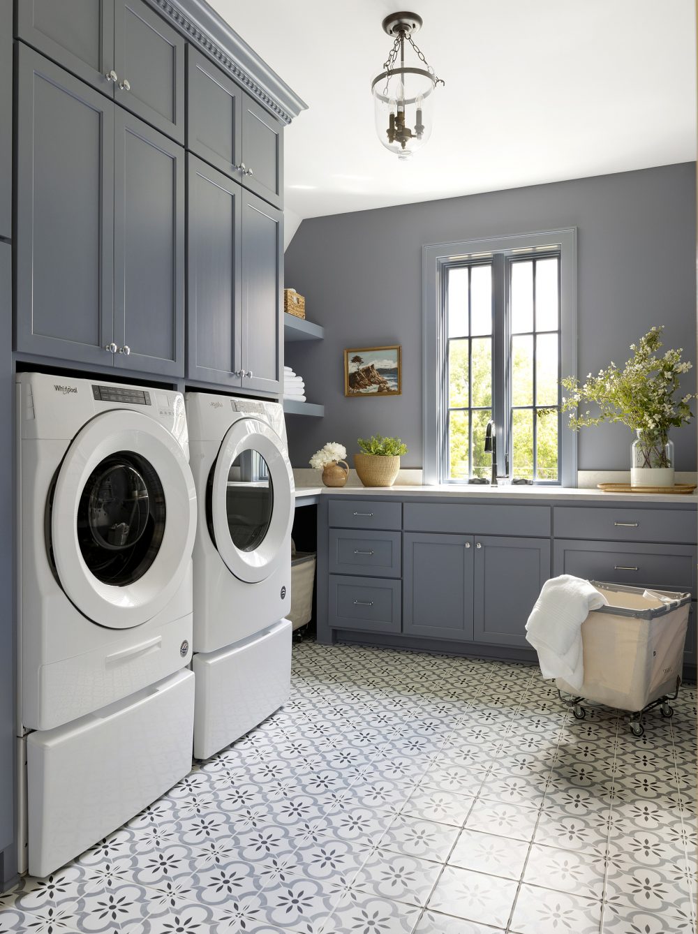
Maybe it’s our way of tricking ourselves into liking every day chores, but we’re firm believers in adding personality and fun into spaces like laundry rooms! For this one specifically, we chose a ceramic tile to bring in pattern that also paired nicely with the blue painted trim and cabinetry.
Loft
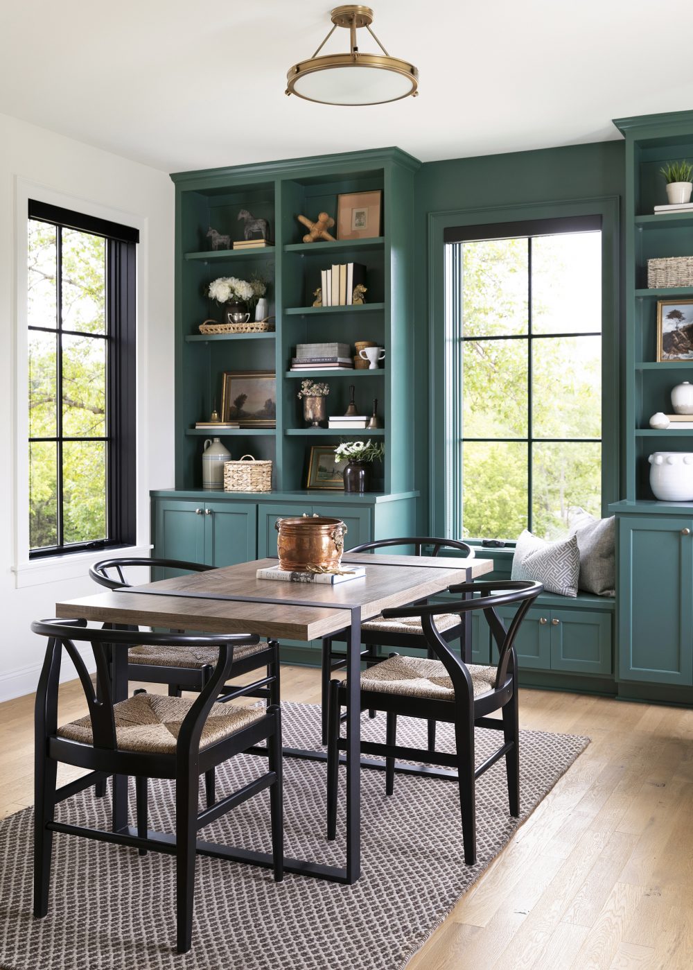
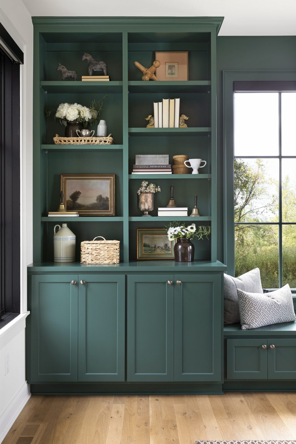
For additional space for the kiddos, this loft area on the second floor has a striking green built-in with a window seat where our clients’ boys can read, place, and unwind.
We love this space and how it can be used for so many different things in the future as their boys grow older. A place to do homework, a spot to watch television, or a quiet place for the homeowners to chat on the phone, get work done, or read a book.
We ensured we were consistent through the house, incorporating traditional elements to keep it from feeling too modern and to keep it very balanced. Working with David Charlez Designs and SD Custom Homes to carry the aesthetic and hand-built details inside makes this home special.
Basement Bar
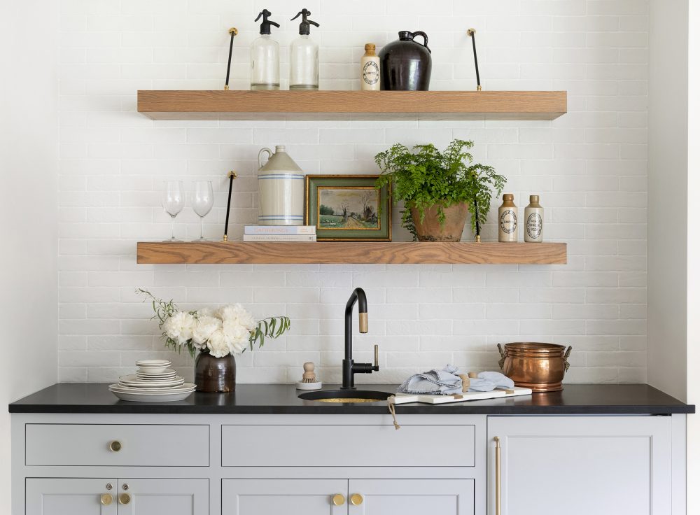
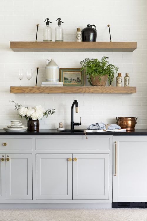
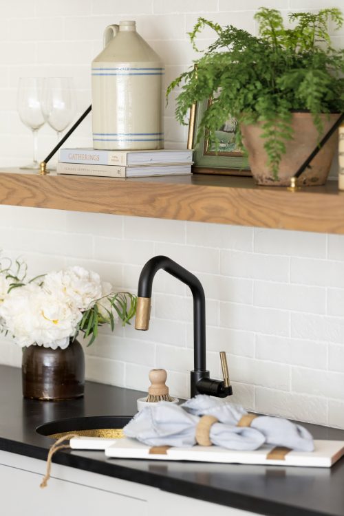
We’ve said this before, but one of our favorite things about designing is creating moments in homes that are unique, unexpected, and catch guest’s eyes. The bar in the basement of this house is the perfect example of that! The brick backsplash mirrors the one seen in the kitchen which makes it feel cohesive with the rest of the home but it still stands in its own way. The addition of Brooke & Lou collected accessories was the cherry on top and made this spot really stand out and becomes a topic of conversation.
And, with that, our tour of our Modern Tudor project is complete! We have been overwhelmed with all the wonderful feedback we have gotten from this home. Thank you all so much for following along with us and loving this home as much as we do. Until next time!




Comments
What is the green color on the bookcases! It’s gorgeous!
Omg i absolutely love this house 💕
Do you mind sharing the stunning green color? It is perfect. Thank you!
Hey Jacqueline, the green is Hunt Club by Sherwin Williams!
Thank you so much for sharing the color!!!!