Over the years, there are projects that come along that change us for the better. They dare us to dream bigger, work harder, and really push us creatively. For our team, that’s our Miami Project. A beautiful, home nestled on the Miami canal that is the perfect balance of our client’s traditional aesthetic and the area’s modern Mediterranean influence.
From the stunning architectural features to the personalized details, this home has been one of the most rewarding projects we’ve ever worked on. And, we are so excited to share it with you all today.
Exterior
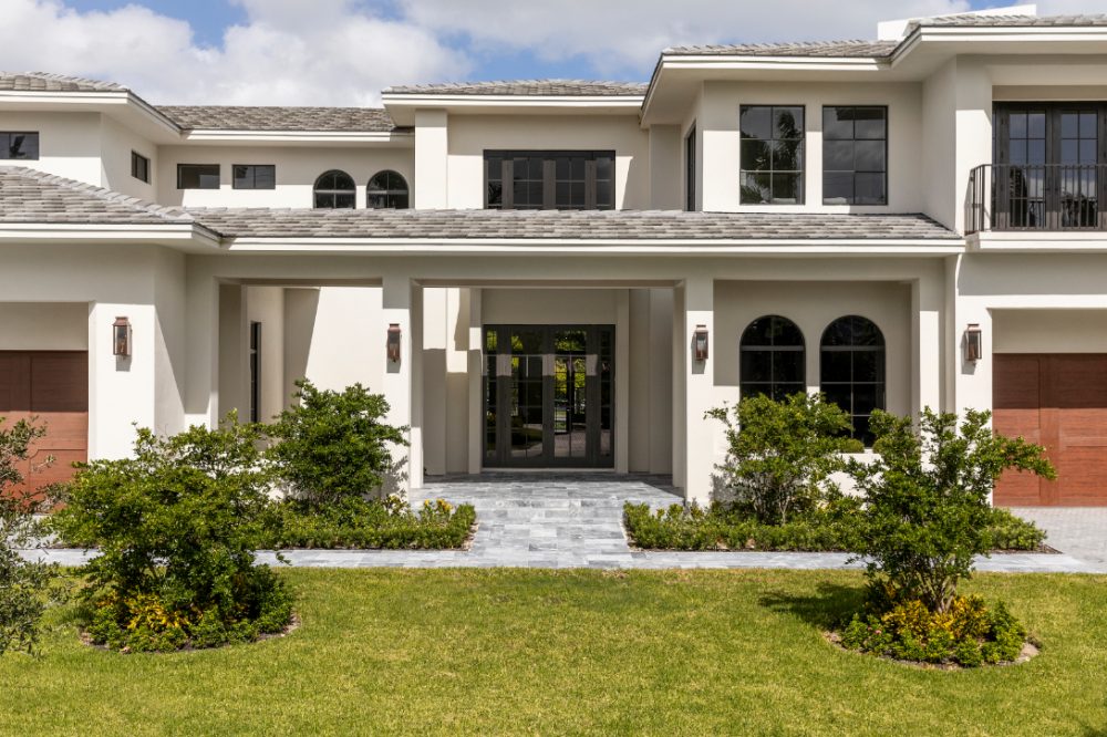
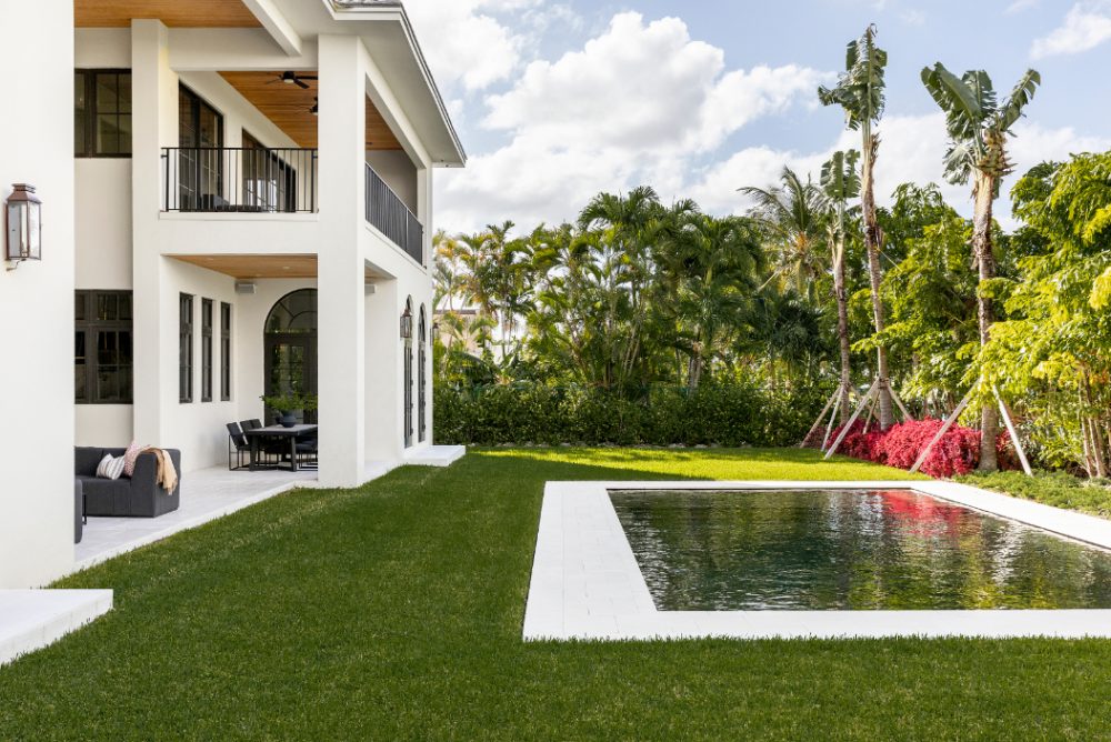
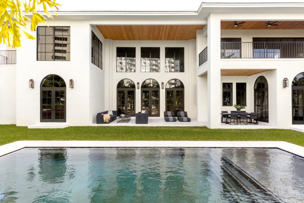
We started from the ground up on this project creating a 7,500ft² haven for our clients and their family. However, despite it’s rather large footprint the charming details like the elegant black curved windows, creamy exterior color, and warm, organic finishes made this home feel inviting even before you walk through the front porch.
Kitchen and Pantry
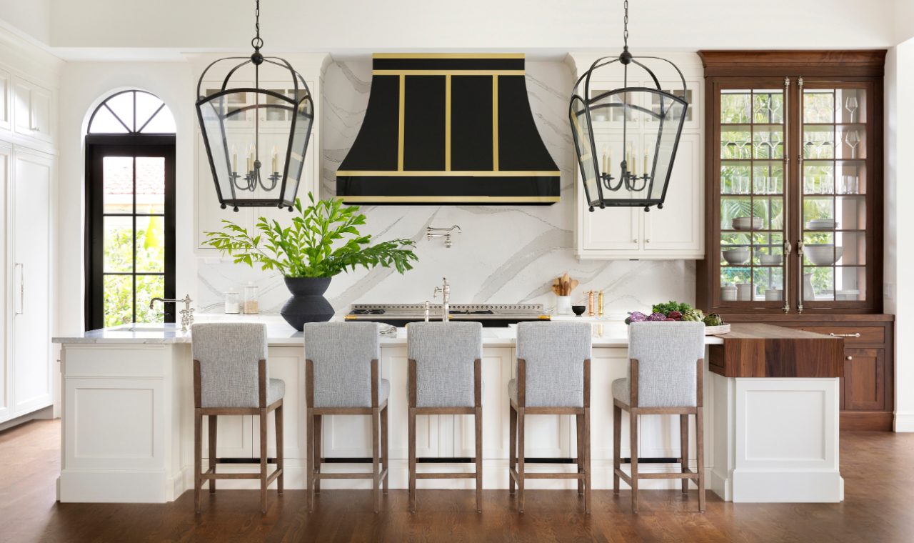
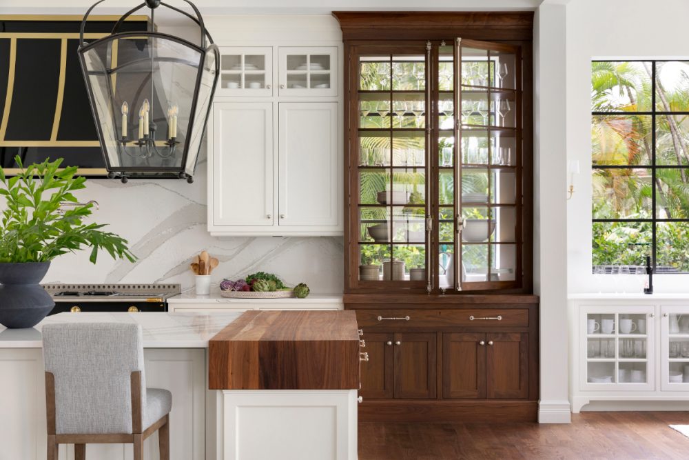
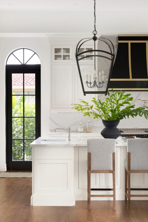
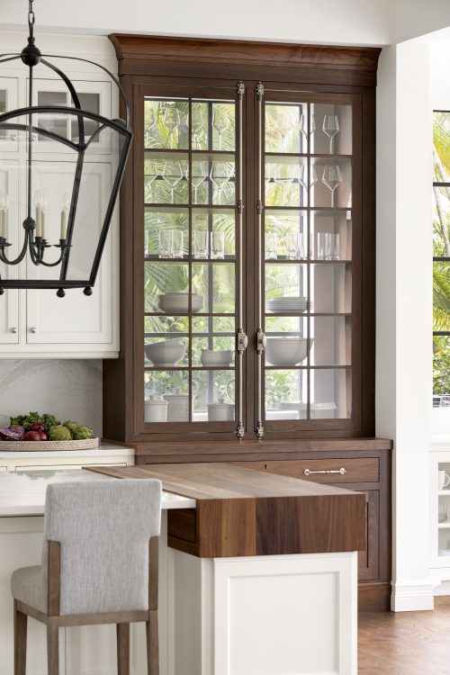
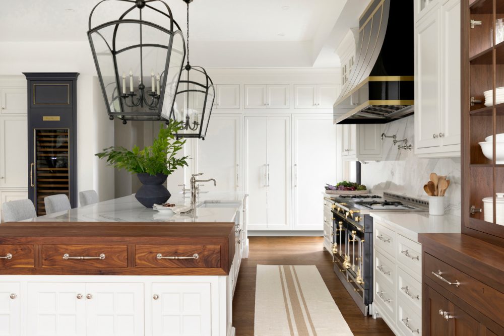
Our clients love to entertain and host their family and friends so a chef’s kitchen was a must. In this home, bigger is better (perks of 10ft ceilings), so we set the scene for this space with massive, plantation lanterns over the island. Cambria quartz countertops, a show-stopping La Cornue range, and a custom hutch with exposed windows made this area equally as beautiful as it is functional for clients.
Knowing the pantry would get used just as frequently as the kitchen, we wanted to make sure it was packed with just as many design elements. We began with the floor-to-ceiling, hand painted Tabarka tile and mimicked the detailing of the hutch in the kitchen with the cabinetry in the pantry to create continuity. Finishing the space, we hung the graphic, Aerin chandelier which he had powder coated in a custom graphite color – another nod to the darker, contrasted elements in the kitchen.
Bar and Breakfast Nook
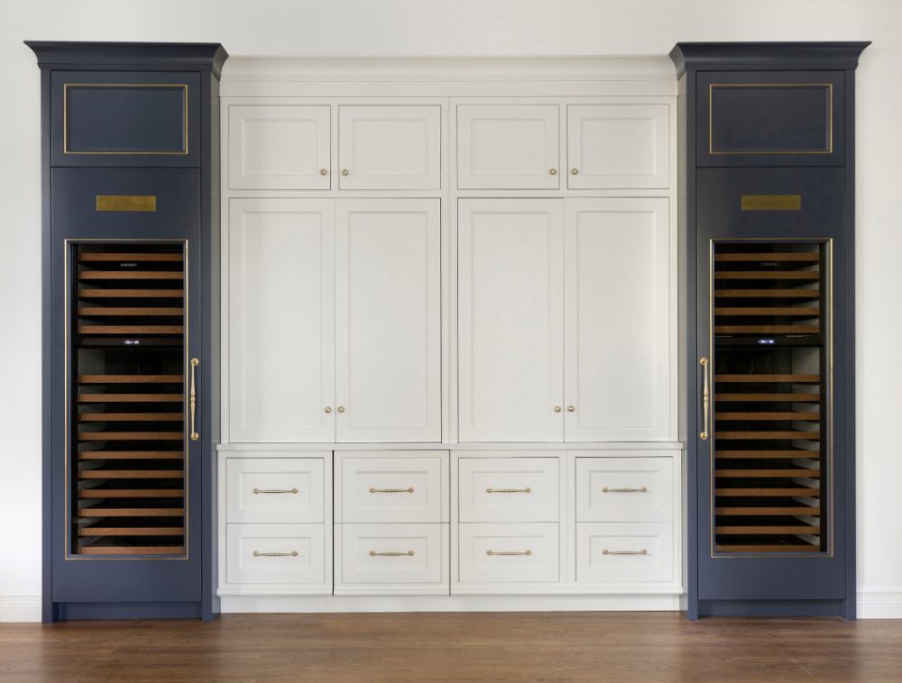
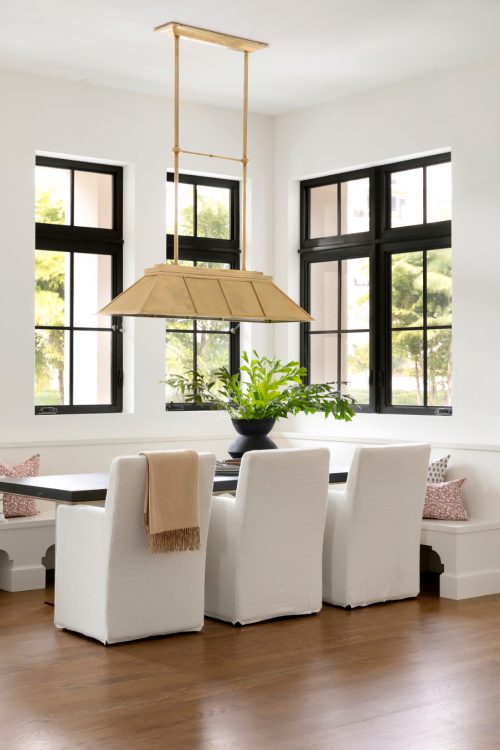
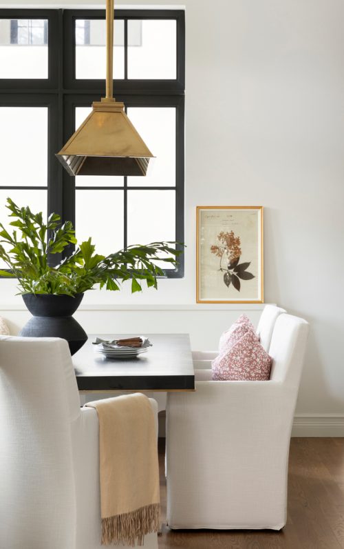
The two spaces beside the kitchen are ones to start and end your day in. In the mornings, our clients can enjoy family breakfasts at the bright, breakfast nook featuring a custom built-in bench and Ralph Lauren brass chandelier. And, in the evenings, a cocktail from the deep gray bar with flanking wine fridges (and custom brass plaques above them!).
Dining Room
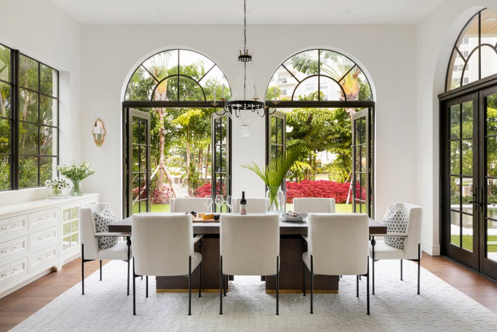
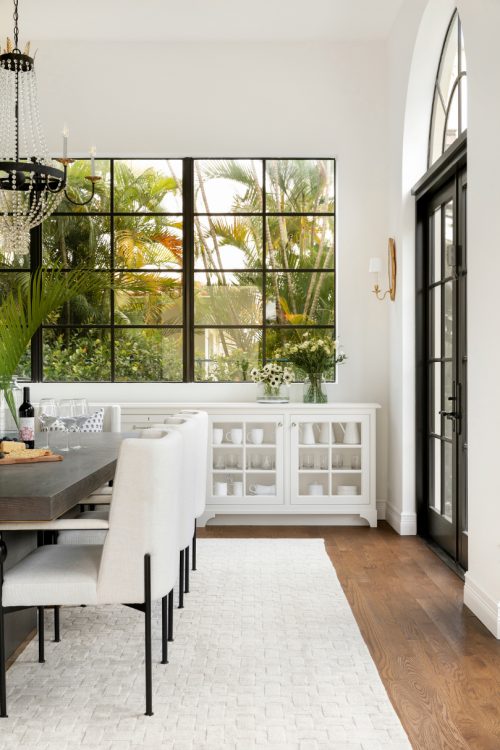
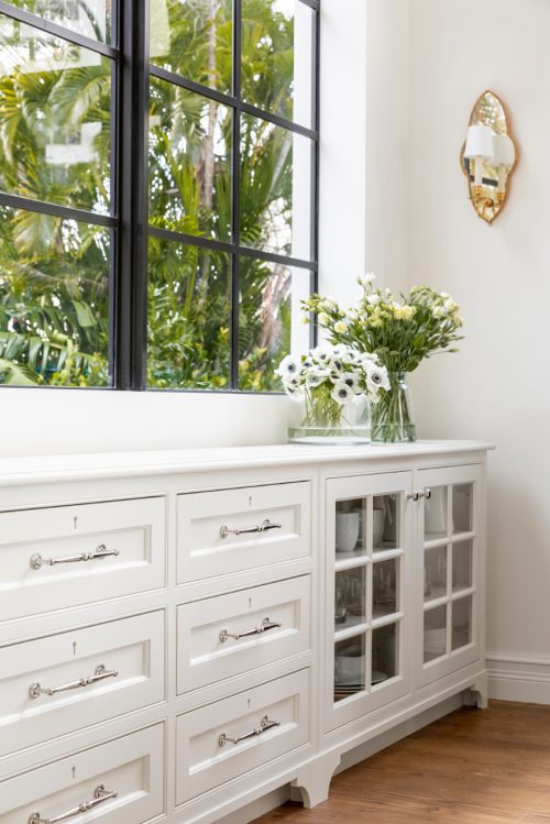
The dining room is truly an host’s dream. An ample amount of storage of all your entertaining essentials, a set of French doors that open up to the outside, and a jaw-dropping crystal chandelier make this space fit for any occasion. Our favorite subtle detail? The vintage, brass sconces we sourced from North Carolina above the built-ins!
Living Room
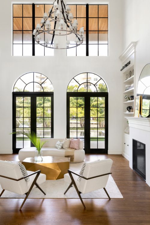
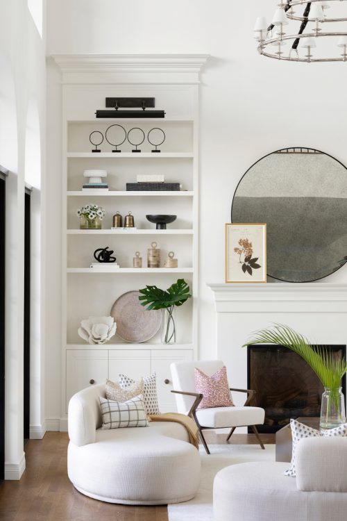
Like we mentioned prior, since the ceilings are so grand in this home, we were able to go big. In the living room, that meant not only a set of doors leading outside, but a set of windows above that as well to let in all the natural light our clients (and we!) love. It also meant large, built-in bookcases flanking the fireplace and the most gorgeous leather strapped chandelier you’ll ever see.
Office
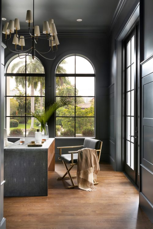
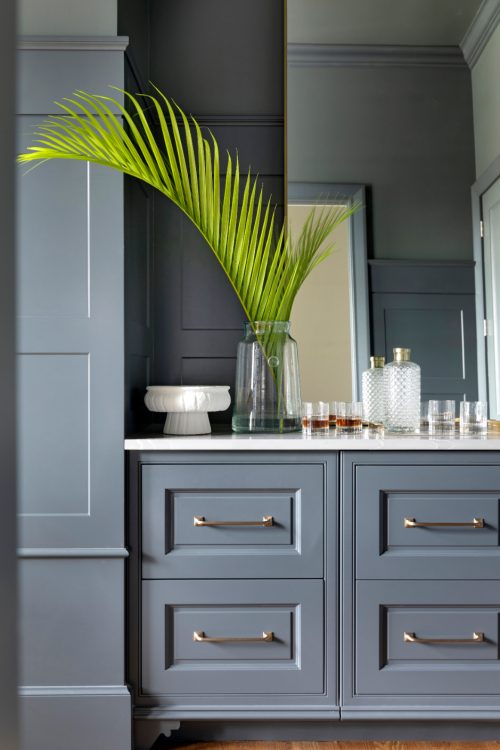
While the rest of the home is light and airy, we knew we wanted to do something a bit more moody and masculine for our client’s office. That took shape by incorporating a deep, Farrow & Ball paint floor-to-ceiling (yes, even the ceiling!) for a bold look. Add in a brass light fixture, a built-in bar, and more modern elements and this room is sure to inspirate creativity and productivity all day long.
Mudroom/Laundry Room
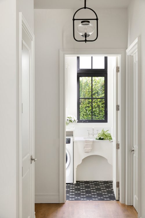
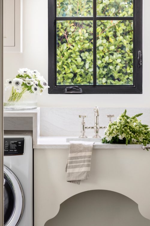
For mudrooms and laundry rooms, we typically like to be a bit more playful. Adding joy to a space that typically is home to more mundane tasks makes for a happier day in our opinion. For this space, we knew we wanted to add that but still keep with the sophisticated, neutral palette of the rest of the house. So, we opted for a dark, custom cement tile that added a unique pattern while also hiding the everyday messes and stains that will take place in this high traffic area.
Bathrooms
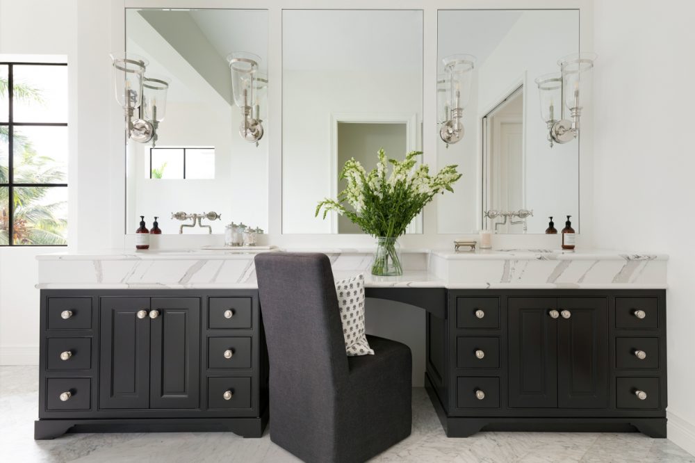
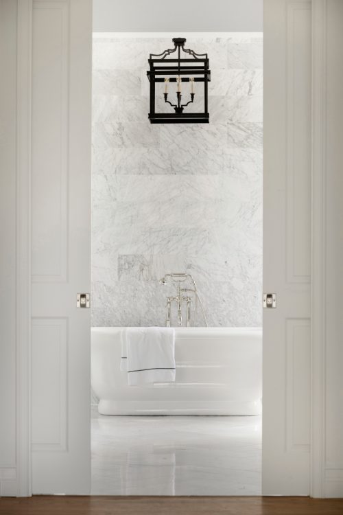
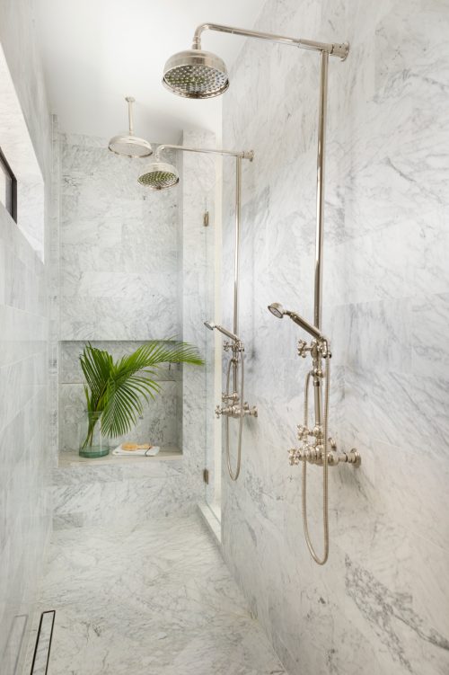
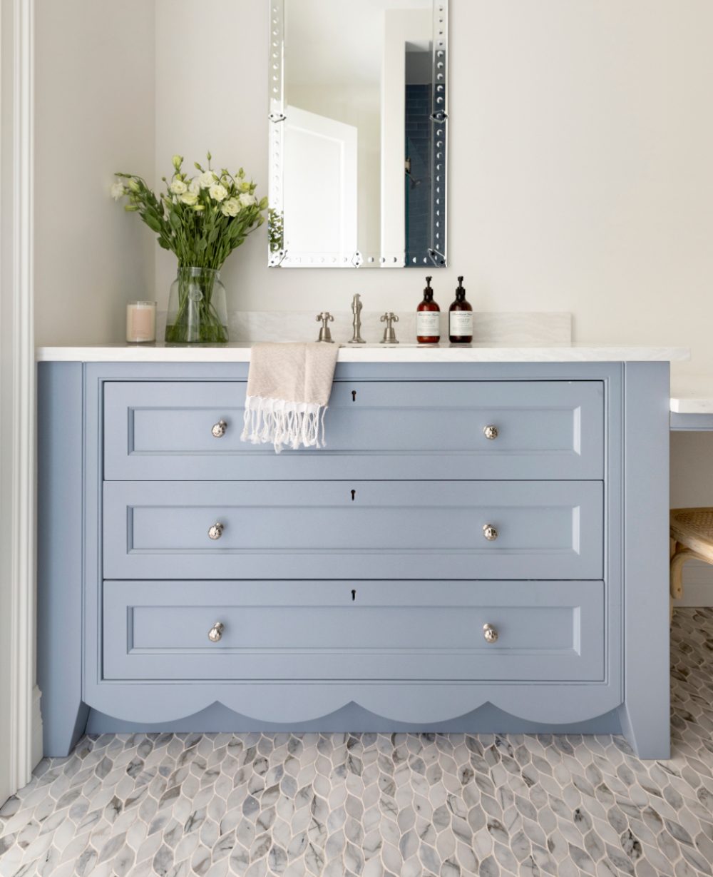
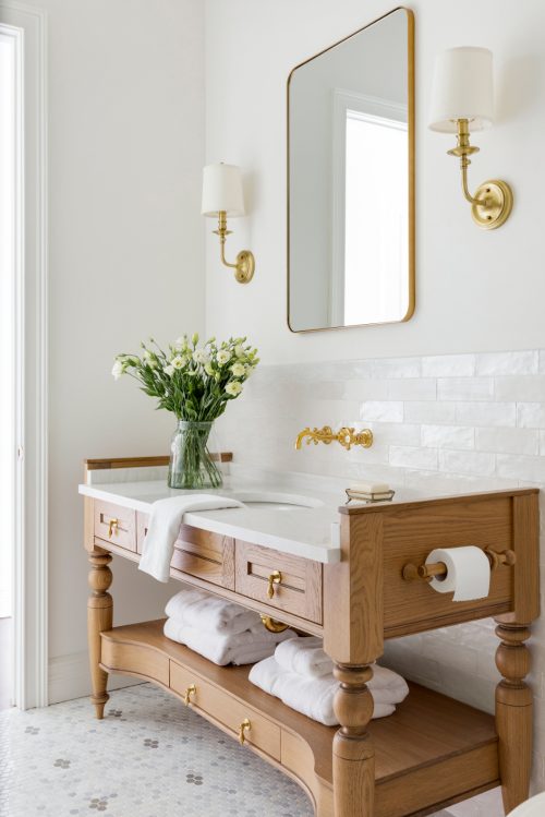
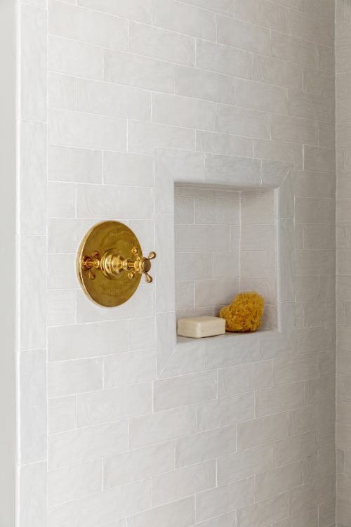
If there’s one thing this home doesn’t lack, it’s beautiful bathrooms. From the owner’s retreat, their daughter’s bathroom, to the powder rooms for guests, each of them is equally as breathtaking and holds their own unique design aesthetic.
While we could go on about this project forever, we’ll leave it here. We would love to answer any questions you might have about the process or finished result of our Miami project! Feel free to drop them below in the comments or shoot us a direct message on Instagram. We hope you all love this project just as much as we loved designing it!
Photos by: Spacecrafting Photography








Comments
Just beautiful! For the Miami project, can you share the blue color for the bathroom vanity and provide any info on the custom ceramic tile in the laundry room?
Thank you Lori! The vanity is painted Little Falls by Benjamin Moore and the tile in the laundry is Daisy Flier by Mosaic House.