Say hello to our latest project – a historic home with all the vintage charm.
Nestled on top of a hill in a cozy Rochester neighborhood lives our beautiful Rochester Historic Project. This home was built in 1919 and was originally home to a doctor at the Mayo Clinic – according to a historical plaque outside the office.
Upon entering the home, one is greeted with stunning architectural details that show off the homes historical roots. Throughout the design process we made selections that would seamlessly blend original details of the home with updated accents and accessories to honor the history of the home. That being said, millwork was an area that we put a lot of focus on to add texture and detail – which you’ll find in the guest bathroom, dining room and entryway. Our client had a feminine, vintage style so blending that with elements throughout the home was key in the overall vision of each space. We adore this project for all the darling details and can’t wait to walk you through each space. So with that, let’s get started!
Vestibule
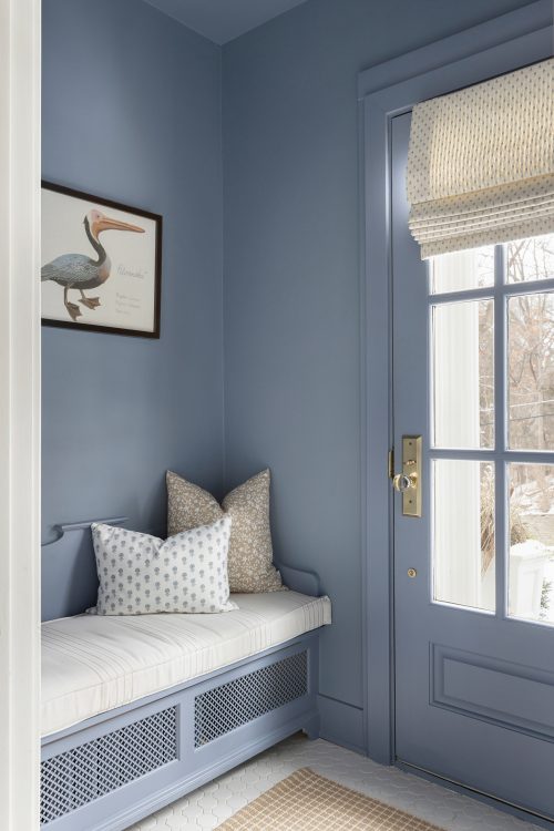
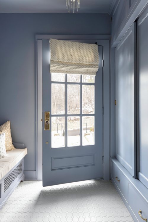
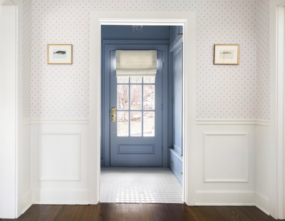
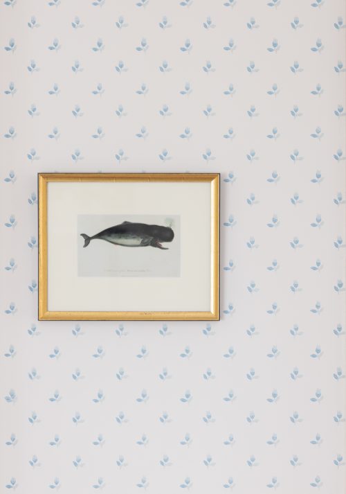
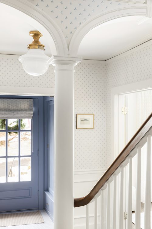
Behind the front door of the home sits a cool blue vestibule. Often found in older homes, this space serves as a mini mudroom-like space with storage and a custom bench that we added to hide the original radiator. On the door, we added a custom roman shade so that our clients can adjust as needed for privacy. The adorable whale art you see in this space are vintage pieces that our client already had – we love how these pieces compliment the space!
Foyer
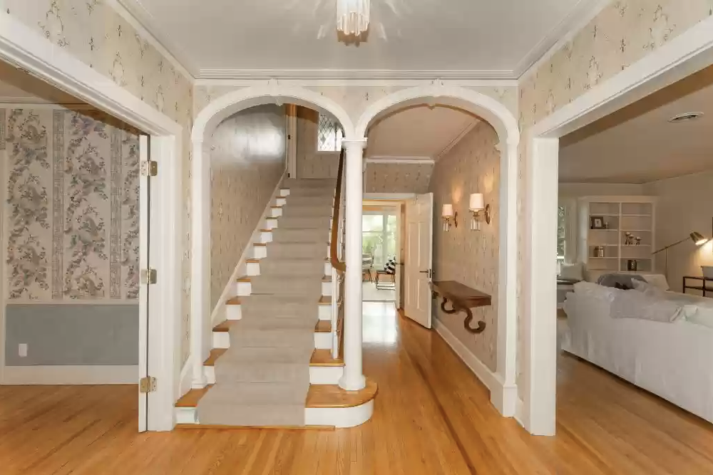
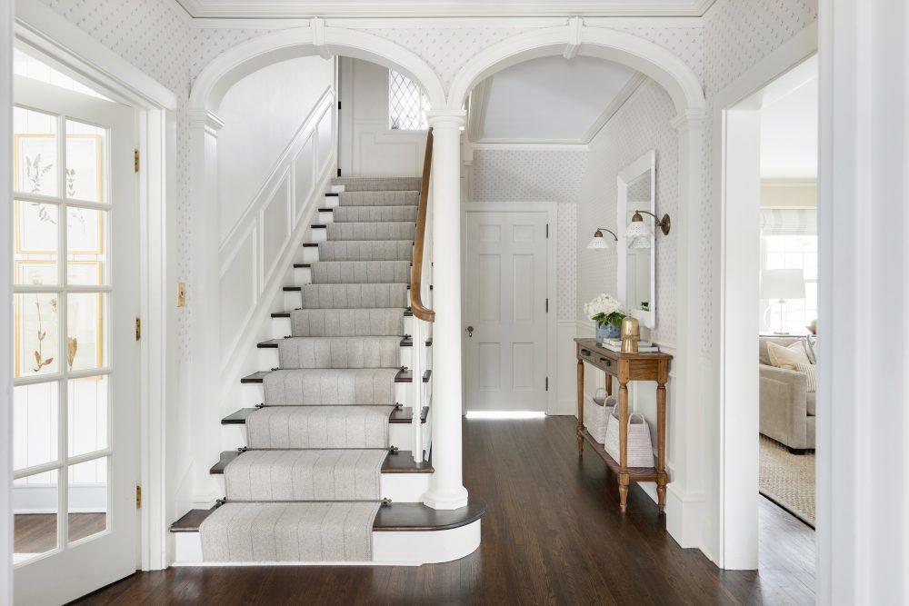
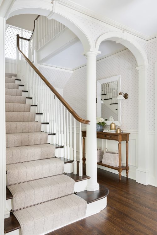
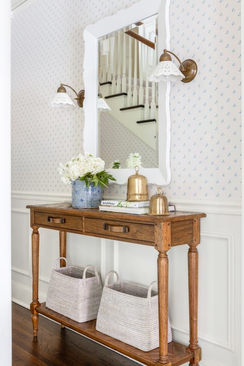
The foyer is the heart of this home and features all the charming, vintage details we love such as this dainty wallpaper and the lace-like sconces. In this space we wanted to seamlessly blend the homes historical elements with updated details so that it would be hard for one to differentiate between old and new. The structure of this space (including the arches) remained the same, however we updated the space with wainscoting, darling wallpaper, fresh floor stain and added a new runner to the staircase. For the fixtures and accessories, we wanted to tie things back to the clients love for vintage pieces with feminine flair – these sconces did just the trick!
BEFORE
AFTER
Dining Room
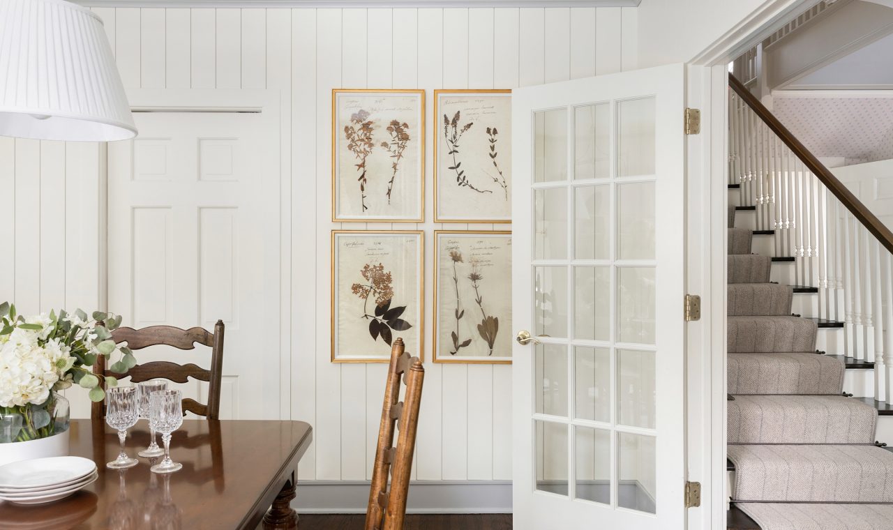
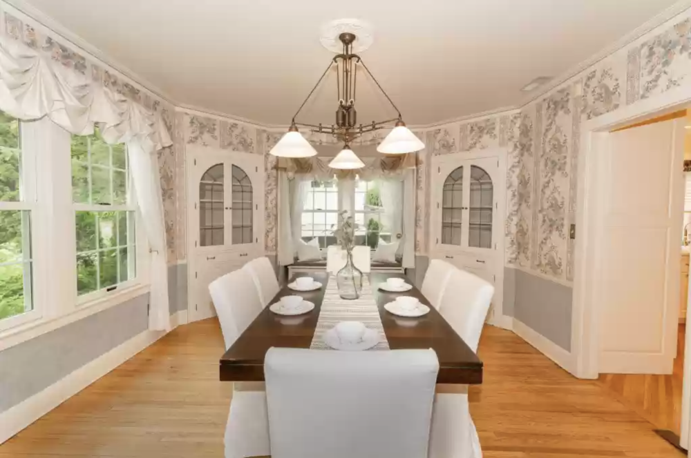
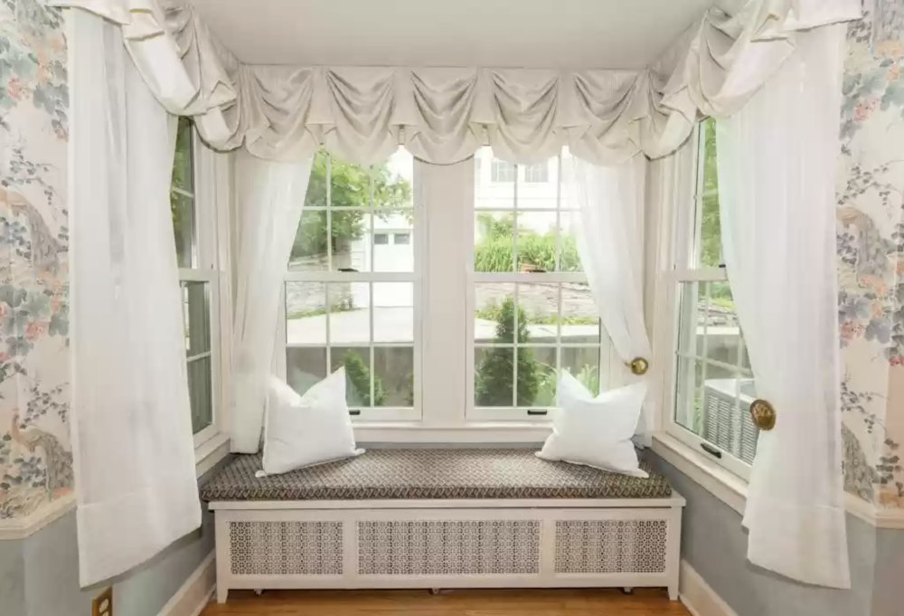
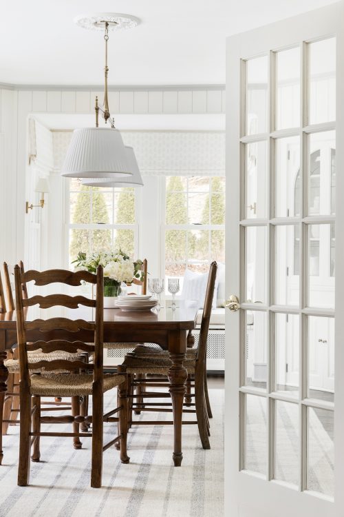
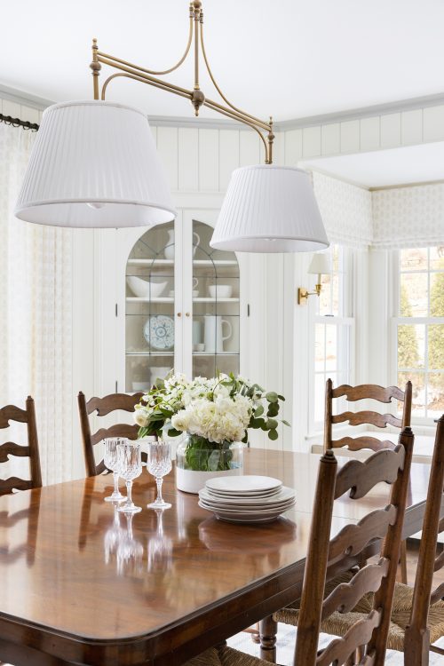
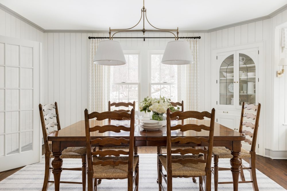
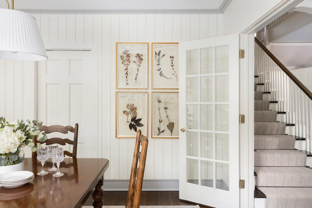
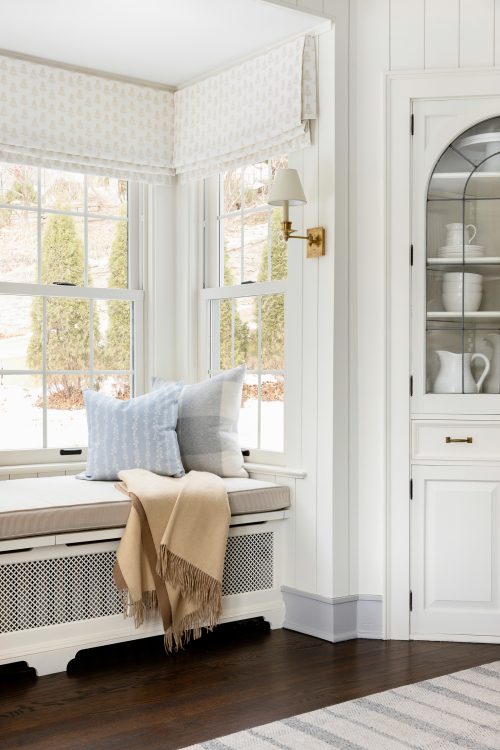
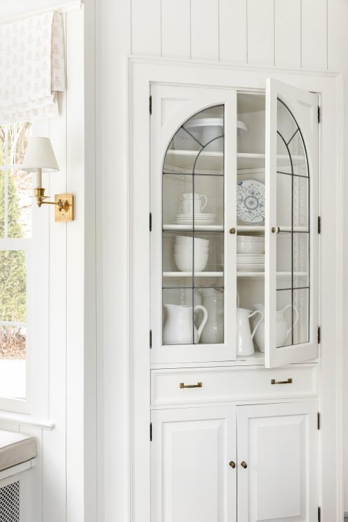
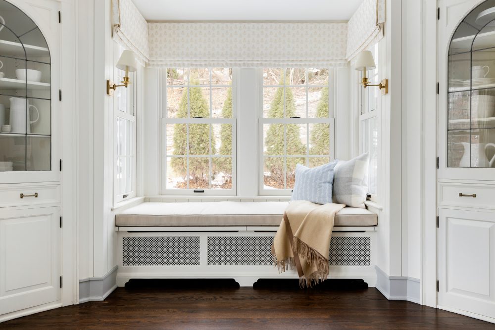
To the left of the foyer and through beautiful french glass doors, you’ll find the dining room. Because of the proximity of this space to the foyer and vestibule, we wanted to carry in elements from both of those spaces to create a flow from room to room that feels natural yet still adds an element of surprise to make each space feel special. Since we added wallpaper to the foyer, we chose to keep the walls of the dining room a solid creamy white and incorporated a contrasting trim and vertical shiplap millwork to add detail and texture. For the light fixtures, we went with brass and opted for pleated lamp shades to tie in that vintage flair. This space had so many beautiful original details (such as the built-in bench, french doors and cabinetry) that made it easy to transform this space with fresh updates that felt natural while keeping the historic charm of the home.
BEFORE
AFTER
Guest Suite
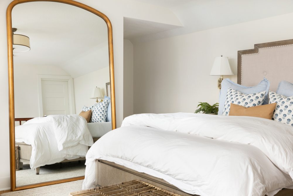
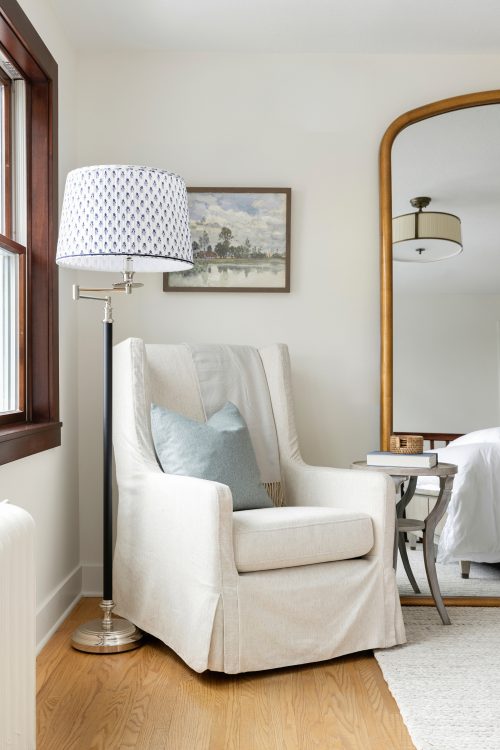
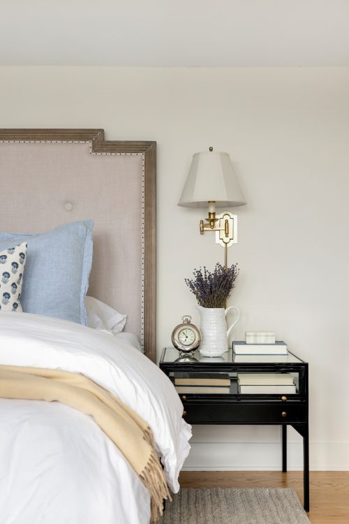
In the guest suite, we stuck to a gender neutral palette so that the room felt welcoming for any and all guests without having any sort of “theme.” We always try to mix and match when it comes to choosing a bed frame and nightstand combination and love how this space pairs the natural wood bed frame with a more modern metal nightstand, giving the space some contrast.
BEFORE
AFTER
Guest Bath
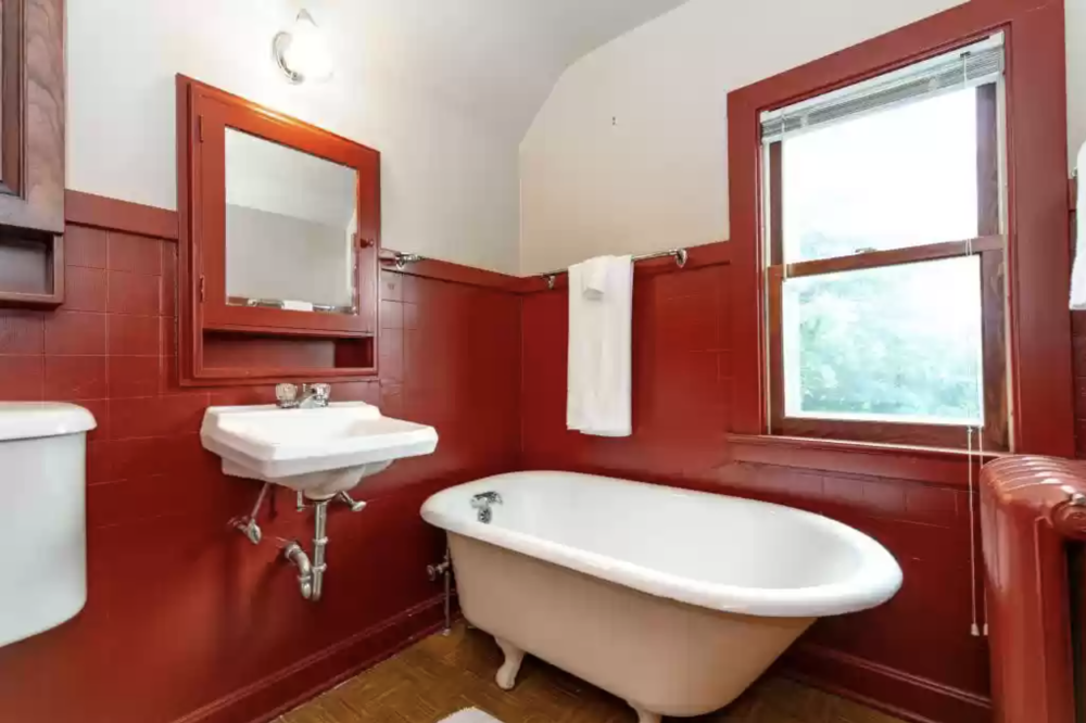
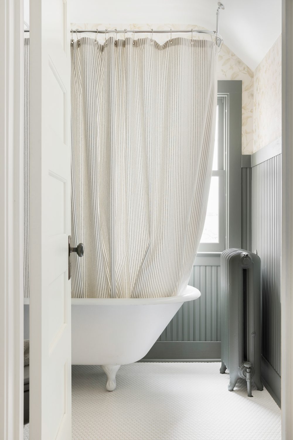
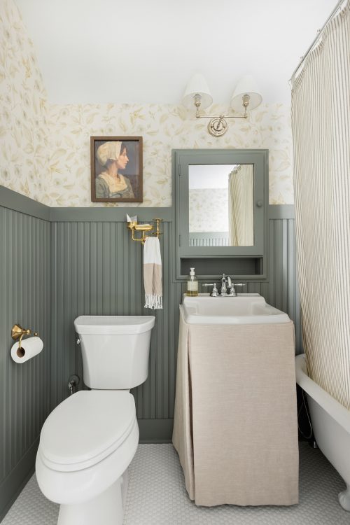
Right off the guest suite lies the guest bath – a charming little space featuring a cast iron tub and custom millwork. While this space may be small, the transformation of this space may have been the most amazing of them all! We started things from the ground up by replacing the original flooring with a fresh white tile and added millwork to the walls along with a pretty coat of paint to tie into the new wallpaper on the upper half of the walls. The cast iron tub was original and too beautiful to swap out – so we had it recoated, cleaned and added a custom shower curtain to bring it back to life!
BEFORE
AFTER
It’s always bittersweet seeing a project come to an end, but we are so pleased with how this charming historic home came together and can’t wait to hear your thoughts on this home, too!
Shop the Project
A note from Bria Hammel Interiors: Below are the disclosed sources for our Rochester Historic Project! While we understand that our readers love to shop/know the details of our projects please know that not all sources will be shared. To honor and respect our relationships with our clients, items that are custom, one-of-a-kind, or to the trade only will not be revealed. Retail items and/or similar options will be linked above. Thank you for following along!
Vestibule: Pillow | Roman Shades – custom made | Artwork – vintage, one of a kind | Paint Color – Benjamin Moore Oxford Gray
Foyer: Wallpaper | Staircase Carpet – to the trade | Flush Mount | Console Table | Mirror | Sconces – to the trade | Baskets – similar option | Floral Vase | Brass Bells
Dining Room: Dining Table | Dining Chairs | Rug | Chandelier | Floral Pillow | Artwork – piece 1, piece 2, piece 3, piece 4 | Curtains & Shades – custom made with Brooke & Lou’s Stella Floral fabric | Paint Color – Benjamin Moore White Dove & Coventry Gray
Guest Suite: Bed Frame – to the trade | Nighstands | Duvet | Pillows – custom made | Sconces – to the trade | Accent Chair – to the trade | Side Table | Lamp – to the trade | Lamp Shade | Artwork | Mirror | Rug
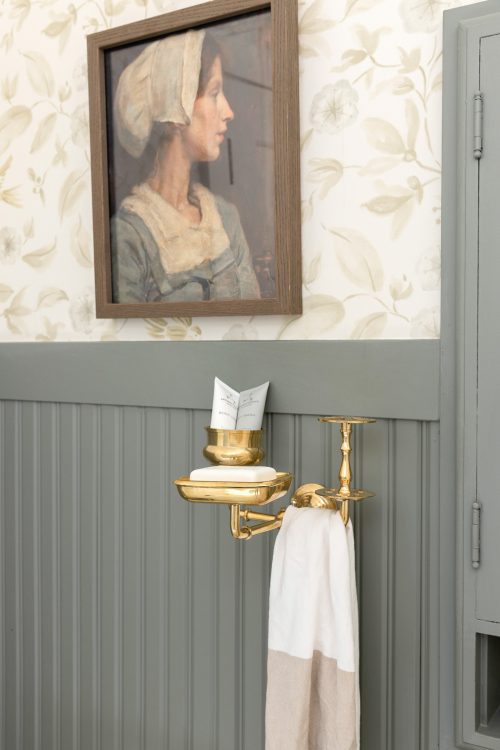
Guest Bath: Sconce | Artwork | Wallpaper – to the trade | Shower Curtain – custom made | Vanity Skirt – custom made | Paint Color – Benjamin Moore Duxbury Grey




Comments
[…] The prettiest before and after […]