We are thrilled to reveal our latest project, our Lexington Ave. home, a new construction project designed for a young family. The construction details of the home were classic and neutral, giving us a great canvas to add personality and character through the wallpaper, window treatments, lighting, and furnishings.
Our design approach for this project was to create a warm and welcoming environment that would be comfortable for the family to live and grow in. We wanted to incorporate classic design elements that would stand the test of time, while also infusing the space with playful touches.
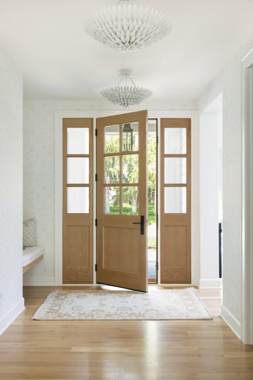
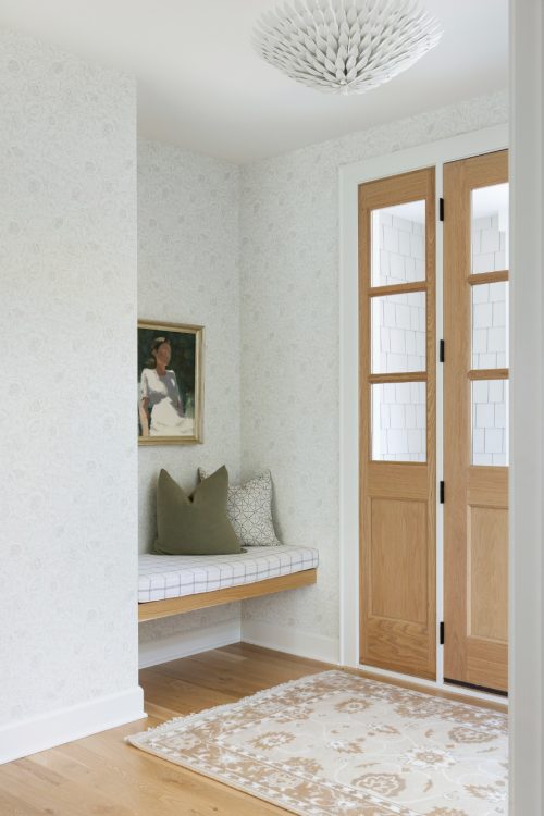
As you walk through the front door, you are welcomed with an open, inviting space. Adorned with a subtle-but-stunning wallpaper and dual light fixtures, this area really sets the tone for the rest of the main level.
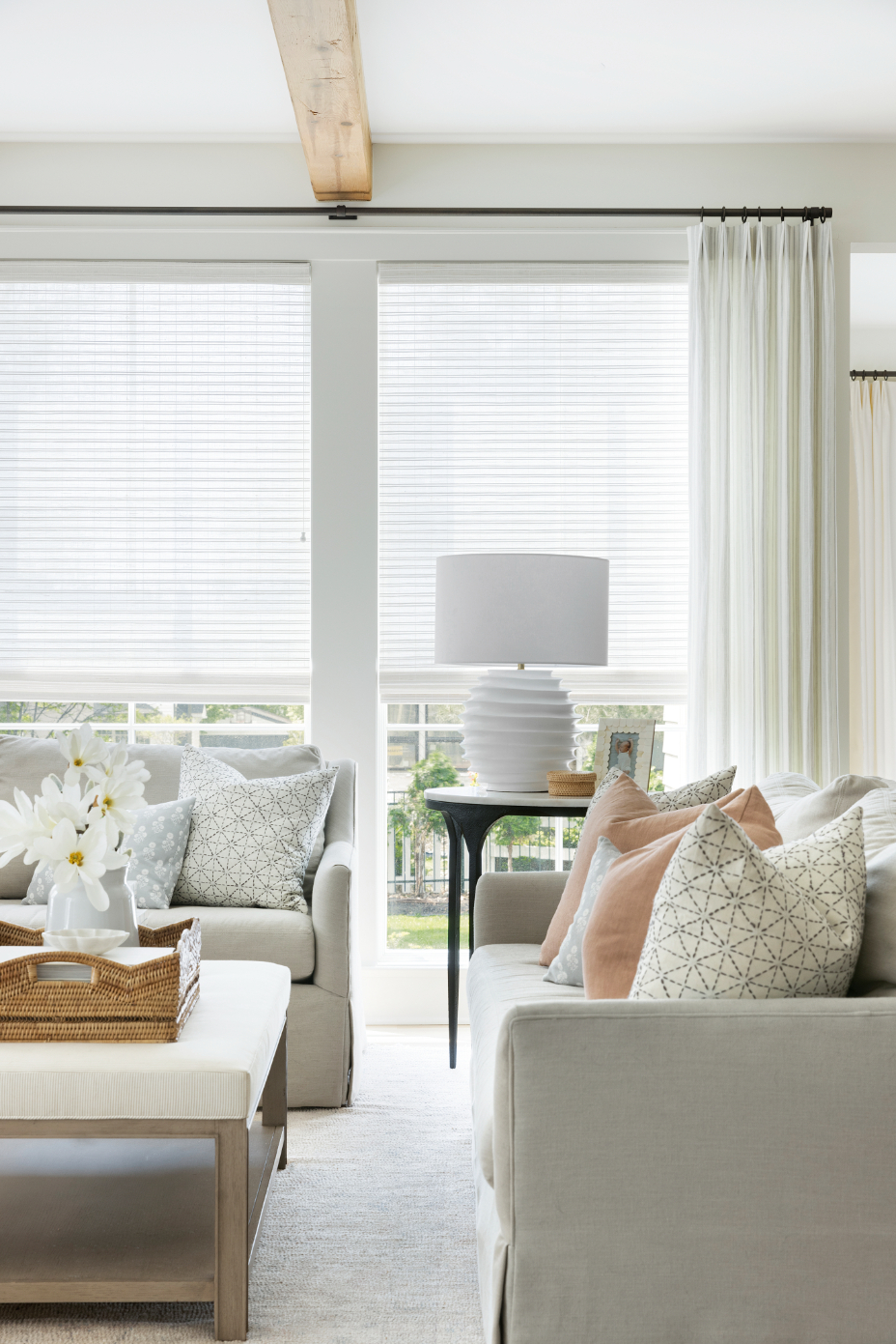
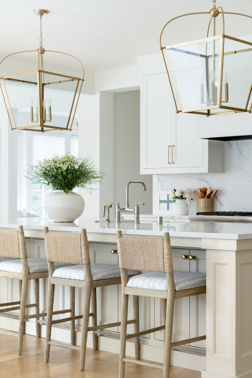
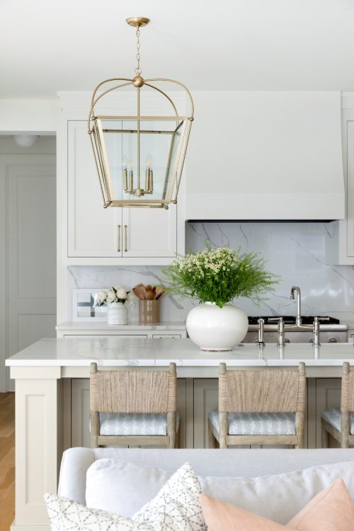
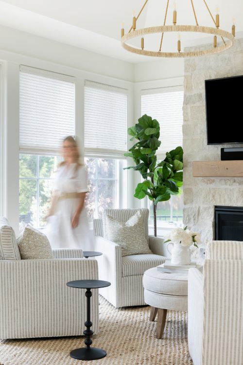
From there, you’ll find an open-concept layout consisting of the living room, kitchen, dining room, and sunroom. We made sure to keep the color palette of all of these spaces a soft pastel with just pops of pattern to not create too much discourse between each room. The end result is an effortless flow from space to space – each equally alluring.
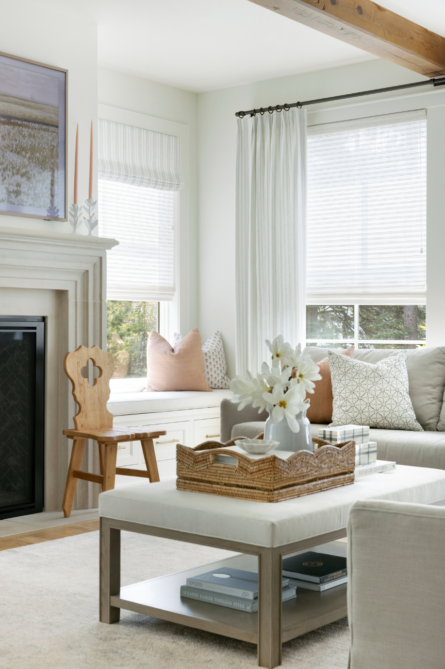
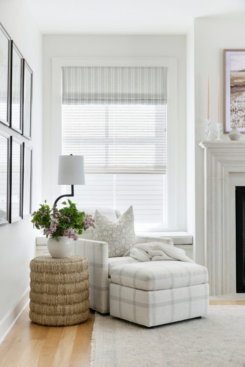
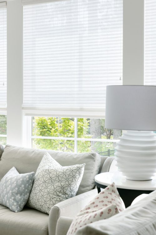
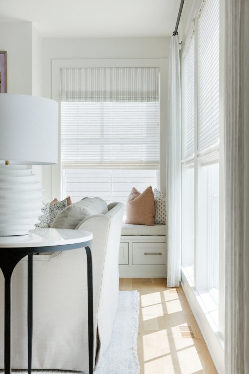
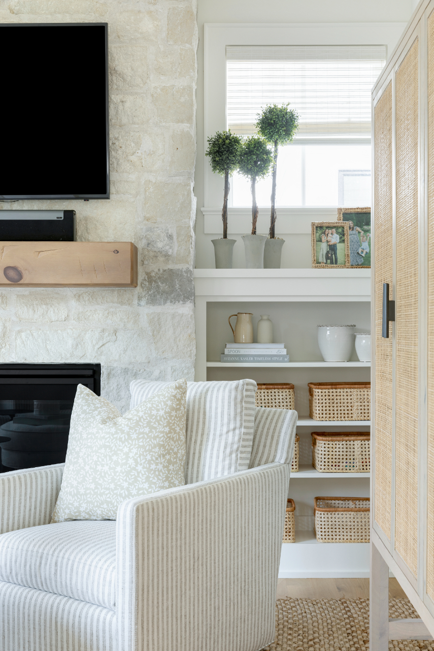
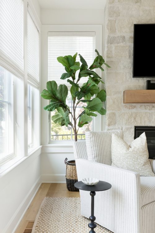
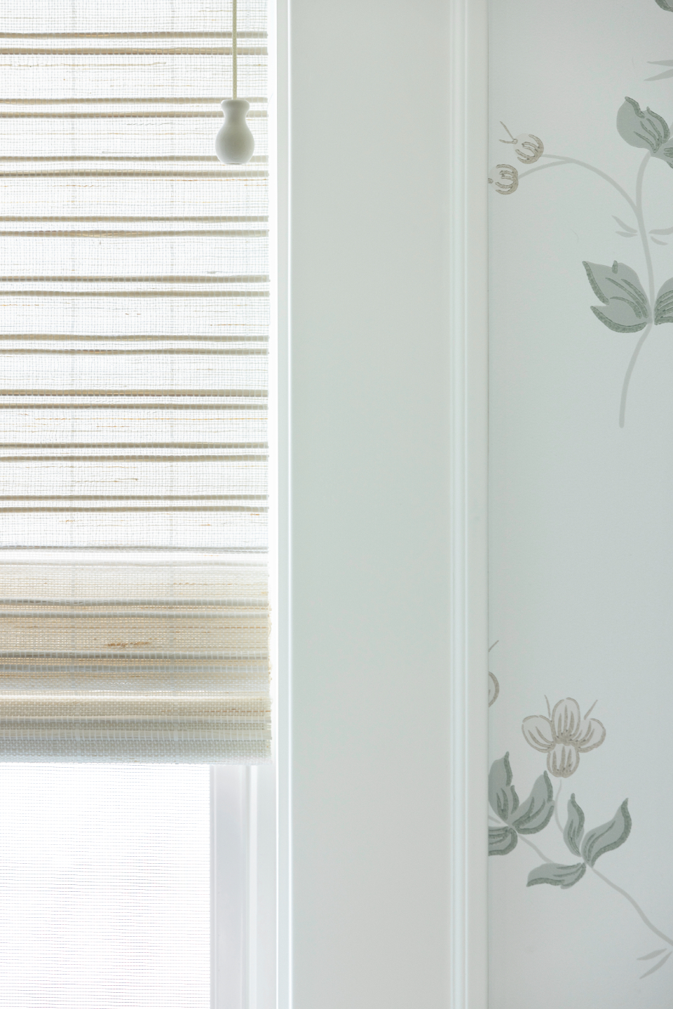
Layers were an important consideration and focus in this home. Aside from the layers of textures, patterns, and finishes seen in the furnishings, we knew we wanted to incorporate details that made this new construction home feel “lived in” immediately. The easiest way to do that in any space? Window treatments! From the Hunter Douglas woven wood roman shades (which you all know is our go-to!) layered with long pleated drapery panels (do you spot an upcoming Brooke & Lou teaser…?) these aspects made each room feel “homey” instantly.
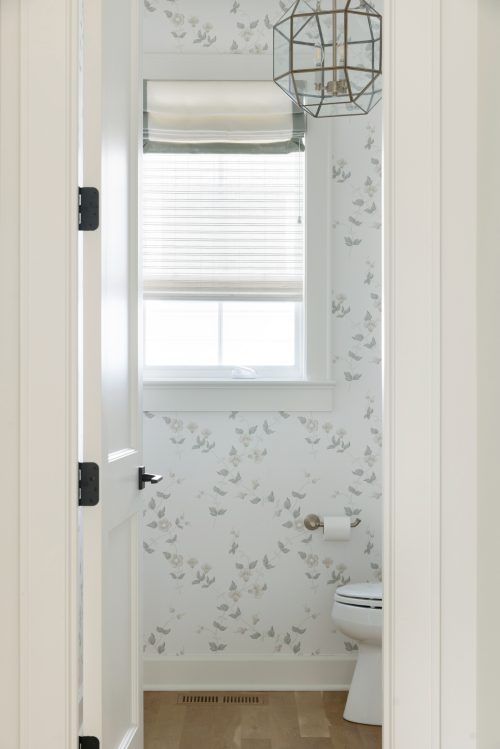
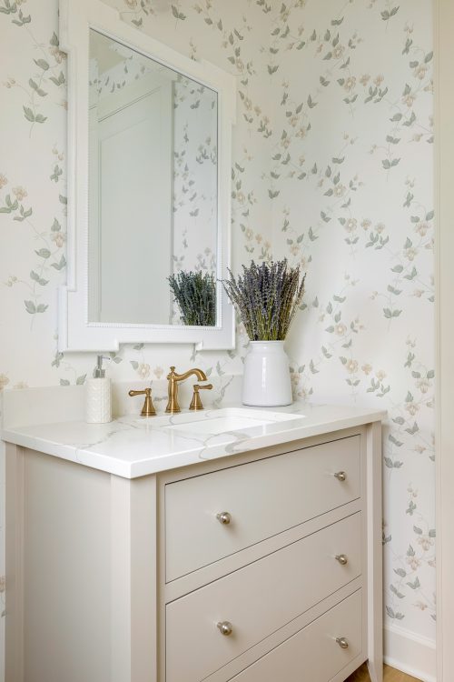
Additionally, nestled on the main floor is the main powder bathroom. This isn’t something new for us, but we love to add a bit of personality to these smaller spaces for a bit of whimsy and unexpectedness. From the floral Brooke & Lou wallpaper to the fun window treatment and lighting choices, we couldn’t love this space more.
Overall, we are thrilled with how our Lexington Ave. project turned out. The classic and neutral construction details provided a great foundation for us to infuse our “BHI touch” and we are confident that the young family who will call this house their home will love it just as much as we do.
Pssst… Keep an eye out in the coming weeks for pt. 2 of our reveal, the kid’s rooms!
FOYER
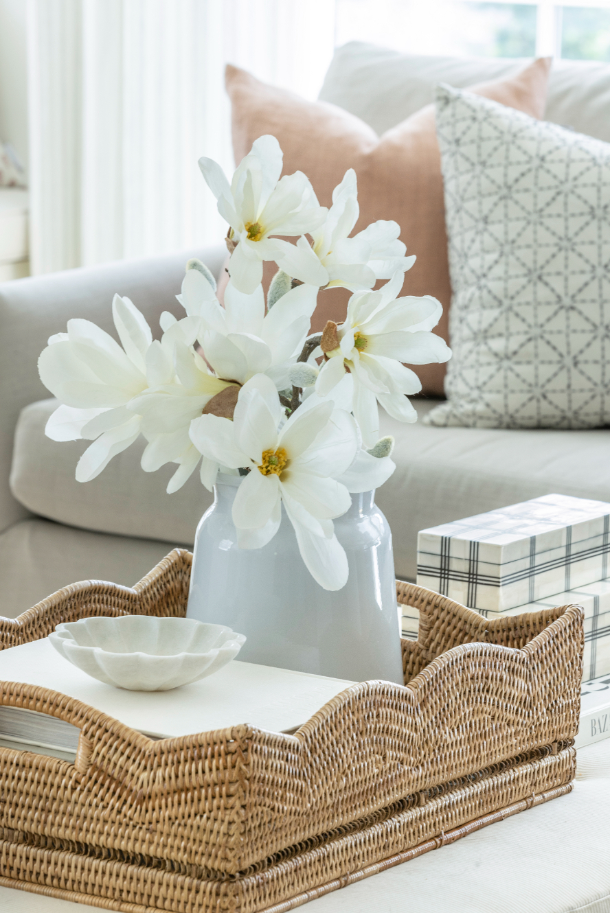
LIVING ROOM
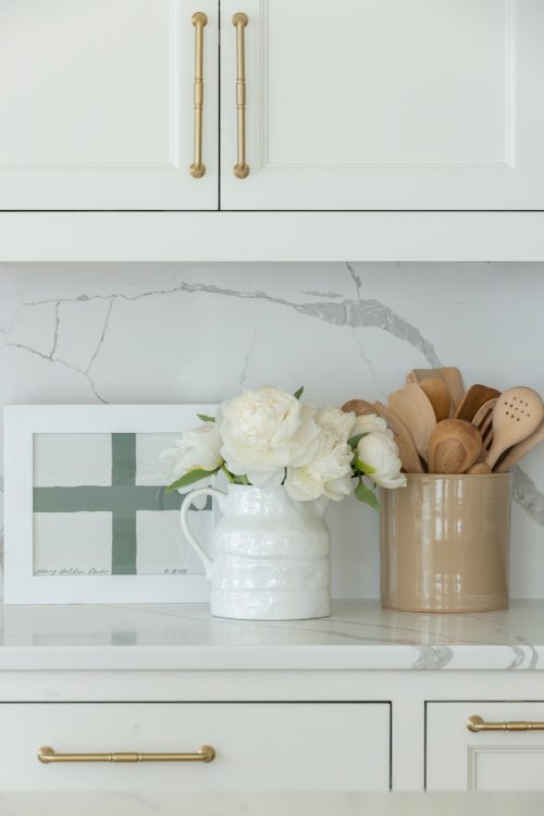
KITCHEN
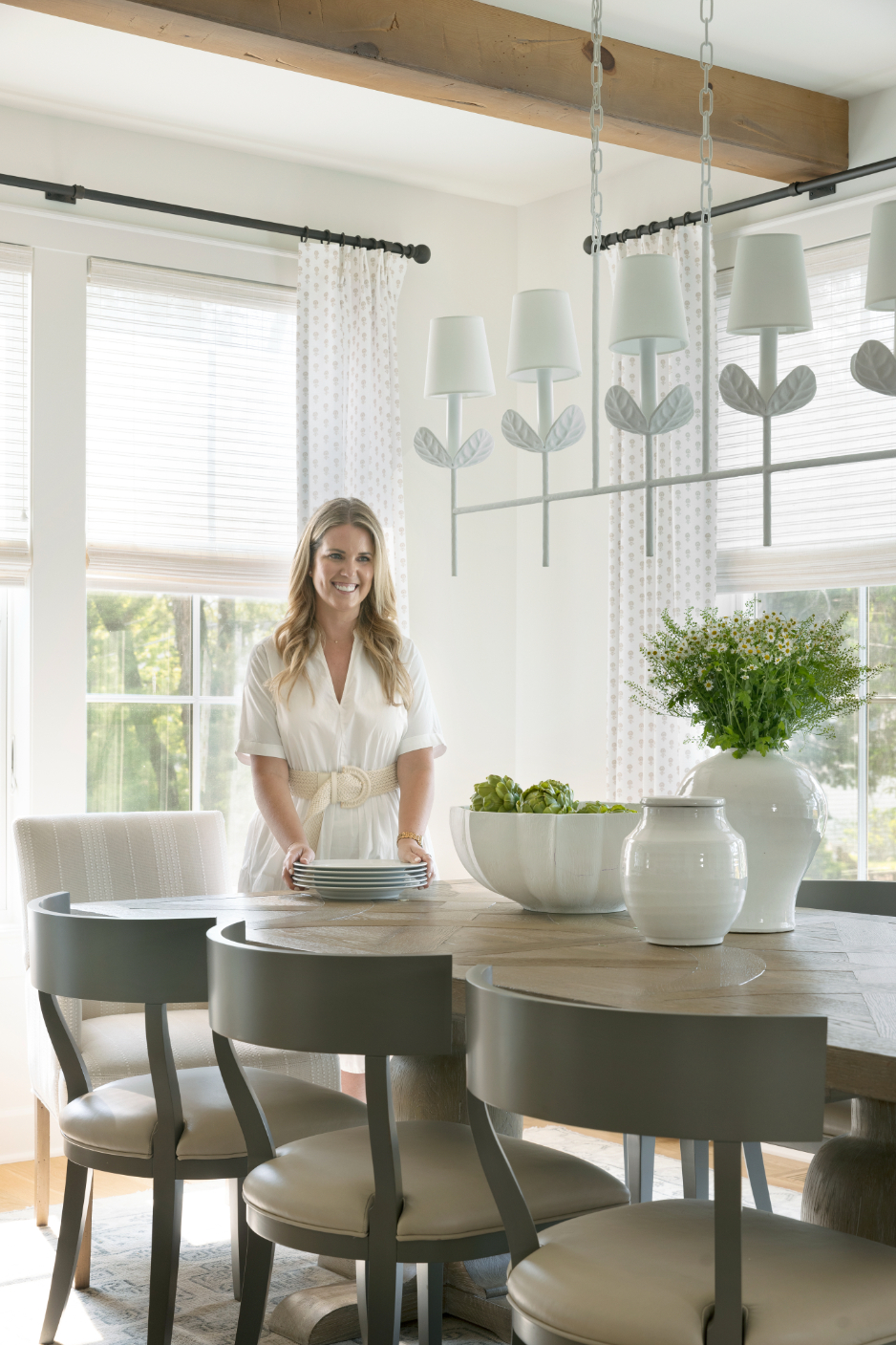
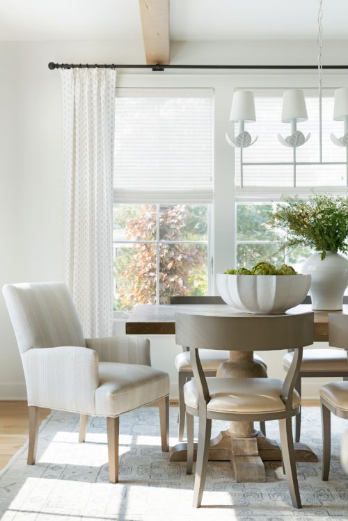
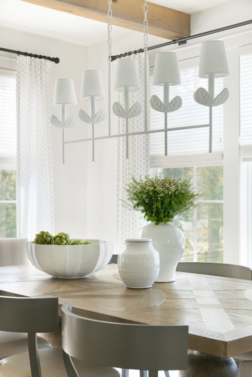
DINING ROOM
SUNROOM
POWDER BATHROOM
Photos by: Spacecrafting Photography
Shop the Look
A note from Bria Hammel Interiors: Below are the disclosed sources for our Lexington Ave. project! While we understand that our readers love to shop/know the details of our projects please know that not all sources will be shared. To honor and respect our relationships with our clients, items that are custom, one-of-a-kind, or to the trade only will not be revealed. Retail items and/or similar options will be linked above. Thank you for following along!
Foyer: Rug | Wallpaper | Pendants
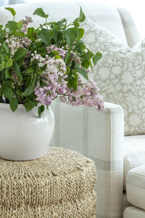
Living Room: Rug | Drapes and Roman Shades – Custom | Sofa(s) in Zinc | Ottoman – Custom | Table Lamp | Side Table | Pillows – Custom | Scallop Tray | Rope Accent Table – To the Trade (see similar here) | Chair with Ottoman – Custom | Gallery Wall Art | Faux White Magnolia Stem | Grey Vase
Kitchen: Barstools – Custom | Vase | Pendants – To the Trade
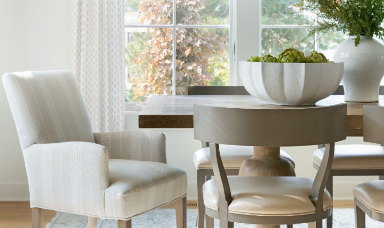
Dining Room: Chandelier – To the Trade | Dining Table | Head chairs – Custom | Side chairs | Rug | Window Treatments
Sunroom: Chairs – Custom | Pillows | Ottoman – To the Trade | Black Metal Accent Table




Comments
What color are your kitchen cabinets?
They are White Dove by Benjamin Moore!