If you’ve been keeping up with us on our social channels, you might have seen us blushing over the fact that Traditional Home published our Modern Tudor project with SD Custom Homes and David Charlez Designs on their website recently.
This home was featured on the Twin Cities’ Artisan Home Tour this summer and was one of our favorite projects we completed in 2019. So, it’s safe to say we were thrilled to hear that the Trad. Home team loved it as much as we did!
Since there are so many incredible spaces we want to share in this home, we’ve decided to break up the reveal into two parts. Today, we’ll be starting with the exterior, foyer, office, sunroom, and kitchen/pantry. Ready? Alright, let’s dive in!
Exterior
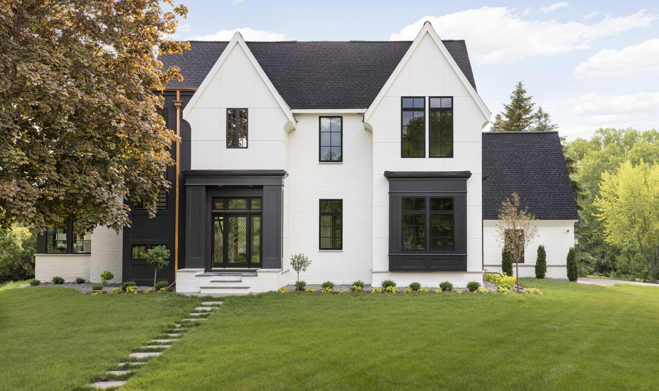
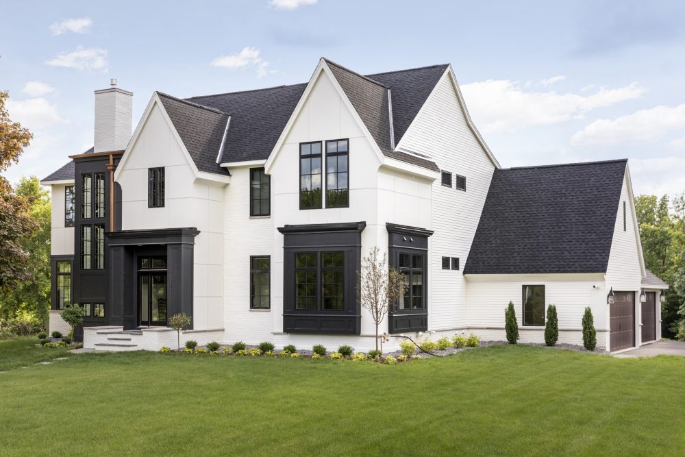
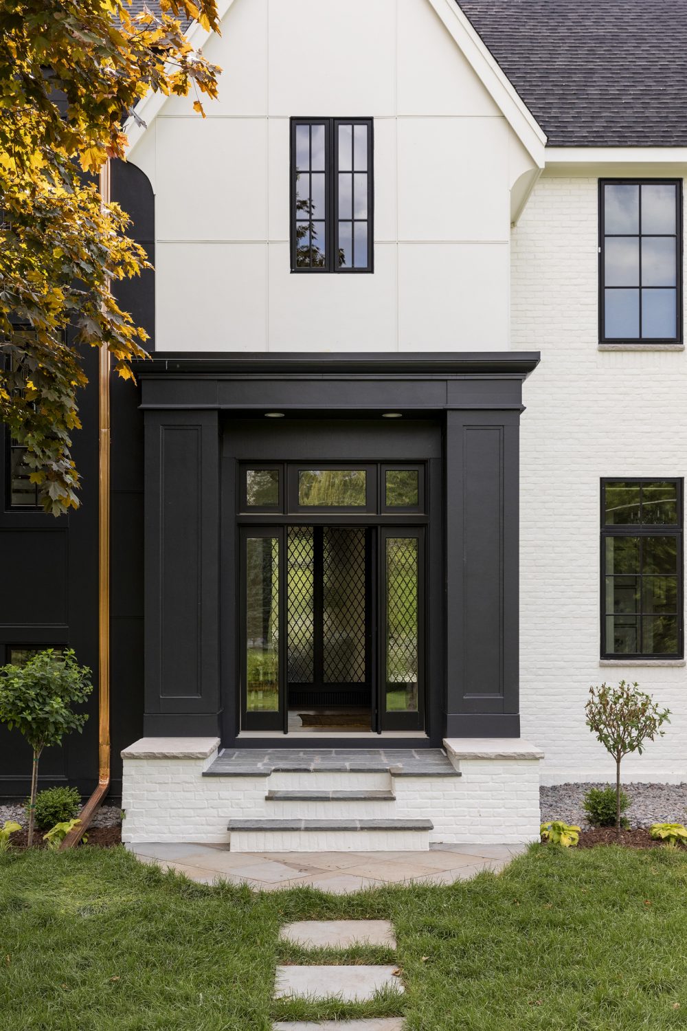
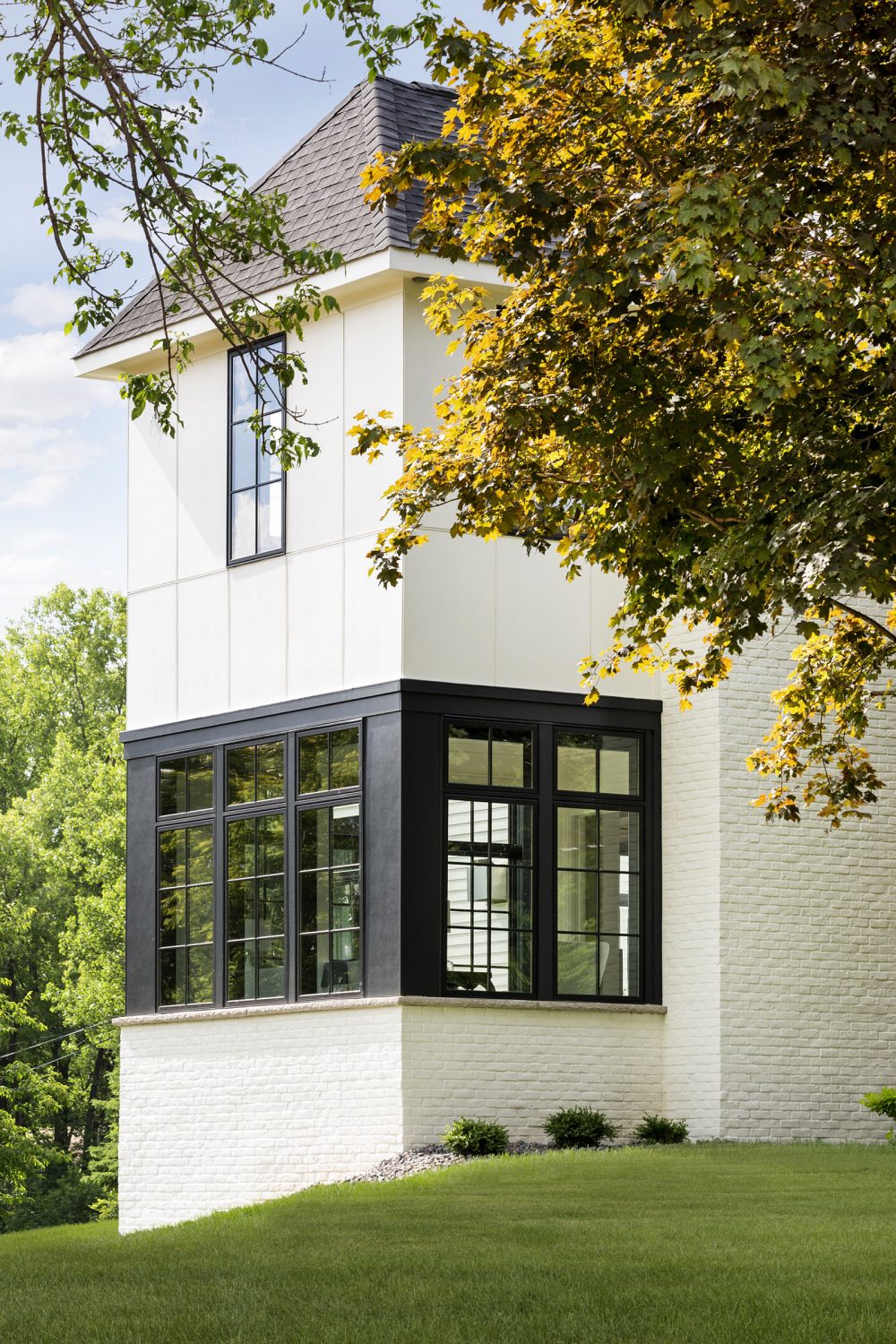
As the name of this project indicates, this is a Modern Tudor style home. There are so many things we love about a Tudor style – the traditionalism, the character. But, you often don’t see it in new construction homes. We knew that we couldn’t fool anyone into thinking it was a historical home, so we decided to purposely incorporate updated, modern details to the design.
We worked closely with SD Custom Homes and David Charlez Designs to craft this home with an old soul and we couldn’t love it more.
Our favorite detail? The copper gutters. 😍
Foyer
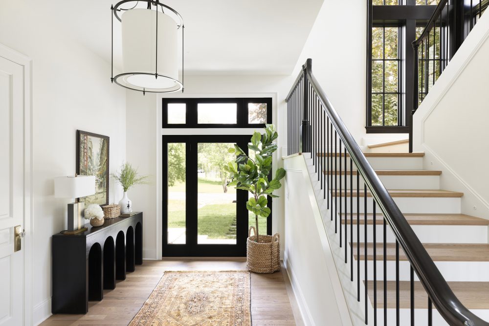
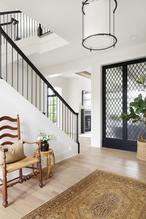
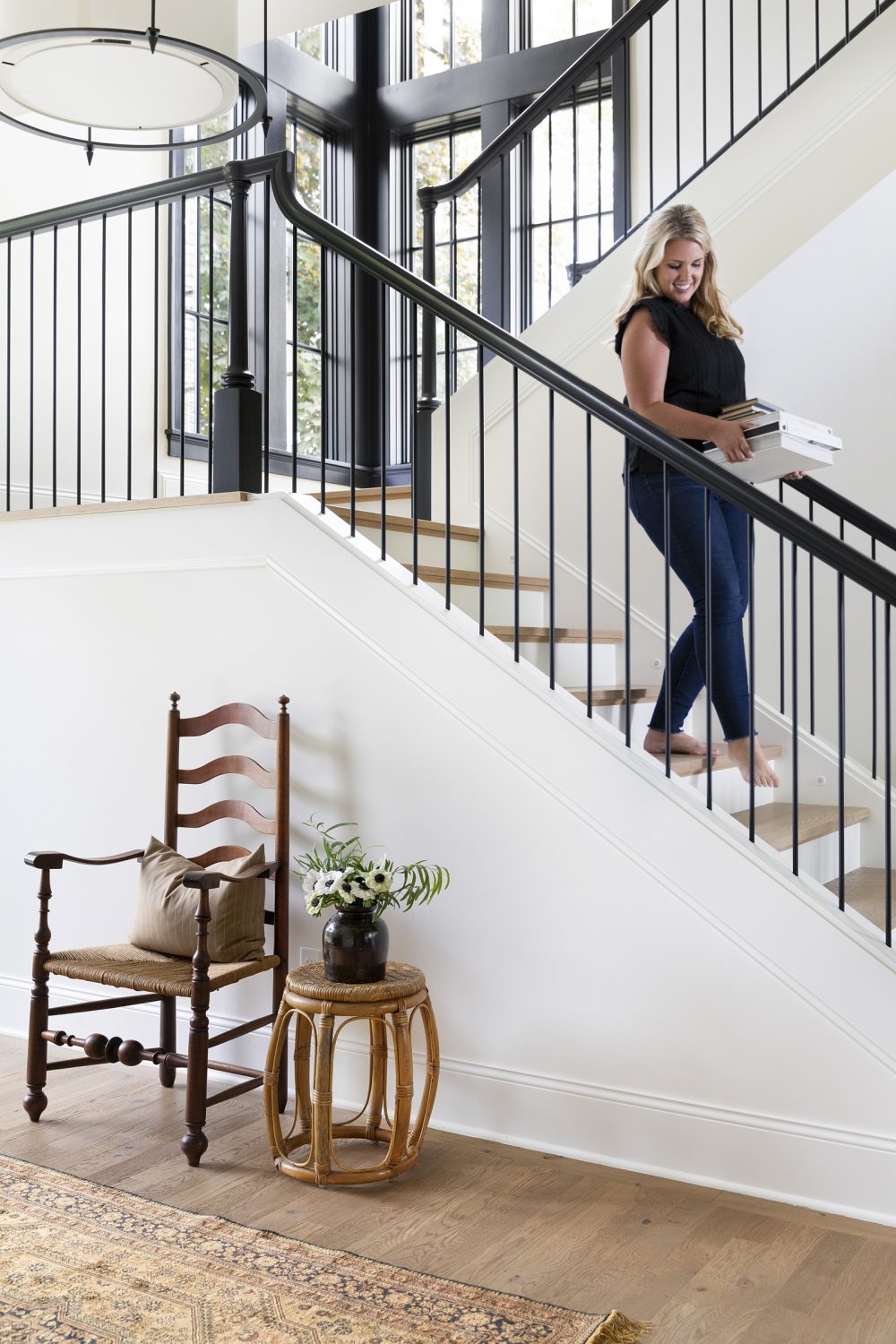
As you walk through the front door, you step into the beautiful, bright foyer. Our client’s art from Hong Kong and vintage rug from India made the perfect accessories and give that rich, unique personality to the space that juxtaposes the modern touches throughout.
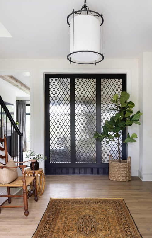
When designing this area, the homeowners expressed their desire to have a privacy wall or separation between the foyer and living room. Not wanting to get rid of any natural lighting, we landed on the idea of creating a custom leaded-glass partition.
SD completely nailed it when it came to sourcing this piece that was driven all the way to Minnesota from Baltimore. Worth. It.
Office
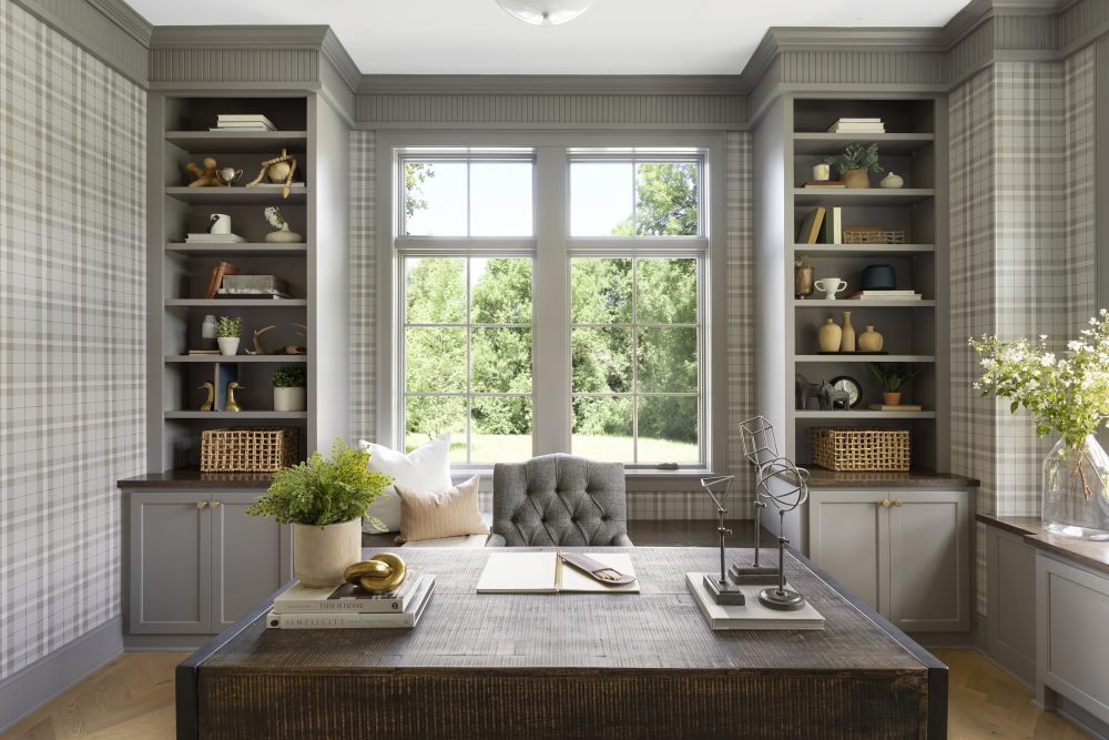
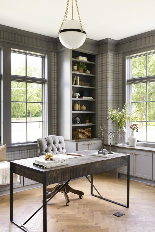
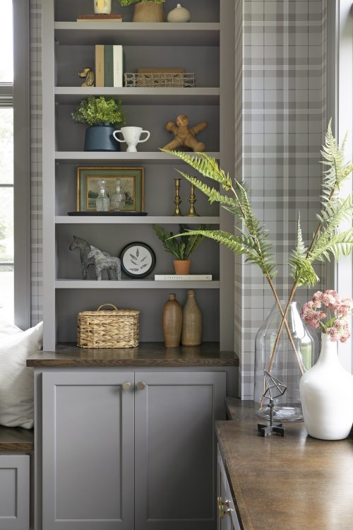
For the office space, we wanted to play with a more masculine aesthetic. From the menswear inspired wallpaper to the gray painted cabinetry, this space is beautiful and inspiring – characteristics we believe every office should have!
The reeded crown molding throughout gave a nod to the traditional style while the more modern details (i.e. hardware and lighting) balanced the space out. Brooke & Lou collected accessories adorned the built-in bookshelves which also gave the room an eclectic, unique look. Our favorite!
Sunroom
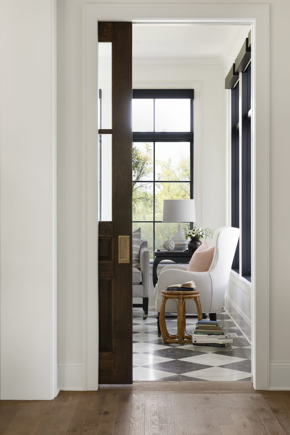
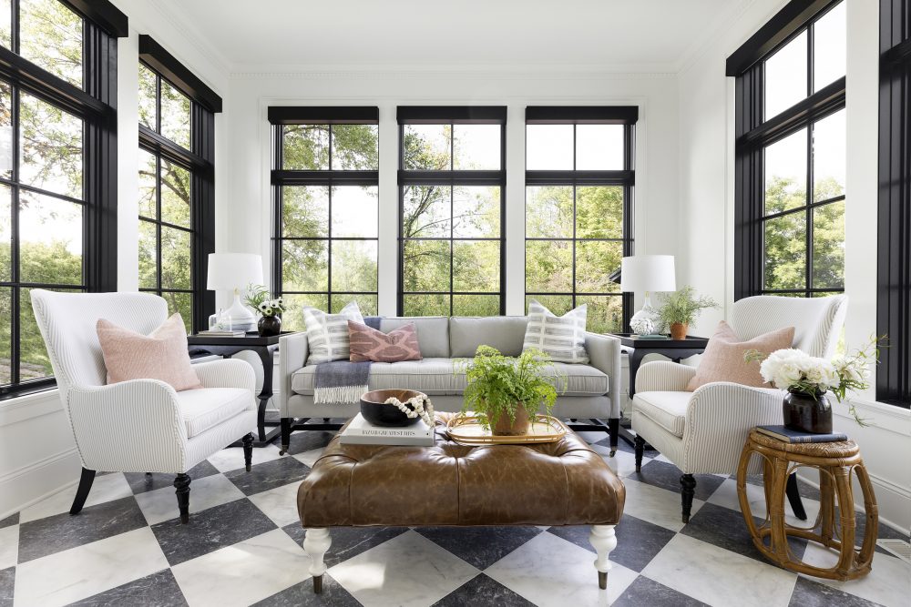
Now this is a room we could spend hours in. Our client nicknamed this area her “garden room” as it is surrounded by walls of windows that overlook the beautiful landscape outside.
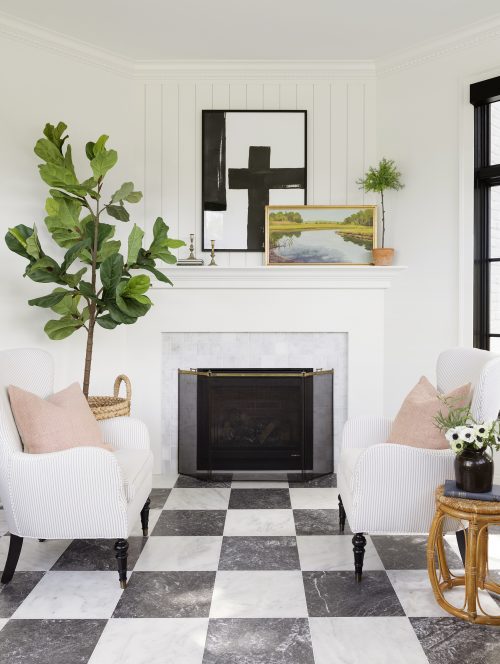
With loads of sunlight, a marble, checkerboard pattern tile floor, and soft, blush pink touches, this room allowed us to play with a more feminine design scheme (without going overboard!). We love that it feels special and personalized for her while not seeming out of place in comparison to the rest of the home.
Kitchen
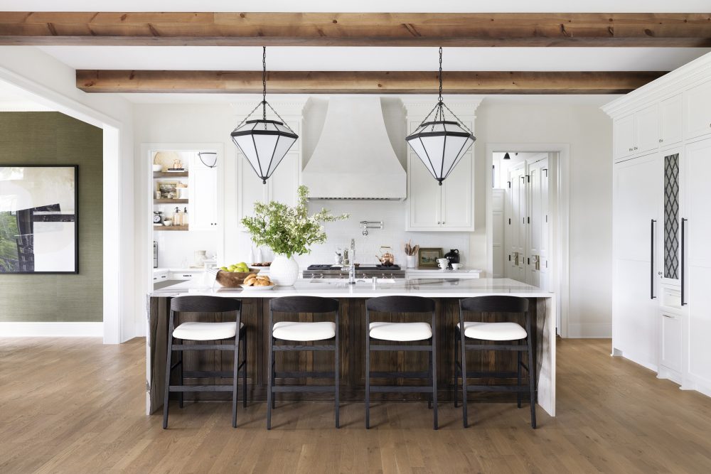
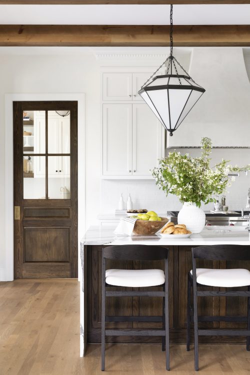
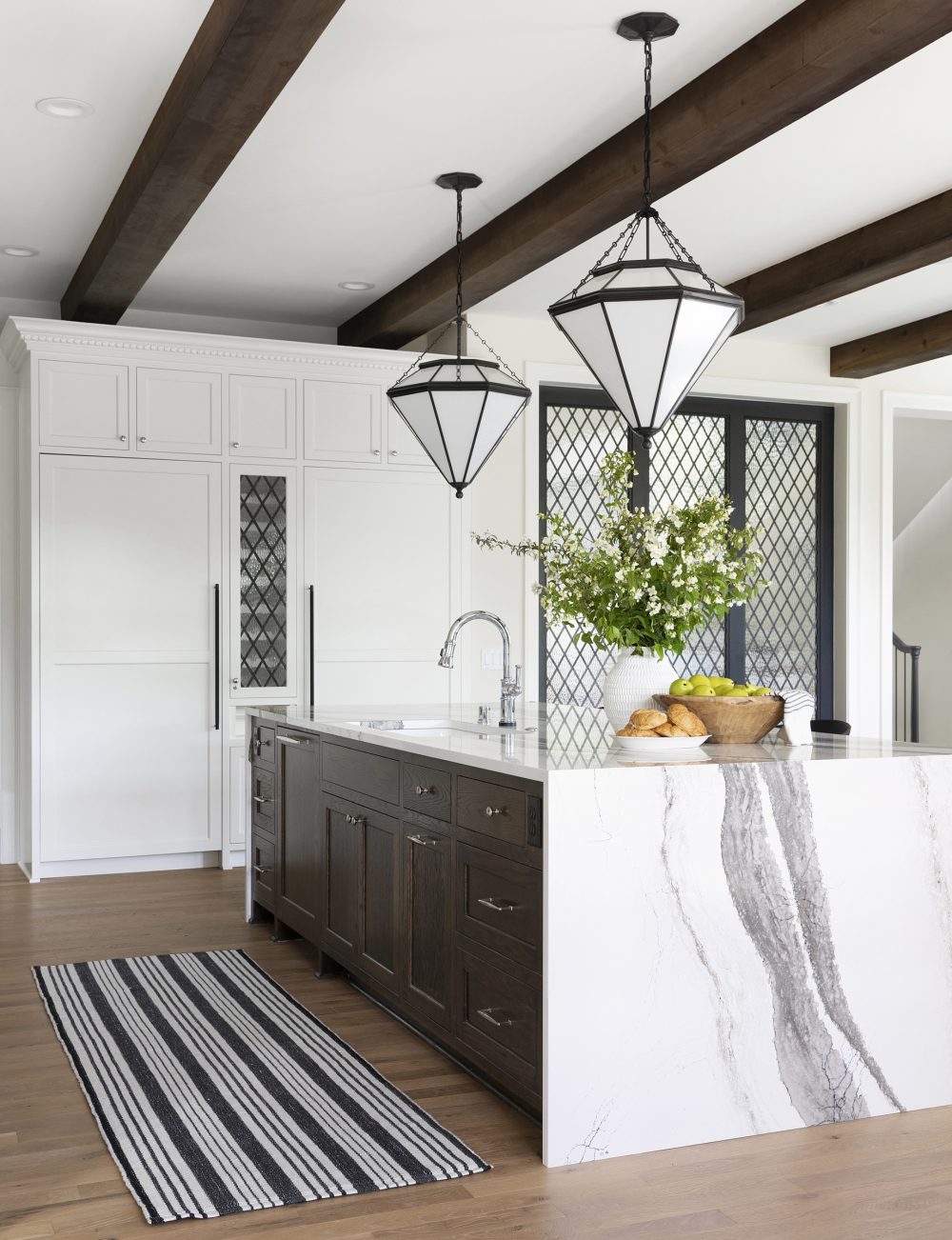
For the last stop of our tour today, we’re finishing with the kitchen and pantry! Out of all the spaces in the home, we believe this room encompasses the Modern Tudor style the most.
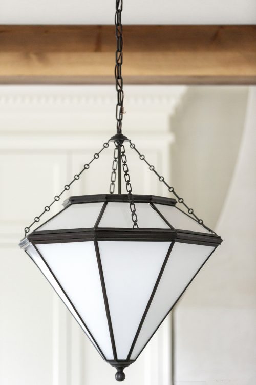
Iron diamond-shaped pendants over the island bring in the form and weightiness of a past era, as does a white brick backsplash. However, the Cambria waterfall island and sleek, black barstools speak directly to today.
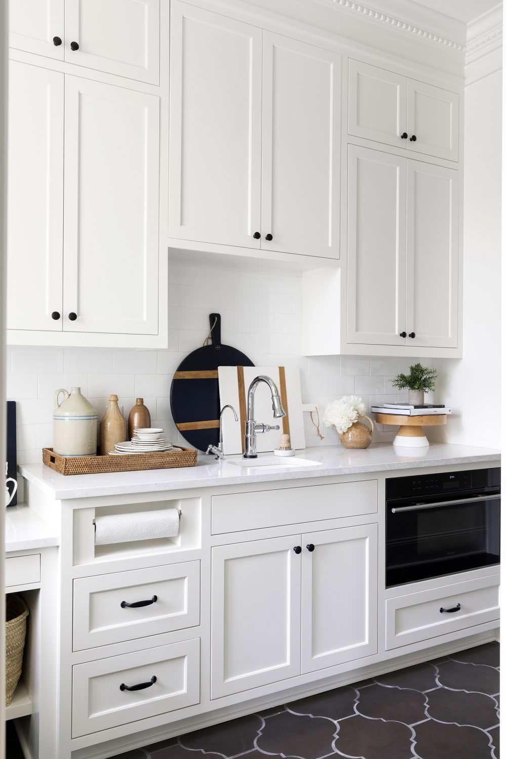
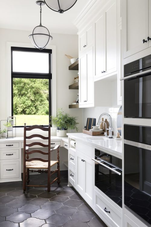
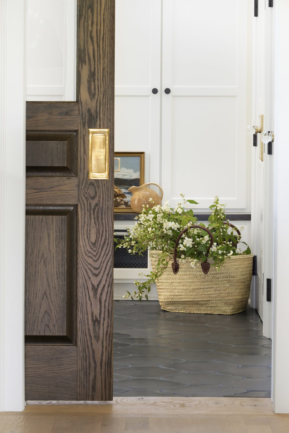
Aged-oak pocket doors separate the kitchen from the butler’s pantry that houses the appliances as well. More and more often we’re seeing our clients wanting to hide away their ovens, sinks, and microwaves from the rest of the kitchen area and we’re all for it.
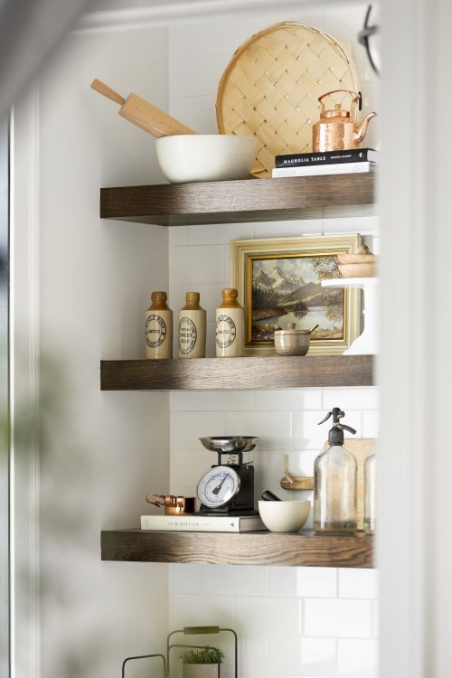
While the butler’s pantry is extremely functional, we made sure that it didn’t lack in beauty or attention to detail. Flooring made of handmade tile offers durability and a time-honored look and open, wood shelving made the perfect place to display extra kitchen accessories in style.
That’s all for today! Make sure to check back in next week to see Part II of our Modern Tudor project reveal.
Photography by: Spacecrafting Photography




Comments
This is stunning!
Love the lights over the island. Where are they from?
Hi Elizabeth! It's the Cannes Pendant by Visual Comfort. Thanks for reaching out!
Please share the exterior color of this home. Love it!
Hi Lisa! It's White Dove and Graphite - both Benjamin Moore colors. :)
A unique, refreshing design - interior and exterior.
A unique, refreshing design - interior and exterior. What month was this tudor featured in the Traditional Home publication? My thanks.
Absolutely stunning
[…] Her Holly Road project includes a soft white window seat bench with built in bookcases. And the Modern Tudor project has another must-see office space, complete with plaid […]
What whites did you use for the interior walls?
Hello Debra, most of the interior walls are White Down by Benjamin Moore with the trim in White Dove.
Do you have a floor plan for this house?
Hi, Lisa! Out of respect for our clients, we do not share floor plan information. Thanks for understanding!
This is very beautiful! Are the interior walls and kitchen cabinets also Dove White?
Thanks Jennifer! Most of the interior walls are White Down by Benjamin Moore, and yes, the cabinets in the kitchen are White Dove.
Hello! Love this gorgeous design and especially those Sunroom checkerboard floors... could you please share the tile details of the checkerboard floors? I am desperately looking and these are perfect!! Thank you
Hello Payal, thank you! These tiles were so perfect for this space! We used a mystic white honed and dark grey honed tiles from Paris Ceramics. Hope that helps!
Beautiful! Can you please share the color of the kitchen cabinets
Thank you Pia! The cabinets are painted White Dove by Benjamin Moore.
I have been searching for a grayish/brown plaid wallpaper for months. This room is gorgeous with this wallpaper! Could you share where it is from? Thank you.
Thanks Anna! You can find the wallpaper here.
[…] some inspiration online this week and found this modern tudor house tour from Bria Hammel. Here’s Part One (don’t miss the office, that gorgeous wallpaper, right?) and here’s Part Two in case you […]
Love the kitchen and the decor!
What color is the exterior paint? Both white and black?
Hey Melissa, that is White Dove and Graphite by Benjamin Moore.