For today’s reveal, we’re taking you all about an hour out of the Twin Cities to Rochester, MN. While it’s predominantly known for being home to the extraordinary Mayo Clinic, it’s also known to us for being home to one of our favorite clients! Over the past few years, while working on this project, we’ve grown to love making the drive and getting out of the city and into the country to visit them.
Appropriately themed to the area, our clients were looking for a modern, casual farmhouse for their growing family. This project was part renovation, part new construction and we worked with the existing foundation on parts of the house which created limitations/things to work around but also gave us a challenge and an opportunity to get creative. We adore how it turned out and are so excited to share it with you all. Now, let’s get started!
Exterior
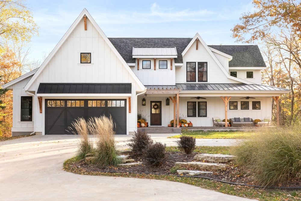
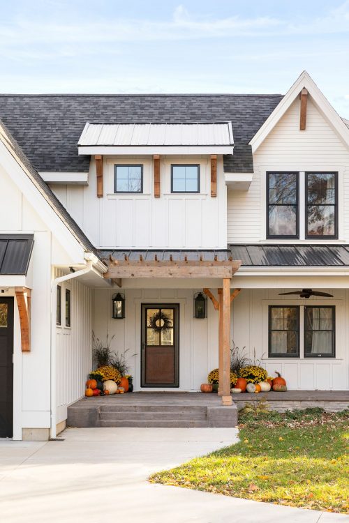
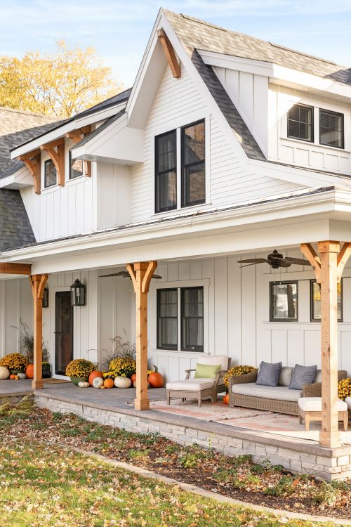
As we mentioned, the style of this project was a casual, modern farmhouse. We wanted that to be evident as soon as you drove up the long driveway and that began with the exterior selections. From the cedar columns and brackets, to the ship lap and board and batten we incorporated all the warm, inviting things we love about farmhouses while juxtaposing it with contrasted, black windows and sleek lines to give it an updated feel. Add in authentic, plantation style fans on the front porch and we have ourselves a space we’d never want to leave.
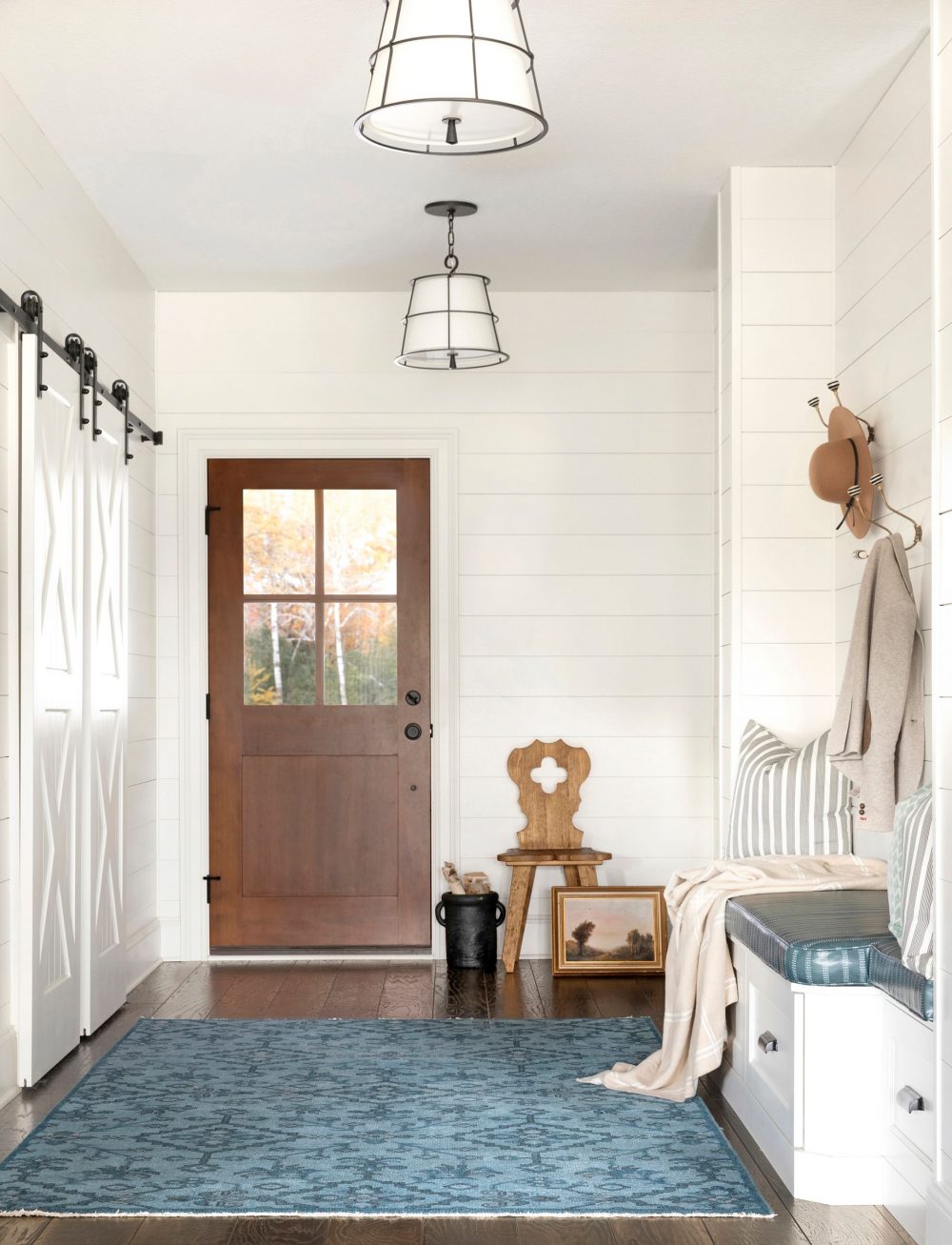
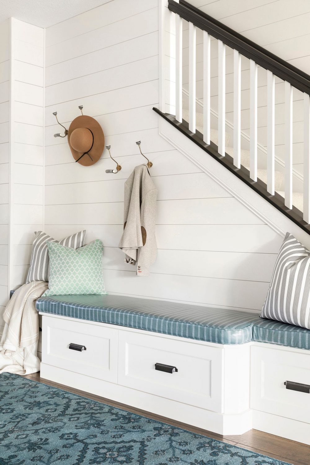
Foyer
In the foyer, we played up the farmhouse style again by using shiplap in the entire area. Because they are a family with three young boys, we wanted something durable for the walls since it’s a high traffic area and it’s a whole lot easier to clean than sheetrock. For even more durability, we installed a custom cushion for the bench using Brooke & Lou’s Life Friendly™ fabric (aka clear coated and wipeable!).
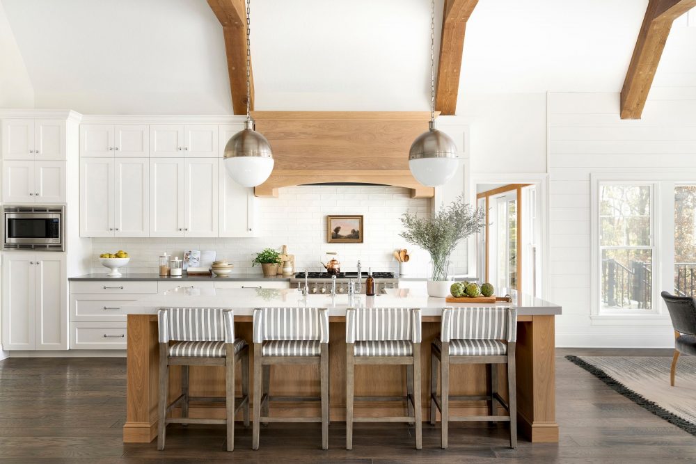
Kitchen
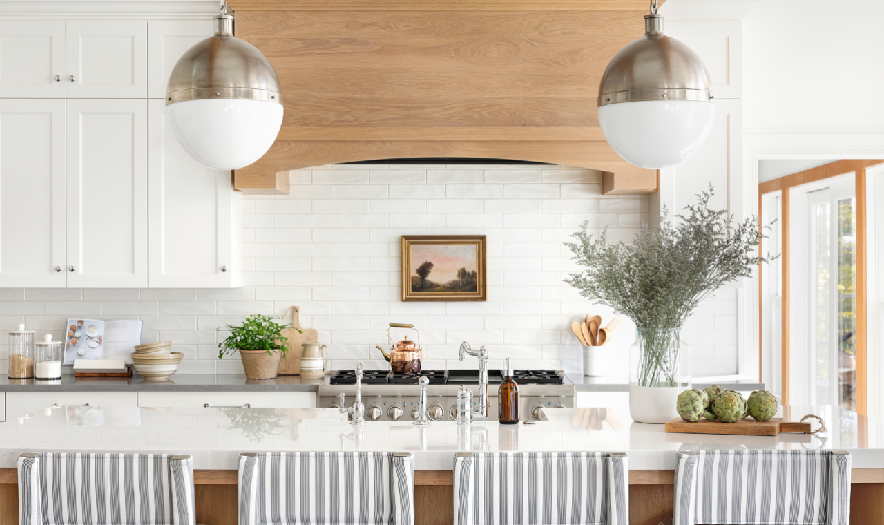
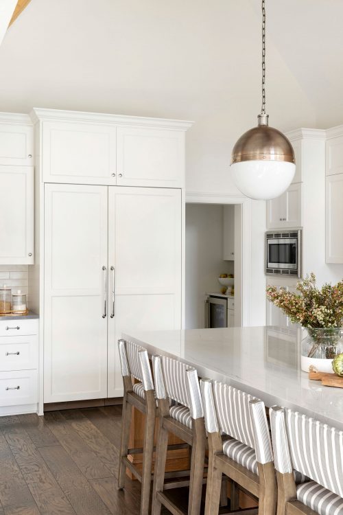
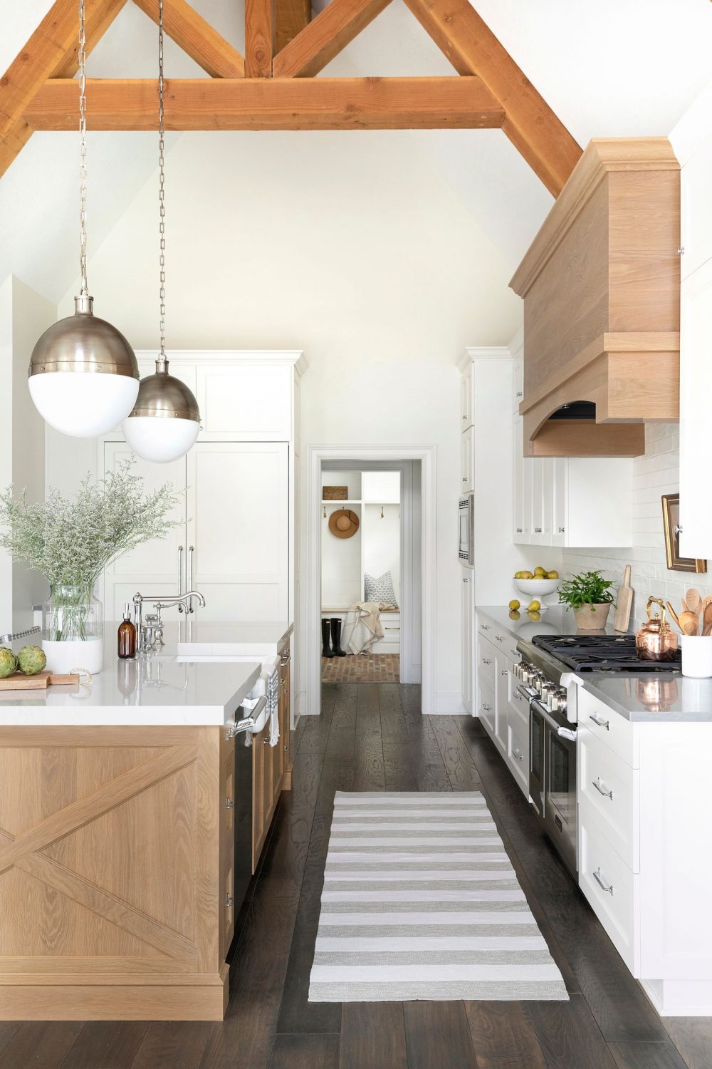
Kitchens are typically our most favorite room in homes and that is definitely the case for this project too. For this space, we worked with part of the existing foundation and one of the things we had to play with was the ceiling (this explains the vault). So, instead of pretending its not there we decided to amplify it which is why we did the gorgeous, dramatic beams. Because the ceilings were so high, we did a few things to accentuate that while also still having it feel inviting and cozy.
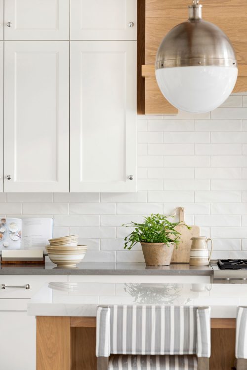
To start, we painted the cabinets the same color as the walls. Typically, we would bring cabinets to the ceiling and since we couldn’t in this case we opted to paint the walls and cabinets the same color which helped to make it seem like they don’t have to be brought to the ceiling and also drew your eye up. Second, we installed beautiful, oversized light fixtures that hung over the island.
For the finishing touch we placed in a few textured, vintage, Brooke & Lou accessories that gave a nod to the collected, farmhouse feel of the home. It’s incredible how accessories can bring warmth and character to a space (especially a kitchen!) and we absolutely love the ones in this kitchen.
Mudroom
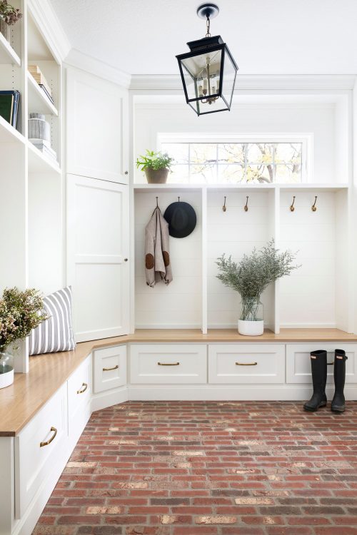
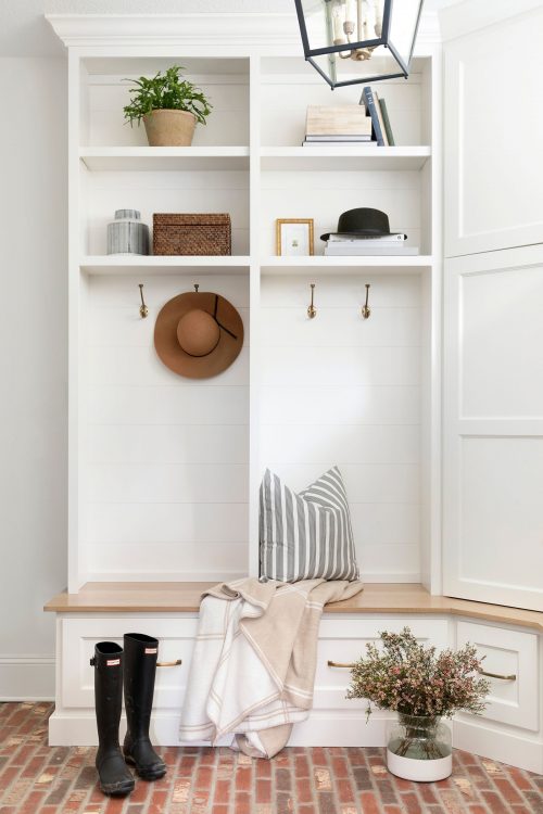
The mudroom gave us everything we love to see in a mudroom. A brick floor perfect for hiding the dirt, a wood top bench for durability, and lots of drawers and hooks for storage! This is what designing with intention looks like. While the outcome looks beautiful, it’s so important that its functional and practical for our clients.
Dining Room
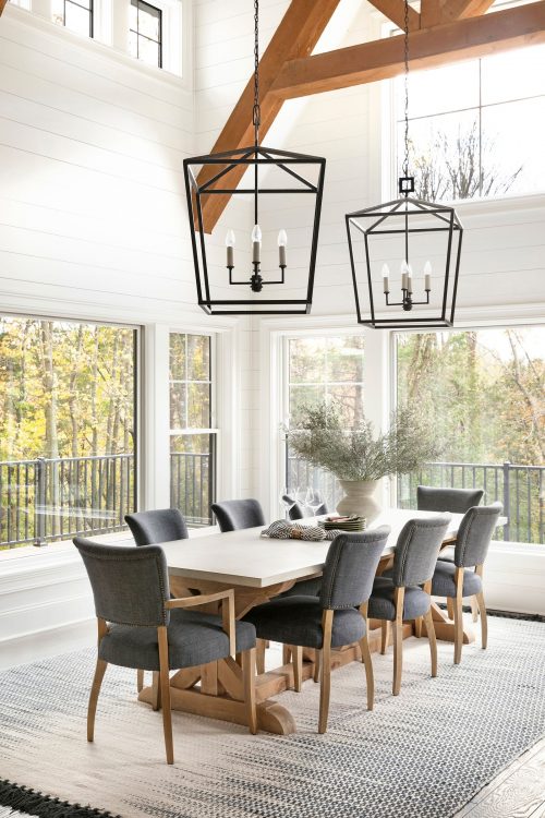
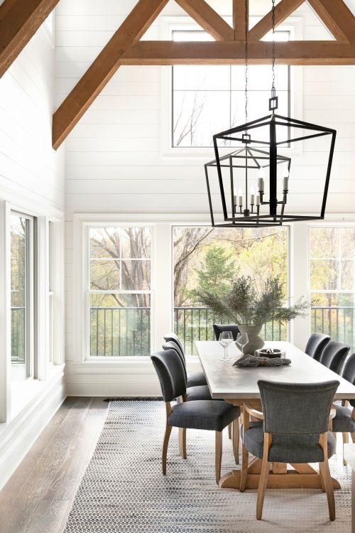
Adjacent to the kitchen is the dining room. Because of its size, we wanted to put things in here that would balance the scale of the room in general. The light fixtures are massive, oversized lanterns and we chose a finish that would pop against all the white. We also mapped out where the beams were going to go based off the lights so it was important to be mindful of that. This space became such a warm, inviting area and we are secretly jealous we can’t be a part of all the fun dinner parties and lively brunches that will take place here.
Living Room
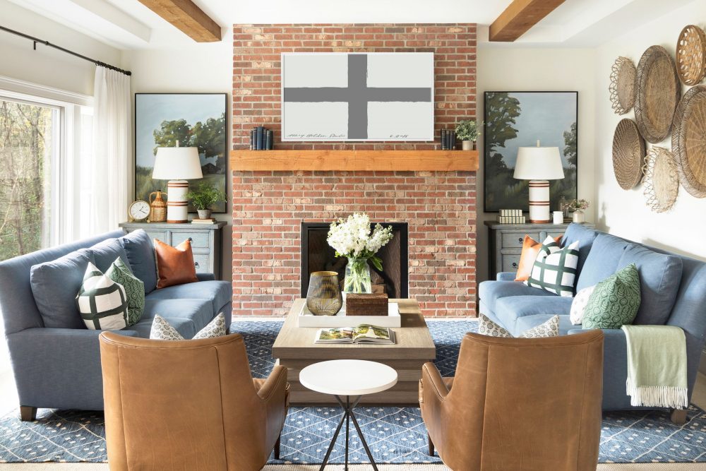
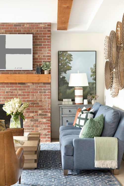
The dining room and kitchen open up to the main living room so it was important to tie in certain aspects of all of these spaces to have it feel cohesive (i.e. the brick of the fireplace matches the brick from the mudroom floor). Since our clients opted for keeping the brick natural instead of painting it, we chose furnishings that wouldn’t distract from it but, instead, in a similar palette and in saturated colors.
Just one of the wonderful things about opting for deeper colors (such as the sofa color) is that it hides stains and messes that might arise with children. Now, I know what you’re thinking… “then why do you have two white chairs?”. We know that it might seem a little crazy, but that’s where our trusty friend, Crypton fabric, comes into play. All Crypton fabric is easy to clean, even white, therefore you don’t have to be afraid of it when you have little ones around. How great is that?
We’ve said this before, but one of the favorite things to do in a home is to create unexpected details or moments. In the living room, we selected a coffee table that has secret, hidden drawers that can hide toys, television remotes, etc. Genius!
Boys Bedroom
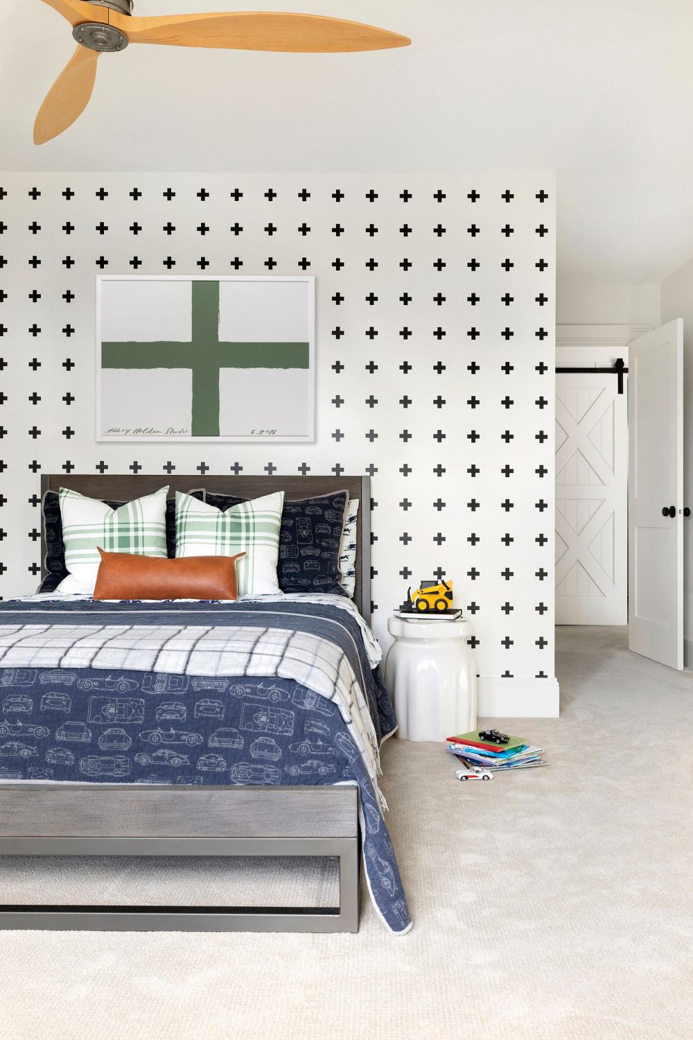
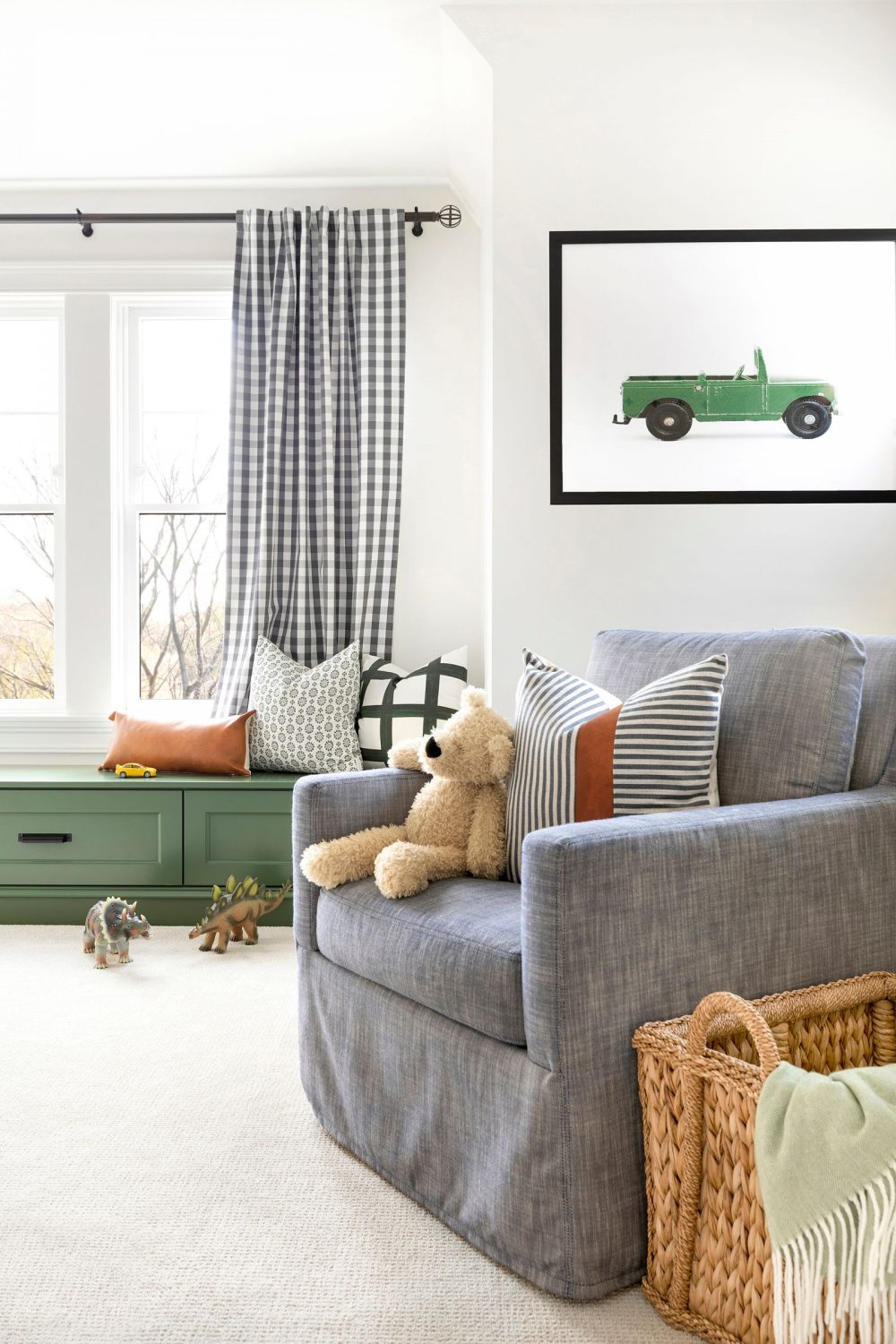
As we mentioned above, our clients have three, beautiful boys. While we would NEVER pick a favorite boy, we did pick a favorite bedroom of theirs that we wanted to share. 😉 It’s no secret that we typically lean more on the softer, feminine style when decorating so it’s always fun for us to go outside of that to design a room for a boy. From the graphic wallpaper to the touches of green, we love that this space can grow with him for years to come. This room might also be our favorite because of all the Brooke & Lou pieces in it. Shop all of them (and more!) below.
Photographer: Spacecrafting | Architect: David Charlez Designs | Builder: G Cubed Homes





Comments
Beautiful house! I love those subway tiles- they look almost like a pounded tile with more of a matte finish? What is the name of them or where can I find some like that to look at I’m person. We are in Woodbury. -Jess
Hi Jess! Thanks for reaching out! :) It is one of our favorite tiles from The Tile Shop! Here is the source: https://www.tileshop.com/products/imperial-bianco-gloss-ceramic-subway-wall-tile-4-x-16-in-441970.
This boys room is fantastic! Can you please share the green paint color? I love it so much!
Hi Jessica! Thanks for reading. The color is Peale Green by Benjamin Moore. :)
Don't need our want a house this big anymore, buti love it!!
Hi! What white color do you use on the walls in the boys room?! Is it the same color throughout the house? I love the freshness of the spaces!
Hi Amy! It's White Dove by Benjamin Moore. We used it throughout the entire home. :)
Stunning!! I am on a deep search for the perfect white for our home. What color white did you use throughout the house on the walls, trim, kitchen cabinets? And did you use different finishes of the same color? (Matte, glossy, eggshell?) Thank you!
Hi Kelsey! Thanks for reaching out. :) We used White Dove by Benjamin Moore (a color we use in A LOT of our projects because we love it so much!). We used a flat finish for the walls and a satin finish for the trim and cabinetry. Hope this helps!
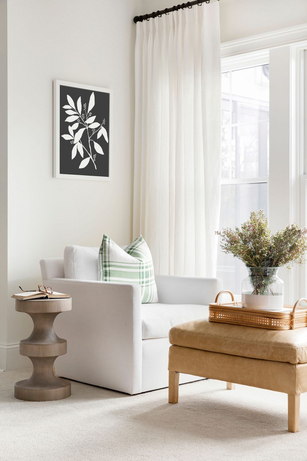
Could you tell me where I could purchase the black and white botanical prints in the Rochester Farmhouse? Thank you
Hi Christy, Of course! Here is the link: https://bit.ly/3a56vJZ :)
Love the green color bench seat, can you share the color? Thanks!
Thank you Emily! The green bench seat in the boys room is painted Vintage Vogue by Benjamin Moore.
Beautiful home! Is the exterior color also White Dove?
Yes, it is!
Can you tell me the color of your siding? We are looking to re-side our home. The top half of our home is siding and the bottom is brick that we plan on white washing. Any recommendations for colors or how to make them match? Your house is stunning!
Hi Ashlee, Thank you! The exterior of the home is painted White Dove by Benjamin Moore which is a white we use allllll the time. It goes so well with dark and light shades.
Did you use white dove for the exterior of the home as well?
Yes, the exterior is the same white!
Hi! Where are the kitchen counter stools from? Love them!
Hey Amy, those chairs were sold to-the-trade and were customized for this project!
What carpet was used in the boy room? It’s so pretty!
Hey Ashley, the carpet in that room is the Regina carpet in Taupe from Fibreworks!