Say hello to our latest project, where modern farmhouse roots meet European elegance and sophistication.
Built in 2020, our clients purchased this home as a blank slate and came to us with an eye for opportunity. The home itself has beautiful bones with large windows, an open, flowing floor plan and gorgeous high ceilings. However, the style of the home was a modern farmhouse which didn’t feel quite right for our clients who have a more sophisticated, European influenced taste. Being that the home was new construction, we didn’t do anything to alter the structure of the home, but instead, put a heavy focus on the details (such as window treatments, lighting and furnishings) to truly reinvent this home to make it their own. We’re always amazed how proper window treatments and lighting selections can truly transform a space and this project is a prime example of just that. Having been in the works for just shy of a year and a half, we are so excited to reveal this beautiful full-service project – let’s get started!
Dining Room
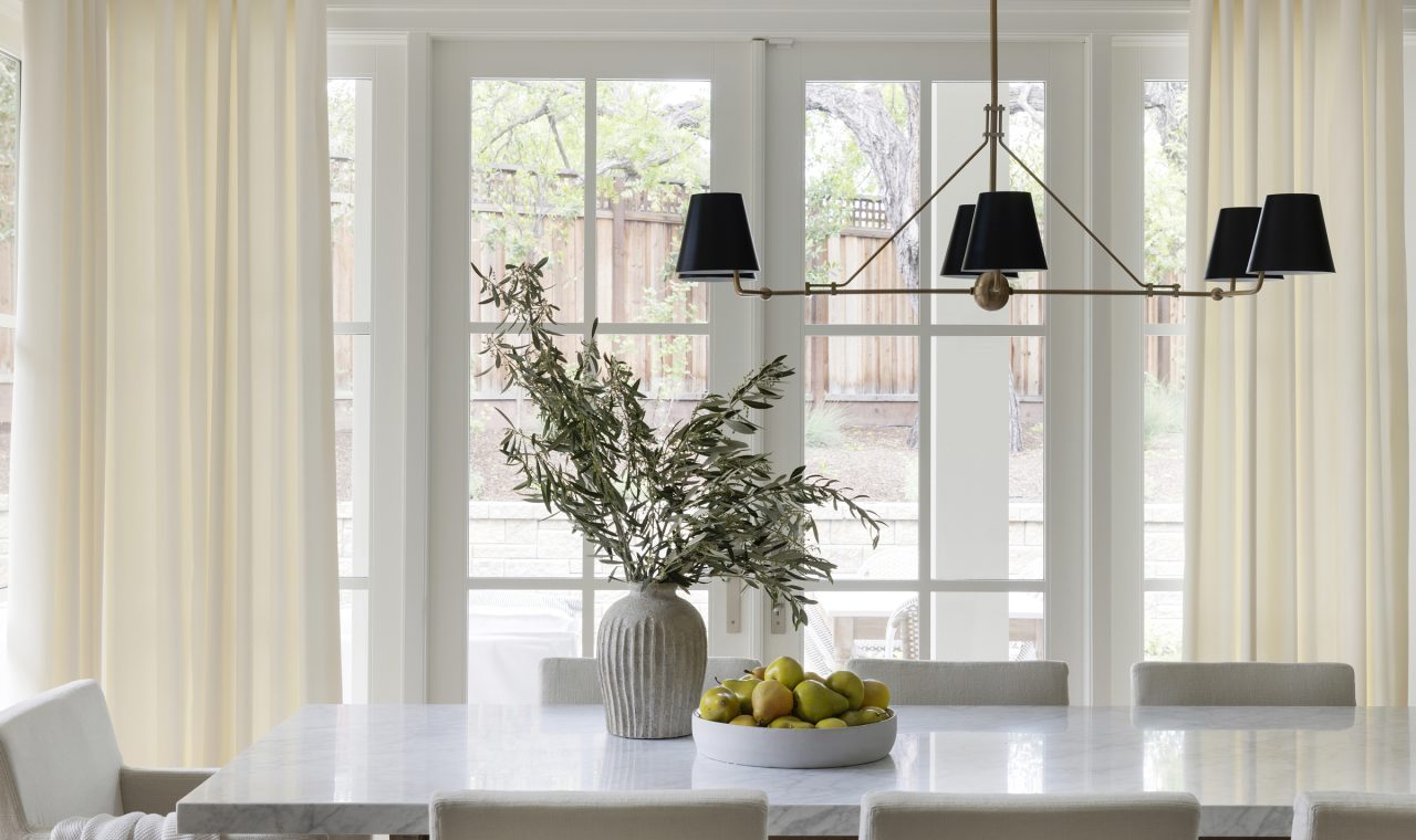
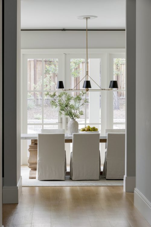
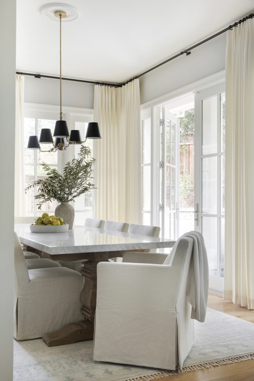
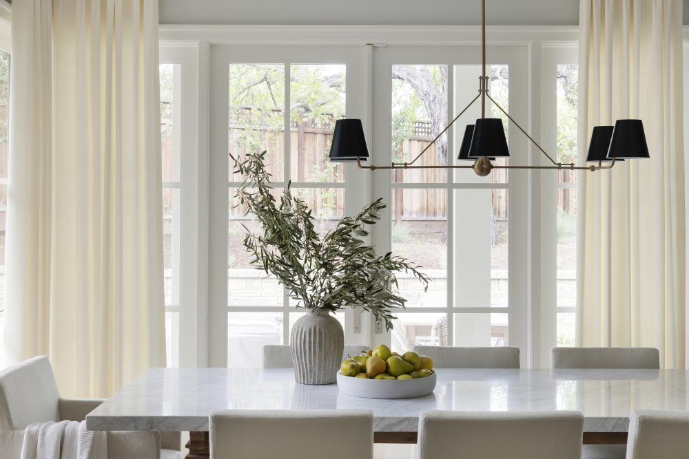
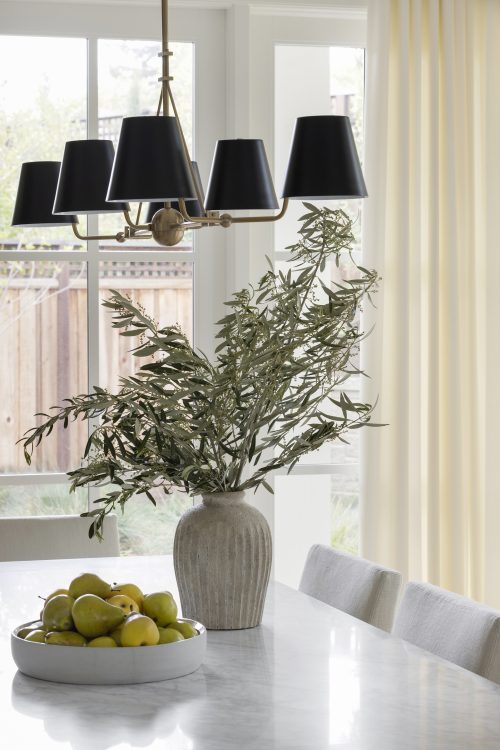
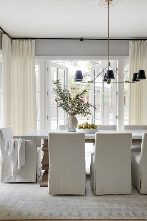
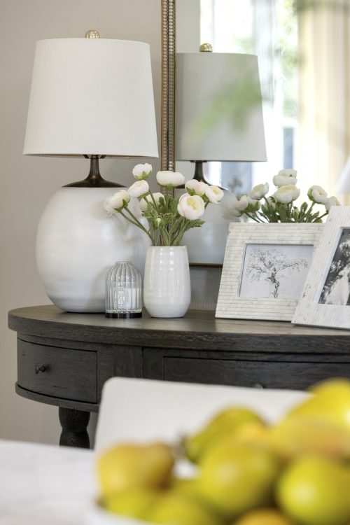
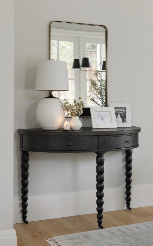
We’re starting things off in a space where this project really shines – the dining room. One of our favorite rooms, this space features all of the elements that made us fall in love with this home – french doors, large windows, soft window treatments and a classy chandelier. In this space you really get a taste of what our clients wanted to see in the home with the European influence brought in through a pretty, neutral palette, the french doors and the proper accessories finishing off the space with minimal detail and texture.
Kitchen
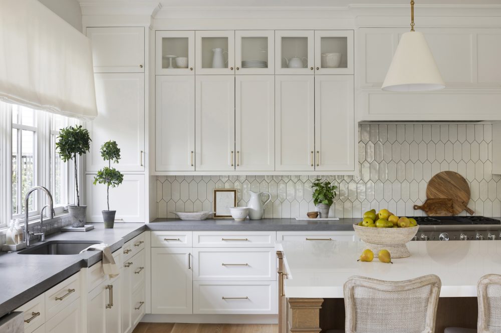
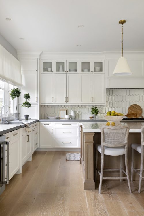
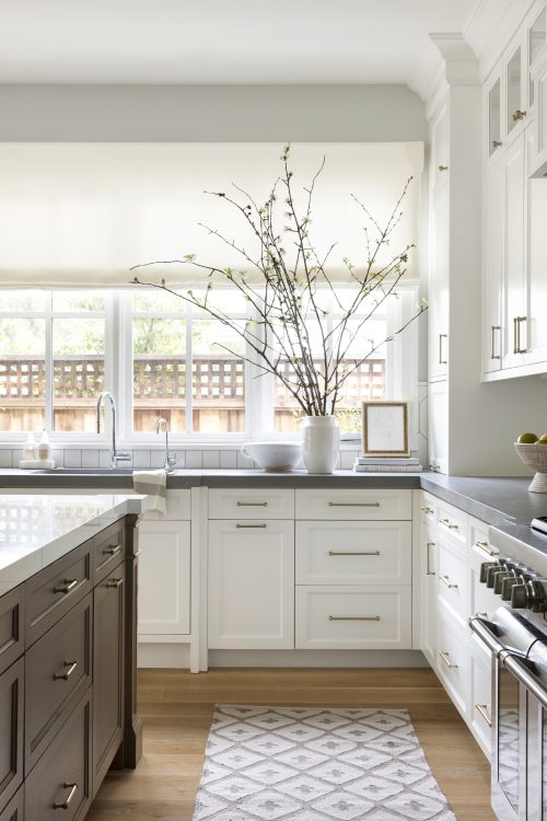
In the kitchen, you get a bit more of that farmhouse feel that ties back to the original roots of the home. Since we were primarily working on cosmetics for this project, we swapped out the light fixtures to add a more modern element to the room that ties into the rest of the home. In addition to the light fixtures, we selected these beautiful counter stools from Brooke & Lou to bring in some texture and subtle contrast against the island.
Family Room
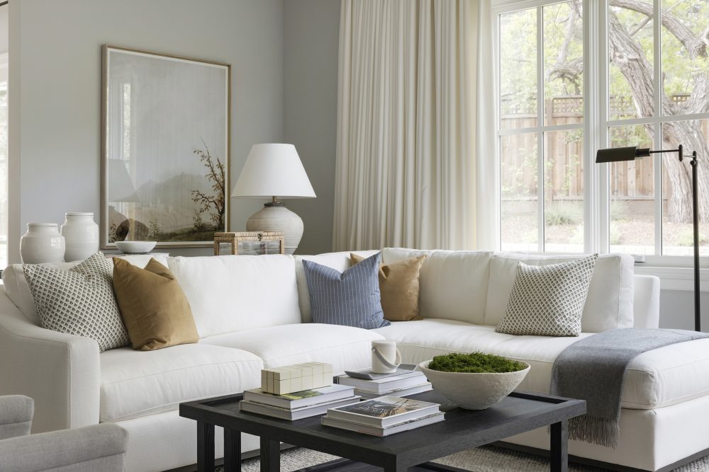
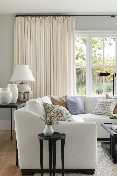
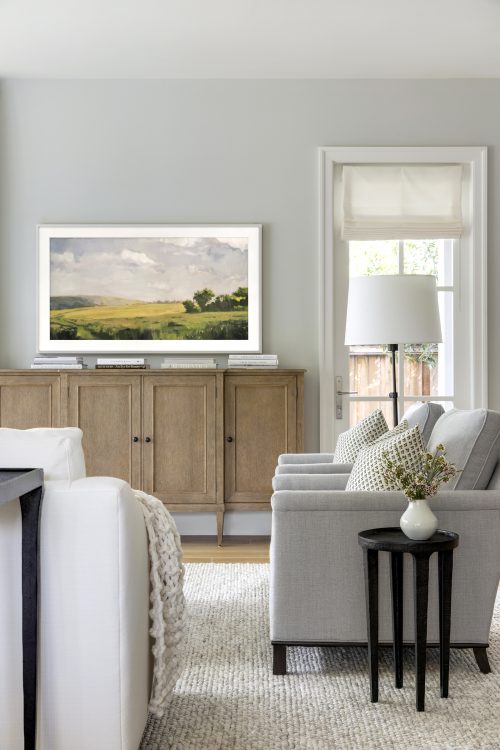
For the Family Room, we wanted to keep things slightly more casual to allow a space for our clients and their young family to kick back and relax. Sticking to the neutral palette of the home, we selected this comfortable white sectional in a durable and cleanable material to allow for a worry free piece that could grow with the family. As of lately, we’ve been adding Frame TV’s to almost all of our projects as we love how they can easily be switched out with various graphics to suit any space. Additionally, we carried over the window treatments from the dining room into this space and absolutely love how they add such a soft, elegant touch to the room without feeling too formal.
Living Room
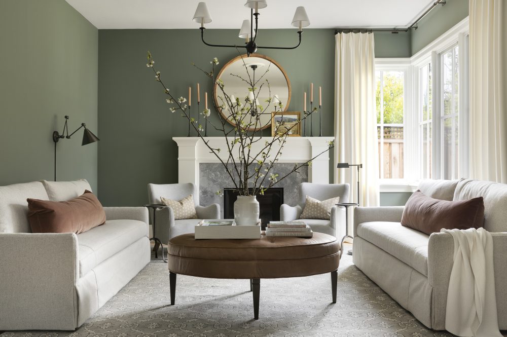
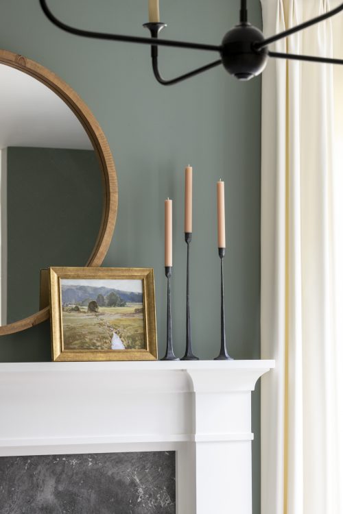
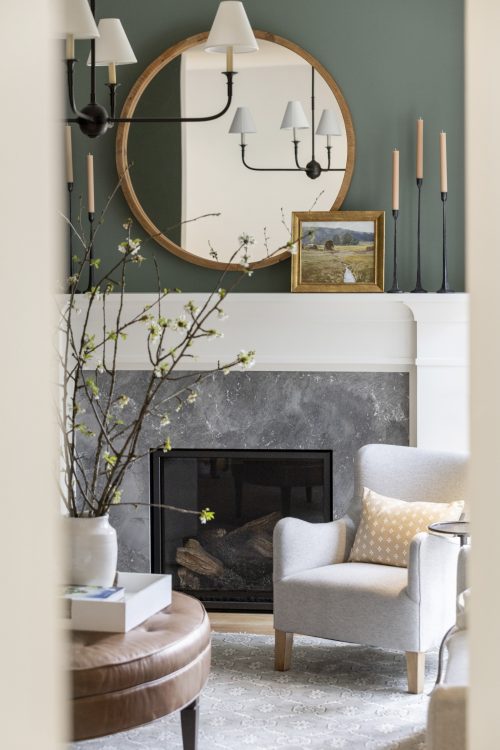
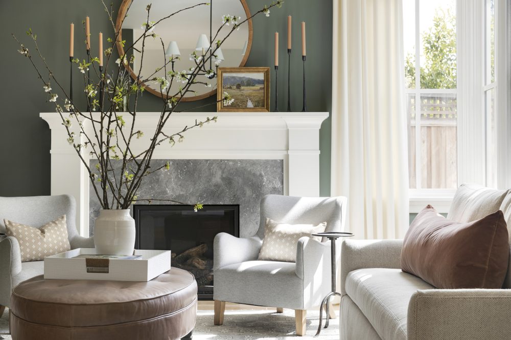
While the Family Room definitely has a more casual vibe, the vision for the Living Room was to create a moodier space with optimal seating for the clients to entertain. Here, we went with more structured furnishings and clean lines while still keeping comfort in mind. We didn’t do much painting in this project, however, we did select this rich green hue by Farrow & Ball for this space as it instantly transformed the room into a moody lounge-like atmosphere that our clients desired without departing too far from the rest of the home’s style.
Primary Bedroom
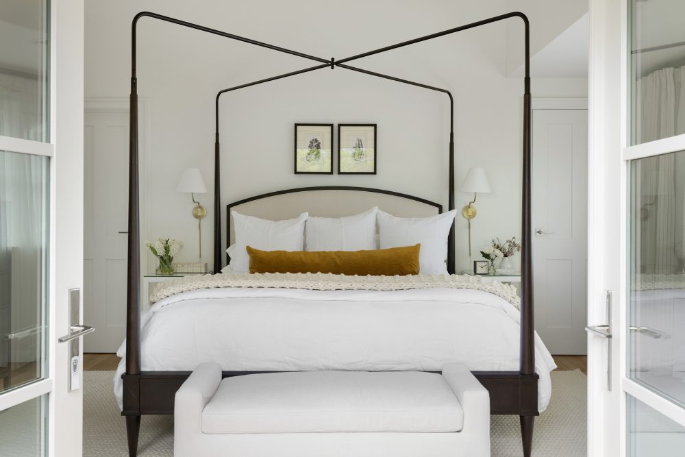
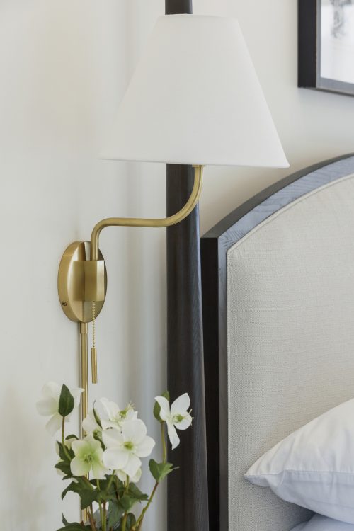
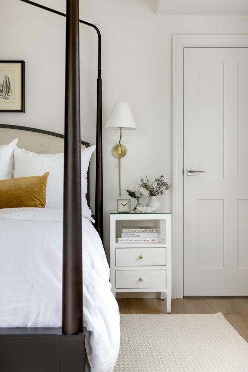
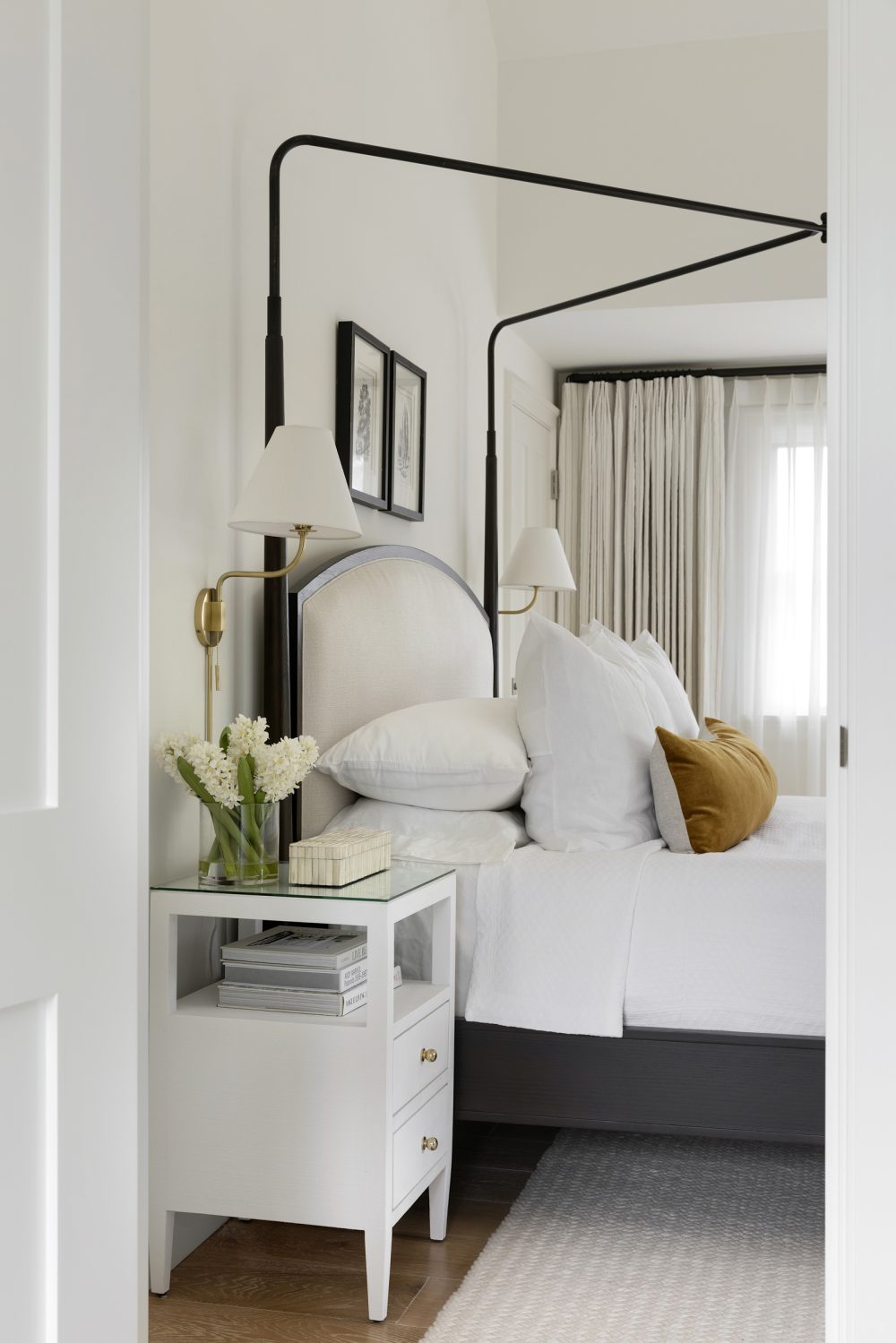
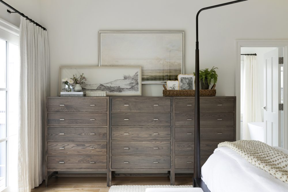
The goal for the Primary Bedroom was to add contrast and give the room a luxurious appeal. To do so, we selected one of our favorite canopy bed frames as we love how the metal frame instantly adds an element of contrast up against the neutral walls. As with the rest of the home, we added custom window treatments to this room as well to add a luxurious feel. Because we weren’t working with a ton of space in this room, we opted for bedside sconces to pair with the smaller nightstands for optimal tabletop space.
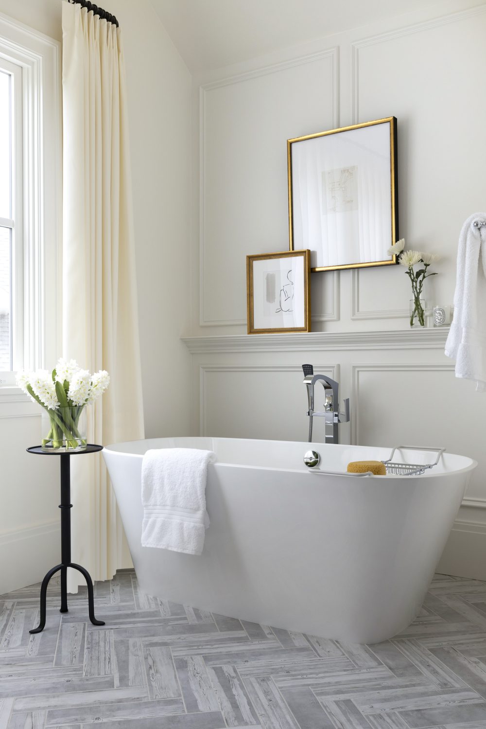
Attached to the bedroom space is the Primary Bathroom where we carried in that luxurious feel by adding custom paneling to the back wall to add some texture and interest to the room.
Nursery
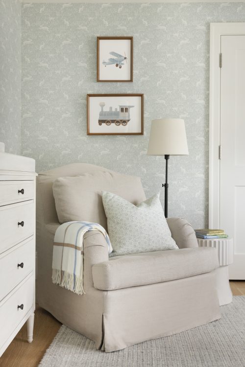
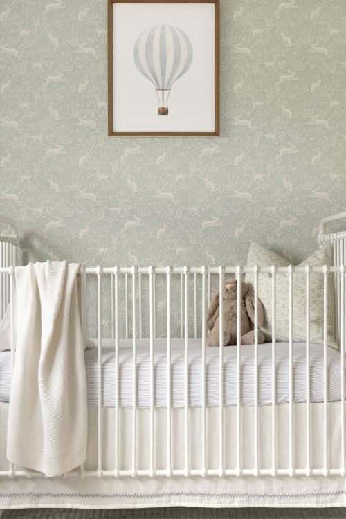
We have a special place in our hearts for nursery design – how could you not?! We’re always a fan of wallpaper and nursery’s are the perfect place to have some fun and go for a whimsical print such as this darling bunny print. As with the rest of the home, we kept things rather neutral in this space allowing the wallpaper to be the statement and selected furnishings in pretty creams and whites for flexibility if needed for future use.
Loft
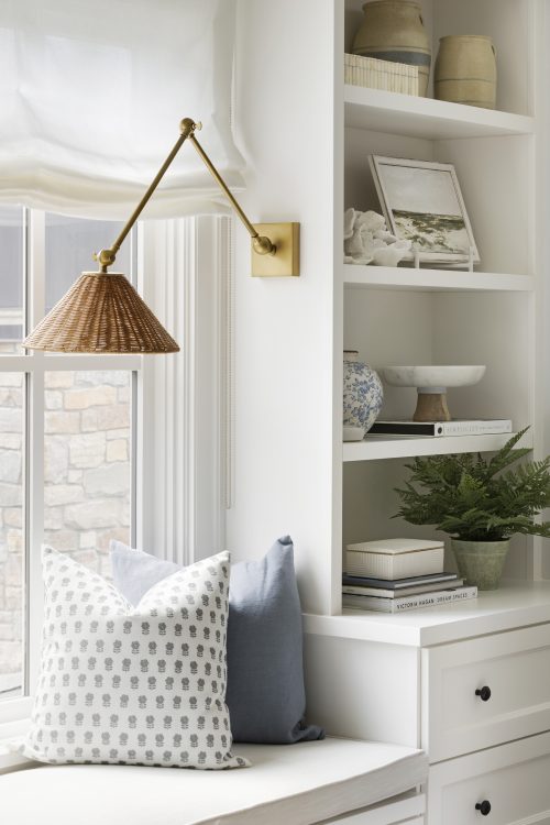
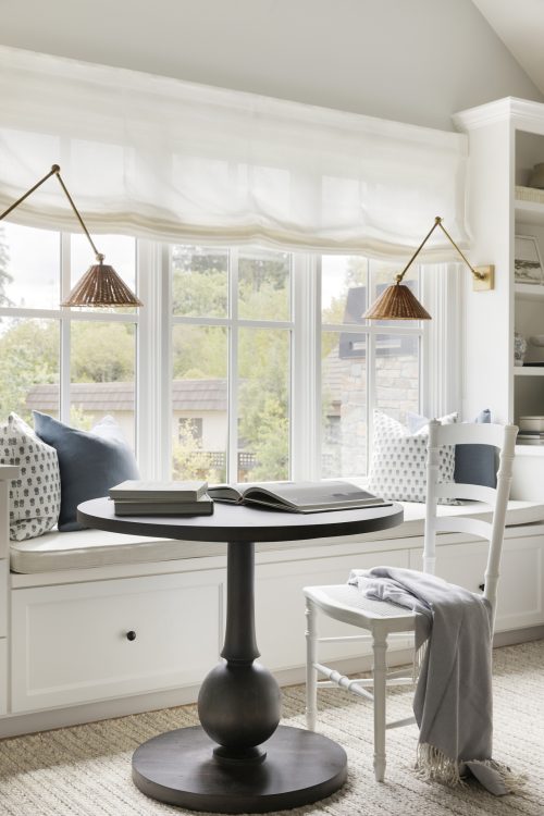
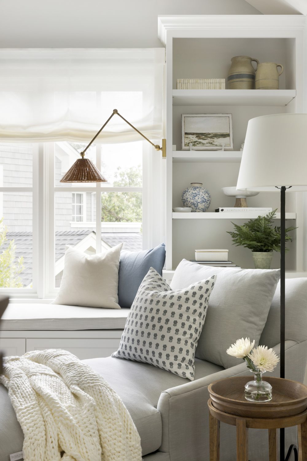
Between the upper bedrooms sits this cozy loft area. Here, we added custom built-ins to allow for more storage and stying options – hello, pretty bookshelves! Additionally, we added a window seat with these adjustable rattan sconces for a cozy little reading nook.
His Office
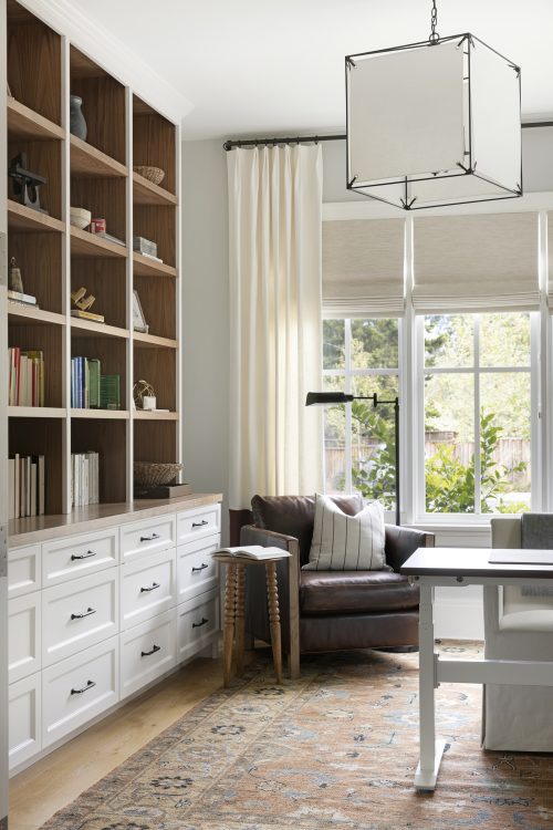
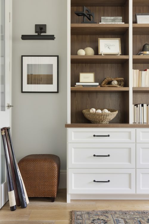
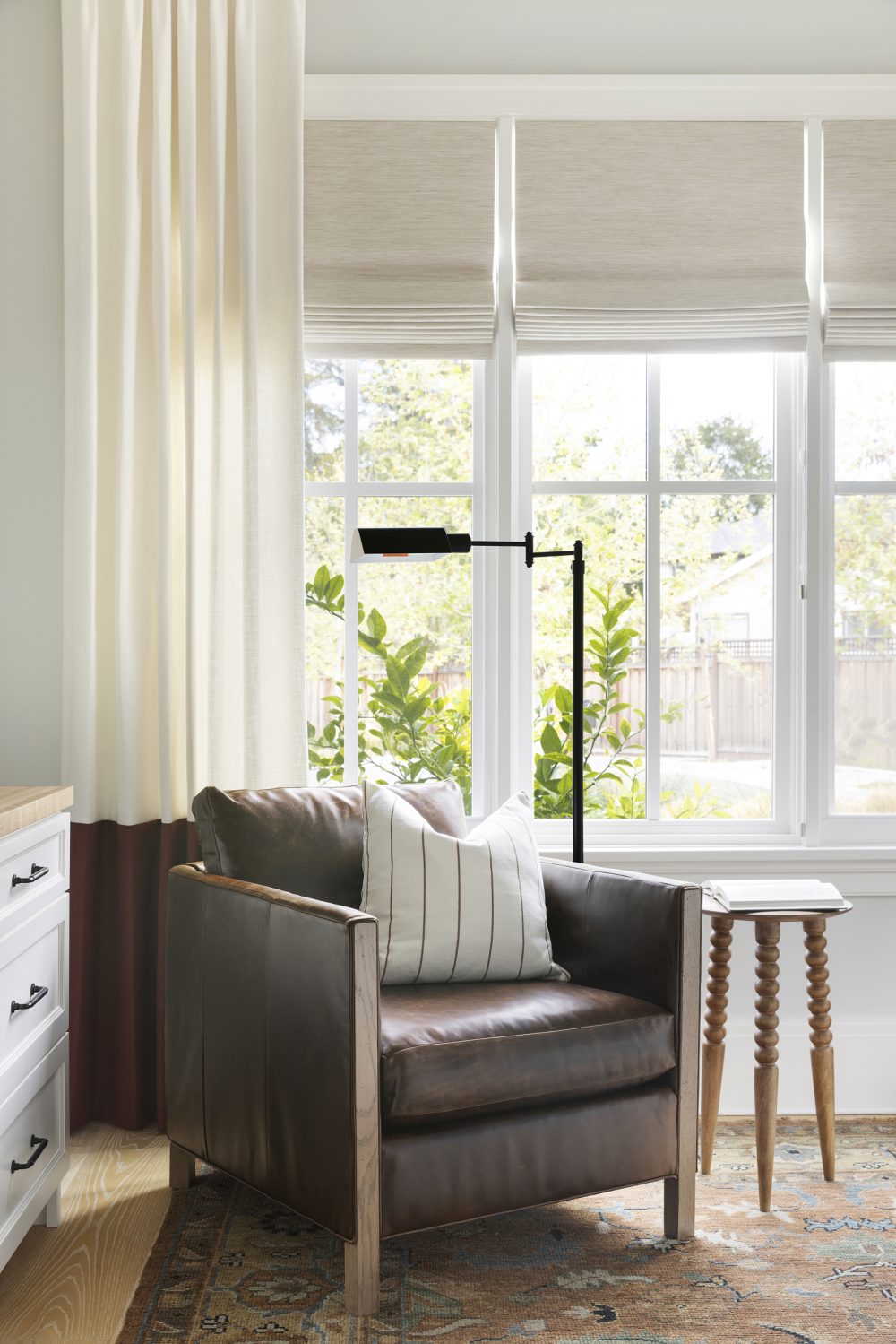
With working from home being the new norm, this home has two office spaces – one for him, and one for her. In this first office space, we wanted to keep things more masculine and stuck to a warmer color palette with touches of burgundy, leather and various neutral hues. This was another space where we added custom built-in shelving and cabinetry for optimal storage. For the window treatments, we added an element of contrast to the bottom half to tie back to the more masculine color palette carried throughout the room.
Her Office
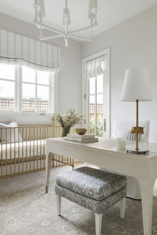
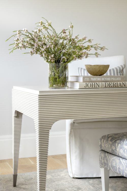
In the second office, a.k.a Her Office, we kept things light & airy with a soft palette and delicate details. Here we went with a roman shade style window treatment for functionality with the crib, desk and back door being all in one place.
Guest Bedrooms
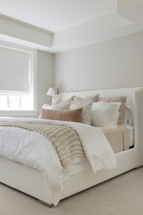
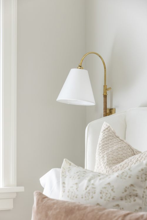
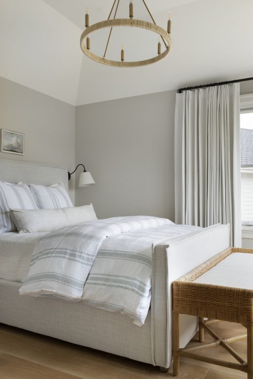
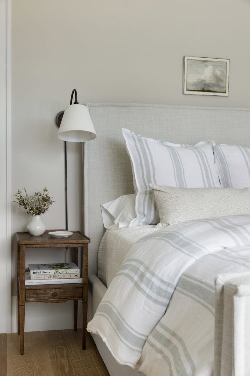
Comfort is always top of mind when it comes to designing guest spaces and these two guest bedrooms feature just that. Because we were working with smaller spaces, we selected smaller nightstands and incorporated bedside sconces instead of table lamps to maximize space as much as possible. We always aim to make guest bedrooms as calming and welcoming as possible so comfortable, luxurious bedding is also a must.
And there you have it – our Redwood City Project Reveal! If there is one thing you take away from this project it is the value of investing in window treatments and statement lighting. We say it all the time, but sometimes you need to see it to believe it and this home is a prime example that you don’t always have to start tearing down walls to transform your home and make it your own.
Ready to start a project of your own? Click on the button below to start designing the home of your dreams with our team!
Shop the Project
A note from Bria Hammel Interiors: Below are the disclosed sources for our Redwood City Project! While we understand that our readers love to shop/know the details of our projects please know that not all sources will be shared. To honor and respect our relationships with our clients, items that are custom, one-of-a-kind, or to the trade only will not be revealed. Retail items and/or similar options will be linked above. Thank you for following along!
Kitchen: Counter Stools | Pendant | Woven Bowl
Dining Room: Dining Chairs | Dining Table – to the trade | Window Treatments – custom made | Chandelier | Rug | Console Table | Lamp | Mirror
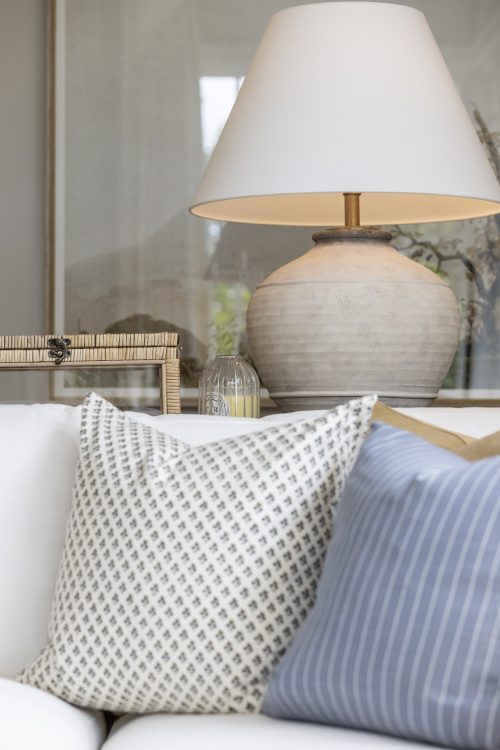
Family Room: Couch – to the trade, similar option here | Chairs – to the trade | Rug | Artwork | Floral Pillow | Camel Pillow – custom made | Coffee Table | Lamp | Side Table | TV Console – to the trade | Window Treatments – custom made | Metal Console Table
Living Room: Round Mirror | Rug | Accent Chair – to the trade | Ottoman | Side Table | Floor Lamp | Chandelier | Sofa – to the trade | Paint Color: Farrow & Ball Green Smoke No. 47
Primary Bedroom: Bedframe | Bedding | Bench | Rug | Nightstand | Sconce
Primary Bathroom: Side Table
Nursery: Accent Chair – to the trade | Crib | Wallpaper | Vintage Plane Print | Hot Air Balloon Print | Floor Lamp – to the trade | Rug – to the trade
His Office: Picture Light – to the trade | Accent Chair – to the trade | Side Table | Rug – to the trade, similar option here | Floor Lamp – to the trade | Woven Cube |
Her Office: Desk | Lamp | Crib | Rug | Chandelier – to the trade
Loft: Woven Sconce | Floral Pillow | Chaise Lounge | White Chair | Round Table – to the trade | Rug
Guest Bedroom #1: Bedframe | Quilt | Sconce | Mirror | Floral Pillow
Guest Bedroom #2: Bedframe | Stripe Duvet | Nightstand – to the trade | Sconce | Chandelier | Bench




Comments