From dark and dated to bright and functional, this charming traditional home was brought back to life with an updated floor plan, statement lighting and pops of contrast.
There’s nothing we love more than seeing a project come to life throughout the design process. What’s even better, is when we can look back at the before images and see the transformation. Today, we’re sharing one of our latest renovation projects that completely transformed the main level of our clients home to bring more functionality, light & warmth to their spaces. The result couldn’t be more beautiful (so much so that we shot Brooke & Lou’s fall collection here!) and we can’t wait to walk you through this project reveal.
The Kitchen
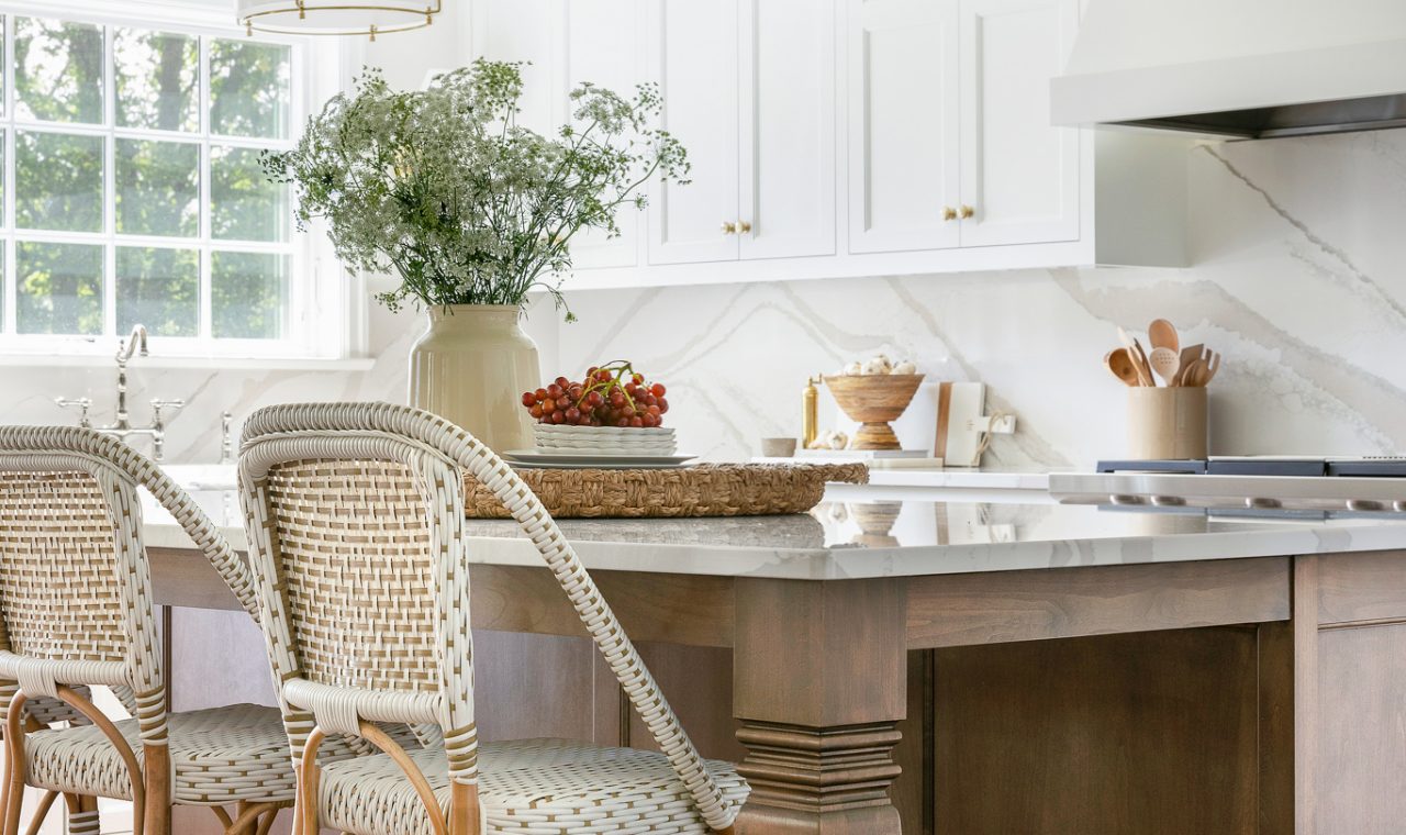
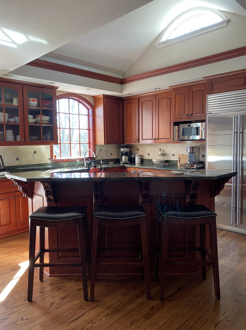
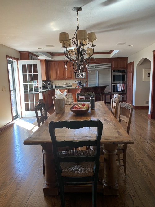
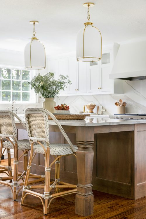
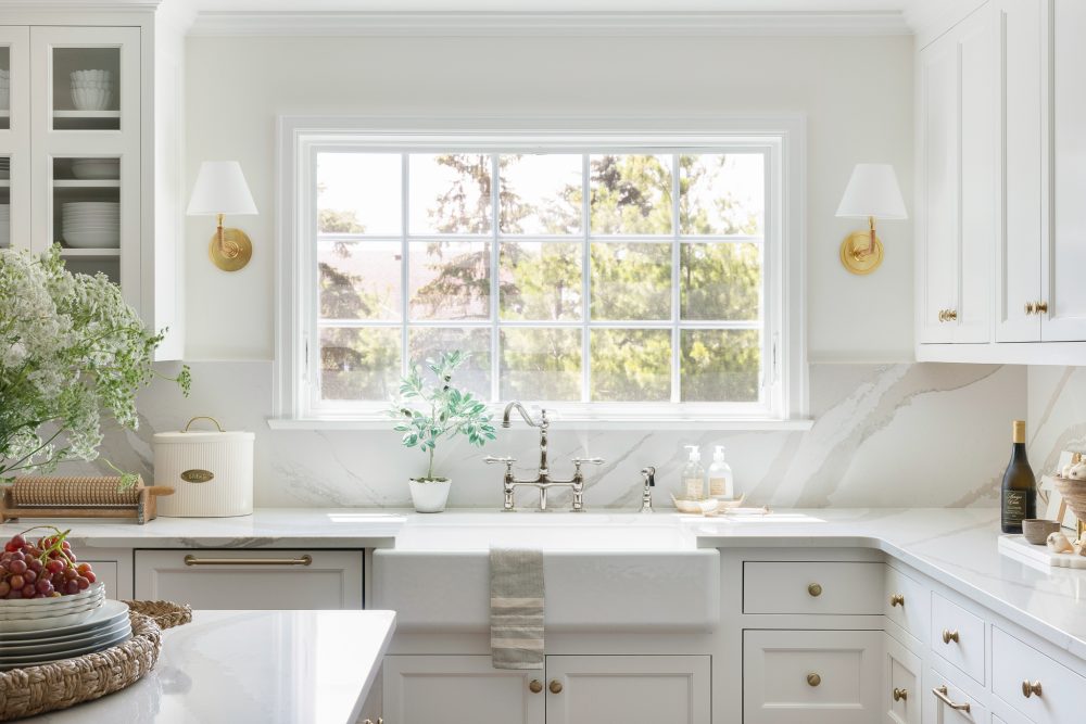
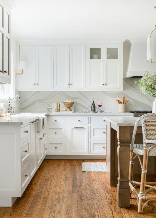
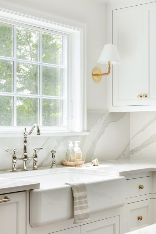
Let’s start in the kitchen – where the biggest transformation took place. As you can see from the before images, the original layout was quite small and didn’t make the best use out of the space available. Our clients no longer have kids around the house, so there wasn’t much need for the desk area. That said, we redesigned the kitchen to feature a large, beautiful island which we centered with the range to create a focal point. Additionally, we made use of the old desk area by incorporating a butlers pantry and moving the appliances, such as the ovens and Thermador fridge, to this side of the room resulting in a gorgeous open floor plan.
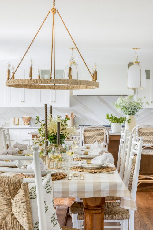
Our clients wanted to make sure that the space didn’t feel too white, therefor, we incorporated a stained island to add some contrast against the white cabinetry. Additionally, we selected Brooke & Lou light fixtures with brass accents and woven details to further add warmth and texture to the space.
The Butlers Pantry
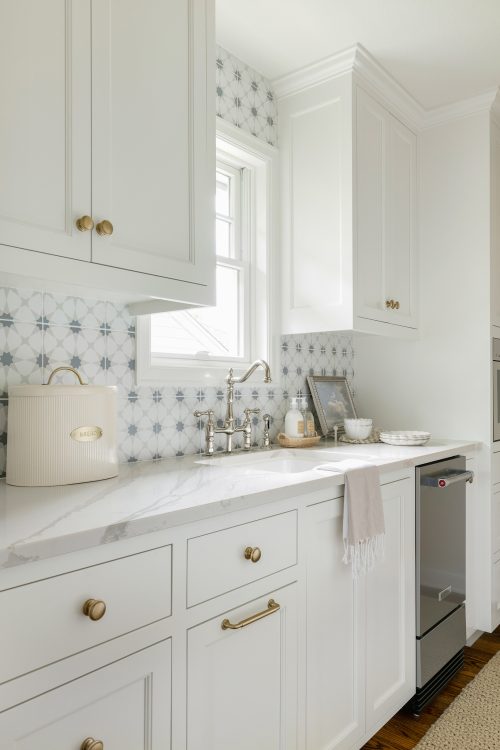
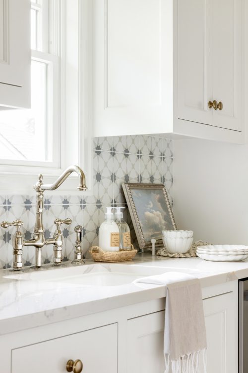
The butlers pantry was a new addition to the kitchen space that we brought in during the renovation. The original kitchen had a very small pantry and a massive laundry room that happened to be right next to each other in the original floor plan. To make the most out of the space, we took some of the space away from the laundry room so that we could add in the butlers pantry – creating a functional space for additional storage, an ice maker and other small appliances.
The Mudroom, Powder Bath & Laundry
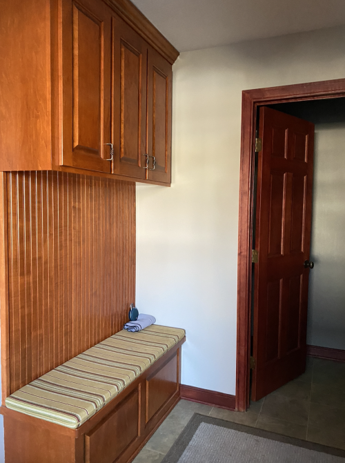
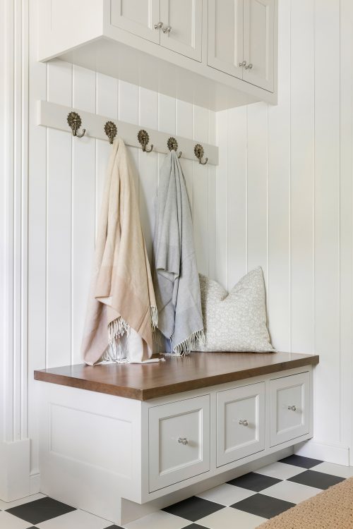
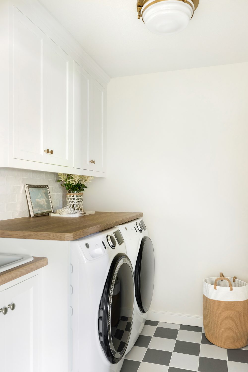
Right off of the kitchen sits the laundry room, mudroom & powder bath. Much like the kitchen, these spaces were also quite dated and featured the same dark cabinetry. To brighten things up, we started by painting the cabinetry white and tied in a fun checkerboard tile design to add contrast to these spaces. Most of the time when you see checkerboard flooring the tiles are marble, however in this case, we went with a porcelain tile from the Tile Shop as porcelain is more durable than marble – making it a great option for high traffic areas, such as a mudroom.
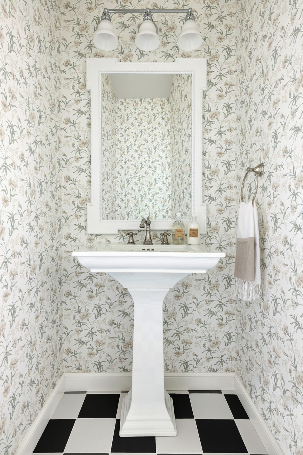
Over in the mudroom & powder bath, we added some floral accents – such as the wallpaper and floral hooks – to add a subtle touch of pretty, feminine details without being too over the top. As for the floral wallpaper in the powder bath, we typically choose an all over print like this when doing checkerboard floors as it’s important to ensure there is no direction to the print so that it does not clash with the flooring
It always amazes us how much a little can go a long way in terms of design – things as simple as painting cabinetry, adding fresh lighting or incorporating a fun element like wallpaper or tile, can truly transform a space and this renovation is an example of just that.
Is your home in need of a refresh? Click on the button below to learn more about our renovation services & more!
Shop the Project
A note from Bria Hammel Interiors: Below are the disclosed sources for our Nature View Project! While we understand that our readers love to shop/know the details of our projects please know that not all sources will be shared. To honor and respect our relationships with our clients, items that are custom, one-of-a-kind, or to the trade only will not be revealed. Retail items and/or similar options will be linked above. Thank you for following along!
Kitchen: Counter Stools | Pendant Lights | Sconces | Woven Tray | Cream Vase
Dining Space: Dining Chairs | Gingham Table Cloth | Chandelier
Butlers Pantry: Scalloped Bowls | Scalloped Plates | In the Clouds Art | Hand Lotion | Rattan Tray | Bread Box
Mudroom: Camel Throw Blanket | Grey Throw Blanket | Floral Pillow | Floral Hooks




Comments
This came quite beautiful. It appears it was a much-needed upgrade.
[…] Bria Hammel is working her magic again, and I’m in love. […]
[…] love the island in this kitchen remodel. I added it to my kitchen dreams […]
[…] This kitchen and butler’s pantry are amazing – gah – Bria Hammel is magic! […]