It feels like we’ve been waiting for this day for years! Today, we’re so excited to share with you a project we’ve been holding in our back pockets for quite some time so it could make its grand debut on MyDomaine first! We worked with Alyssa Rosenheck to capture the essence of this home, and we couldn’t be happier with how it turned out! Our Scottsdale project has been our baby for the last two years! Since it was a vacation home for previous clients, and they wouldn’t be living here full time, we were really allowed to push the envelope on creativity here. Dream clients? They define it!
The Exterior
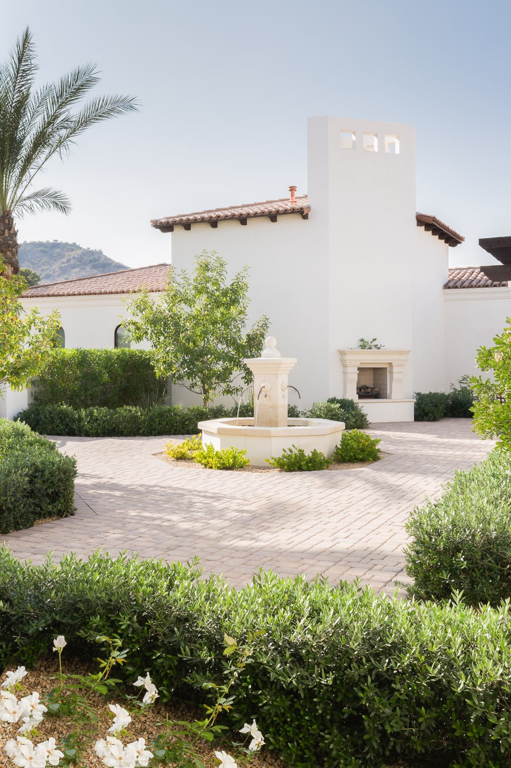
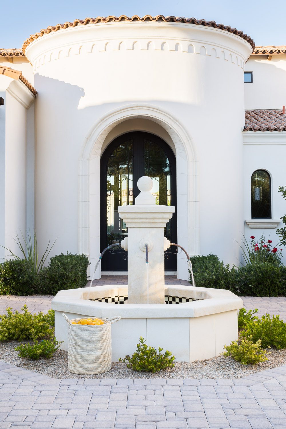
The exterior of the house set the tone for the whole project. With it’s fresh white stucco material and Spanish Mediterranean influence, we wanted to capture the way we felt when approaching the entrance of the home, and sprinkle it throughout the interior. Feelings of being welcomed, comfortable, and at ease.
The Foyer
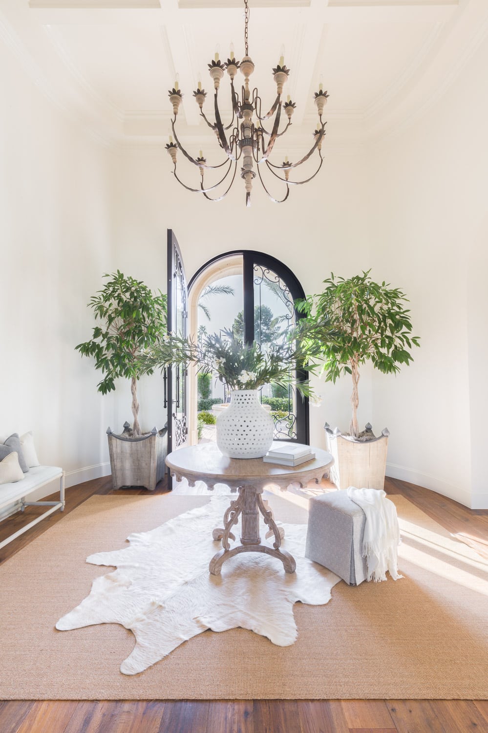
The architectural details of this home truly spoke for itself. So, in the foyer we kept things simple, embraced the scale of the room and added lots of greenery to bring the outdoors in. We knew the instant we would be doing a project in Scottsdale that we needed to incorporate olive trees in the project! Might be one of the worst things about living in Minnesota…the lack of beautiful greenery throughout the entire year! Using two oversized olive trees on either side of the arched metal doors are the the perfect welcome to this home. Using natural wood materials for the foyer table, planters, and chandelier were how we kept things feeling casual in a room that could easily be seen as grand and formal.
The Living Room
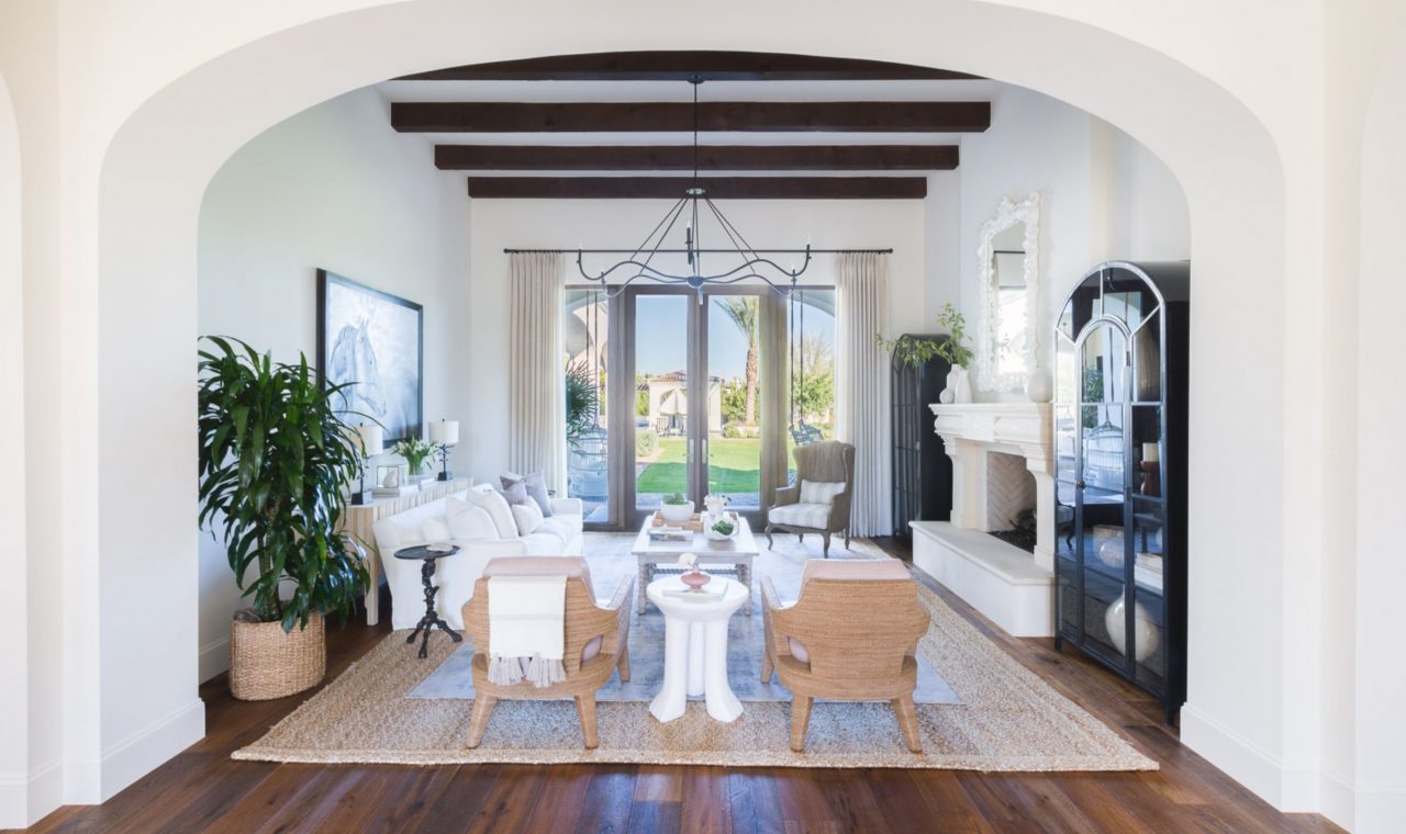
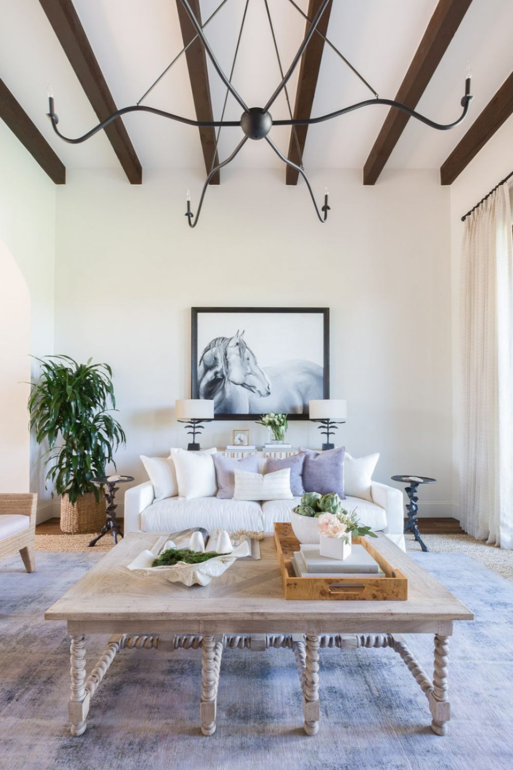
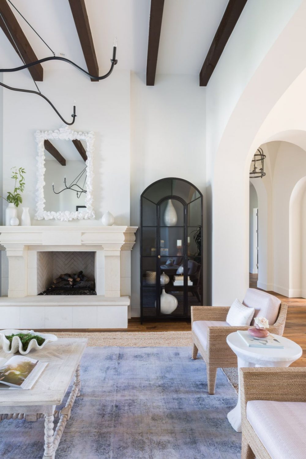
The living room is hands down one of our favorite rooms in the home. Right off of the foyer; the casual, organic inspired furniture, touch of lavender and use of texture make us drawn to this room every time we visit! The art was custom painted to pay tribute to our clients love of horses by one of our previous designers who helped assist on this project. We added bronze and black accents to incorporate contrast and tie in the dark stained ceiling beams. But do you want to know our favorite thing in this room? The mirror hanging over the fireplace! We never tire of this textural, resin piece! It truly is a sculpture piece for this room!
The Kitchen
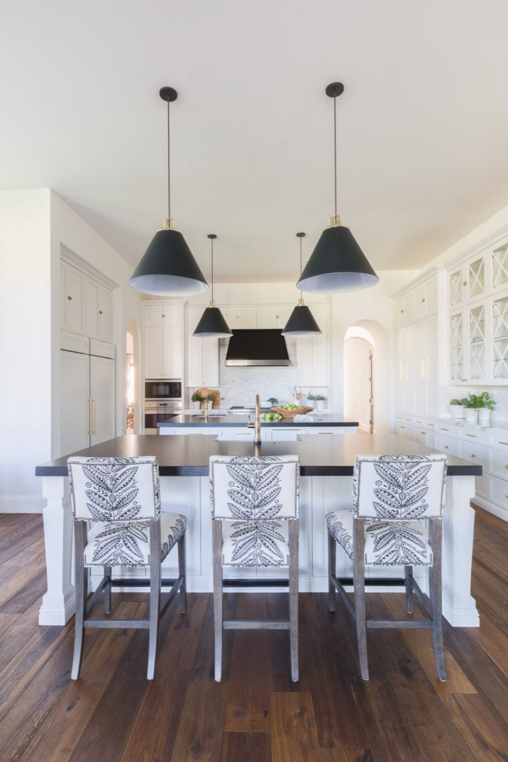
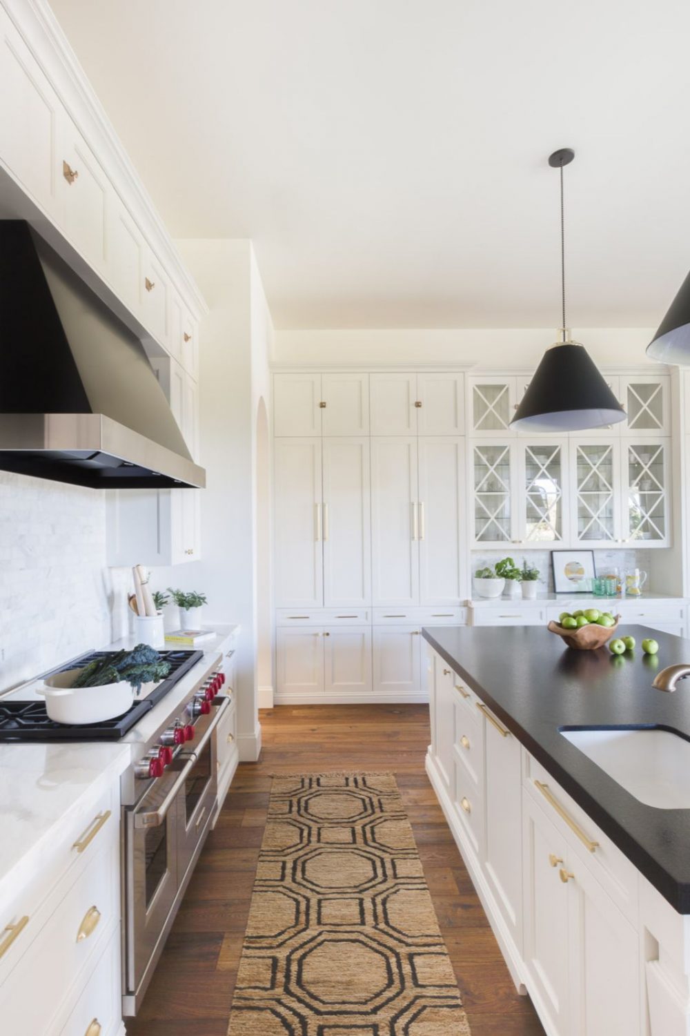
The kitchen had great bones to start with but it felt uber traditional compared to the rest of the house. We swapped out the pendants for a more modern option that provided contrast and tied in with the range hood. Changing the cabinet hardware and plumbing to brass brightened up the space and added warmth to an otherwise mostly white kitchen. We love using black honed granite for kitchen countertops…they’re durable, easy to maintain and keep a space feeling classic! Having double islands in a kitchen this size worked perfectly for the amount of entertaining these clients would do for their friends and families while on vacation. Finally, adding some pattern through the graphic runner and counter stools were the finishing touches this spaces needed!
The Kitchen Nook
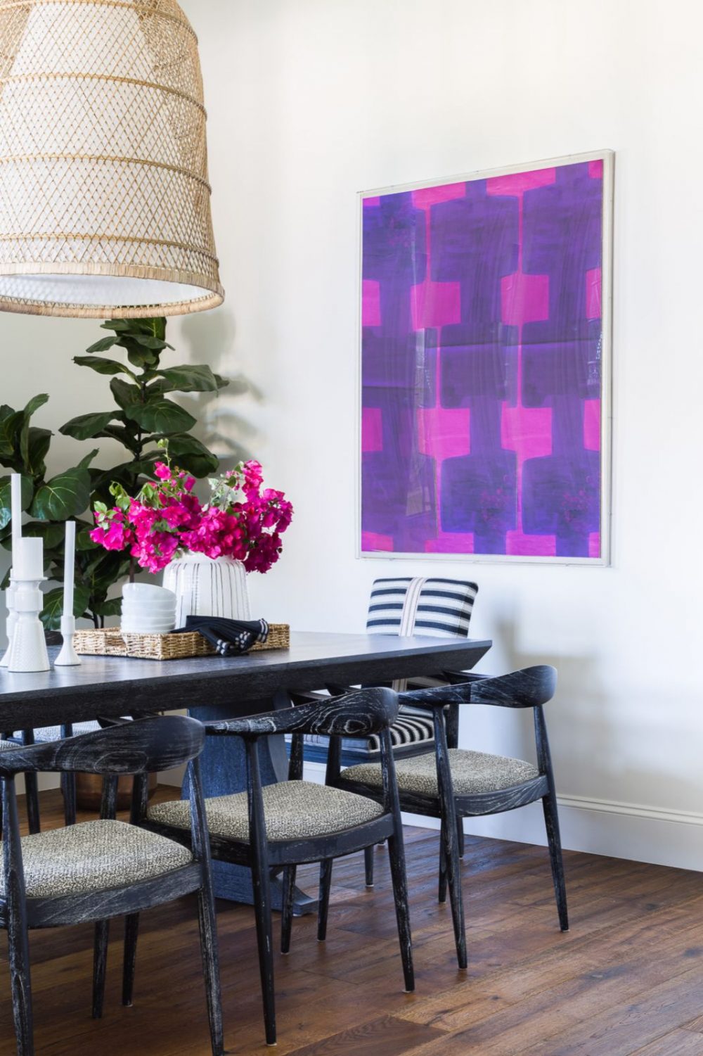
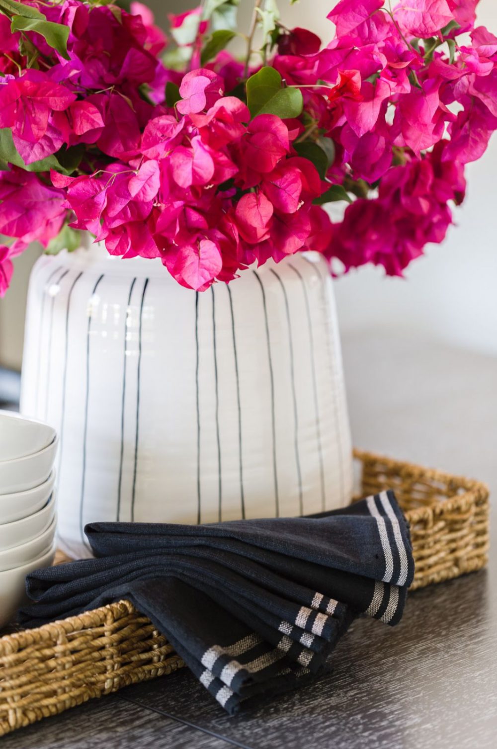
We had fun in this space by adding lots of material texture and color! We started with the graphic art framed in a modern acrylic box, which reminds us of all the hot pink azaleas we see on each visit to Scottsdale. The oversized rattan cone pendant added an ethnic touch to the nook, which just felt right in an Arizona home! We love the black cerused wood found on the modern wishbone chairs around the table.
Stay tuned for more reveals in the coming weeks of our Scottsdale Home! We have much more to share with you!
Photography by: Alyssa Rosenheck





Comments
Bria, this home is incredible. Your design is peaceful and brings in the southwest without cliche. Karen
Thank you Karen! That is exactly what we were going for <3
I’ve just finally run into ur work and love it! Can u share the color of the Spanish house on the Outside and inside?? Thank uuu