Today we’re revealing part II of our Scottsdale project! If you missed part I make sure to check it out here, or hop over to MyDomaine to see the full house feature!
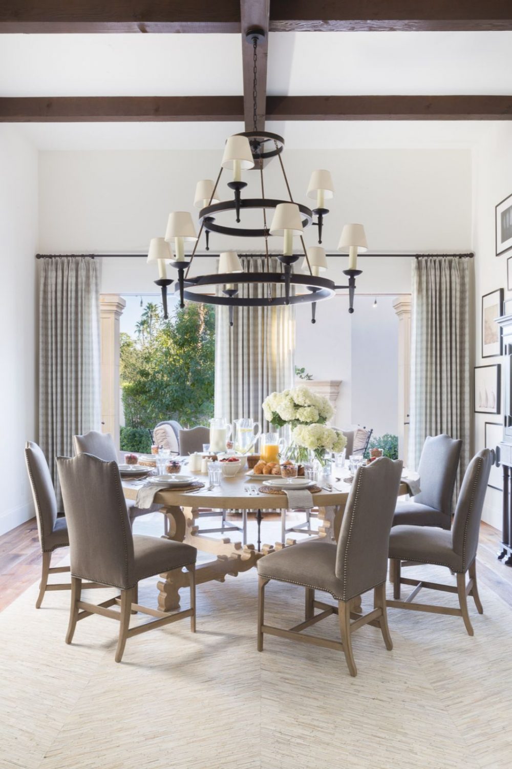
The Formal Dining Room
Even though this space is considered the formal dining room of the home, we put a major focus on making sure it still felt casual. After all, this is our clients vacation home, and we wanted to make sure it didn’t feel too fussy for all their guests! One of our favorite things about this room is that it has access to the front courtyard. Being able to open the double French doors every morning sounds like a brunch made in heaven!
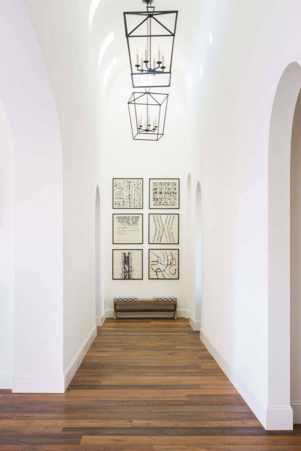
The Hall
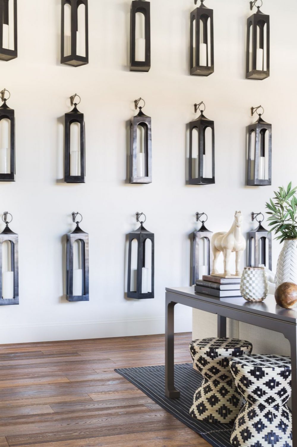
Beautiful and understated, the architecture in this hall truly speaks for itself. The arched, 18′ ceiling with sky lights allowed for the most beautiful lighting to enter this space. A simple bench, oversized lanterns and a custom gallery wall was all this hallway needed!
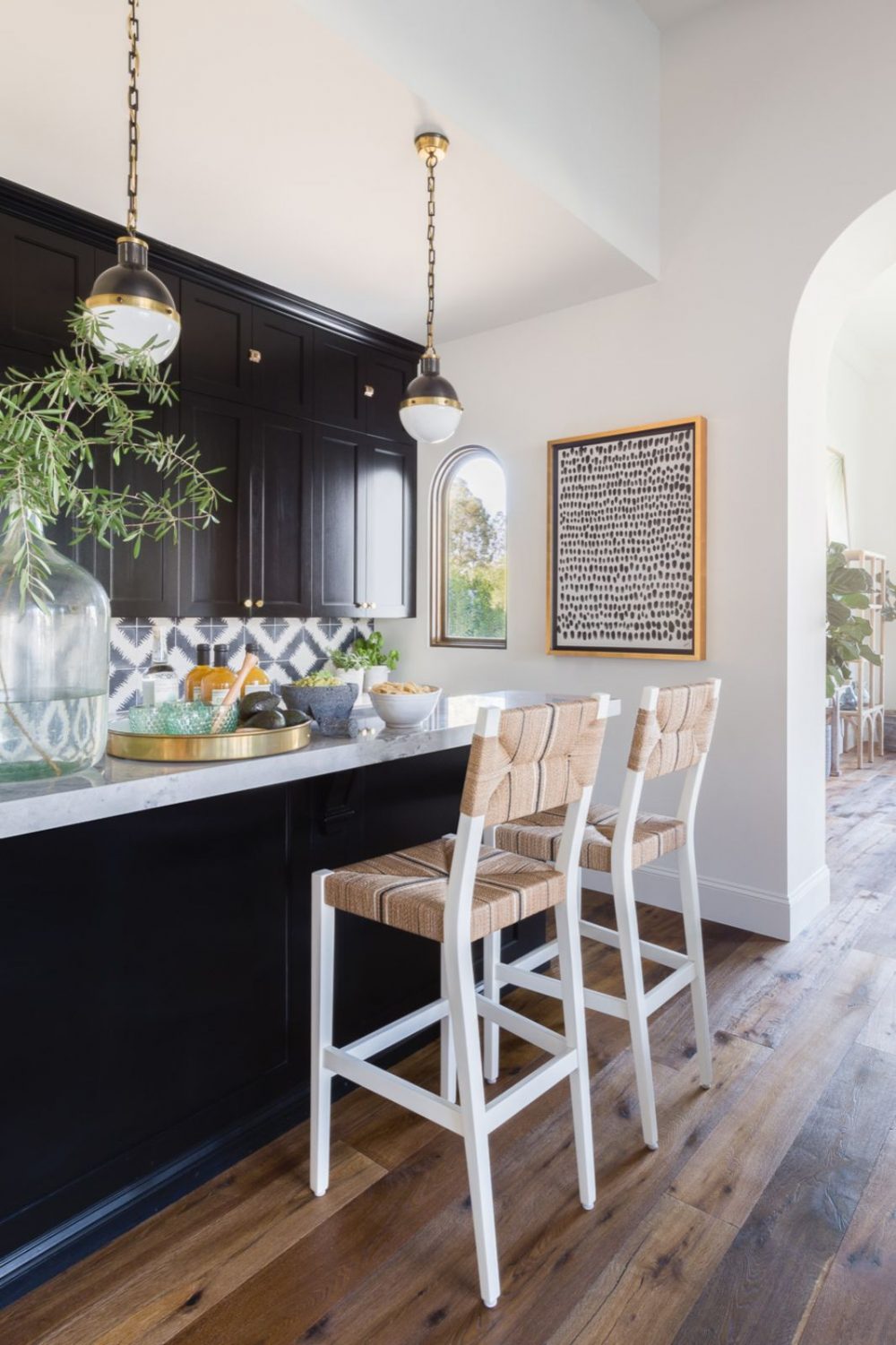
The Bar
The cabinets in this space were previously existing, so we focused on ways to add freshness to this otherwise dark nook off of the great room. Adding black and white patterned tile to the backsplash and changing the hardware and lighting to a bright brass did the trick! We incorporated pattern and organic texture through the bar barstools to add softness to the space! Now, it’s the perfect place for guests to gather when entertaining in the home!
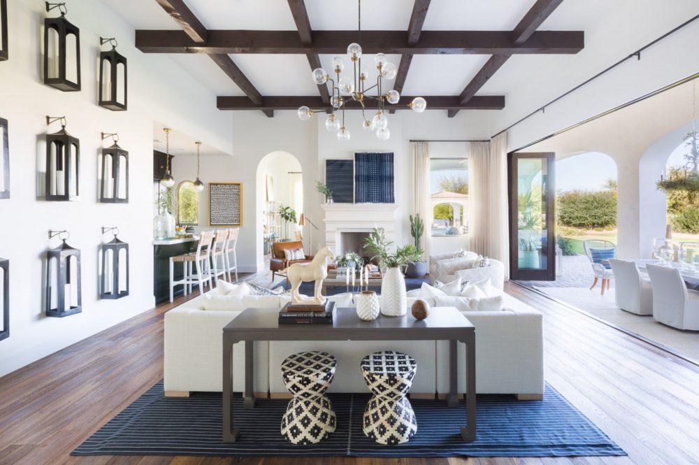
The Great Room
The great room is centrally located and gives access to the kitchen, bar and outdoor living areas. One of our favorite details in this room is the large, overstated wall installation of repetitive dark bronze lanterns…it truly acts as art in the space! Since this room features large bifold doors to open up to the outdoor dining space, we focused on bringing both natural and textural elements to this space to make the outdoors feel as one with the great room.
The Master Bedroom
Other than the dark wood beams in this room, we were able to work with a blank slate for the master bedroom. Dreamy, creamy whites and soft blues were our focus but adding a dark contrast in the steel nightstands, allowed us to tie in the dark beams. Our favorite feature are the double chaises with the most beautiful curved lines on them!
Make sure to come back again next week to see the final rooms for this project! We saved the best for last!
Photography by: Alyssa Rosenheck






Comments
Bria The place looks stunning. May I please know where are the hanging lanterns and blue prints above the mantel? Thanks.Nina