This past Summer we worked on a charming, American foursquare style home in Saint Paul and we are so excited to share the transformation of the kitchen and mudroom with you all today! This home is located in one of the most sought after neighborhoods in the city because of it’s historicalness, so it was important to us to not let that character slip away in the update.
One of the most challenging aspects of a renovation is making sure that the remodeled space feels as if it was always meant to be there and seamlessly blends in with the rest of the home. Our vision for this kitchen was to design a modernized version of what you would expect to see in this style of home and, we have to say, we love how it turned out!
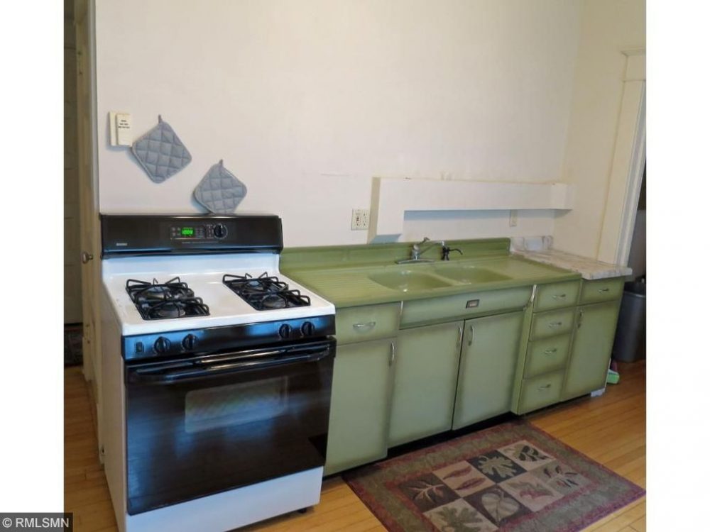
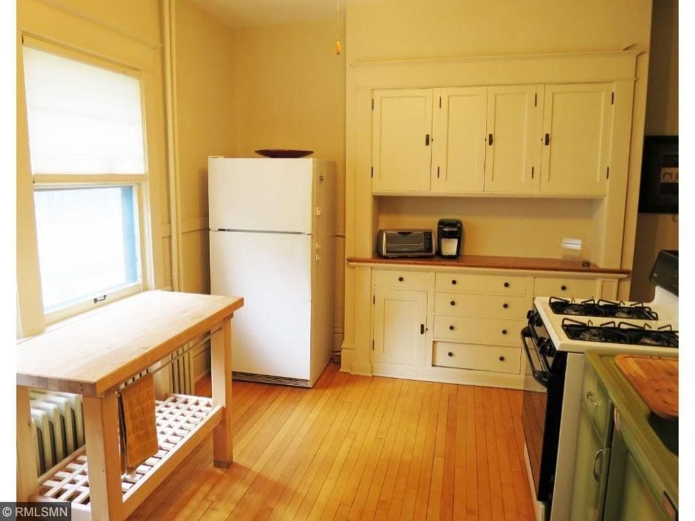
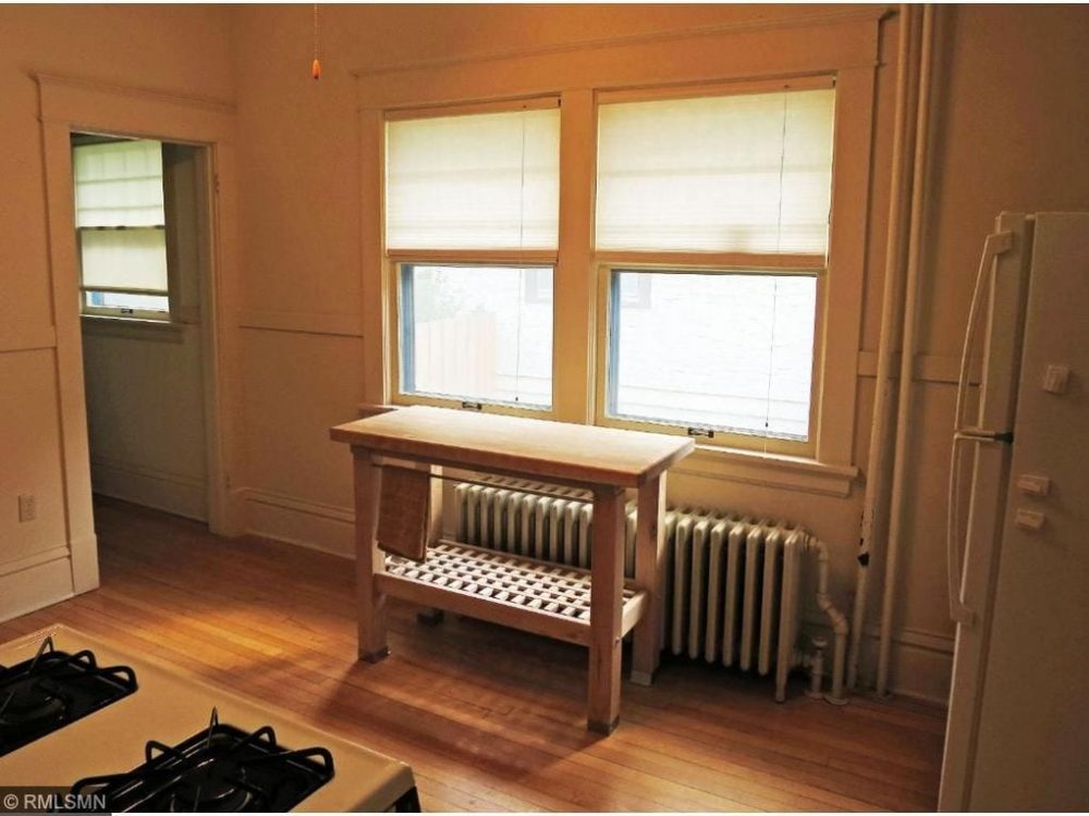
Before we dive into the all of the details of the new space, here are a few “before” photos…
Before
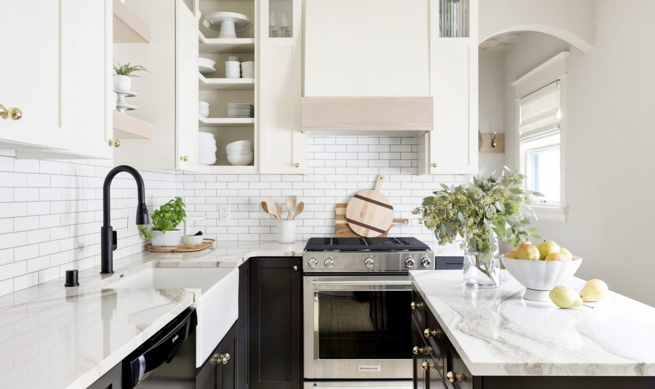
After
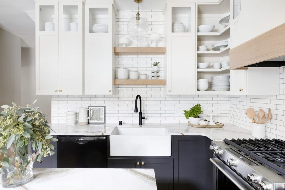
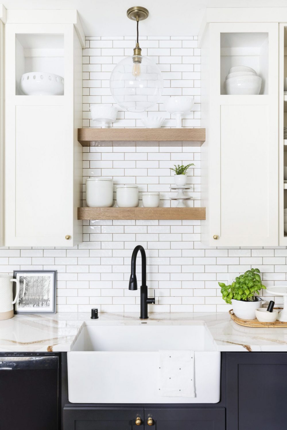
And… voila! A once drab, outdated space is now a dreamy, creamy, oasis! Before we began designing the kitchen, our clients let us know that they potentially want this home to become a rental property in the future. This made a huge impact on our design, as we knew that we needed to create a space that would appeal to a broad audience and remain timeless over the years.
We also played with mixing high and low finishes. For example, we chose simple, black cabinetry for the lower cabinets so that it would blend in with their existing dishwasher (instead of them having to buy a new one or paneling one), but chose to pair it with a stunning Cambria quartz countertop.
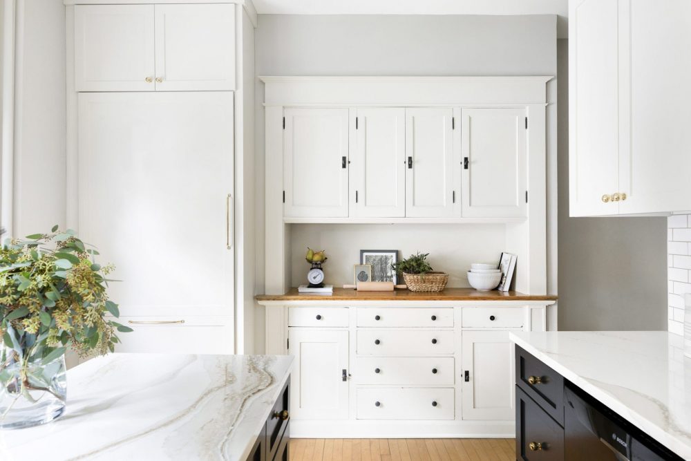
There were some aspects of the kitchen that we just had to keep, one of them being this amazing built-in hutch. With a little TLC and a fresh coat of paint, it really becomes a focal point in the space and a great use of storage for the homeowners!
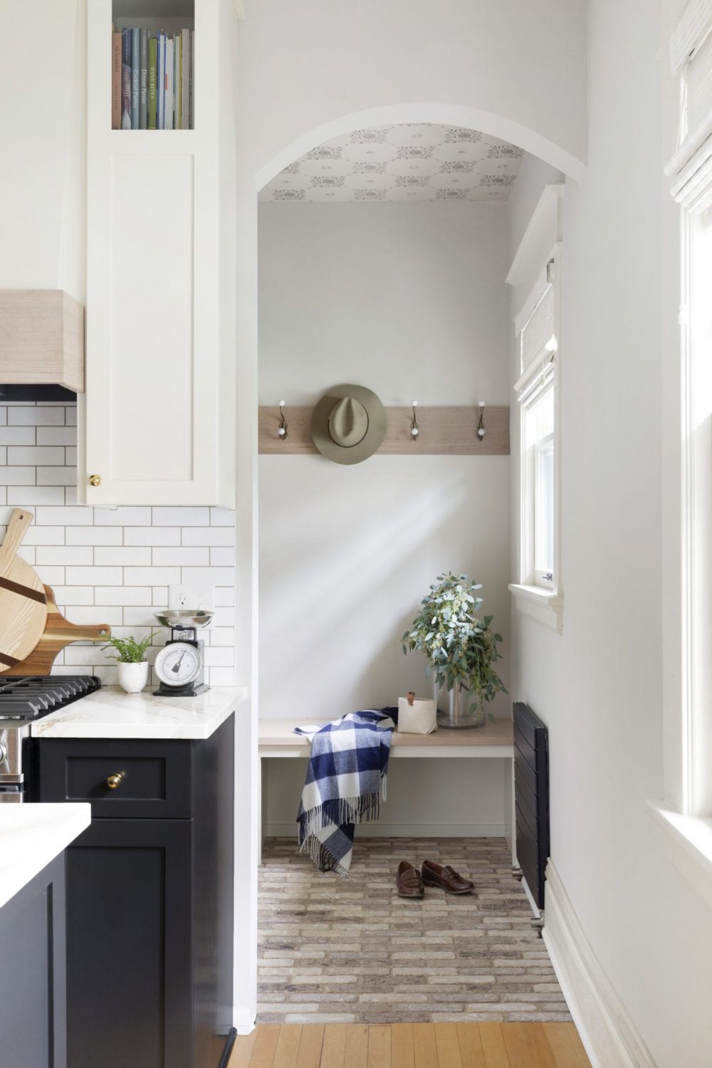
Right off the kitchen is the mudroom. We decided to break up the room from the kitchen and making it feel like a more separate space by installing brick flooring instead of just carrying the hardwood throughout. Brick is such a great option in a mudroom because, similar to tile, it’s highly durable that is not easily damaged by the rigors and dirt of a busy household. For this room specifically, it was the perfect choice because it looks almost original to the space as well!
To add a tiny bit of personality, we decided to wallpaper the ceiling. Did you catch that? It’s so subtly beautiful! We loved this detail and thought it added the the right amount of character and whimsy that we so often love to add to a mudroom.
We would love to know, have you ever taken on a renovation of your own? And, if so, would you do it again? Let us know in the comments below!
Photography by: Spacecrafting Photography





Comments
What a beautiful job! I really like how you respected the history of the space and gave it so much personality. Putting the wallpaper on the ceiling of the mudroom was brilliant. It nicely accents this hardworking space and the homeowners do not have to worry about it being damaged.
Thank you Stacy, it really was a wonderful project with amazing clients.
Really fantastic job!
Thank you so much!
I did catch the wallpaper on the ceiling, although I thought it might be tiled! I'm inspired by your vision, this space was dreary and you breathed beautiful life into it! The only renovation I have tackled has been to have dark cabinetry professionally refinished, (new stainless sink, trim work added to the peninsula, new under cabinet lighting) taking it from dark to bright white, ripped out the backsplash replacing it with white subway tile, and granite (all dated), and lowered the peninsula bar. It had cut the room off visually. I kept the granite flat, expanding the surface area, opening the view, chose very light white, granite, and added new hardware. It already had beautiful dark wide plank dark hardwood flooring which was a nice contrast to all of the white. Everyone thought I gutted the kitchen. Having the right contractors made the difference. Your kitchen renovation is outstanding. You have an incredible ability to maintain the character and at the same time provide the perks of today's conveniences!
Thanks Carol! Sounds like you worked on a fun project!
Such a beautiful kitchen! I love the black and white cabinentry and the layout looks super functional. We did our own kitchen renovation about 3 years ago right when we moved in and we still love it. We keept it pretty classic and clean with white cabinents and backsplash, and a pretty gray and white quartz. I would definitely do another one! Total worth a few months of pain to have a functional pretty space to use everyday.
We couldn't agree more. It might be a headache to go through but so worth the end result!
Well done! What have you done with the refrigerator? What kind is it?
What is the name of the Cambria quartz for the counters?
It's Brittanica Warm.
This is beautiful. I love the black and white. The quartz doesn’t look like the usual white and grayish colors. Could you please share what color you used? Thank you!
Yes! It's one of our new favorite colors from Cambria- Brittanica Warm.