Today we are so excited to continue the tour of our Marianna Cottage project! If you loved the before and afters in Part I, today’s might be even better. In this post, we’ll be sharing the master foyer, bedroom, main floor powder bathroom, and porch. Similar to the main living areas we revealed earlier, these spaces were taken from dark and outdated to bright, fresh, and serene. The transformations of these rooms (the master bedroom specifically!) completely blew us, and our clients, away. But, we’ll let you decide for yourself. Also, make sure you stick around until the very end to see our very first VIDEO! Alright, let’s get into it!
Master Foyer
Before
after
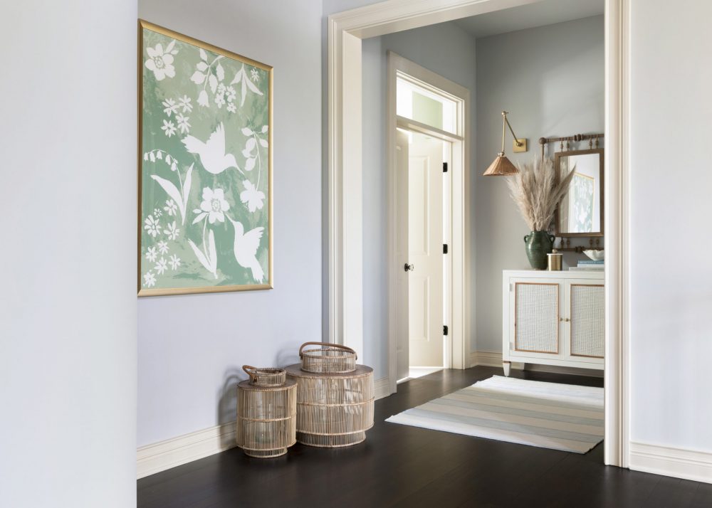
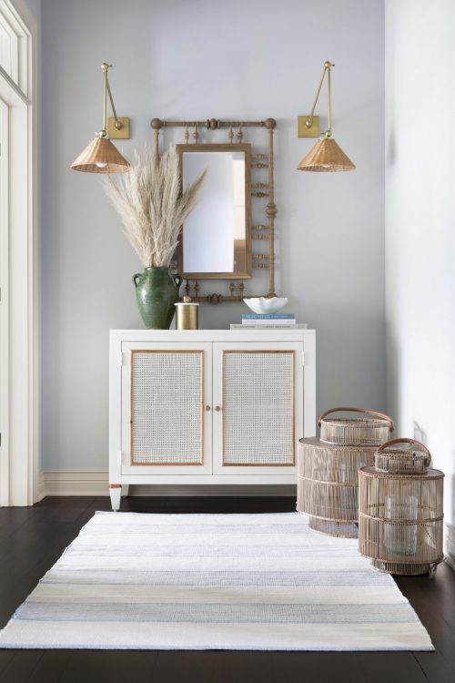
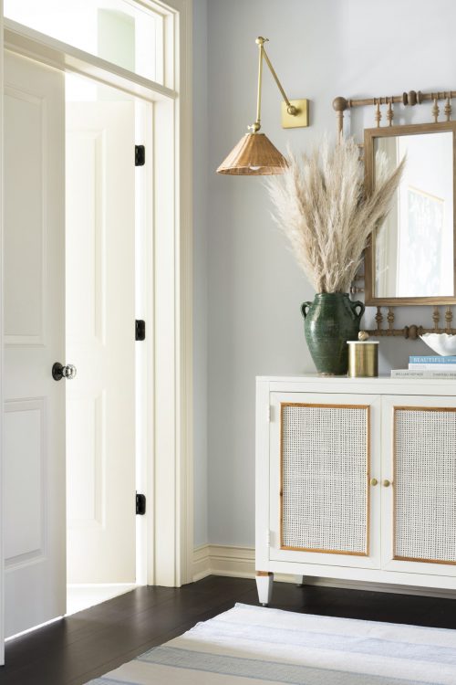
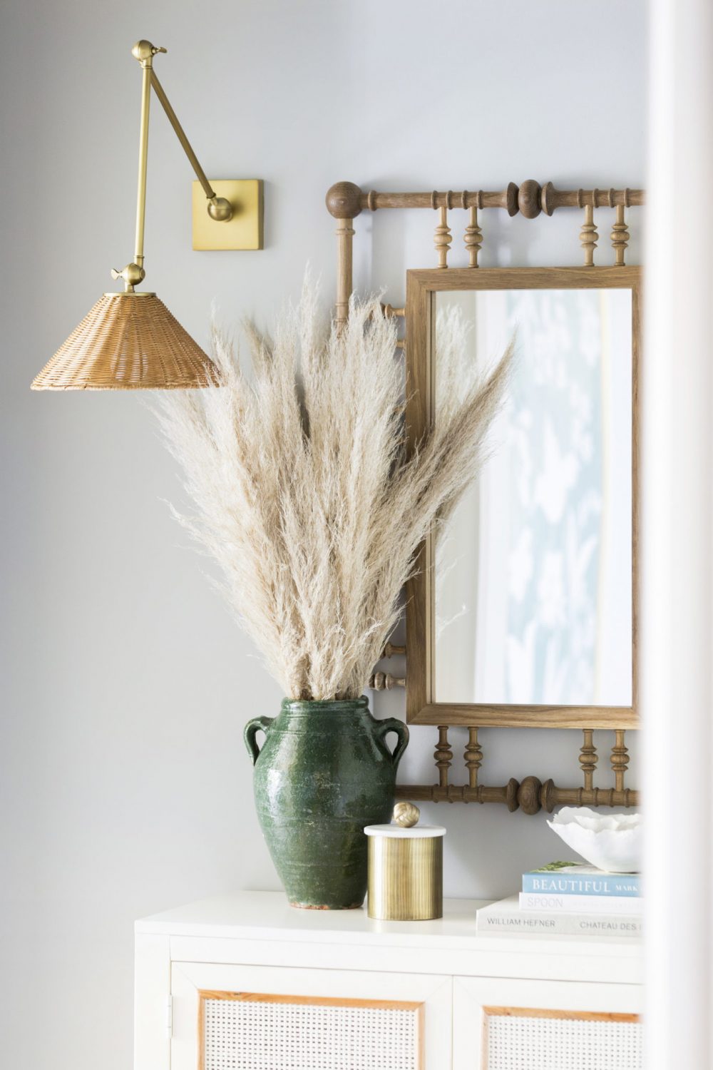
Leading into the master bedroom is this incredible foyer. Due to the home’s open floor plan, this is also an area that people can see when they walk through the front door so we really wanted it to be a show stopping moment. When designing this space, we went with a color scheme of creamy whites, greens, and natural wood/wicker tones to create warmth and add texture.
We began with Brooke & Lou’s Garden Party art, which gave a nod to the traditional, cottage style of the home. No surprise at all, we absolutely adore this piece and the gold frame tied in the accessories and light fixtures perfectly! For the furniture and wall décor, we turned to a few of our friends in the design community who are creating some pretty amazing pieces. First, the mirror by Dunes and Duchess that is handmade by our friend Stacy and her partner, Michael, on the east coast. Completely stunning and turned out even better than we could’ve ever imagined.
Second, the beautiful stripe rug on the floor is from a new collaboration between Mark D. Sikes & Annie Selke! Can you can dream team? We got to preview their collection at High Point Market in April and we were immediately drawn to this piece. It officially launched last Thursday and you can shop it here.
Oh, and as for that cane front chest? Well, you can pick that beauty up on Brooke & Lou in September. Eeek!
Master Bedroom
Before
after
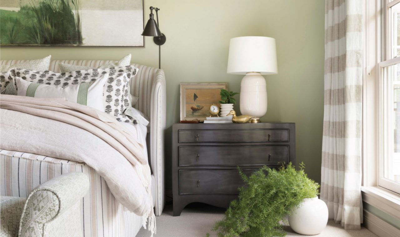
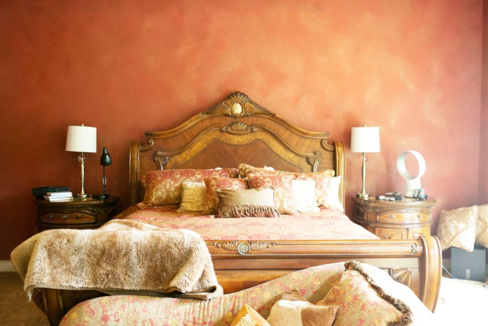
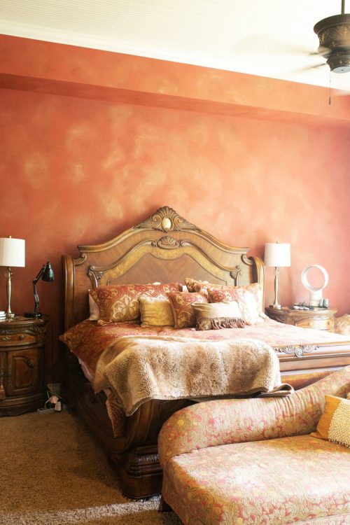
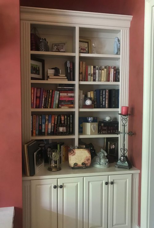
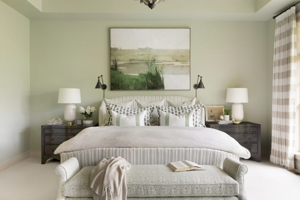
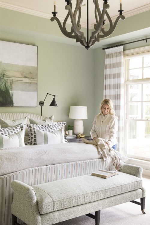
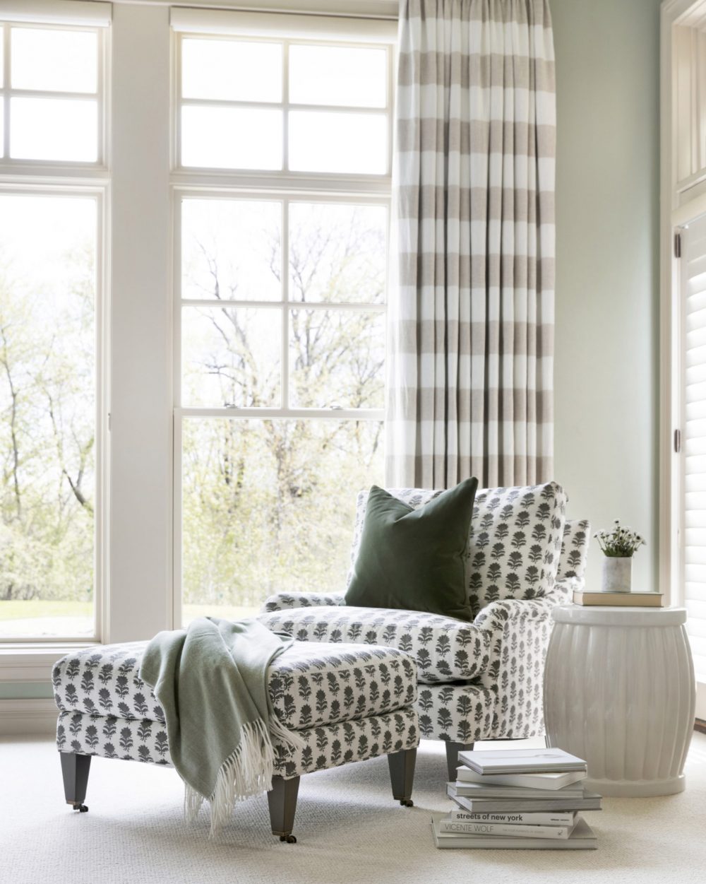
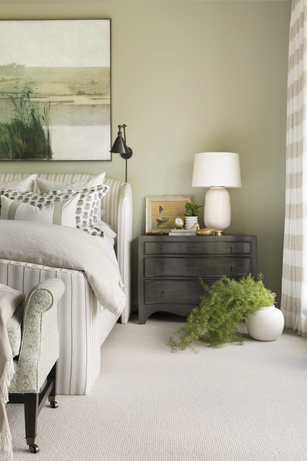
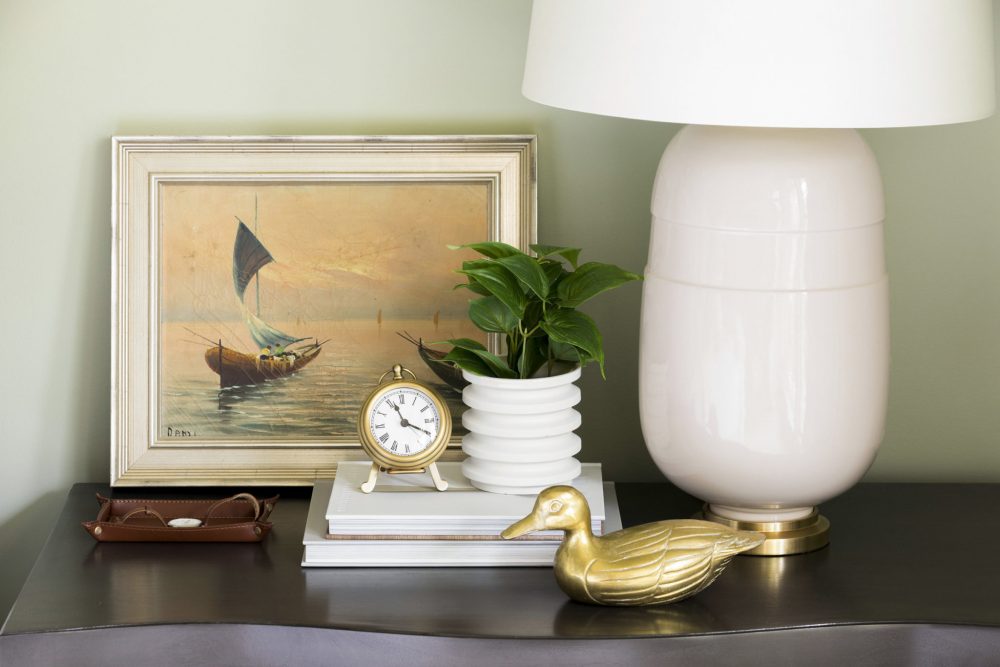
This. Master. Bedroom. Earlier we mentioned that this room is the one that especially blew us away and it’s pretty easy to see why, right? This space did a complete 180° and in the best way. Previously, this room was a bit overwhelming because of its intensely red walls and heavy furnishings. So, we wanted to take this room and make it the calm, relaxing oasis that our clients deserve! With a few coats of paint (okay maybe more than just a few coats) and new furniture and accessories, this room quickly became our favorite master bedrooms ever! Big statement, we know. 😉
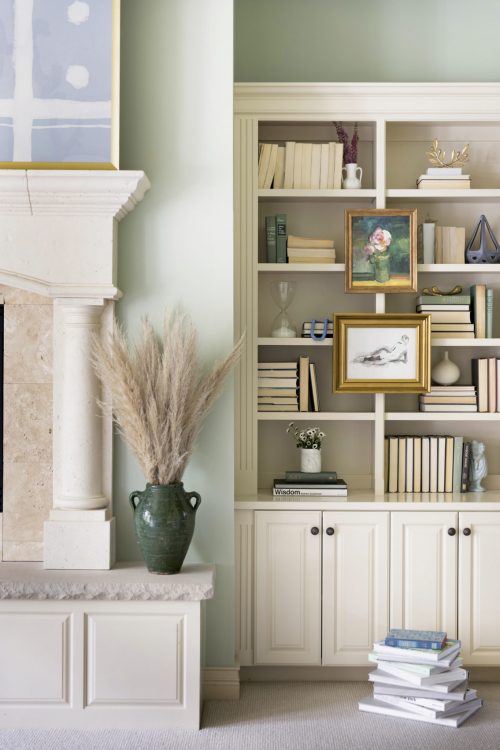
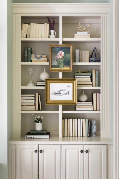
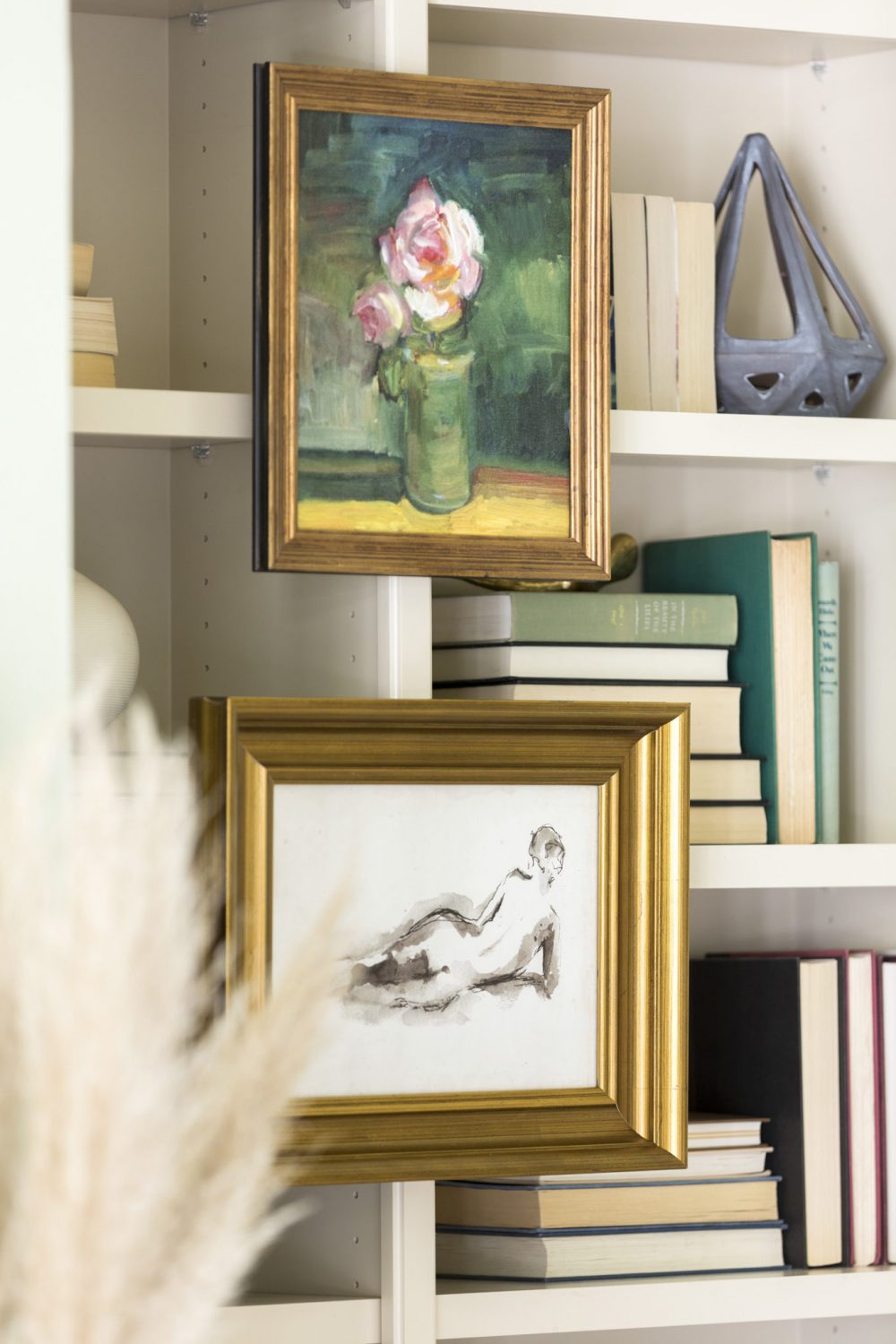
Similar to the rest of the home, the bedroom had great, existing built-ins that we wanted to play with. Along with a few styling pieces, we decided to hang artwork directly on the shelf itself which created a unique, collected look.
Powder Bathroom
Before
After
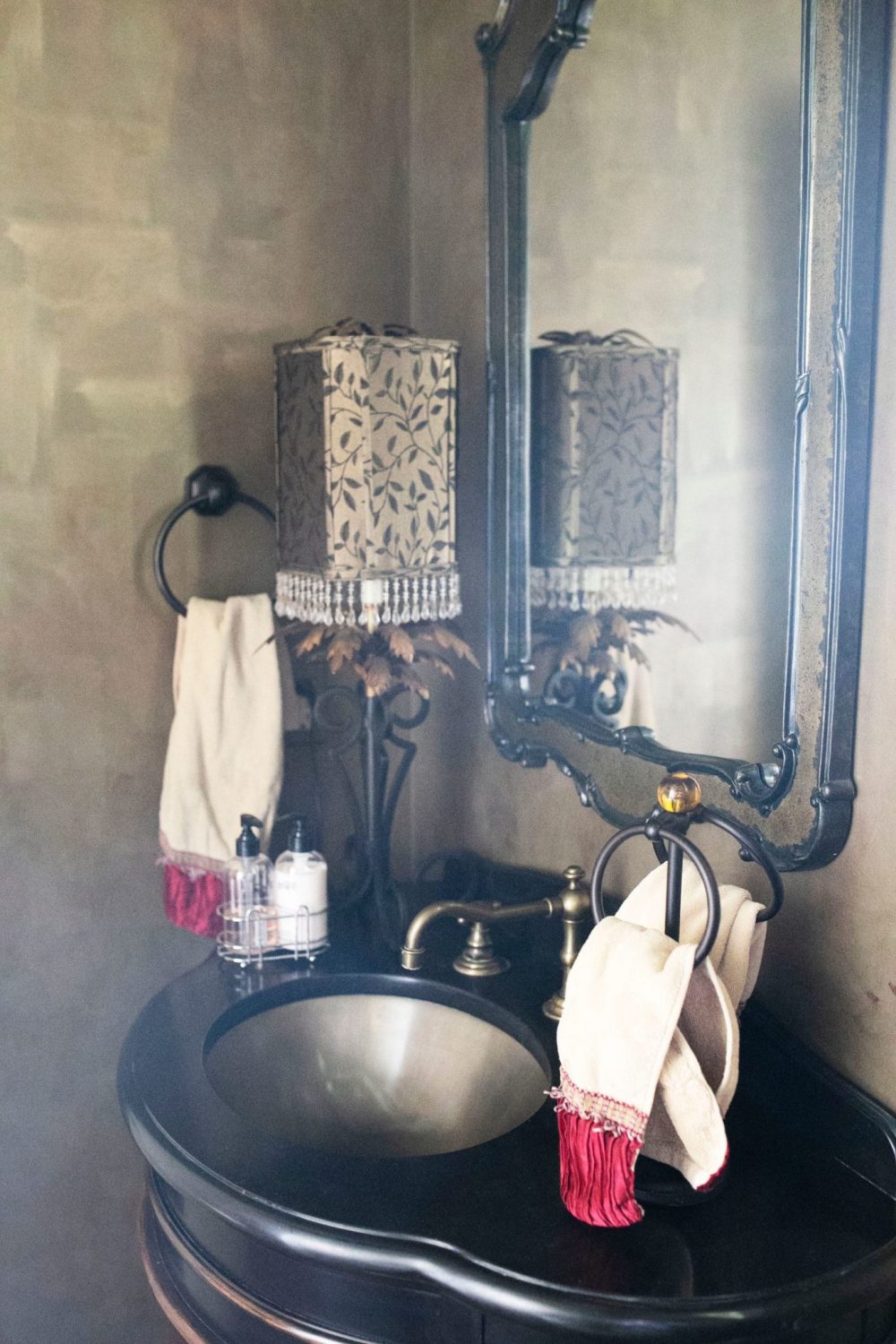
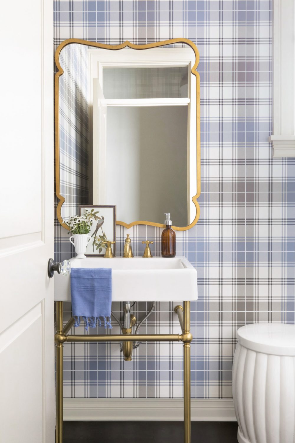
On the main floor, there is also a powder bathroom. In smaller spaces like this, we always like to take the opportunity to focus on detail, detail detail and really packing a punch. We did so in this room by selecting a gorgeous, plaid wallpaper and adding in pops of brass through the mirror, sink, and faucets.
Porch
Before
After
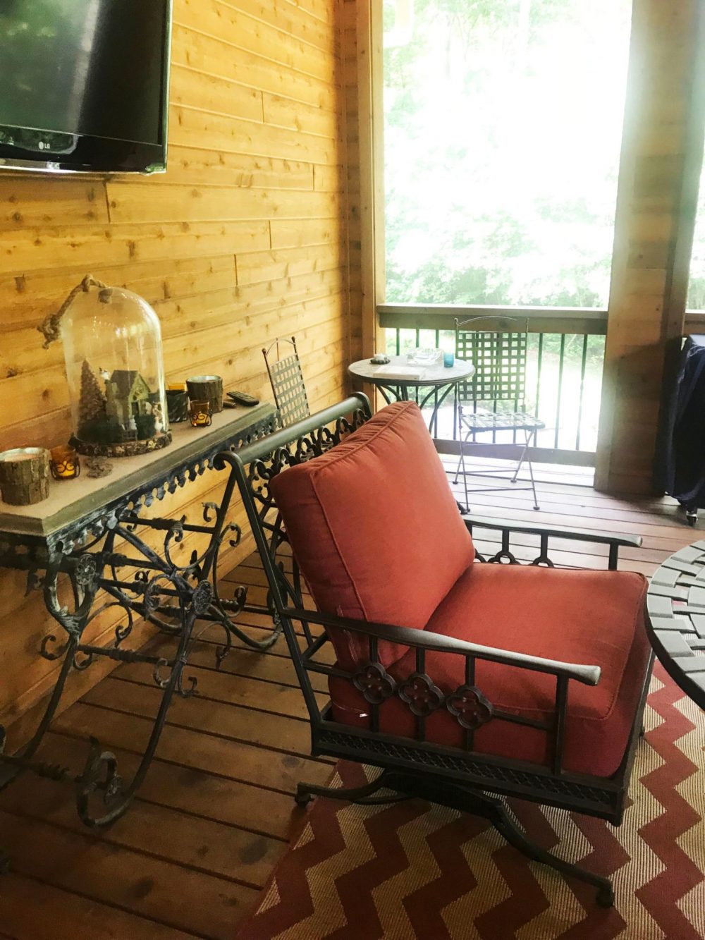
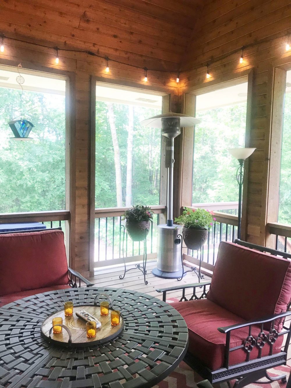
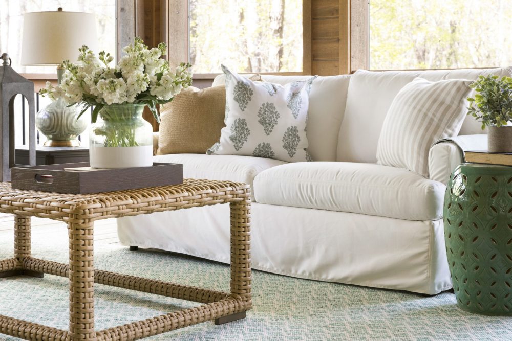
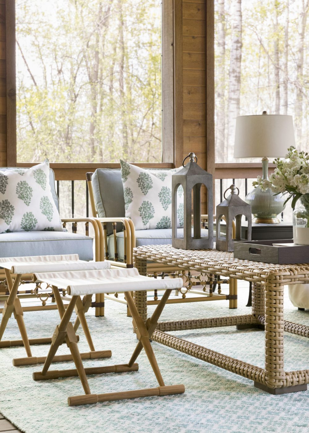
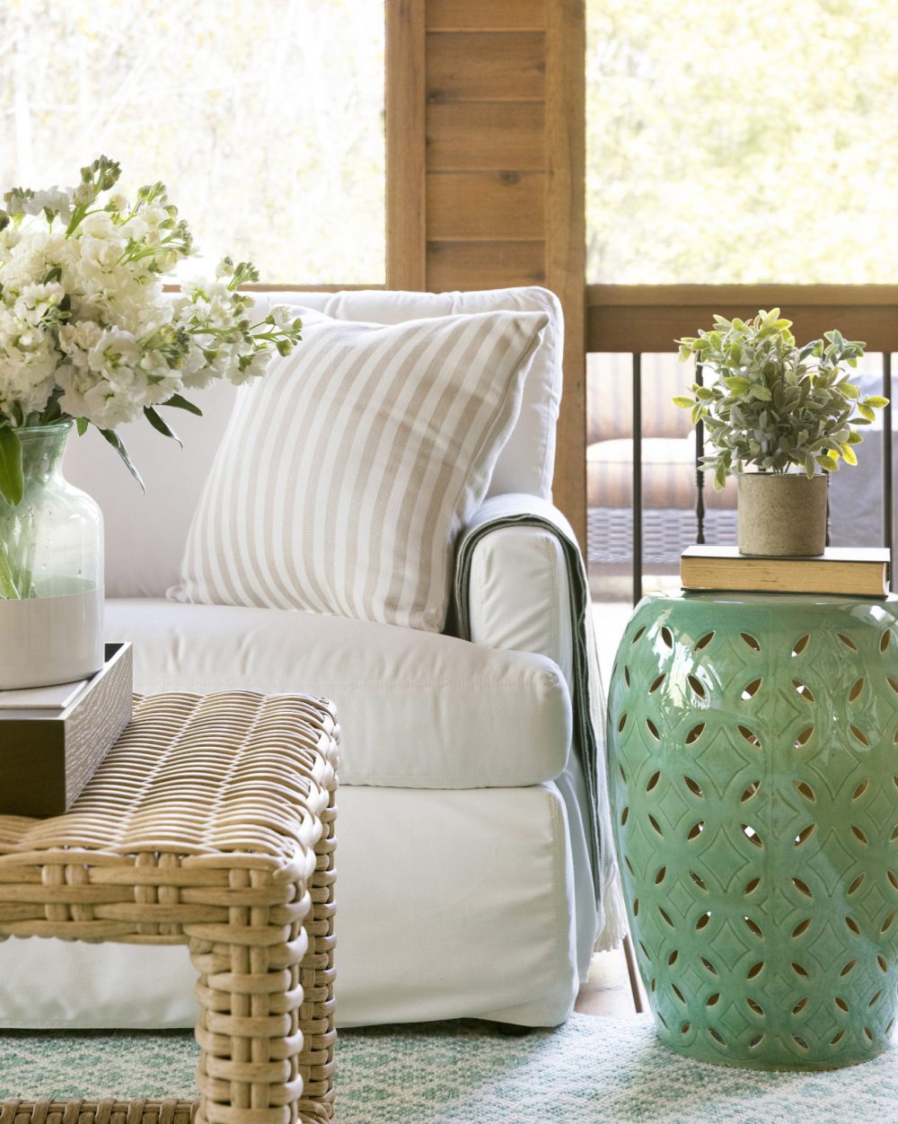
The porch was already incredible so we didn’t have to do too much to it. Our client loves to invite her neighbor friends over to chat over a glass of wine and this room is one of their favorite spaces to gather. Because of this, we knew it needed to have a great flow for conversation and was cozy enough for them to sit for a few hours on end. Using indoor/outdoor fabrics, textural elements (i.e. rattan coffee table, bamboo chairs, etc.), and a white and green color scheme, this room gave a nod to the great outdoors.
As promised, here is BHI’s first video! We are so enthusiastic about diving into this new medium and having you guys explore our work and projects that much deeper. Are you as excited about this as we are? Let us know what you think in the comments below!
Another one of our favorite projects comes to an end and it’s very bittersweet. We enjoyed working with these clients so much and are so thrilled to see them explore this new chapter in their lives in this stunning home. Until next time…
Additional Credits: Photography and Videography by Spacecrafting.





Comments
Hi, I might have missed it, but what is the green you used for the bedroom walls? Thanks!
Hi Brandon, the paint in the master bedroom is Salisbury Green by Benjamin Moore!
Hi Bria, Fabulous job! What is the blue wall color in the kitchen and eating area? Thank You, Robin
Thanks Robin! The kitchen and dining room walls of our Marianna Cottage project were painted Coventry Gray by Benjamin Moore!
I love the look of the foyer. What color did you use on the walls. It looks like gray.
Thank you! That is painted Coventry Gray by Benjamin Moore.
Can you tell me the paint color in the primary bedroom
That is Salisbury Green by Benjamin Moore!