To say that we’ve been eager to share today’s project with you all would be a huge understatement. We’ve waited (semi) patiently over the past year to reveal our Kansas City home and we’re so excited that the day has finally come!
For those who have picked up a copy of On Style, Carl Dellatore’s new book that we’re featured in, were able to catch a small glimpse of this beautiful, traditional, swoon-worthy home. But, today, we’re taking an even deeper dive into this stunning reno starting off with the exterior, foyer, kitchen/pantry, living room, dining room, and hearth room. Let’s dive in, shall we?
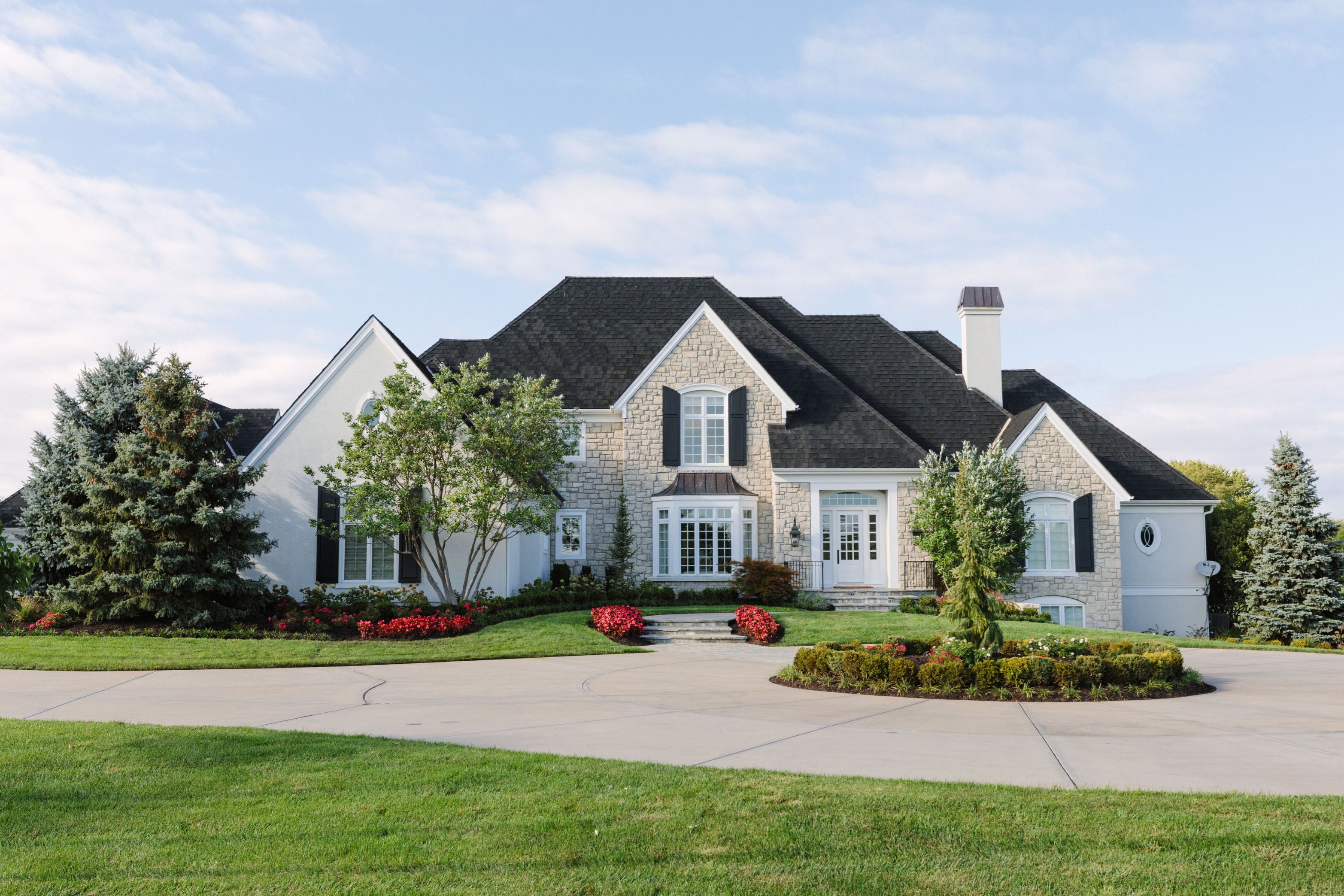
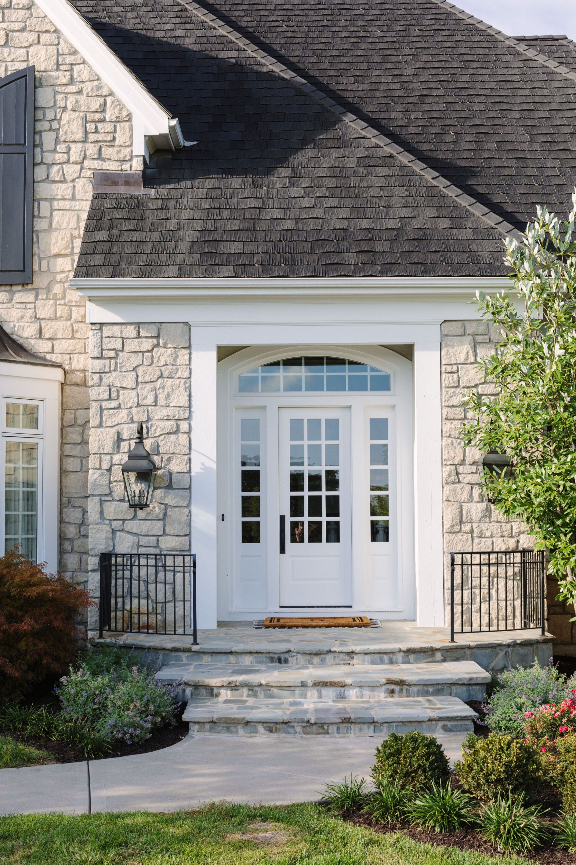
Exterior
While we nearly teared down the entire interior of the home, the exterior was in great shape and didn’t need a whole lot done to it. By swapping out the lighting and front door, we gave the curb appeal a slight update to make it feel a bit more fresh.
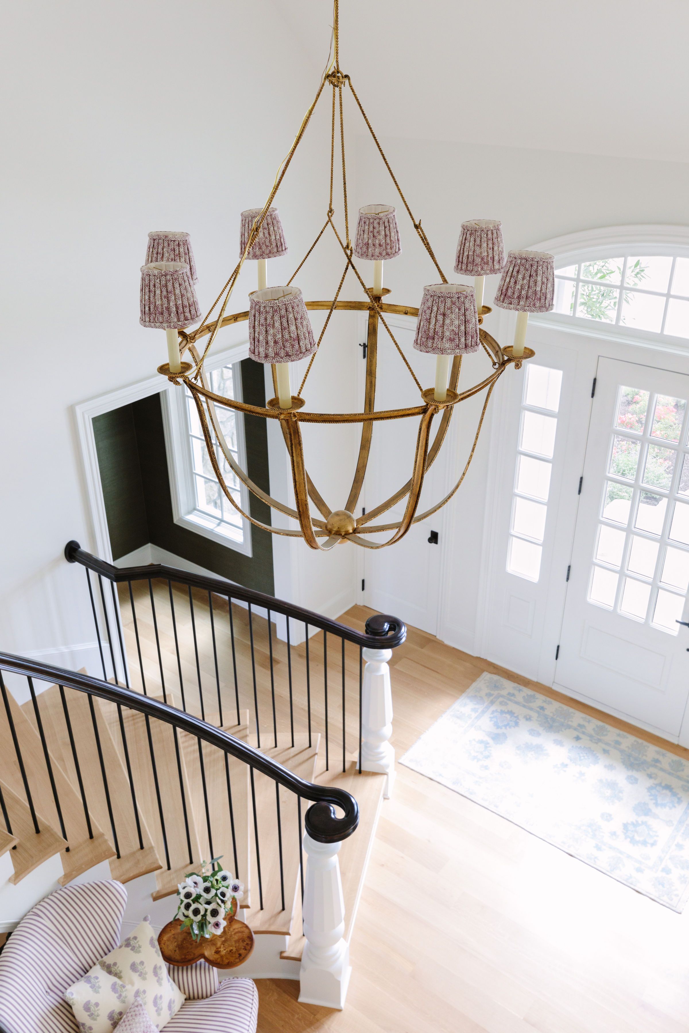
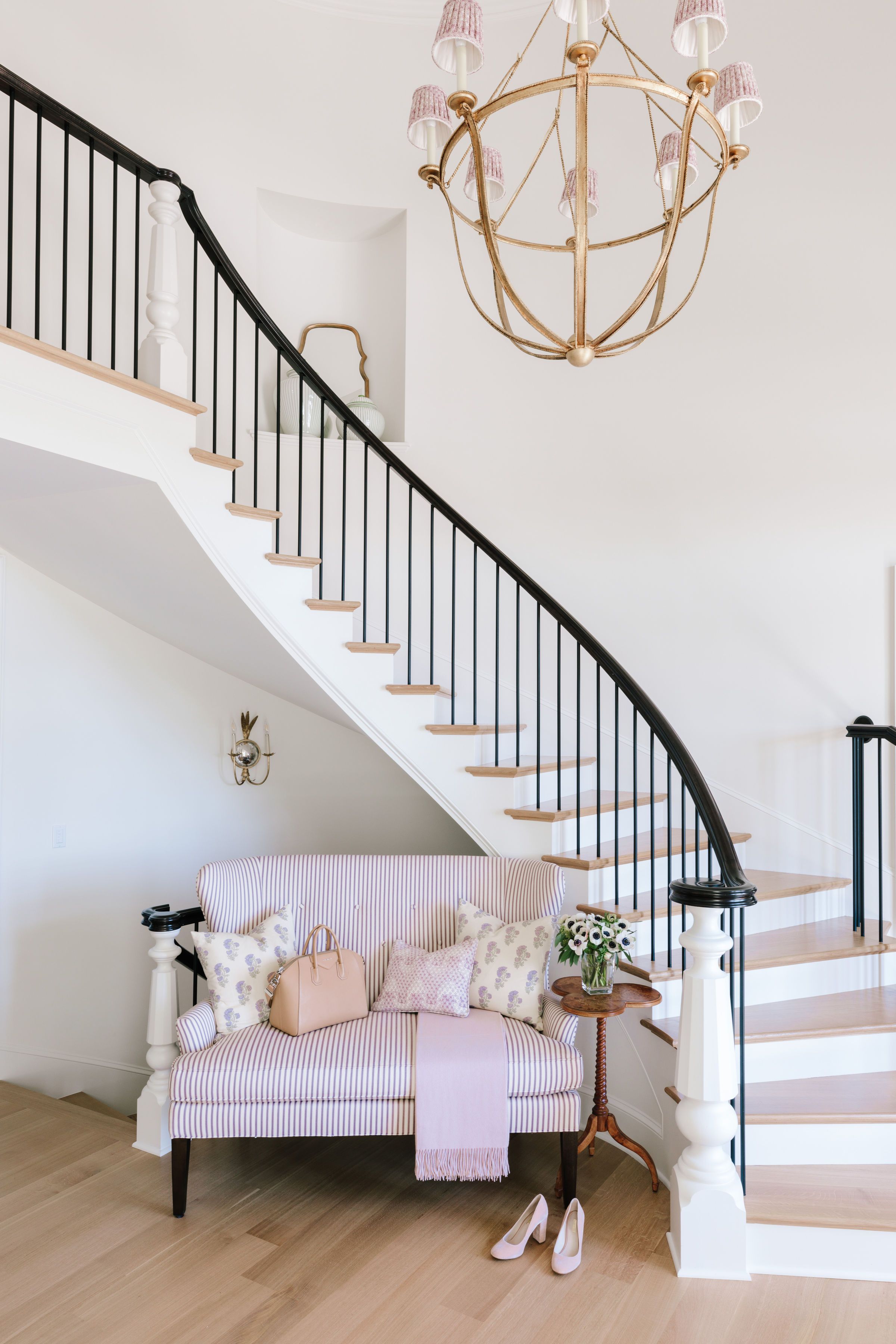
Foyer
We’ve said this before, but we like to think of foyers as the handshake of a home. It’s truly the first chance you get to introduce your house, your style and it’s uniqueness to your guests. And we don’t intend to waste that opportunity. For the foyer of this home, the staircase is the true show-stopper and we wanted to play that up. We completely updated the entire railing system and had custom metal spindles made to give it a more formal look. One of the items our clients wanted to bring with them from their previous home was the chandelier and we happily agreed. By adding custom shades to it, we were able to give it new life and made it’s transition into their new home seamless.

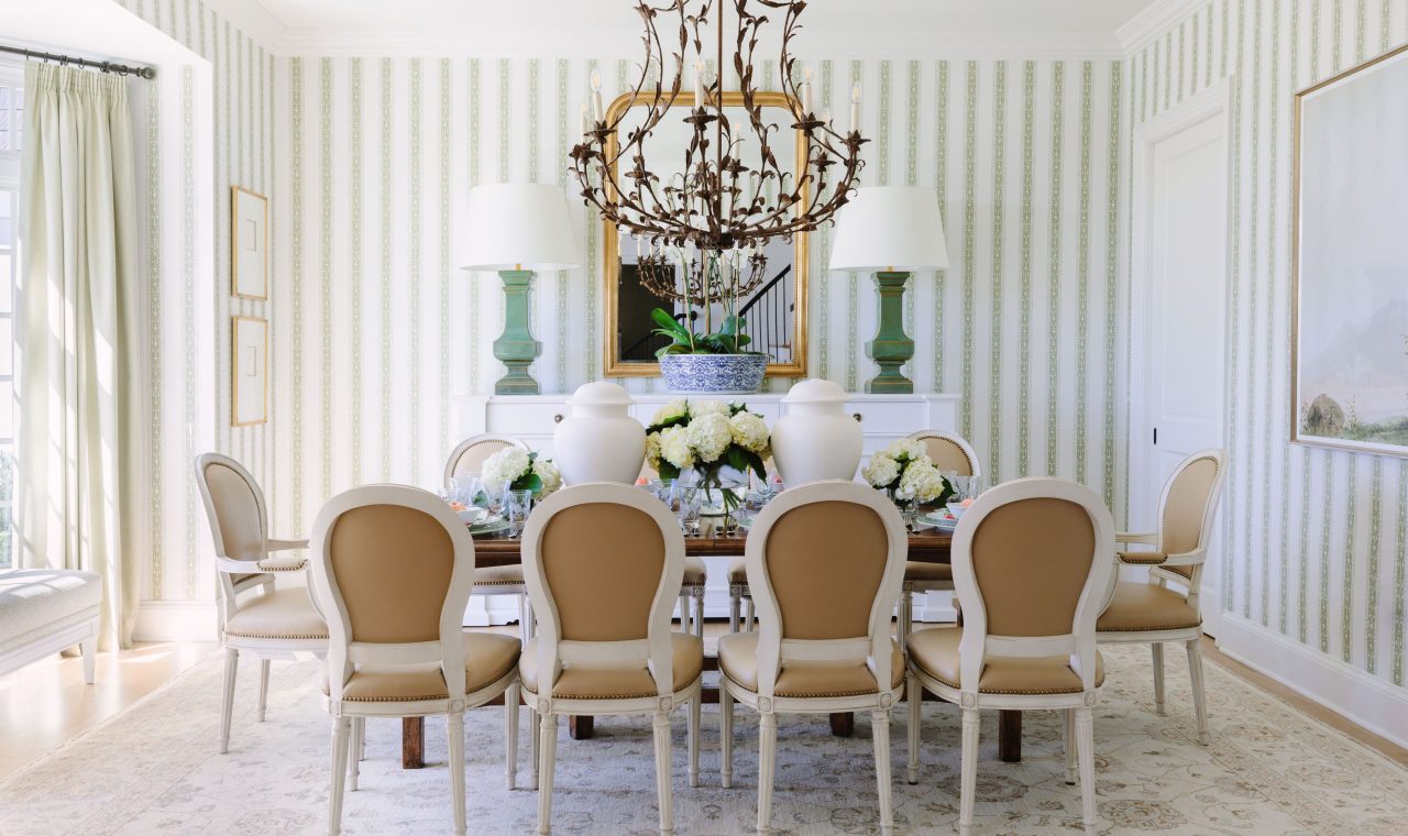
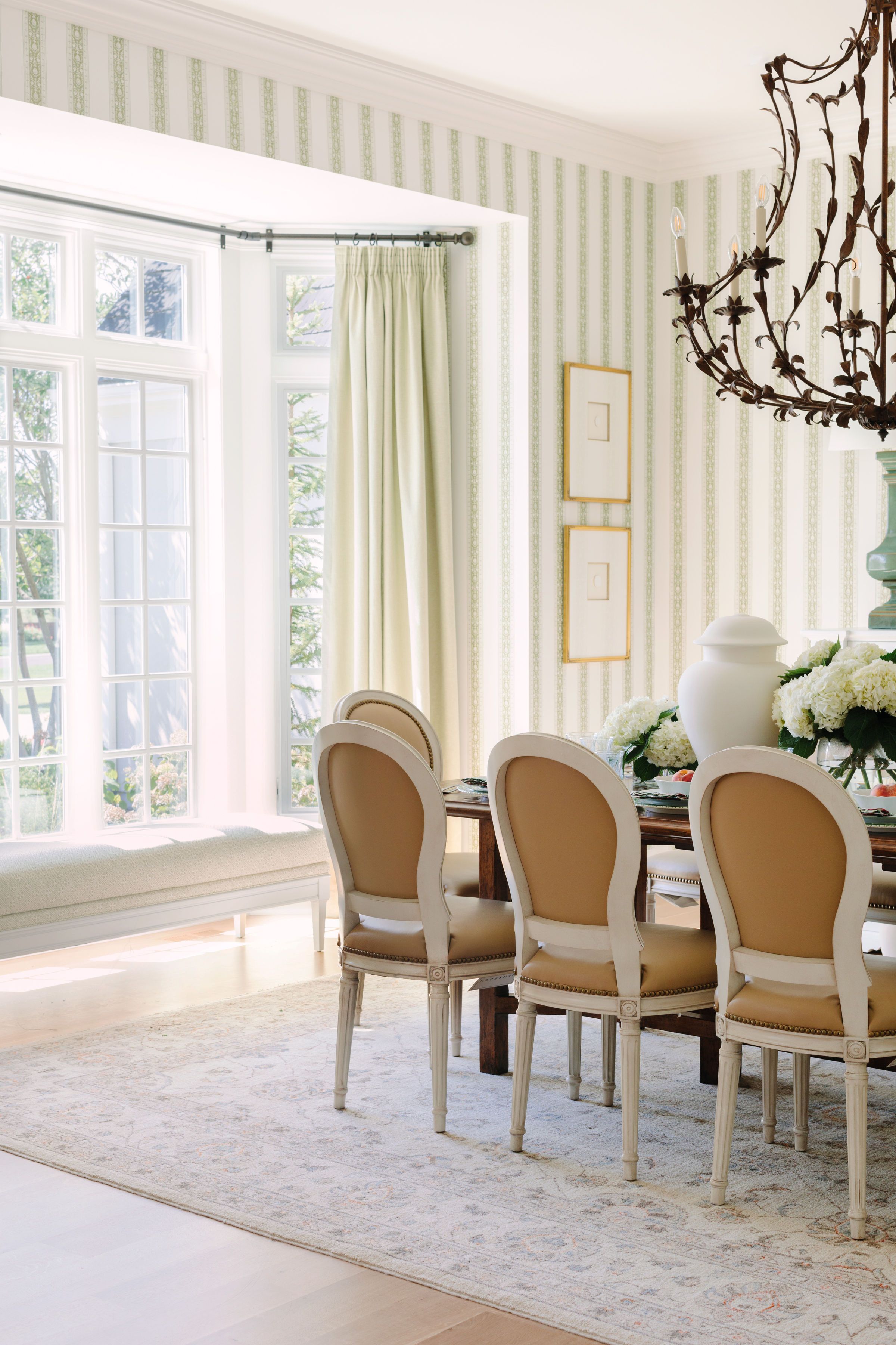
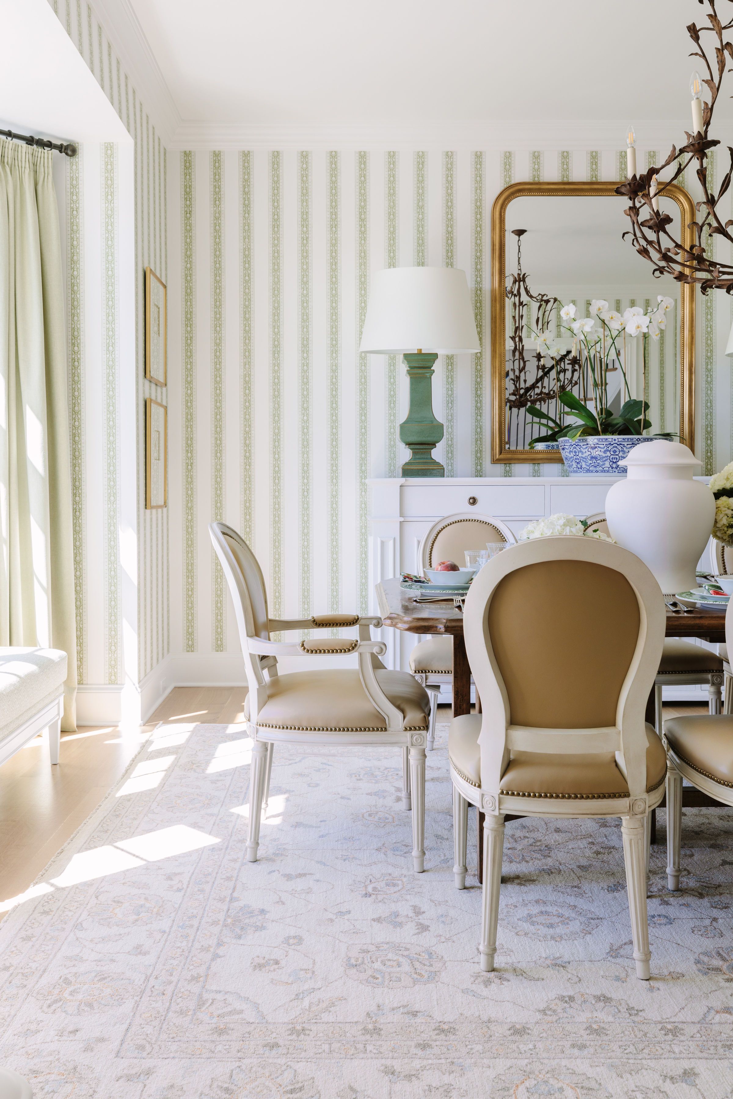
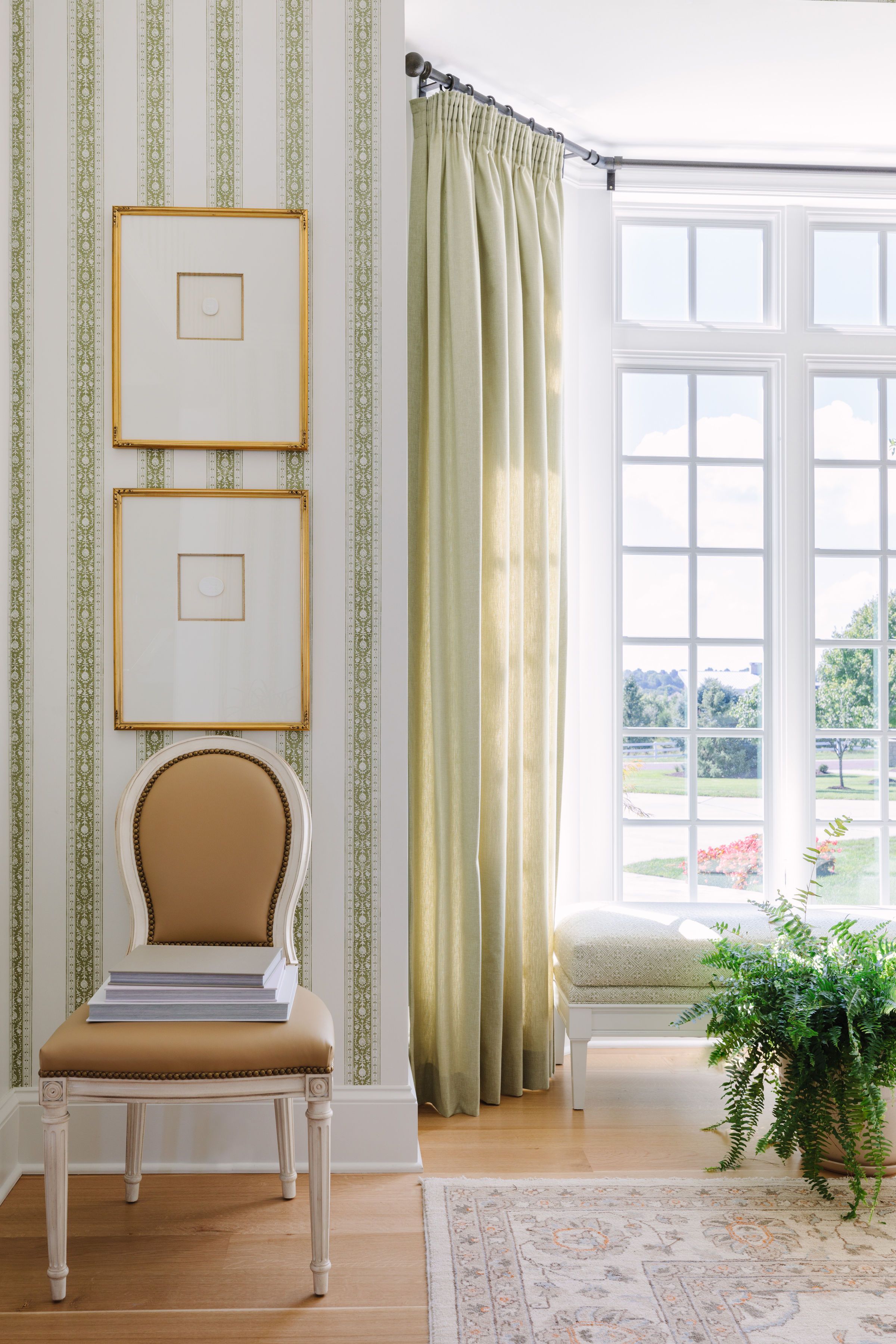
Dining Room
While we hate to pick favorites, this dining room makes a great case for the prettiest spot in the whole home. What pictures don’t depict is how truly massive this space is (those lamps are 4.5ft tall!) and, because of this, we took our time putting this room together. Instead of designing it all at once like we typically do, we slowly composed this space piece by piece and it was one of the last rooms we designed in the home. We knew our clients would use this space for more formal dinners, family gatherings, holidays, etc. but wanted to still keep it approachable and easy-going – just like our clients personalities.
Fun fact: Bria had a vision of a very specific color leather for the chairs. One day, while getting ready for work, she saw an old handbag hung up in her closet that was exactly what she was looking for. She brought her purse in and we sorted through dozens and dozens and dozens of leather swatches until we found the perfect match. #worthit

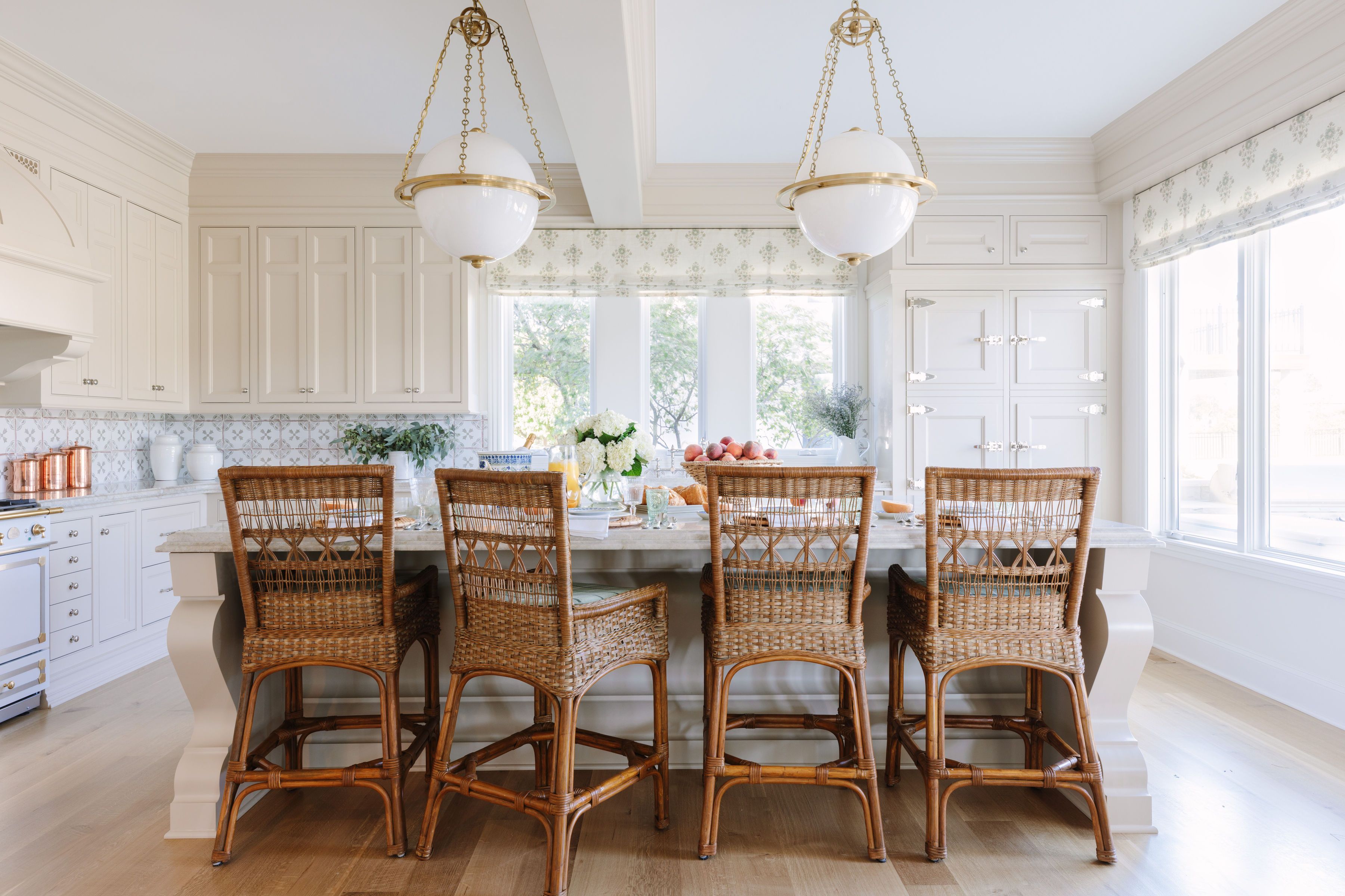
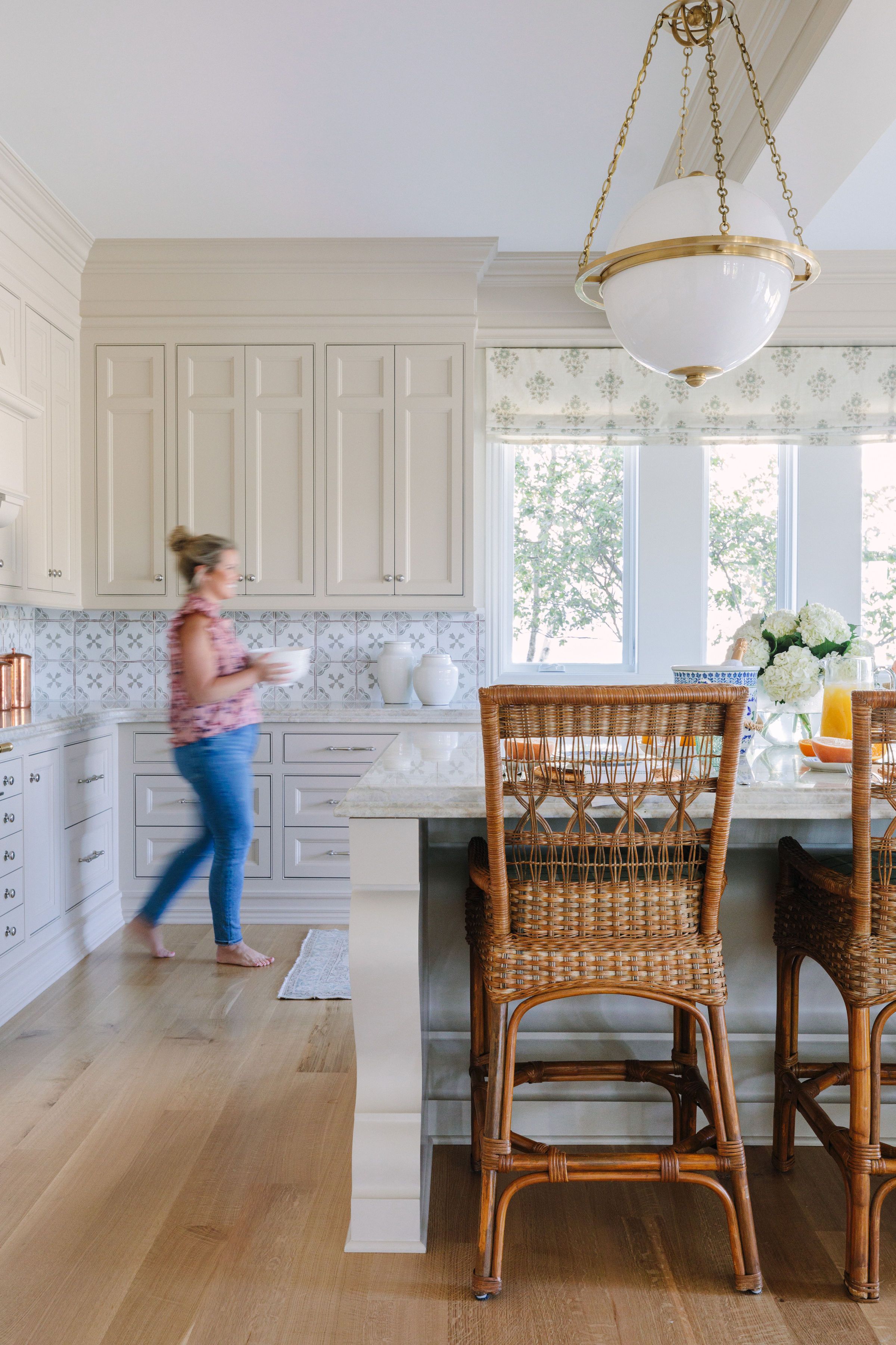
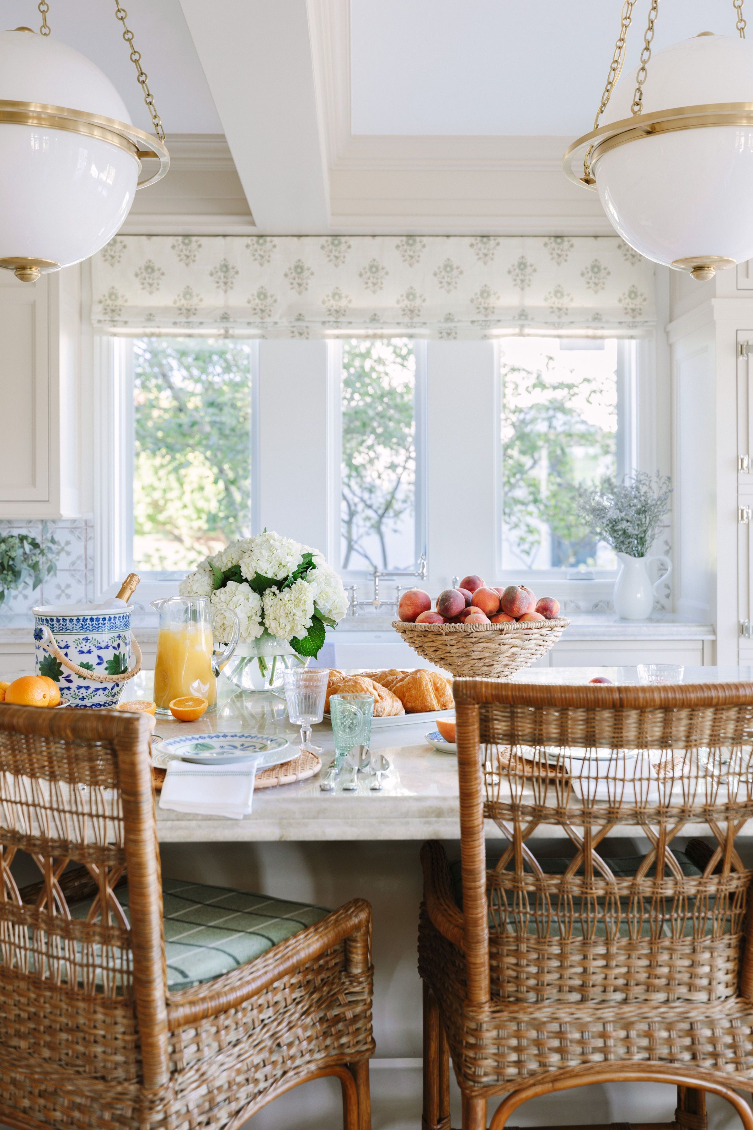
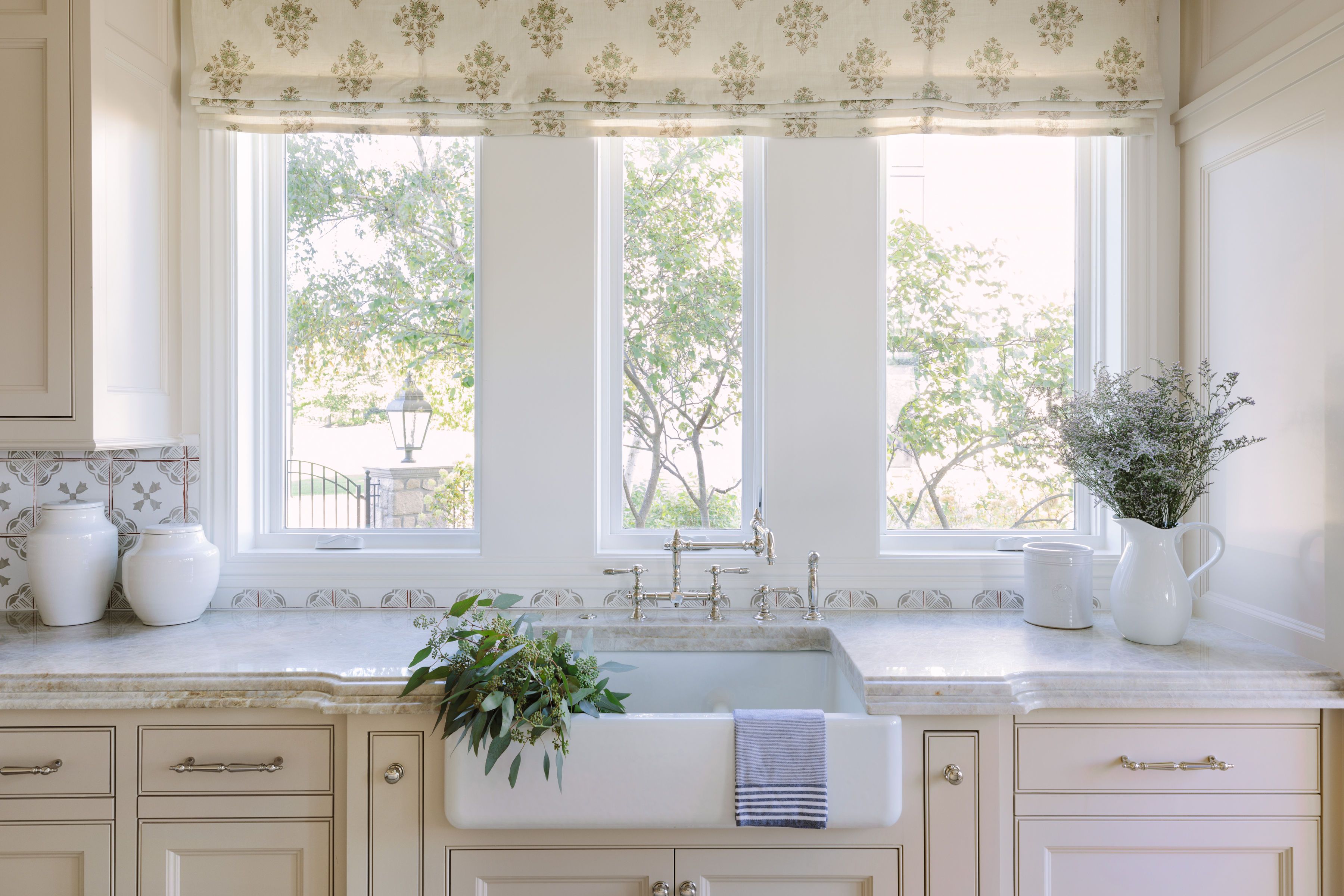
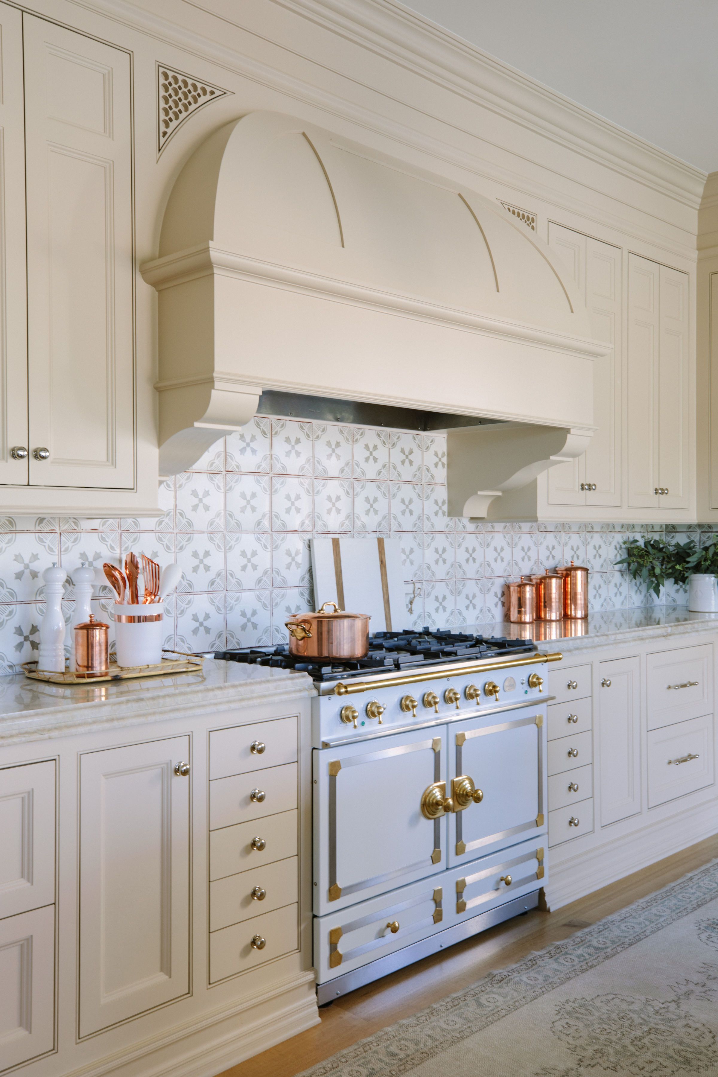
Kitchen/Pantry
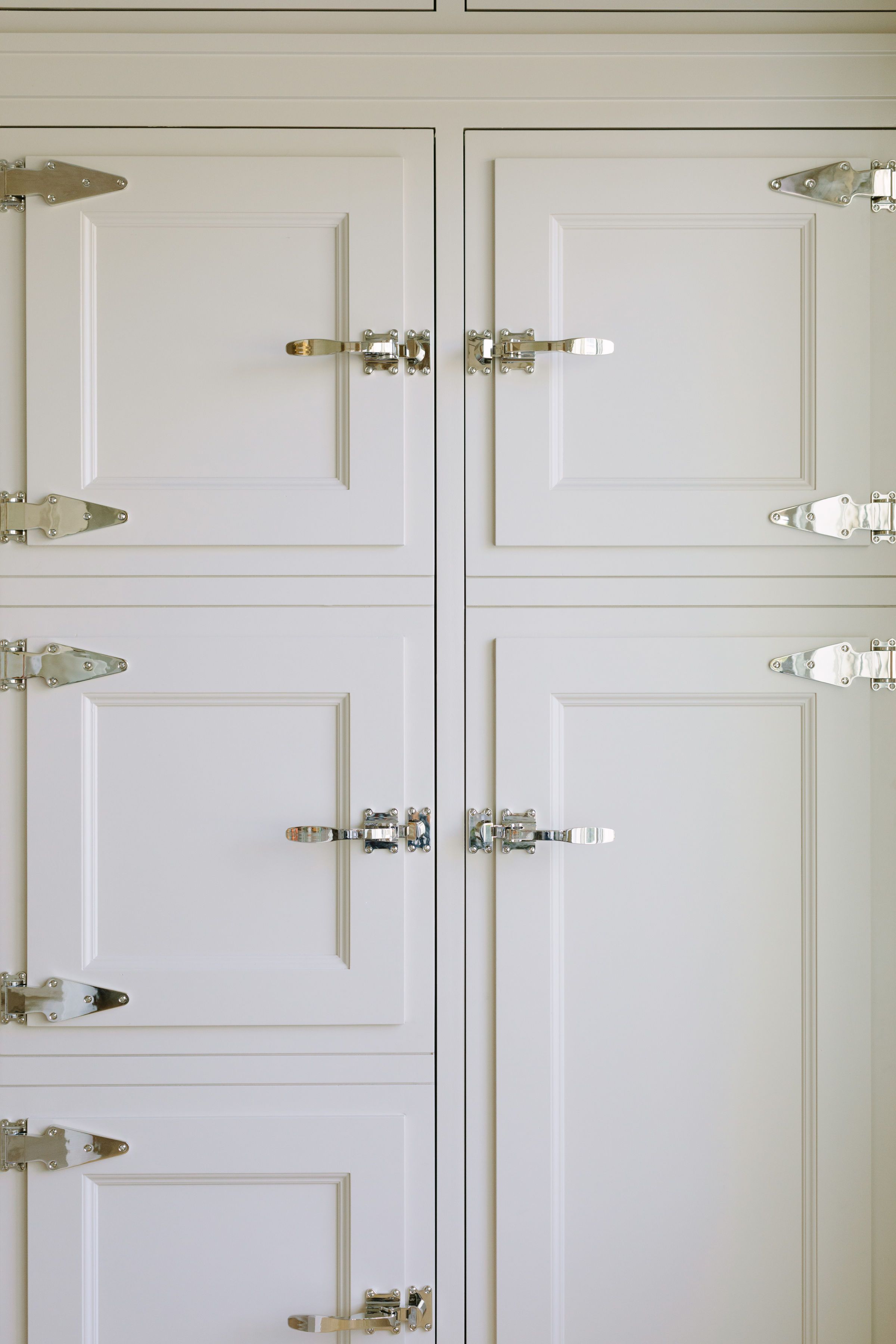
As we mentioned previously, we did major renovation to the interior of the home. The kitchen and pantry being the biggest transformation of them all. We completely redid the layout and took out the old, informal eating area to make one big kitchen. Instead, we worked with our friends at Designed and Made to create a beautiful, large furniture-like island where our clients could eat their breakfasts and dinners on a daily basis. Painting it a taupe color gave it a warm, English traditional feel that we absolutely adore. For the rest of the details, we knew we wanted each aspect of the kitchen to be just as beautiful and high-end as the other. Enter: hand painted terracotta tile, ice box hinge hardware, jaw-dropping plumbing fixtures, and a show stopping oven range.
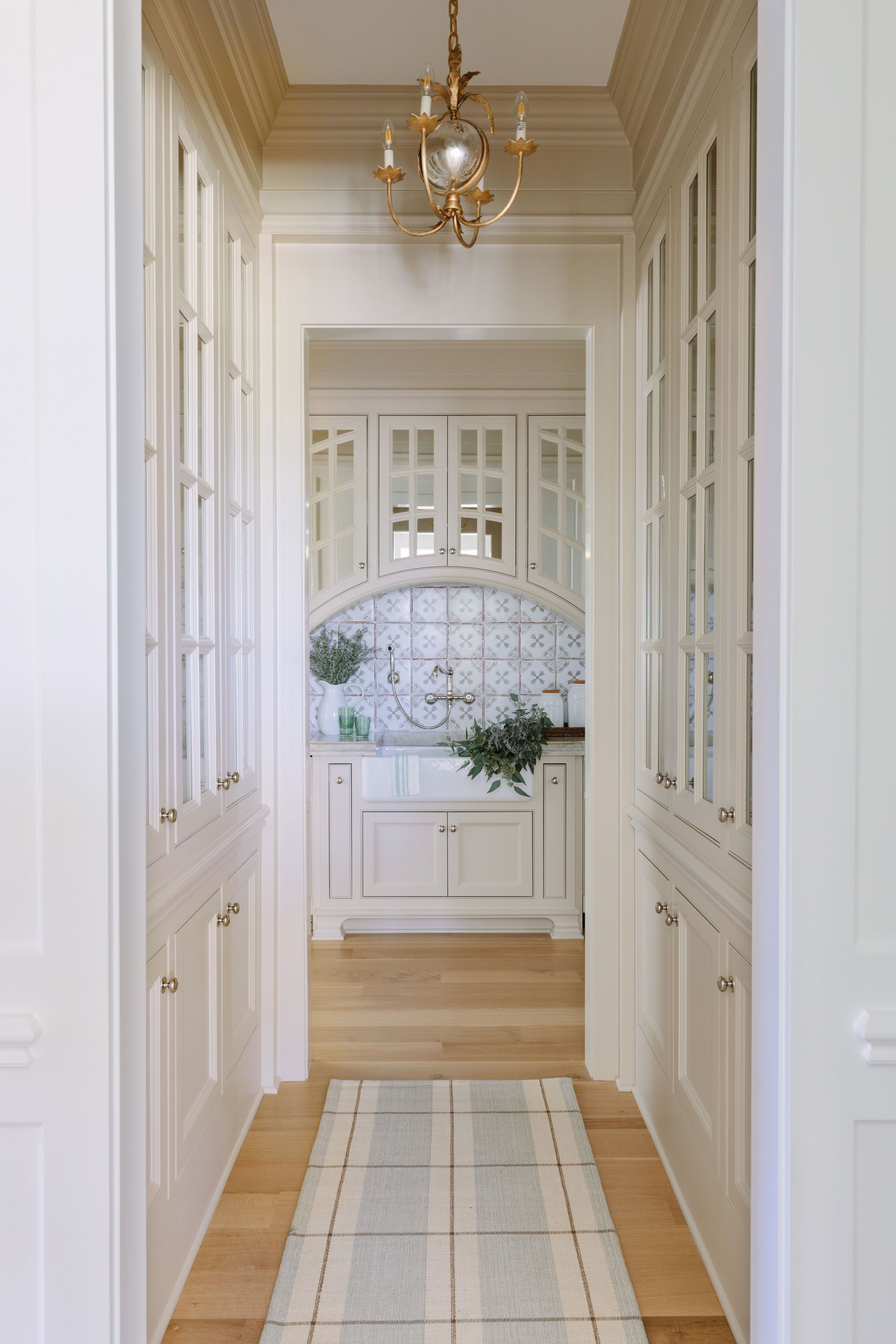
There are three ways to enter the Butler’s pantry so we wanted each entry to be equivalently beautiful. We lined the hallway entrance with display cabinetry for her plates, we mirrored the front of the cabinetry instead of glass due to the complexity of lining up the shelves with the curved detail (which also bounces light off of them to make it brighter), and did the same backsplash, countertop, and cabinet color to make it feel like an extension of the kitchen.


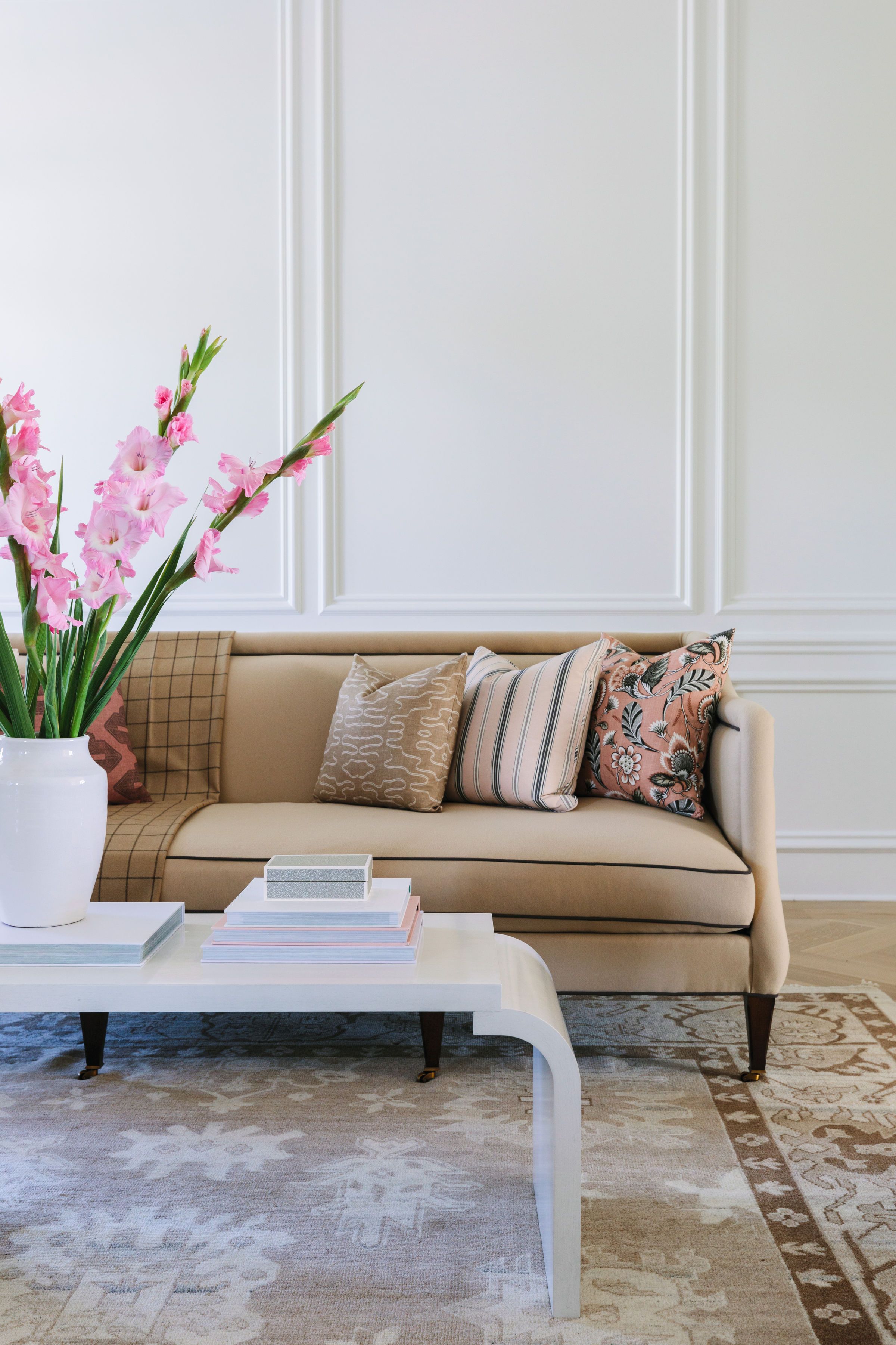
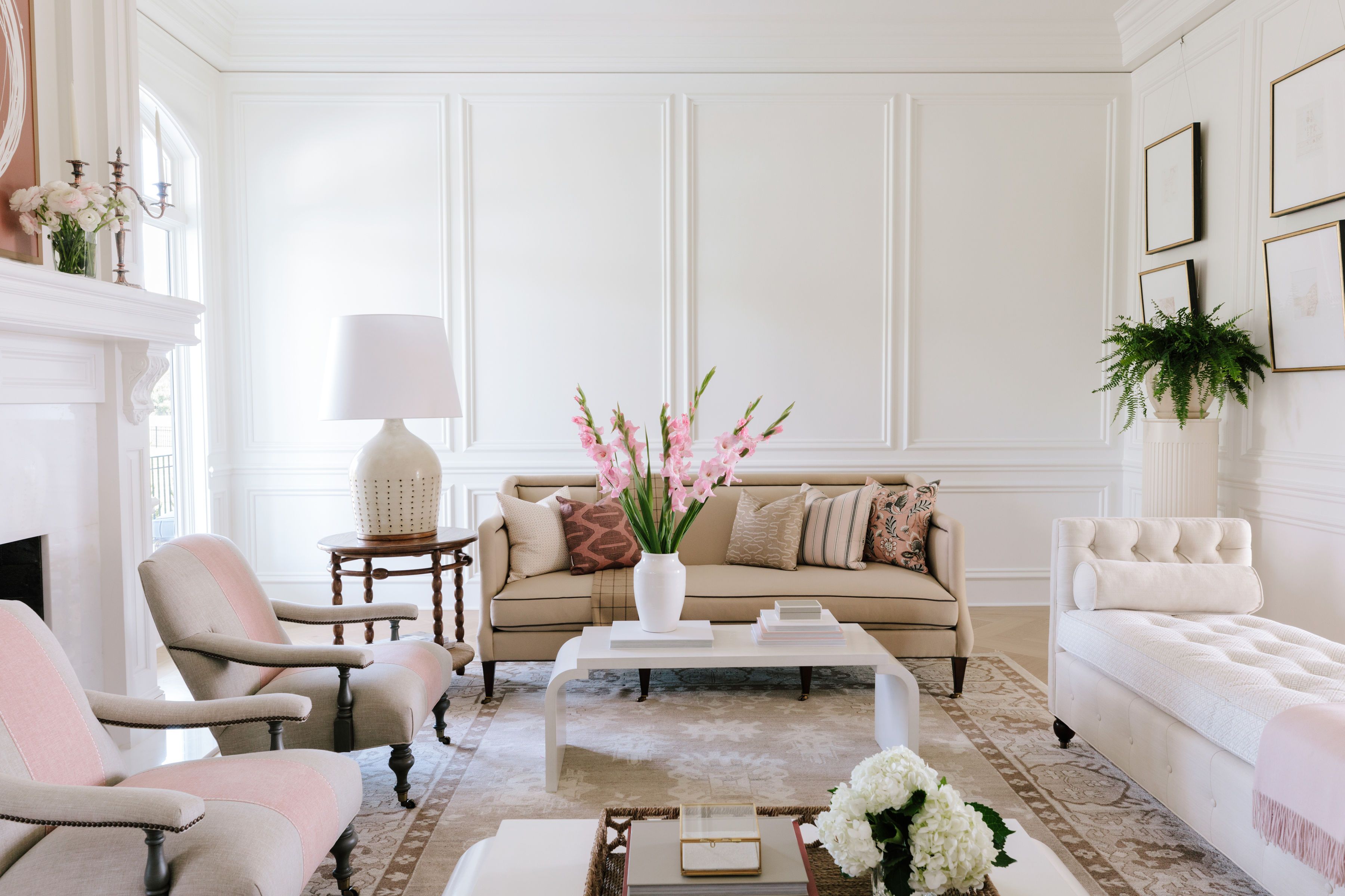
Living Room
There was beautiful existing millwork in this space but we wanted to expand on that even more. We installed paneling to all of the walls as well as a picture rail so that artwork could be hung and swapped out over the years. The fireplace used to be a dark, black granite and in order to lighten it up we added white marble so that it allowed the layers and colors and textures of the room to pop and speak for themselves. The layout for this room was a bit tricky, which is why we worked with unique furniture placement (i.e. double coffee table) and symmetry. Forgoing window treatments was also a decision we don’t typically make as well. However, in this room we wanted the gorgeous, curved details of the windows to shine.

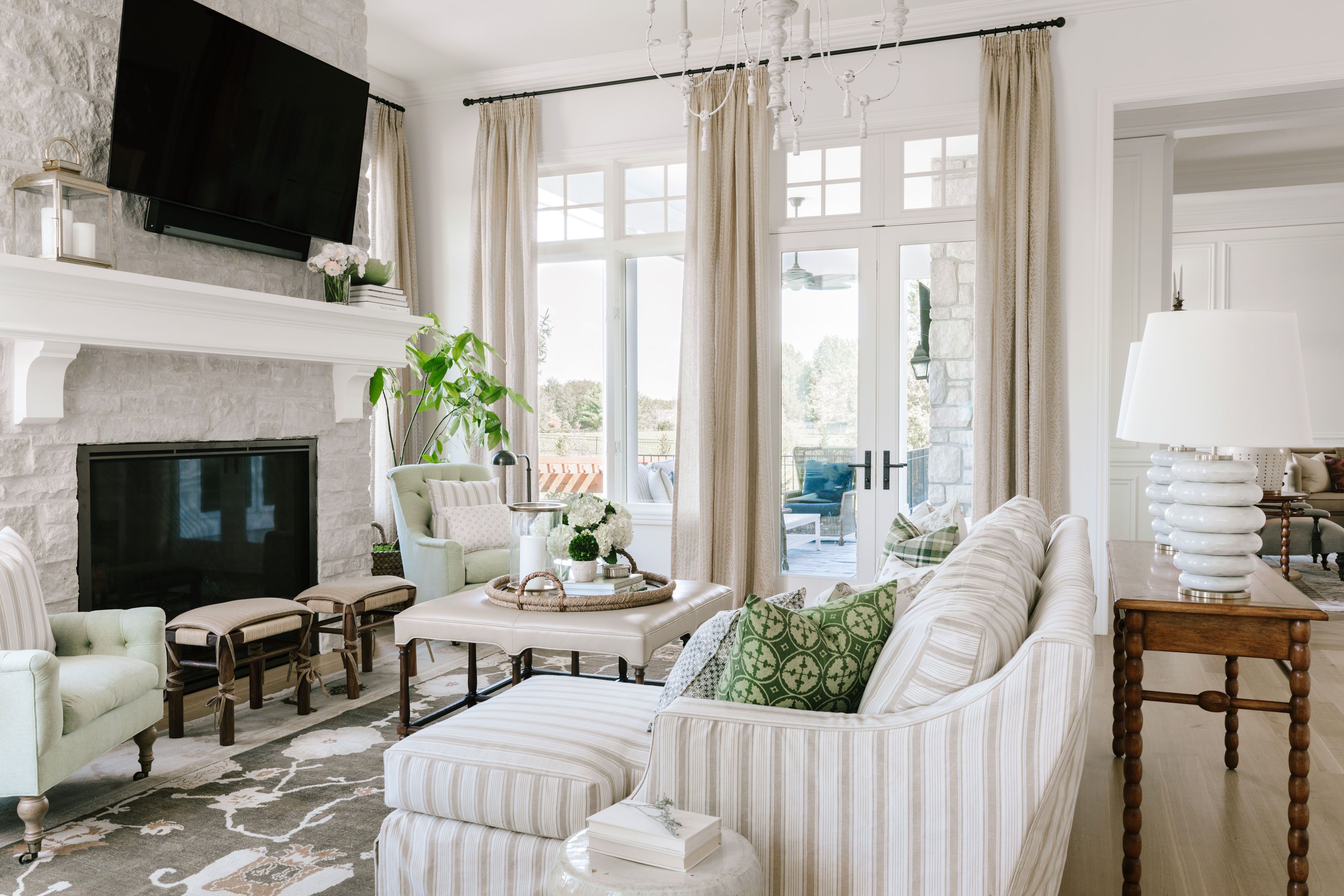
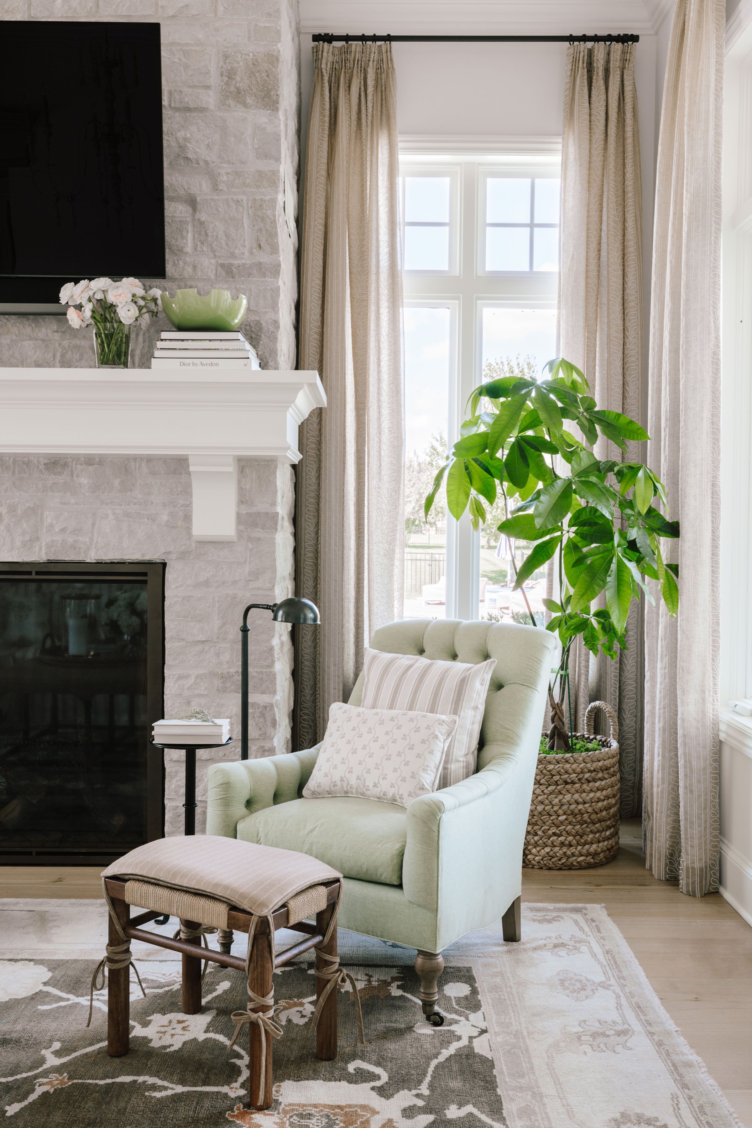
Hearth Room
This is where our clients spend most of their time so we wanted to make sure it was relaxing and cozy for them and their beloved dogs. We added a big, comfy sofa for them to snuggle up on, replaced the fireplace stone and mantel for a lighter, fresher option, and knocked out the built-in cabinets beside the fireplace and replaced them with large windows for more light!

Alright, if you’ve made it this far – THANK YOU! We’ll continue the rest of the tour next week so make sure to check back soon.
Photography by: Aimée Mazzenga


Comments
[…] a striped wallpaper is another safe, classic, and timeless choice for your dining room.Source: briahammelinteriors.com Source: […]