We’re so happy to be back with part II of our Kansas City project! For those who missed part I click here to catch up. As we mentioned in our previous post, today’s reveal will include lots and lots of beautiful bedrooms as well as entertaining areas like the wine cellar, bar, and outdoor pool area. Alright, let’s get to it!
Master Suite
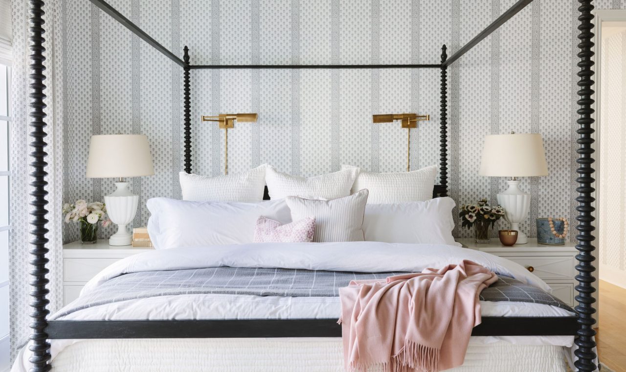
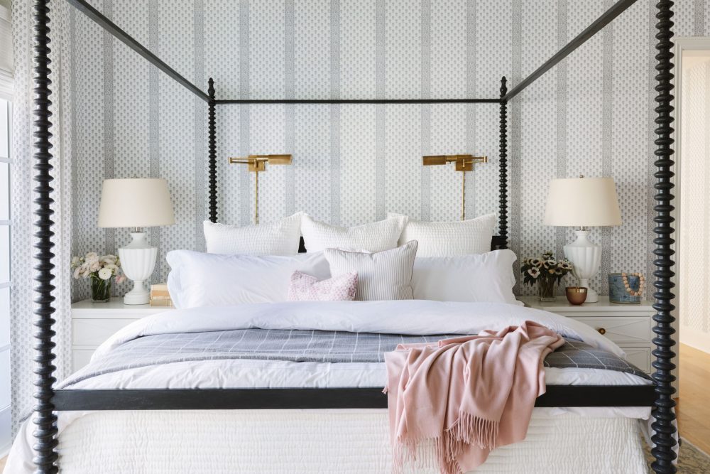
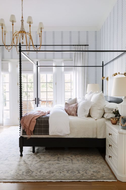
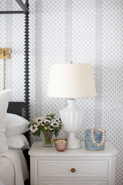
If we had to describe the master suite in this home in one word it would be transportive. Despite its Midwest location, the second you step into the space you suddenly feel transported to another time and place. For us, we get New York City apartment vibes. A touch of glam, a bit of drama, and a whole lot of beautiful. But, that’s not the entire reason why we love it. It also holds a special, sentimental spot in our hearts because it was the first space to ever have Brooke & Lou wallpaper in it! Our Lyla Stripe (seen here in gray) was one of the first patterns we designed for B&L and we couldn’t have imagined a better spot for it than in this bedroom. The wallpaper’s vertical lines accentuated the already tall ceilings and the large, canopy bed complimented it that much more.
While the overall design of this room leans more feminine, we wanted to make sure we incorporated masculine details to balance it out. The dark, charcoal-colored bed frame, black drapery hardware, and neutral tones in the rug gave us some contrast to counteract the feminine colors and patterns seen in the textiles and wallpaper.
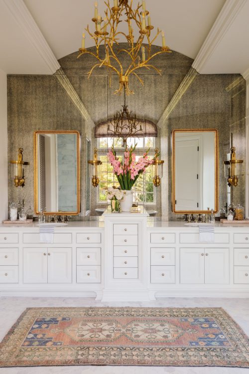
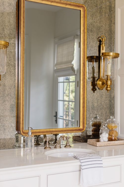
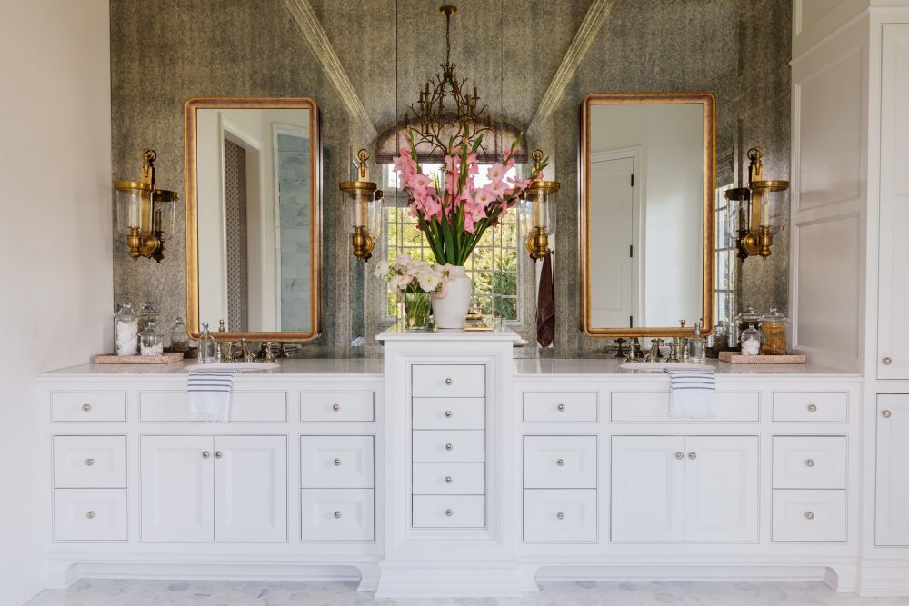
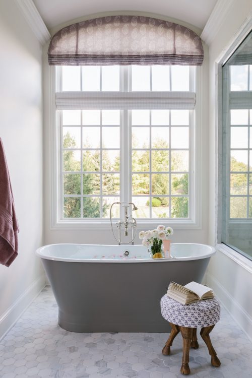
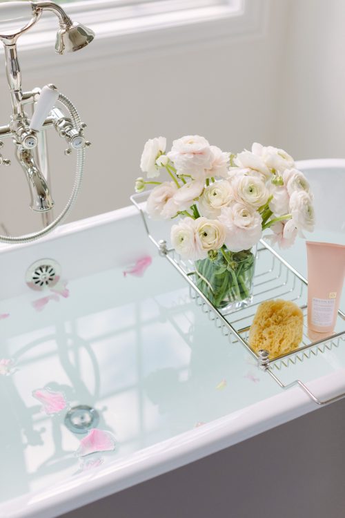
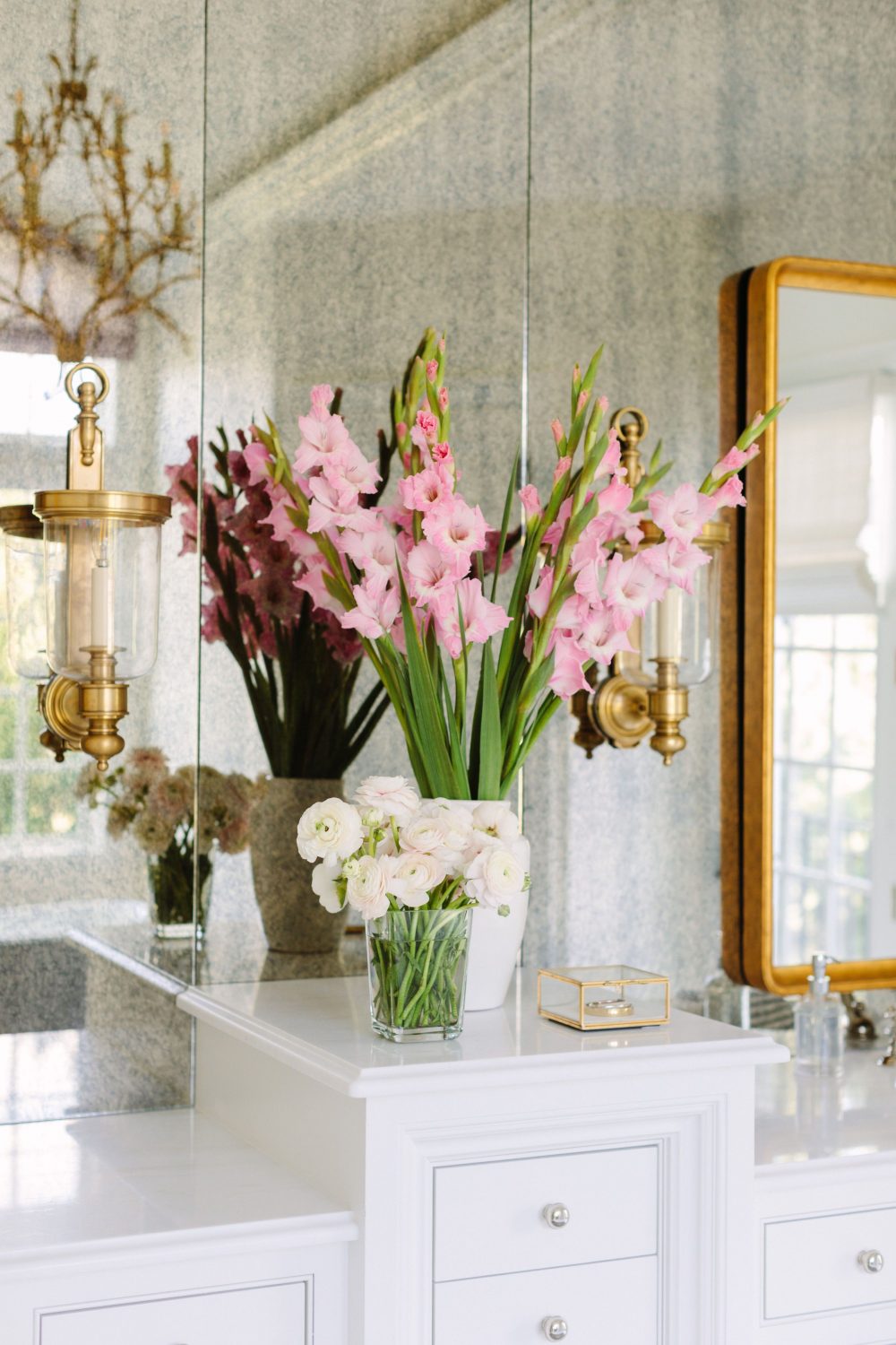
The master bathroom was initially a bit tricky to design because of the arched ceiling. Instead of fighting it, we opted to make it a part of the design by adding an aged antiqued mirror for double the drama. Directly across from it, a gray tub sits to balance the darkness of the mirror and a custom roman shade was installed for the curved window.
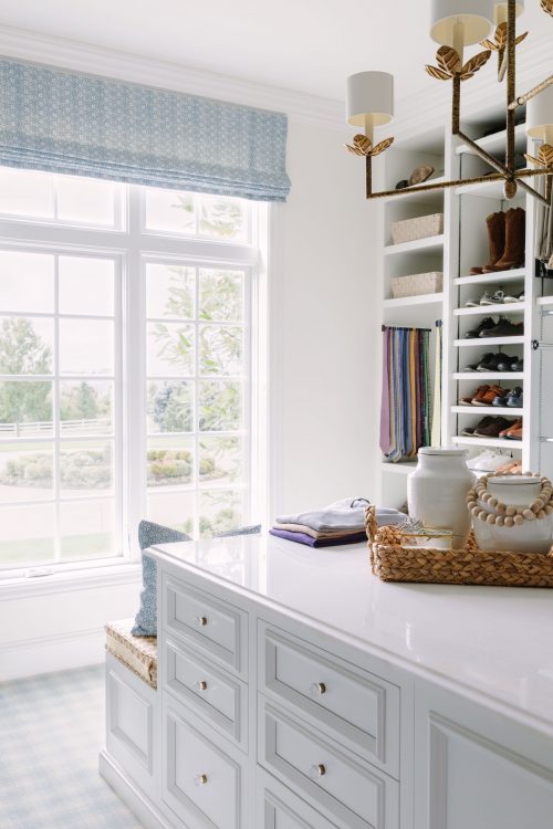
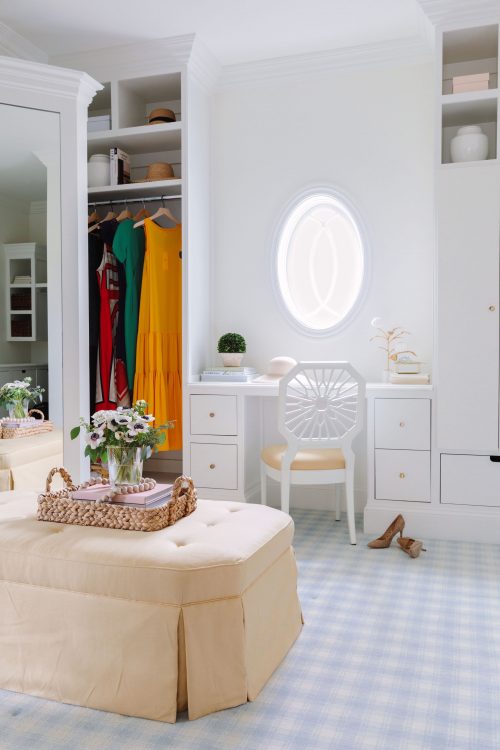
For the master closet, we expanded the space and tore down a wall that once was a home office to create a more spacious area where our clients could each have their own side of the room. Besides the obvious storage and organizational aspects of a closet, we added window treatments and a few ottomans for our client’s beloved pups to sit on while they’re getting ready.
Guest Bedroom #1
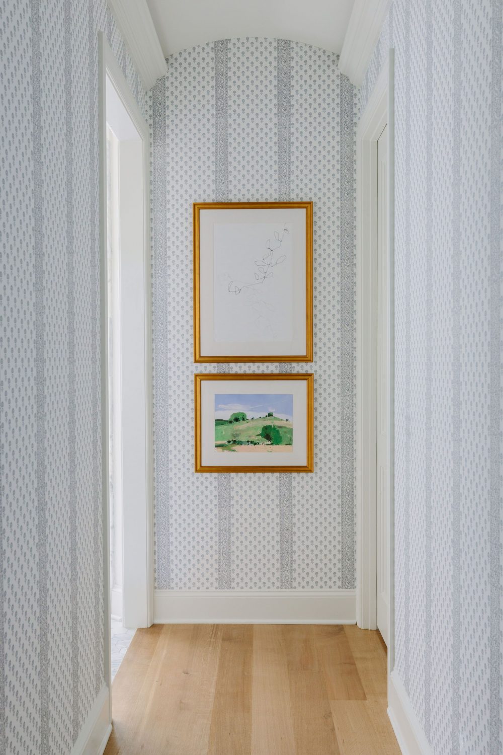
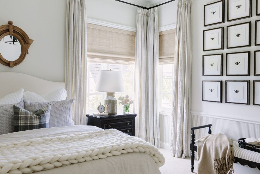
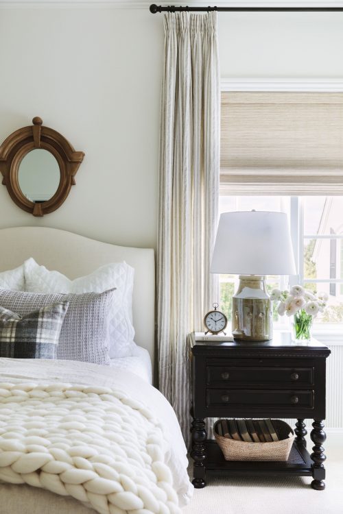
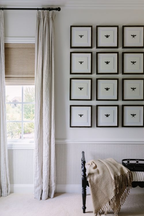
When we’re designing multiple guest bedrooms in a home, it’s always fun for us to create each room with its unique personality and style. For the first bedroom, we decided to go with a neutral theme. The chair rail was existing, so we added a simple, striped wallpaper underneath it to have it feel intentional. Then, high contrast details, lots of textured pieces, and a Brooke & Lou art installation made this space even cozier, inviting and peaceful.
Guest Bedroom #2
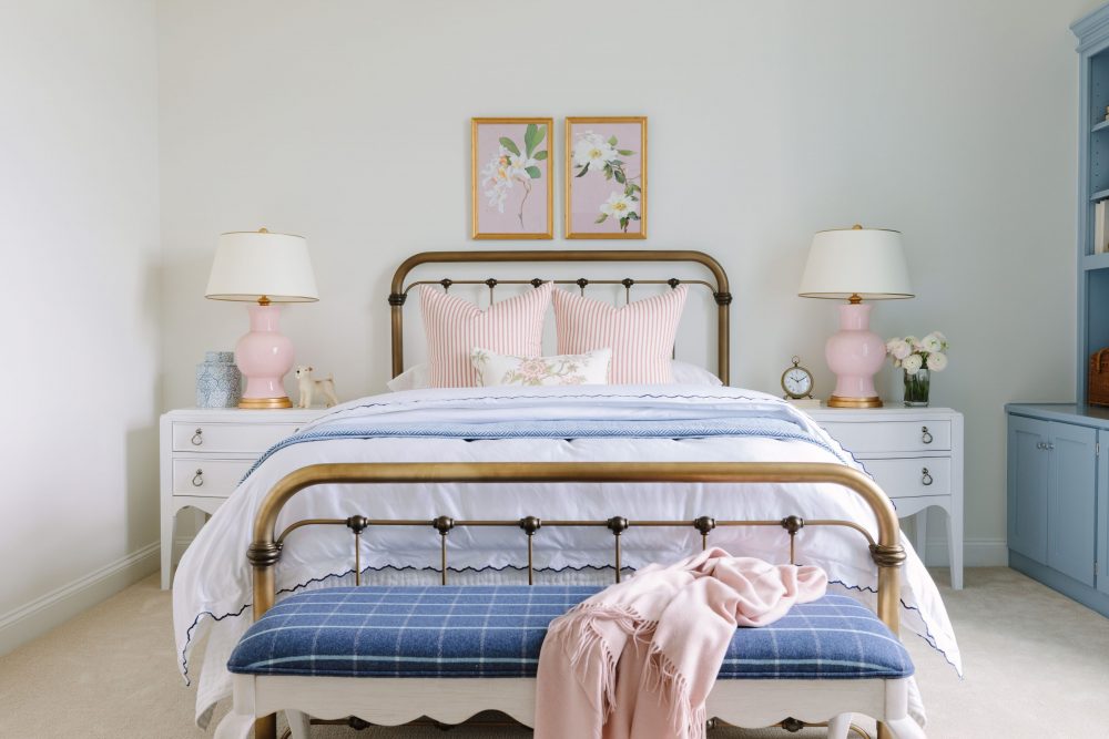
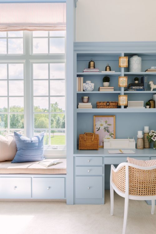
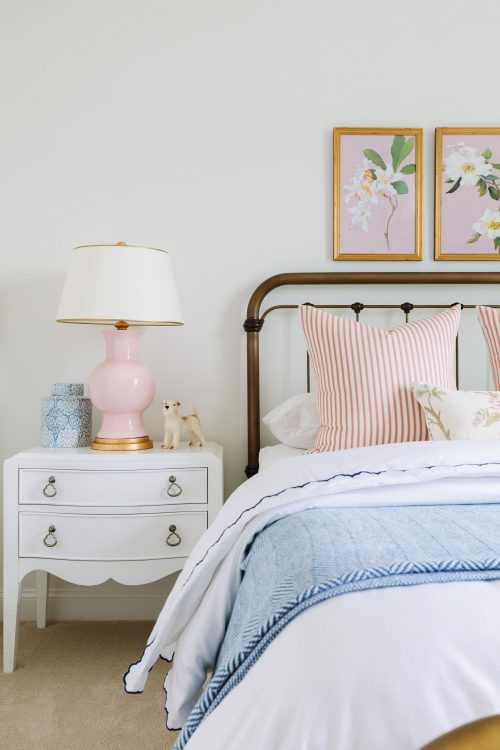
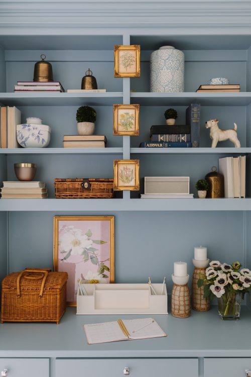
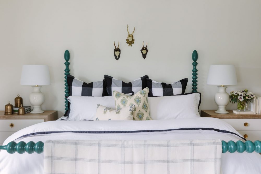
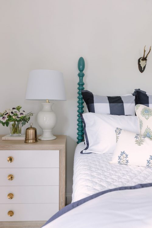
The second guest bedroom is by far the most feminine room in the whole home. The massive, built-in cabinets were such a huge part of the space and we knew we wanted to keep them but, instead, we painted them a soft, blue color. Playing with one of our favorite color combos, we furnished the rest of the room in pale pinks, brass, creams, and blues to give it a pastel, playful feel.
Guest Bedroom #3
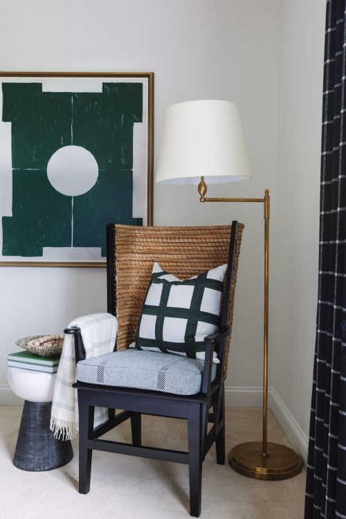
While the previous bedroom had a feminine feel, this room is more masculine. By mixing darker tones, different plaid patterns, and dark greens, we designed this room to feel comfortable, easy, and relaxing for any guest that should stay with our clients!
Wine Cellar and Bar
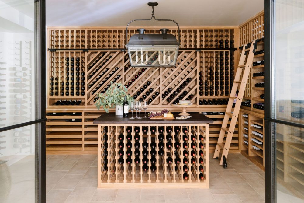
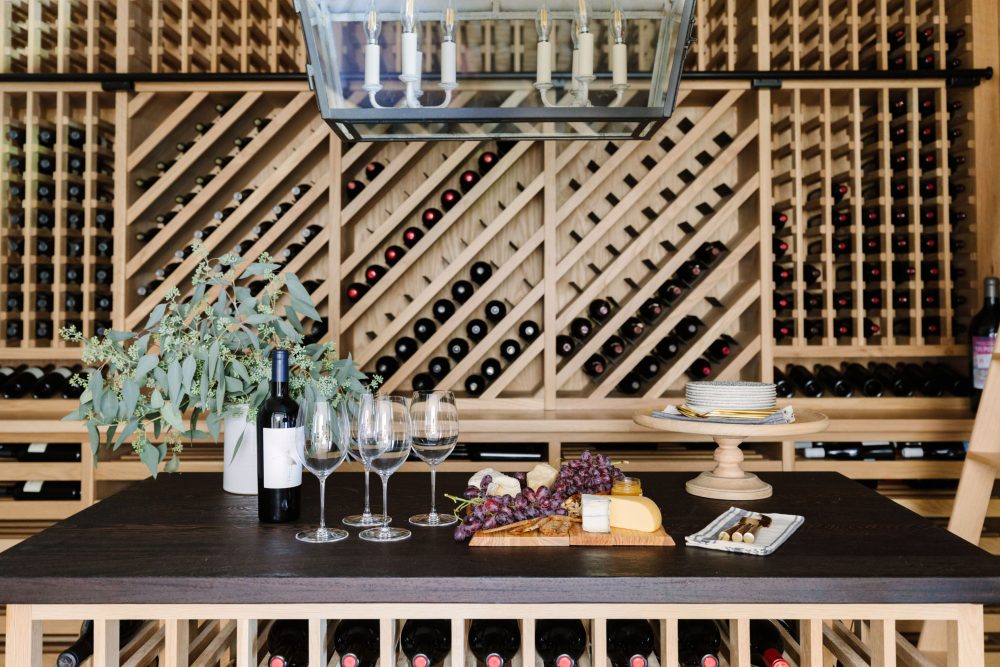
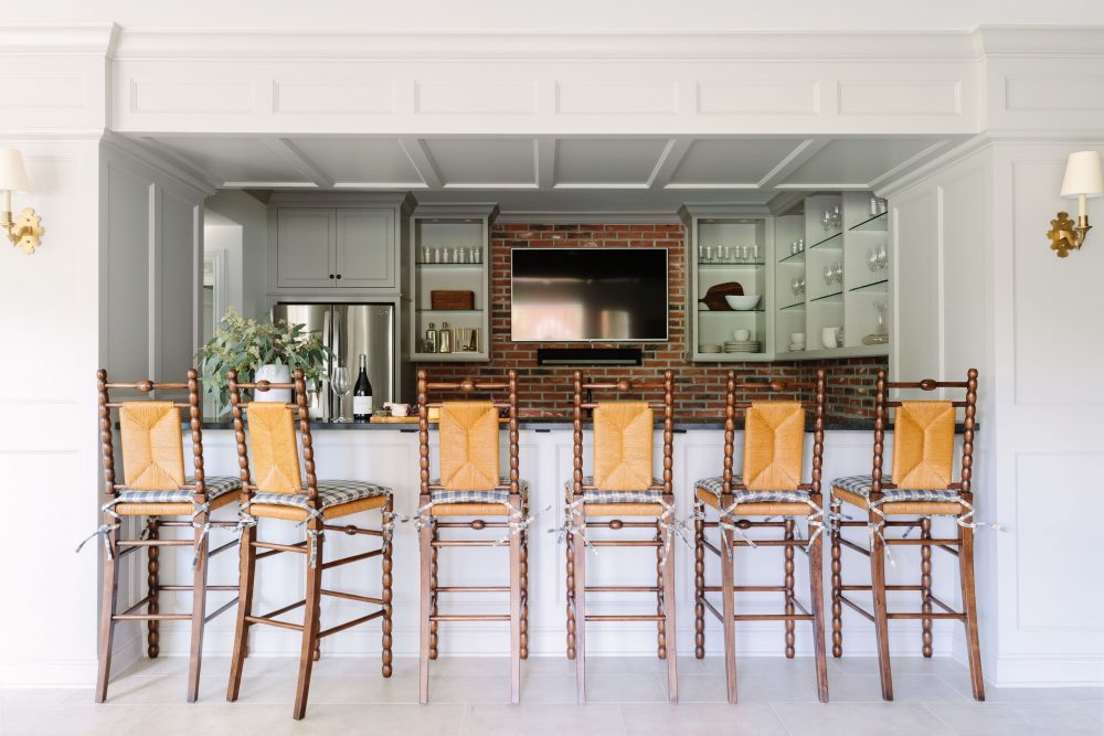
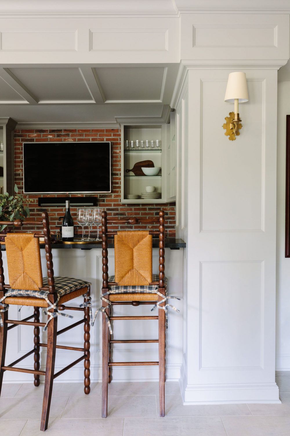
We mentioned in our previous post that our clients love to entertain so we knew we wanted to create spaces that were perfect for doing just that. Starting with the wine cellar, this area used to be the storage room in the lower level that we transformed it into a wine room. Temp controlled, immaculately organized, just waiting for our clients to pour a glass! Beside it lives the basement bar and we love it’s old fashioned, pub feel that was done in a modern way. We added the brick backsplash, ample shelving for our clients to display their mementos, and enough seating at the bar for their friends and family to sit and chat.
Outdoor Area
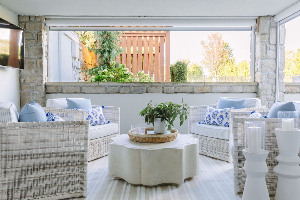
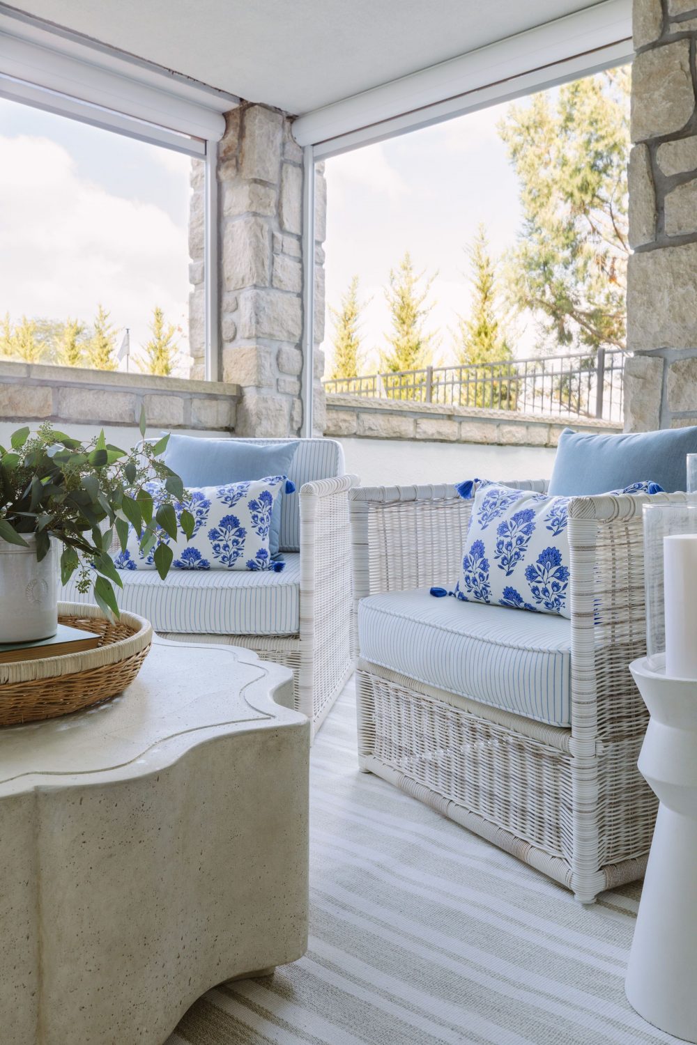
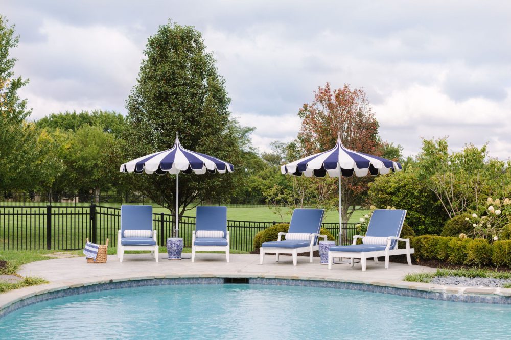
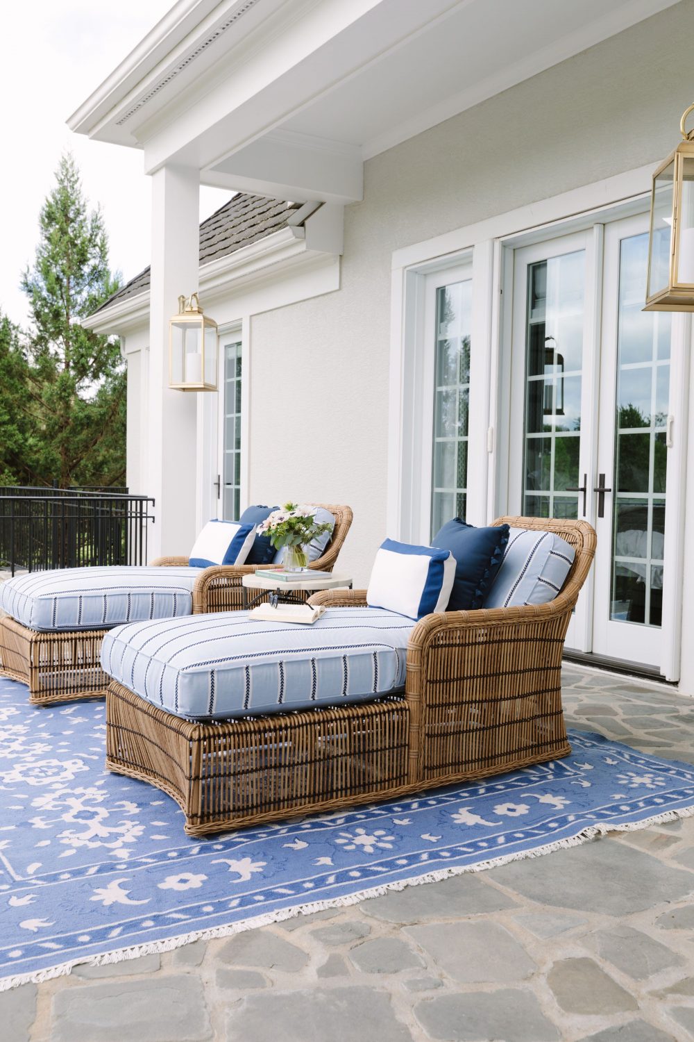
As you head outside, one of the first spaces you’re greeted with is the cigar area. We love that this area is the ultimate man-cave for our client that his wife will also find visually appealing and equally as beautiful as the rest of the home. Space heaters were put in the ceiling for warmth on chilly nights and when the temps drop screens can come down. A television was installed for watching sports and stairs lead you out of the space that brings you up to his putting green. Doesn’t sound too bad, ey? Another thing we love about these outdoor areas are the furnishings! Which, is not normally said about outdoor furniture! These spaces are proof that outdoor furnishings can be just as gorgeous as indoor. You shouldn’t have to sacrifice style for function!
Thank you so much for following along these past few weeks as we’ve revealed this project. It was such a joy for us to design and equally as fun for us to share with you all.
Photography by: Aimée Mazzenga





Comments