We are back at it again today with Part II of our Shady Beach reveal! If you missed Part I, click here to catch up.
Kitchen
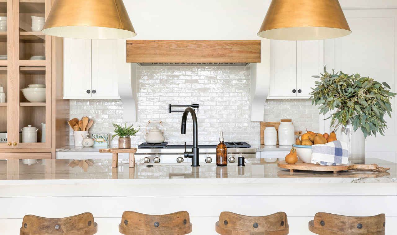
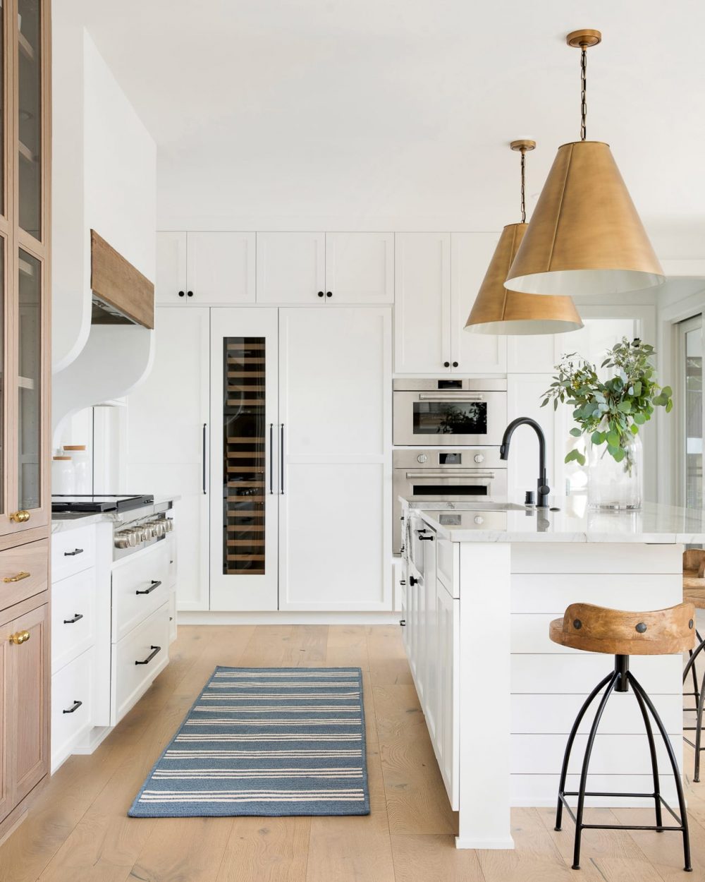
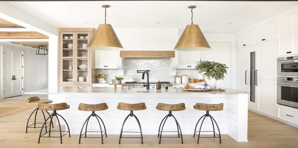
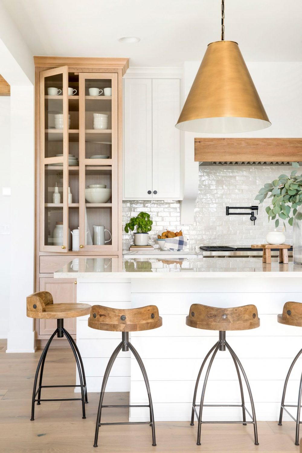
In our opinion, the kitchen is really the room that emulates the modern farmhouse style we were aiming for. For this project, we worked extremely hard to fit our clients budget which turned out to be sort of a fun challenge for us because it drove us to be very intentional with every choice we made! We focused on doing a mixture of high and low selections that still gave us the high-end impact we wanted.
While the majority of the kitchen is clean and white, we knew that in order to add in that farmhouse aspect there needed to be elements of warmth. We carried over the wood from the beams throughout the house and placed it on the hood and through the built-in cabinetry as well as selecting these wood barstools.
One of our favorite details in the room is the large, bronze pendants hanging over the island. We actually have the same ones (in a different finish) in our studio and they are incredible. They create such a statement in the kitchen and we love the warmness the bronze finish brings to the room.
Pantry
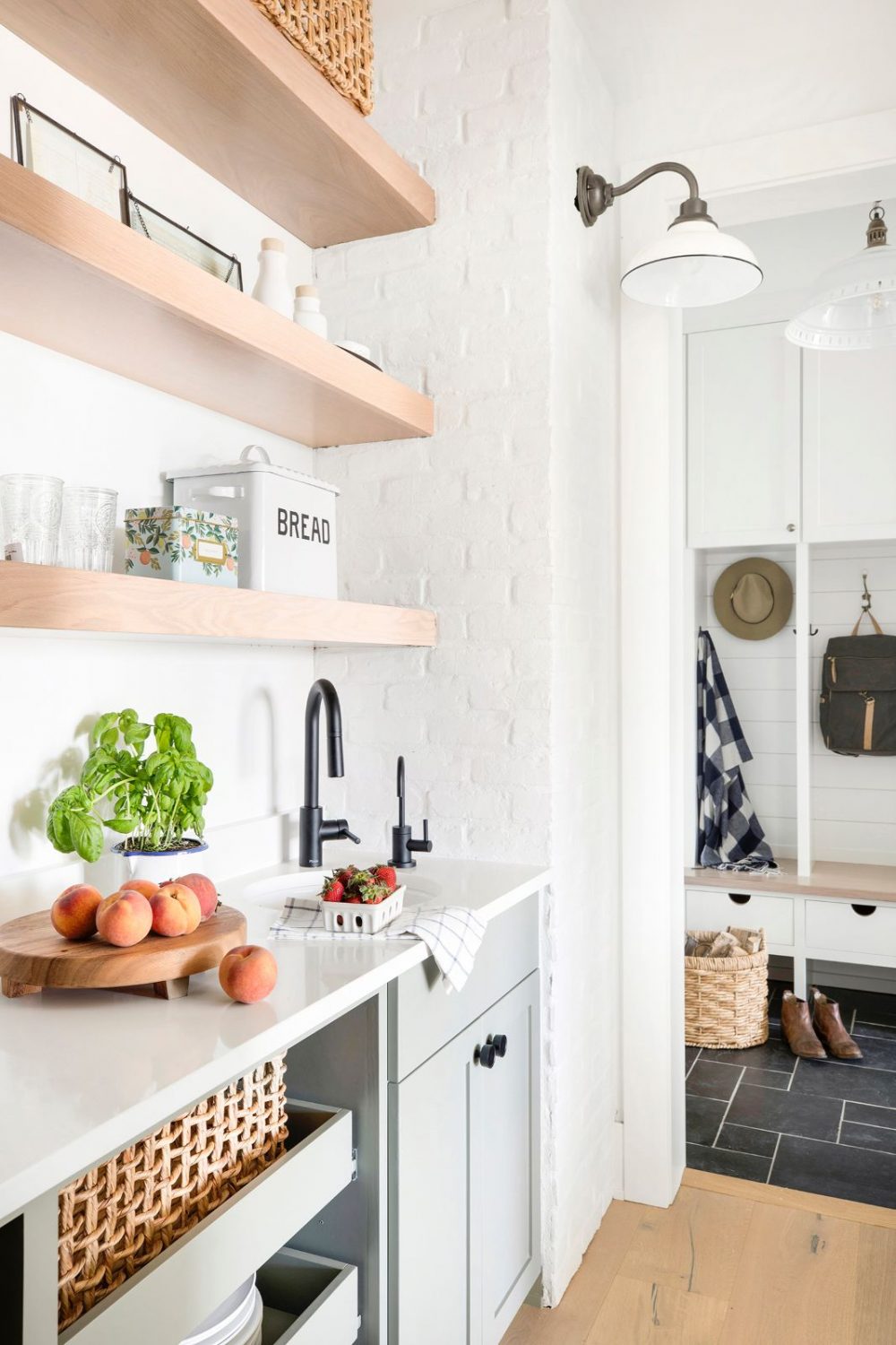
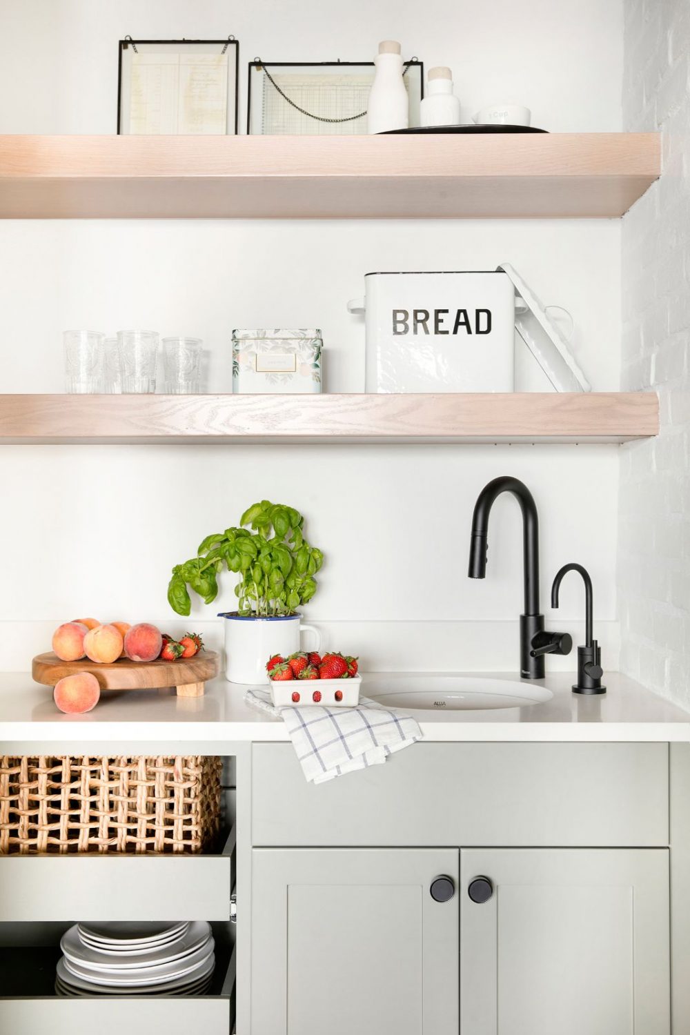
Right off the kitchen is the pantry which is not only extremely functional for the homeowners but ended up being one of the most charming space on the entire main floor! During construction we found out that there needed to be a bump out built to hide pesky vents. This of course wasn’t the greatest news but we decided to find the silver lining in the situation and find a beautiful solution to this, in reality, minor problem. We decided to wrap it in white brick, which gave the room some old-world charm to the otherwise contemporary space.
Dining
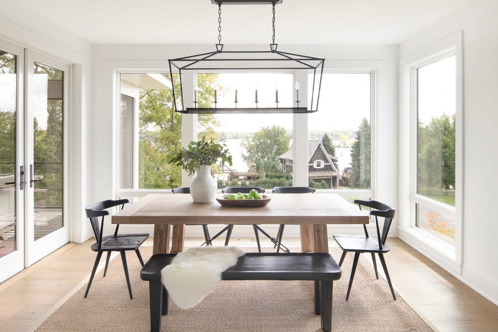
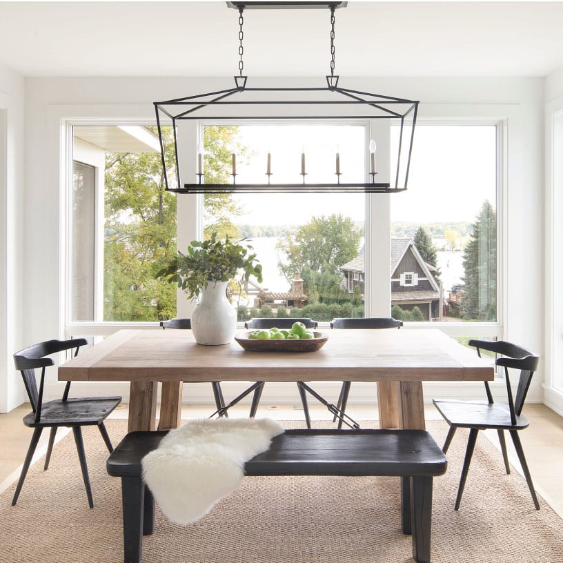
Keeping with the open concept of the main floor, the dining room is adjacent to the kitchen creating that eat-in layout we love. Since our clients lead a busy lifestyle, this floor plan was much more in line with their casual dining style and created a central place for their family to gather.
We decided to place a large, wood table to keep in tone with the farmhouse style while pairing it with sleek, black chairs that are a bit more on the modern side. To elevate the casualness of the area, we also placed a long bench on one side of the table which is fun and convenient for their kiddos.
Porch
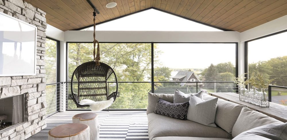
In addition to their main living space, the homeowners also have an incredible three season porch to congregate in. As we’re sure you can tell from the images, this room sits high up in the trees, giving you the feeling as if you’re in a treehouse almost. We decide to play on that sentiment by bringing in those warmer, earthy elements like the stone fireplace and wood shiplap ceilings.
Over the fireplace, we hung our Cross the Lines artwork in light blue which added a little bit of light and worked as a great focal point in the space. Our clients brought the hanging chair with them from their previous home and it worked perfectly in the corner of this room! The porch turned out to be such an inviting and relaxing space and we are definitely jealous of all the cozy nights our clients will spend in the room beside the fire!
Mudroom
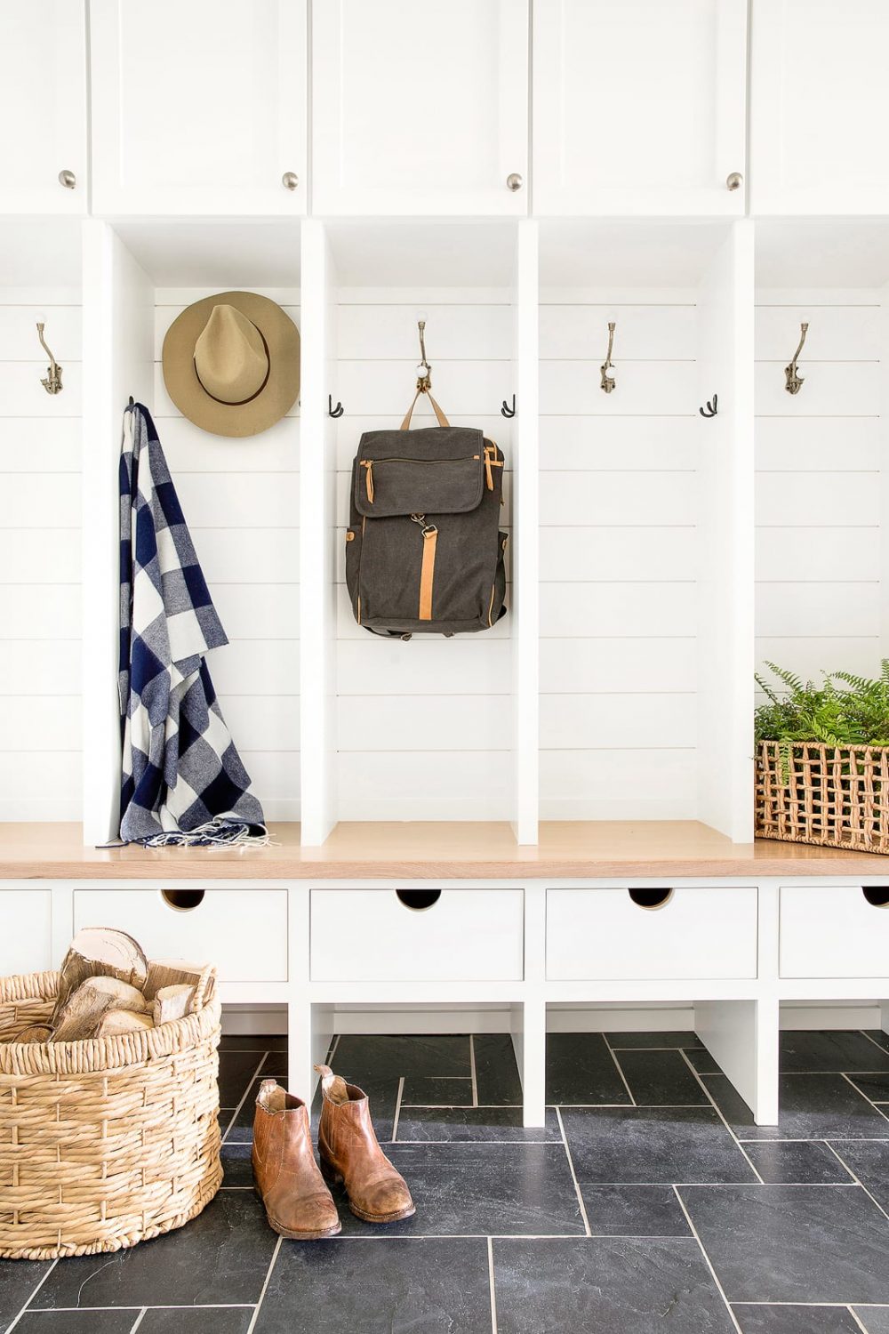
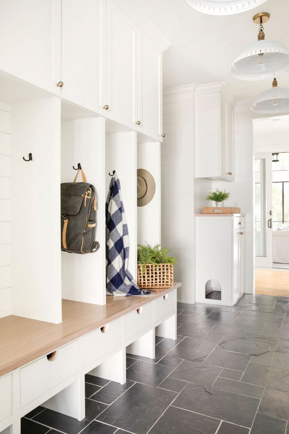
When you have a busy family, a functional mudroom is a necessity. We love the contrast of the white, shiplap cubbies against the dark, charcoal color of the floor. One fun little detail of the space is the small opening in the cabinet for their cat to crawl through – the clients wanted a more attractive way to disguise the liter box for the furry friend! Did you spot that?
Thank you again for all the wonderful feedback you have given us for this home! Next week we’ll be sharing the final part of our reveal which consists of the master bed and bathroom, laundry room, and the cutest playroom you’ll ever see!
Photography by: Spacecrafting Photography





Comments
Hi! Are you able to share the source of the backsplash? It’s beautiful!