There’s no doubt of the power of paint. It can completely transform a room – it can alter a mood, give the illusion of more space, and instantly make it feel fresh and updated. So, you would think something as simple as a white paint would be easy to find, right? Wrong.
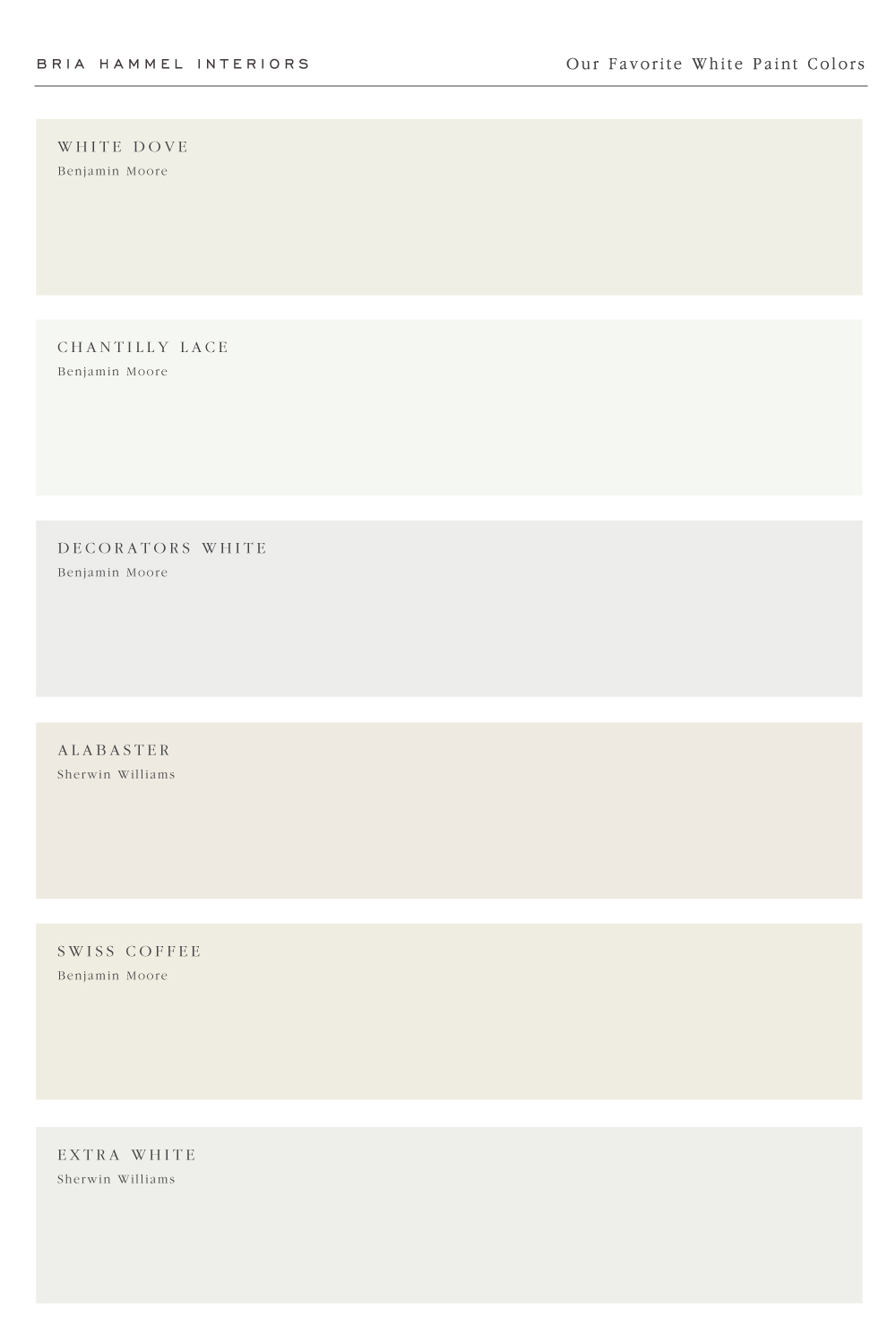
Out of all the colors white, ironically, can be the most difficult to select. With so many different shades and undertones to choose from – where does one start? After year of swatching and testing dozens and dozens of whites, we’ve compiled our list of go-to’s that work beautifully in many different homes.
Today, we’re sharing them with you all and the spaces we love to use them. We hope this helps you during your next run to the paint store but, as always, we always recommend getting a sample to make sure it looks right in your home/lighting.
1. WHITE DOVE – BENJAMIN MOORE
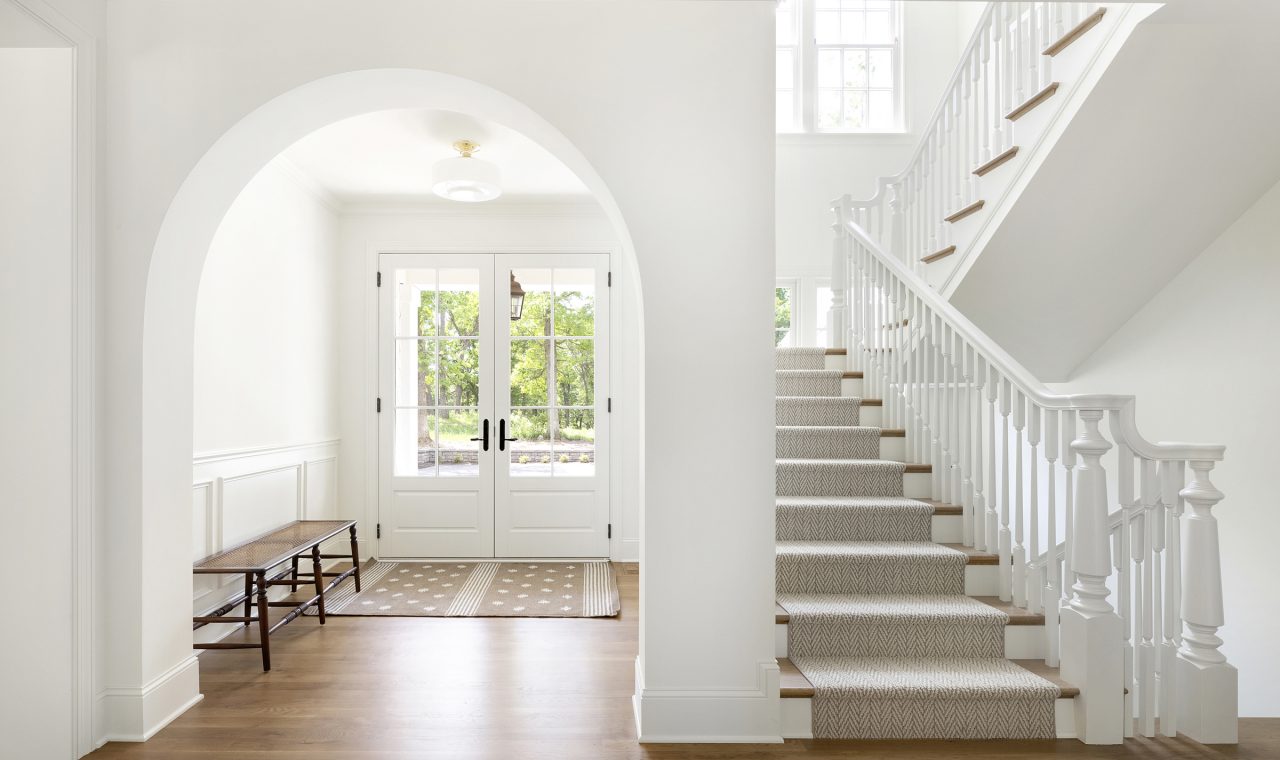
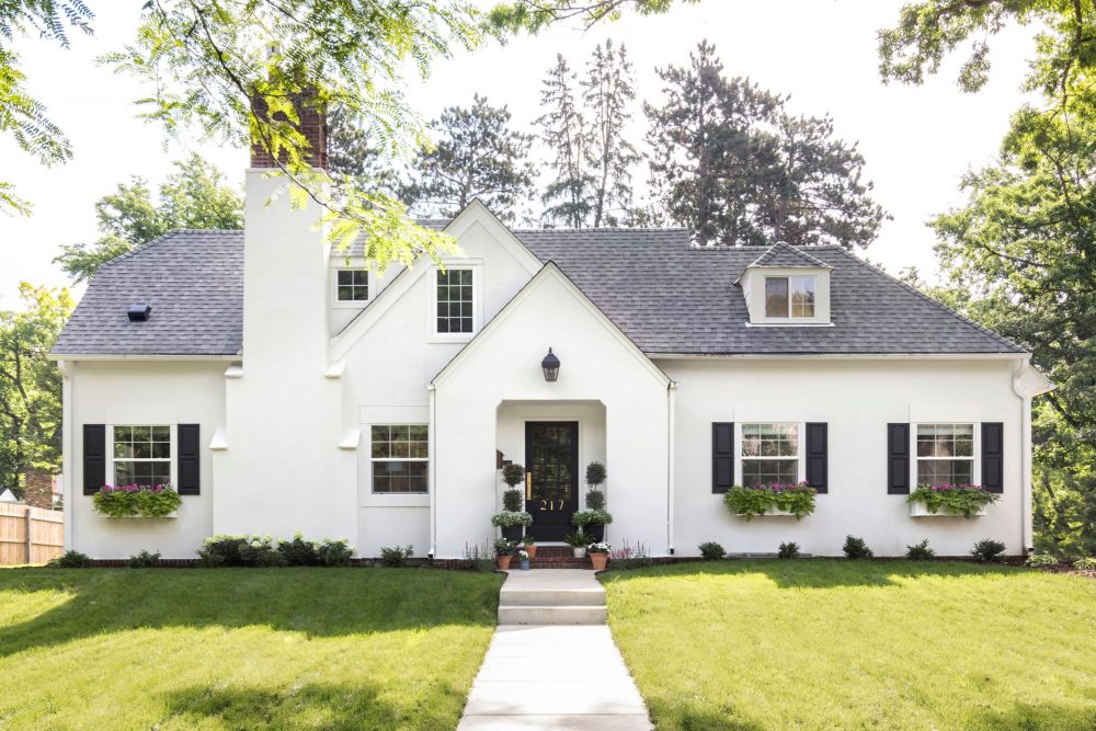
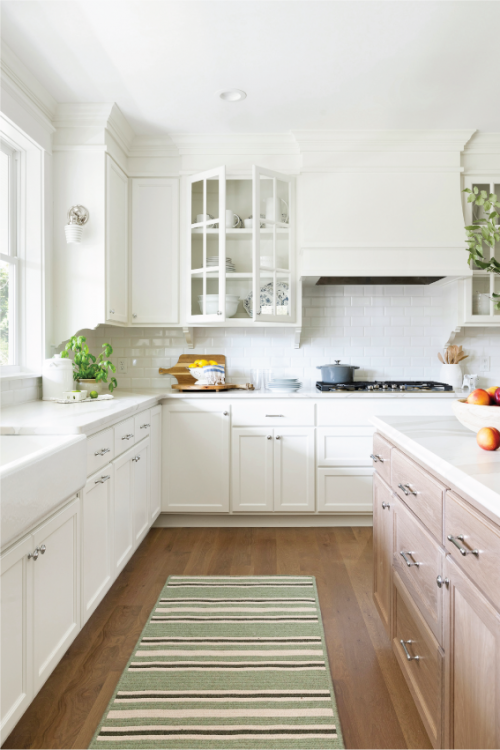
Out of all the white paint colors out there, this is by far the one we specify the most. It’s hard to find someone who has tried White Dove and didn’t love how it looked in their home. To us, it’s the perfect balance of cool and warm. We especially love it for exteriors, since it’s just bright enough to feel fresh but not too bright that it’s blinding.
2. CHANTILLY LACE – BENJAMIN MOORE
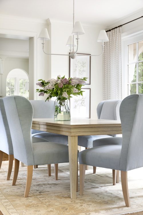
If you’re looking for a clean, bright white this is the one. It is definitely more of a crisp white with grey and blue undertones,but it never feels too stark or sterile. We love pairing it with warm tones like natural woods or cozy textiles to balance it out.
3. DECORATORS WHITE – BENJAMIN MOORE
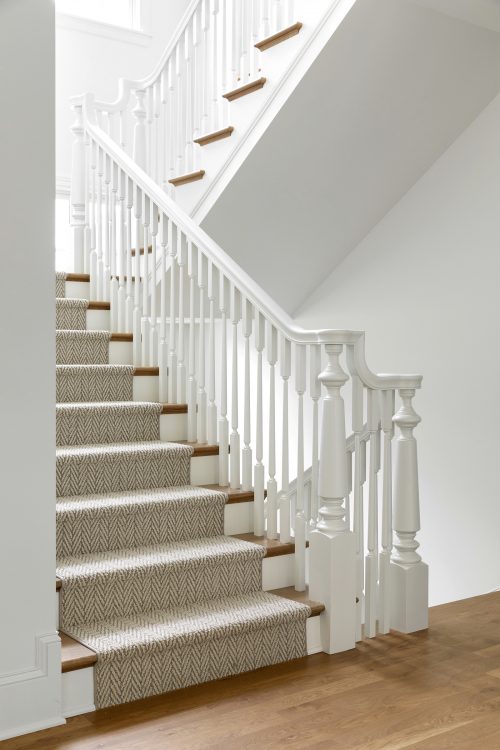
The name of this paint just means we have to love it, right? There are very few white paints that don’t have undertones and this one is one of them. It has such a subtle cool undertone that it has notibly become one of the most popular whites consistently used by builders and designers.
4. ALABASTER – SHERWIN WILLIAMS
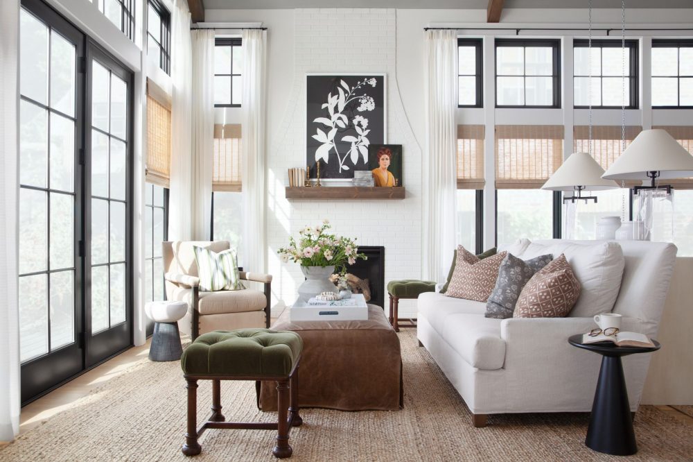
Alabaster is a soft neutral, off-white with warm undertones (although not too heavy). We love the coziness it offers without being too creamy or yellow. We love this color in spaces that get a lot of natural light or on textured surfaces like brick (I.e. the fireplace above!).
5. SWISS COFFEE – BENJAMIN MOORE
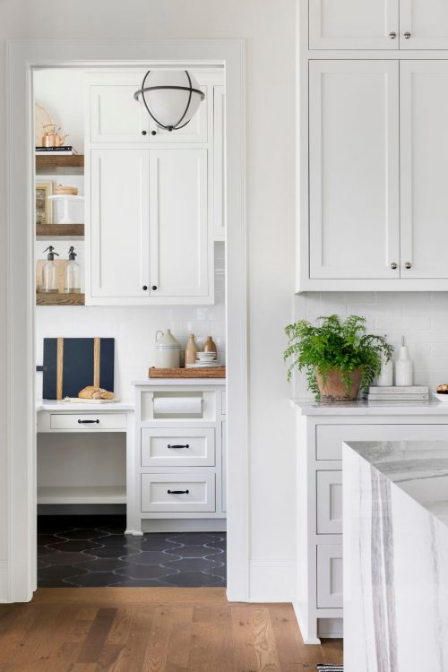
If you have a historic or uber traditional home, swiss coffee might be the perfect option for you. It’s a great choice because it pairs well with other warm, cream, or beige tones. Some think it is very similar to White Dove by BM, but Swiss Coffee provides a little bit more creaminess in our opinion.
6. EXTRA WHITE – BENJAMIN MOORE
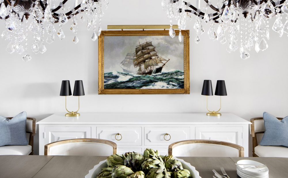
And finally, we have extra white. The name really tells it like it is – this color is stark white. We find it too bright for walls, but we love using it on ceilings to add dimension alongside a different white on the walls (I.e. Swiss Coffee).




Comments
Great article on paint!
Hello. Can you share your advice on what to color to pair with swiss coffee . We just moved into a home and swiss coffee is on the kitchen cabinets. The cabinets are beautiful but I do not like the trim or wall color they chose and need guidance! Thanks..
Hello Lisa, in our Murrieta Project office we paired Swiss Coffee with Oil Cloth by Benjamin Moore, in our Iteri Modern House we paired it with Kendall Charcoal, and in our Beach Street Project we paired Swiss Coffee kitchen cabinets with Classic Grey by Benjamin Moore on the walls. Hope that helps!